
Weekly ChartStorm - The 2022 Bottom
Special Edition: surveying the signs and signals from the 2022 market trough...

Welcome to the latest Weekly S&P500 #ChartStorm!
NOTE: I’m traveling this week (family holiday) so I’ve prepared this one in advance —this session is a follow-on from a previous post on the 2021/22 top (which looked at the charts that helped flag the peak).
The purpose of this week’s post is to look at the charts and clues that helped flag the 2022 market trough. The point of this exercise is to reflect on what indicators proved useful to help with process development, education, and ultimately preparation for the next downturn.
Methodology note: I’ve shown the charts as they appeared at the time [i.e. THE CHARTS ARE NOT UPDATED] (because it is obvious in hindsight, but never entirely obvious at the time and in this way you can see what it looked like at the time).
I’ve also shown the charts I selected in chronological order — because again it’s obvious now, but back then it was a process of: “here’s some clues a bottom might be near”, and then the next phase is “it looks like the bottom is in (but we’re not 100%, risks remain)”, and then you get increasing technical/macro-fundamental confirmation before it finally becomes “obvious”.
1. IPO Activity Collapsed: one clue was the collapse in equity capital markets activity (IPO and SPAC issuance crashed below March 2020 levels by mid-2022. I have found IPO activity to be a reliable indicator of the stage of the market cycle (i.e. as a symptom or output of where valuations/sentiment/liquidity are at), but also there is a simple supply and demand aspect (e.g. if IPO activity surges, supply of stocks goes up, if IPO activity collapses, supply slows). This chart helped flag the peak in 2021/22 and the subsequent market trough in 2022.
“after peaking in early 2021, the previously booming IPO (and SPAC) market has turned to bust. But that may not necessarily be a bad thing… Basically when this indicator plunges towards 0%, that has historically been a sign that a bottom is close.”

Source: Weekly S&P500 ChartStorm - 10 September 2022 [ Topdown Charts ]
2. Valuations Reset: valuation indicators are also an important means of gauging the stage of the market cycle because ultimately they are a measure of investor confidence. If investors are very optimistic on future earnings growth they will pay more money and value those expected earnings flows more highly. If investors are pessimistic and in panic mode, they will lack the certainty or belief required to pay a premium for future earnings, and will be more focused on preserving capital.
In practice the level of valuation indicators is important, but what is also important is the change e.g. the forward PE ratios in the chart below saw a major reset; thereby adding evidence to the possibility of a market trough.
“US equities are in line with recent history average (but not cheap/below average). Whereas the rest of the world does look cheap vs its own history (and vs USA).”
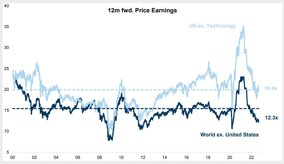
Source: Weekly S&P500 ChartStorm - 10 September 2022 [ @QCompounding ]
3. Speculators Crowded to the Short Side: another important piece of the puzzle was speculative futures positioning plunging into net-short territory. This is an important indicator from a contrarian standpoint as speculators tend to be all-in near the peak, and crowded to the short side near the bottom.
But crowded short positioning also represents future potential buying, especially if the market begins to rebound (triggering panic buying by speculative shorts to square their position).
“Speculative futures positioning is heavily net-short.”
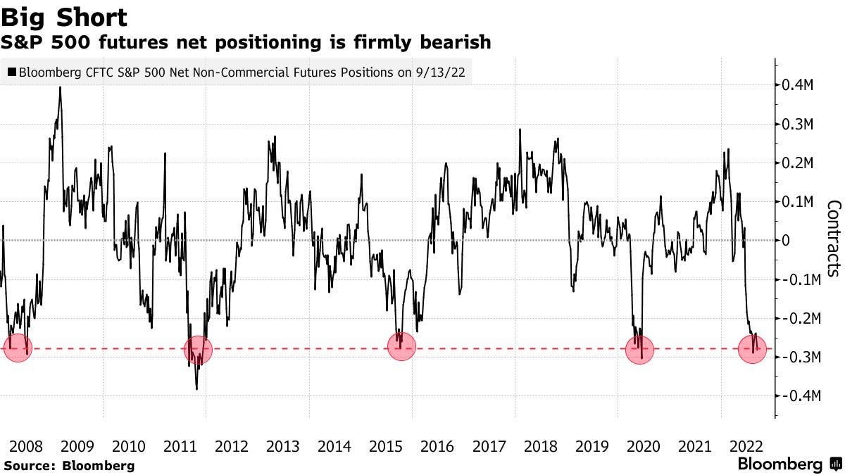
Source: Weekly S&P500 ChartStorm - 25 September 2022 [ @Barchart ]
4. Margin Debt Dropped: similarly, we should pay attention to big shifts in margin debt balances. Large increases in margin debt balances indicate greed, while large drops indicate panic and ultimately lead to a selling climax as margin calls get triggered and capitulation sets in. Once all the sellers have sold, selling pressure exhausts, and the bottoming process can run its course.
“BofA analysis suggests the shift in margin debt rate of change is a contrarian bullish signal…”
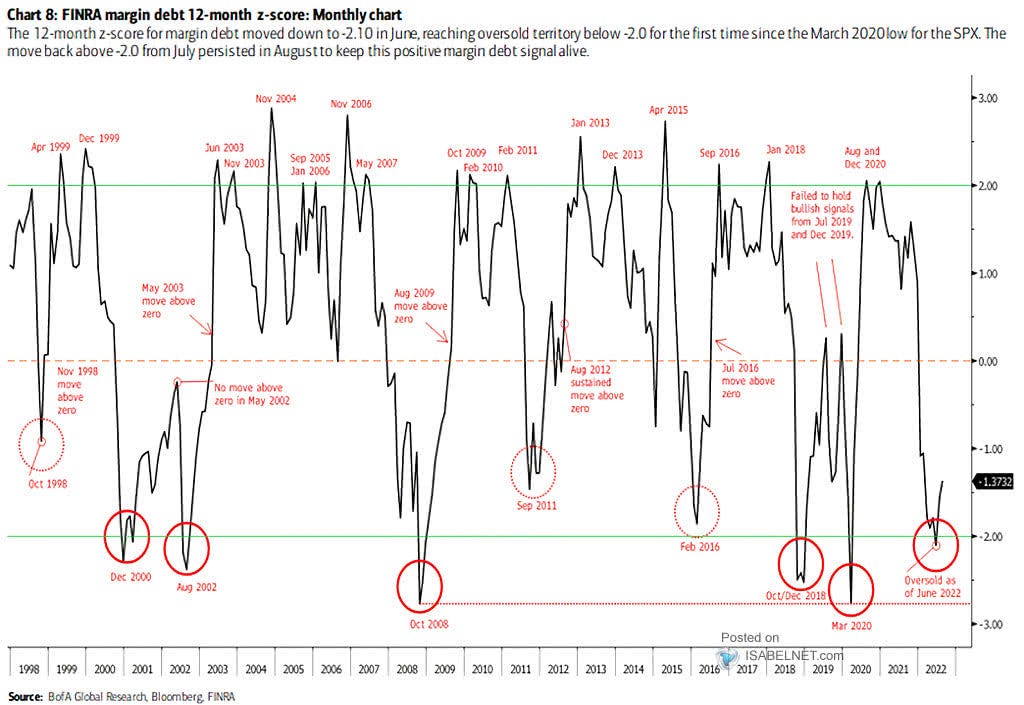
Source: Weekly S&P500 ChartStorm - 9 October 2022 [ @ISABELNET_SA ]
5. Seasonality Worked: seasonality worked well in 2022, not specifically because it foretold an imminent rally based solely on historical averages, but rather because it was a prompt to think about the unthinkable. At that stage people were fixated on the bear case, so seasonality helped by adding to the growing list of clues and by drawing attention to a possibility most were not considering at the time.
“a prompt to consider something we might not have previously considered… a Q4 rally. To consider that: sentiment is extremely bearish, so by definition there are a lot of minds that could be changed and in so doing drive upside”
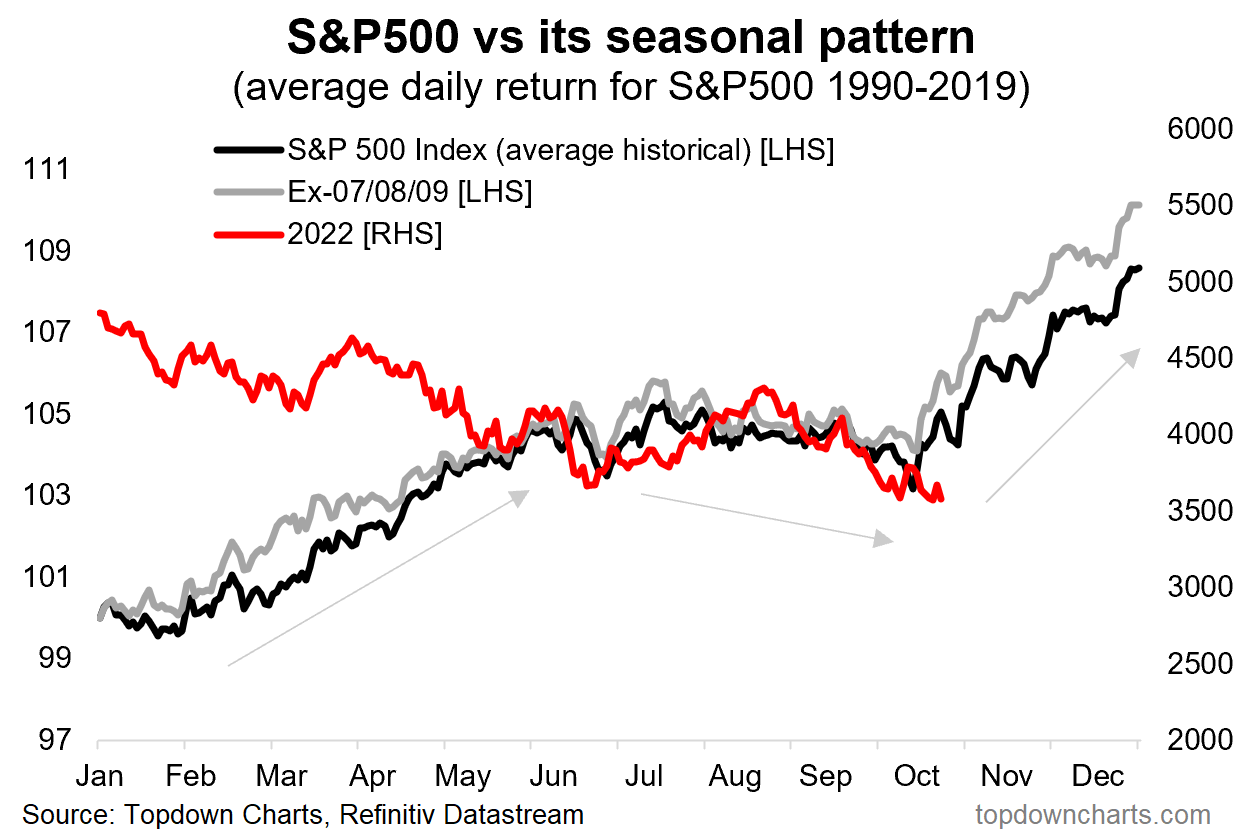
Source: Weekly S&P500 ChartStorm - 16 October 2022 [ Topdown Charts ]
6. Fund Manager Cash Allocations Surged: similar to the futures positioning chart, this one tells us two pieces of information; it tells us that the crowd is bearish (which is often a contrarian signal; albeit not always [sometimes the crowd is right]), but it also tells us that fund managers have dry powder and could become a source of buying power if they change their minds (e.g. if the market turns up, macro improves, etc).
“Fund manager (surveyed) cash levels are apparently at the highest levels since 2001.”
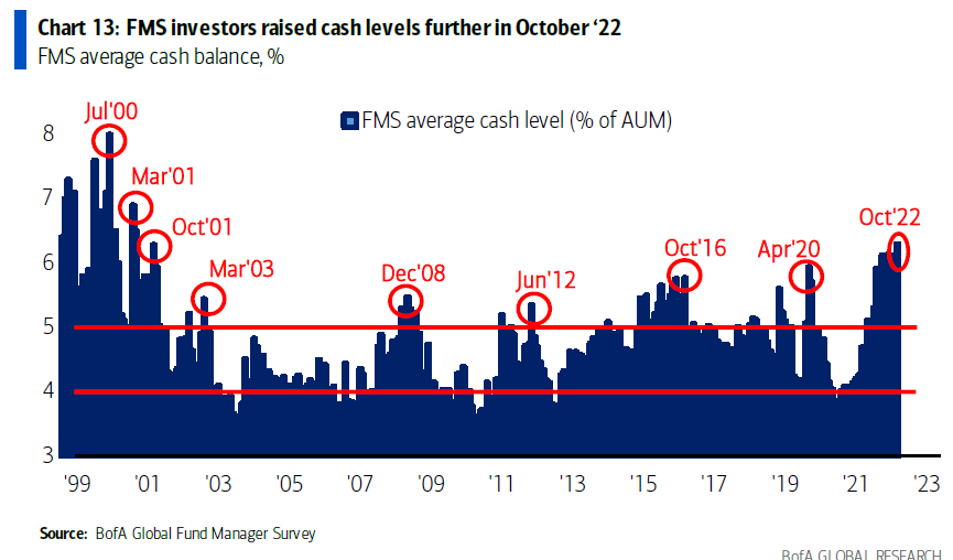
Source: Weekly S&P500 ChartStorm - 23 October 2022 [ @RyanDetrick ]
7. A Bullish Divergence Occurred: technical analysis signals can be an excellent way to build conviction and finesse the matter of timing (as well as being a prompt to consider a different possibility). A bullish divergence is defined as a lower low on the index vs a higher low on the accompanying relevant indicator [in this case the 14-day RSI oscillator], and in this case it added evidence and a prompt to consider the possibility of a new bull market.
“an intriguing “what-if” setup on the weekly chart (bullish RSI divergence: when the index makes a lower low and the indicator makes a higher low — can indicate a shift in market dynamics).”

Source: Weekly S&P500 ChartStorm - 23 October 2022 [ @mattcerminaro ]
8. We went Full Circle on 60/40 Expected Returns: my expected return data (which is normally used for developing long-term strategic allocations) gave some interesting tactical insights in 2022. Forward looking expected returns for the 60/40 portfolio went from deeply negative in 2021, to matching levels it got to in 2020. These expected returns are in large part driven by yields and valuations, but it added another objective datapoint that hinted at the prospect of upside.
“some might argue that several rounds of shock therapy have brought the 60/40 portfolio investing approach back from the dead…”

Source: Weekly S&P500 ChartStorm - 23 October 2022 [ Topdown Charts ]
9. Retail Cash Allocations Spiked: this was the same kind of signal as the fund manager cash allocation chart; retail investors raising cash was a sign of pessimism and panic, but also a source of future potential buying power (and a sign of selling exhaustion).
“reported investor portfolio allocations to cash rose to one of the highest readings of the past decade during October. It reflects a change in investor moods, a change in alternatives, and a change in the risk vs return outlook.”
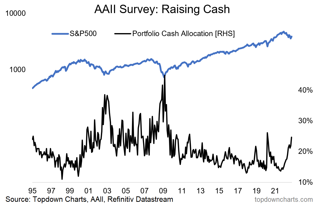
Source: Weekly S&P500 ChartStorm - 6 November 2022 [ Topdown Charts ]
10. Sentiment Crashed and then Turned Up: sentiment signals (direct gauges from surveys and indirect gauges from market pricing, activity) again are useful in telling us the mood of the market, the stage of the market cycle, and contrarian information for market timing. In this case we got the classic signal of sentiment plunging —and then turning up.
“the “Euphoriameter” ticked up slightly in October off of the lowest point since 08/09. Contrarian bull signal?”

Source: Weekly S&P500 ChartStorm - 13 November 2022 [ @topdowncharts ]
11. Back Above the 200-day Moving Average: this one came later in the process —which is basically a feature of longer-term moving average crossovers (i.e. they trigger later, but tend to have less chop/noise/false-signals). But the interesting added condition of spending a material period (6 months) below the 200-day average before crossing back above helped reduce the number of signals and historically had a very good record of flagging the start of new cyclical bull markets.
“Recapturing the 200-day moving average (after a material (6-month) period below) is usually a good thing... (reminds me of another market aphorism — "nothing good happens below the 200dma").”
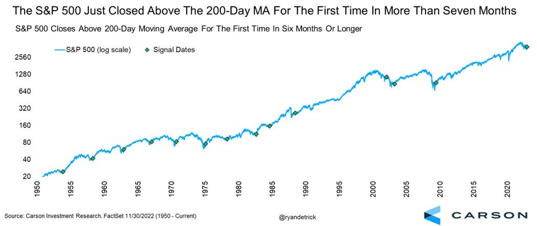
Source: Weekly S&P500 ChartStorm - 4 December 2022 [ @RyanDetrick ]
12. Peak Inflation: lastly, because a big driver of the drop in stocks in 2022 was the surge in inflation, the subsequent peak in inflation was a key development. This chart helped plot a potential pathway from peak inflation.
“Seems like peak inflation is good for equities — unless it is followed by recession...”

Source: Weekly S&P500 ChartStorm - 4 December 2022 [ @patrick_saner ]
To wrap-up, at the time it was a process of gathering evidence and clues that a trough was possible, then increasingly likely, and then subsequently confirmed. It’s obvious now with hindsight, but it is never easy when you are living through it, that’s why this sort of exercise is useful as a sort of post-mortem — to see what worked, what we should have looked at, and how we should have thought and assessed things to help get on the right side of the market.
As a minimum this should have given you some ideas for indicators to track in the future, further understanding of market analysis principles, and a worked example for navigating market cycles.
And in the end, that’s why I do the Weekly ChartStorm — partly because I just like doing this (I find it interesting; I enjoy the craft), but also because I know I’m helping people with my work.
On that note, if you haven’t subscribed yet, please feel welcome:
also, p.s. I am making this available as a free article, so you can share it or forward on to friends/colleagues if you’d like.
Thanks for reading, I appreciate your support!
—
Best wishes,
Callum Thomas
Founder & Editor of The Weekly ChartStorm
and Head of Research at Topdown Charts
Twitter/X: https://twitter.com/Callum_Thomas
LinkedIn: https://www.linkedin.com/in/callum-thomas-4990063/
See also: Weekly ChartStorm - The 2022 Top


Have a great holiday and I guess you are also hinting current conditions perhaps reflect the nearing peak excess as the trillion dollar valuations roll in on space and AI.
Enjoy your holiday Callum 🙂