

Welcome to the Weekly S&P500 #ChartStorm — a selection of 10 charts which I hand pick from around the web and post on Twitter.
These charts focus on the S&P500 (US equities); and the various forces and factors that influence the outlook - with the aim of bringing insight and perspective.
Hope you enjoy!
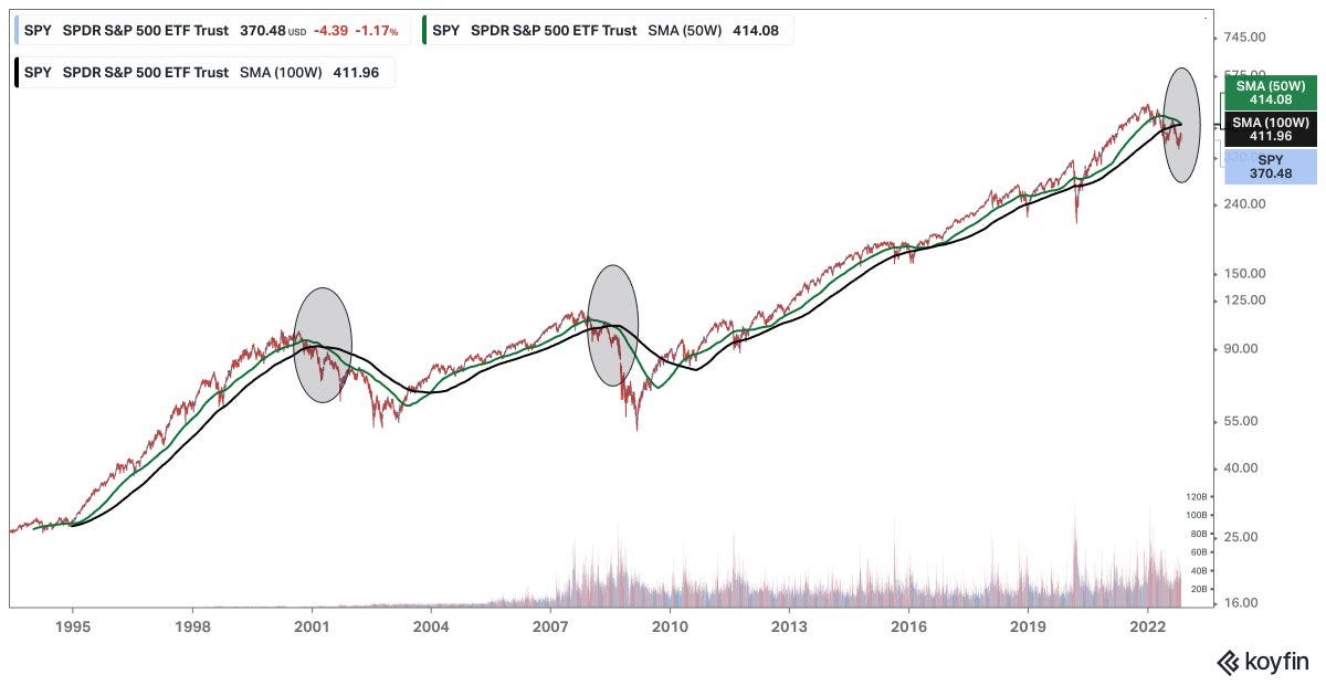
1. The Bear Truth: From a long term trend perspective, a prospective crossing over of these longer term moving averages would demarcate this from a shakeout/correction to a proper shift in trend -- a concept which would be outright alien to many.
Source: @howardlindzon
2. Broke Brokerage Accounts: For a while there folk couldn't open brokerage accounts fast enough... now they are walking away as the get rich quick dreams turn to get poor quick nightmares. A good reminder that “get rich quick” is often a false promise, and at best a treacherous expedition.

Source: @Lvieweconomics via @SnippetFinance
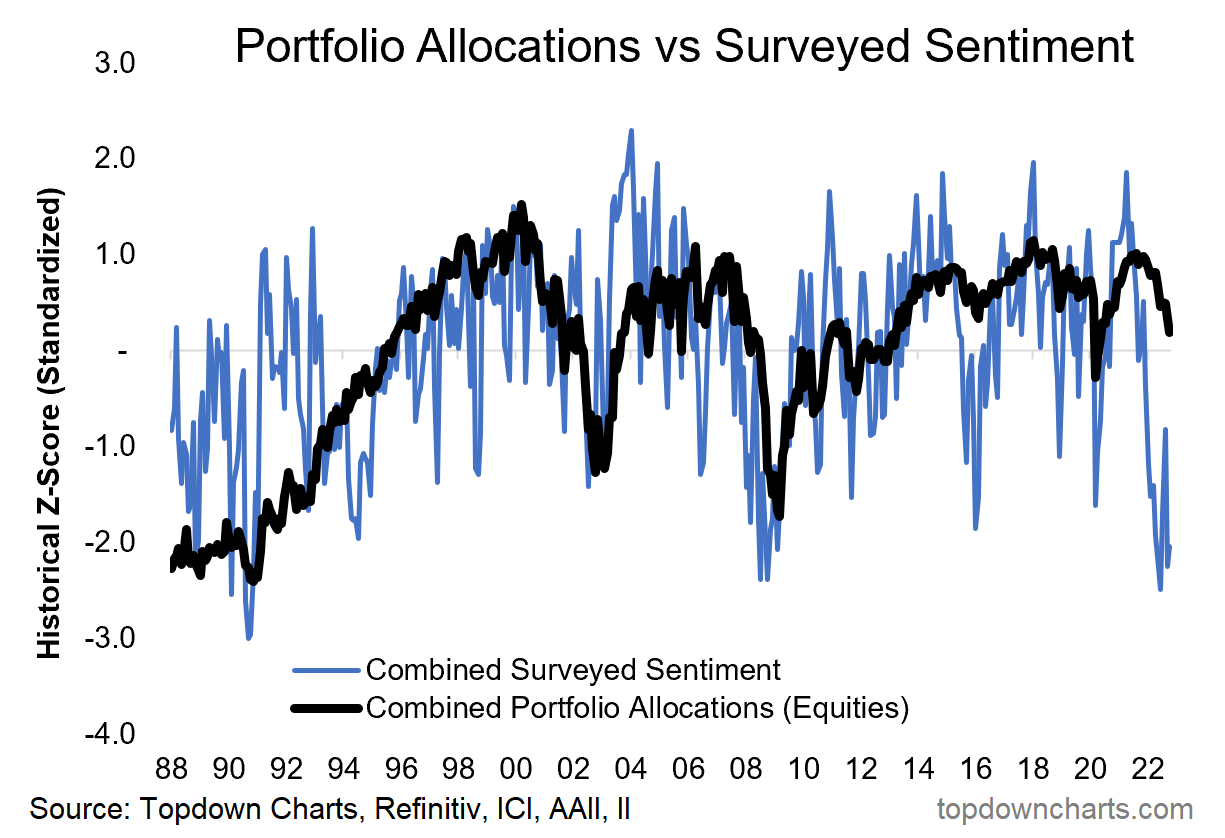
3. Allocations vs Sentiment: Investor portfolio allocations to equities are starting to catch down toward still very bearish sentiment... clearly the risk case is that allocations catch all the way down to sentiment (albeit equally, sentiment is already fairly morose, so perhaps easy to surprise to the upside — if you can muster up something actual positive though!).
Source: @topdowncharts
4. Sell Side Sentiment: Maybe it still needs to go lower, but BofA notes "whenever the indicator was at current levels or lower, the subsequent 12-month returns for the US equity index were positive 94% of the time -- with median gains of 22%"

Source: @dailychartbook
5. Earnings Estimates vs Price: Bulls will say that a resilient EPS outlook = bullish support. Bears meanwhile will say that EPS estimates are way too high, will catch down to price as recession sets in.

Source: @dlacalle_IA
6. Adjusted Earnings Estimates: Interesting follow-on from the previous chart -- turns out if you adjust EPS estimates for energy windfall profits, the underlying earnings picture looks much weaker.

Source: @C_Barraud
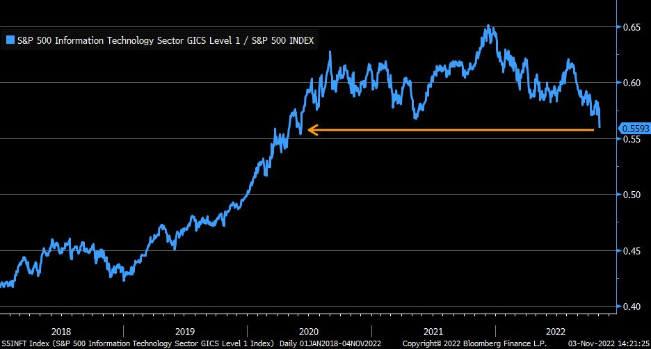
7. Tech Turning: Tech Sector relative performance is looking fairly weak, arguably in the process of breaking down...
Source: @LizAnnSonders
8. Growth vs Value: went from good buy to good bye.

Source: @KailashConcepts
9. Asset Deflation: This kind of wealth destruction is rare and likely ripples long beyond the horizon that most are focused on.

Source: @PhilipJagd
10. Financial History: Sure stocks are down, but they aren't new-addition-to-the-tails-of-the-distribution-down like bonds.
Truly a year (*so far!) for the history books.

Source: @RealAlpineMacro
BONUS CHART >> got to include a goody for the goodies who subscribed.
The Rise Of Cash: reported investor portfolio allocations to cash rose to one of the highest readings of the past decade during October.
It reflects a change in investor moods, a change in alternatives, and a change in the risk vs return outlook.
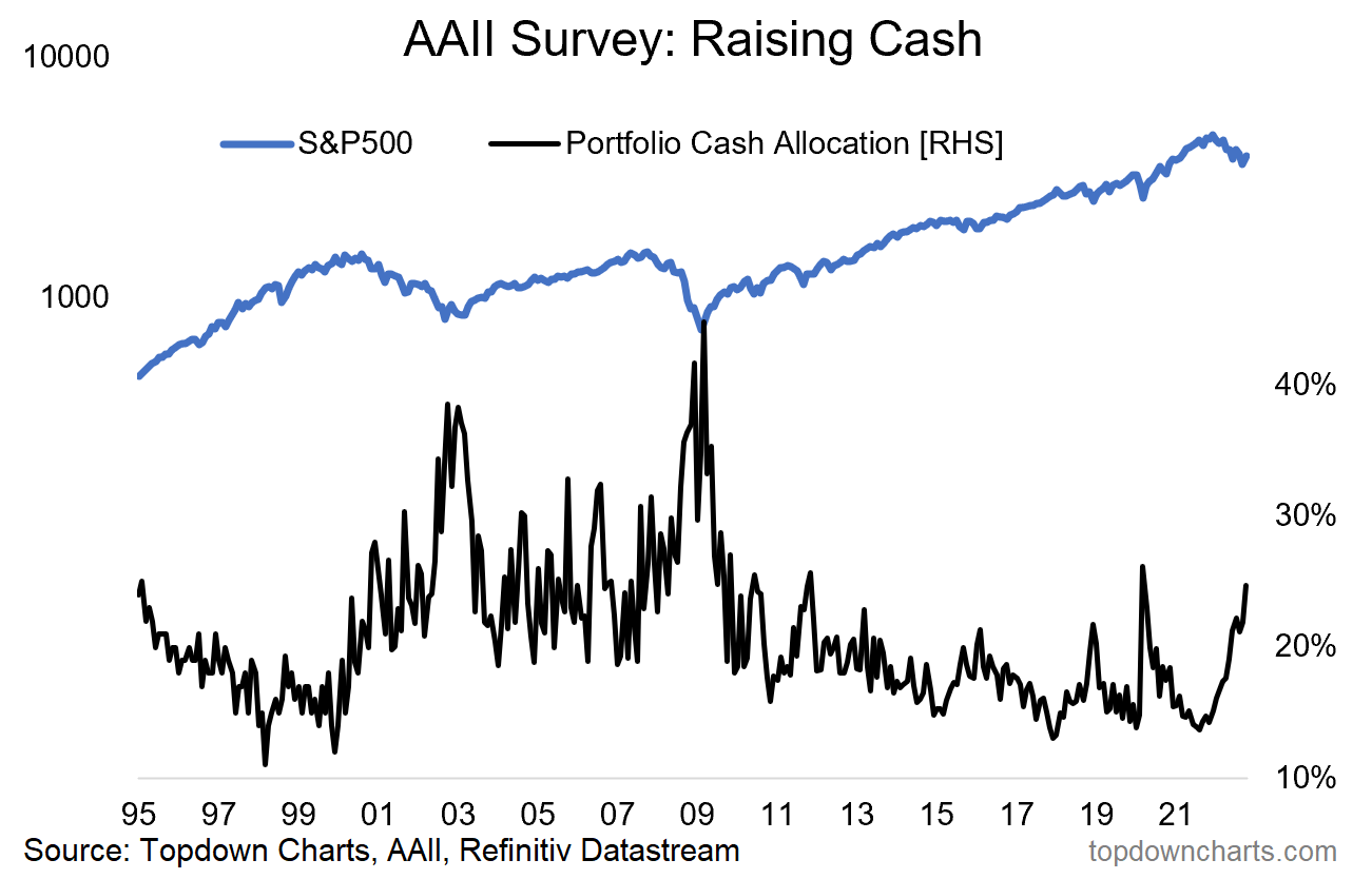
At 24.7%, the October reading is comfortably above the average of the past decade, and still somewhat elevated vs the all-time historical average of 22%.
It also represents a fairly sharp increase, rising 11ppts off the low point of 13.7% in August last year. The chart below puts the pace of change of cash allocations into perspective.

As alluded to, it reflects a change in investor moods as cash allocations rise when investors either actively change allocations or allow allocations to be drifted by the market (which is effectively also an active decision).
But it also reflects a change in alternatives, with cash rates now headed towards mid-single-digits from 0% a short time ago. We’ve gone from TINA (there is no alternative) to TAMA (there are many alternatives).
Lastly, it also reflects a change in the risk vs return outlook. Historically the odds are in favor of long-term equity investors when cash allocations are higher vs lower. The shift in cash allocations also means we are moving further through the typical market cycle (albeit I’d say we are still not quite “there“ yet).
So an interesting development, with interesting implications, and something to keep an eye on as the cycle progresses.
—
Best regards,
Callum Thomas

Information for prospective Sponsors/Partners of The Weekly ChartStorm: https://chartstorm.substack.com/p/information-for-sponsorsadvertisers
Absolutely loving your content Callum, would you be open to allowing us to share it with our 60k+ audience as well?