Weekly S&P500 ChartStorm - 9 October 2022
This week: market technicals, investor sentiment, margin debt, flows and positioning, REIT relative performance, QE to QT, gold vs stocks, perils of stockpicking...
Welcome to the Weekly S&P500 #ChartStorm — a selection of 10 charts which I hand pick from around the web and post on Twitter.
These charts focus on the S&P500 (US equities); and the various forces and factors that influence the outlook - with the aim of bringing insight and perspective.
Hope you enjoy!
This week’s edition is sponsored by The Daily Upside
There’s a reason our friends at The Daily Upside are the fastest-growing finance newsletter in the world. See why 750k+ readers trust their expert team for crisp, easy-to-read market insights – free, always. Sign up today
1. S&P Status Check: The past week was basically a wash, market is still meandering around that major line in the sand...
Bulls will say: this is bullish, no breakdown, there’s still a chance!
Bears will say: this is bearish, market couldn't rally off support!
But pausing to think for a second, the reason we pay any attention to “arbitrary lines“ like this is that it provides a useful framework for thinking about the next steps, and a trigger point for action/inaction. Clearly there are other people also looking at this or similar charts, so there is also important market psychology information in it too.
In terms of the next steps, it probably does need some sort of catalyst/excuse to break down (and down is probably the path of least resistance given the bearish market + macro momentum). Meantime probably more meandering until then.
Source: @Callum_Thomas
2. Investor Dysphoria: The "Euphoriameter" is doing like it did in 08.
The good news is that the previous market froth and ebullience has been deleted. The open question is whether it is enough of a reset to be contrarian yet… (I would say probably not, and technically speaking the indicator probably needs to actually tick up first to trigger a buy signal as such, judging by previous episodes).
Source: @topdowncharts
3. Bullish at the Margin? Puns aside, BofA analysis suggests the shift in margin debt rate of change is a contrarian bullish signal…
(albeit, n.b. this was early in the early-00’s bear and 08 crash — again, be patient on the bull side until the evidence says so)
Source: @ISABELNET_SA
4. Flowmo: ETF flows show investors are still net-buyers.
No capitulation here... and in general I would say my overall sense of the flows/positioning situation is somewhat of a wishful complacency.
Source: @MacroCharts
5. Passive Flows: Investors are putting the blinders on and just buying the index. DCA
Source: @DylanLeClair_
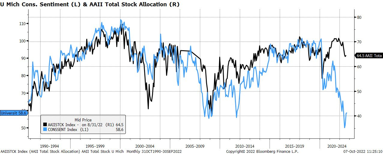
6. Long and Hating it: Consumers are extremely glum, but individual investors are still running (unusually) high allocations to equities.
Source: @daChartLife
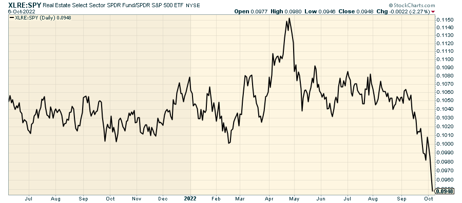
7. Real Trouble in Real Estate.
(it's always real estate!!)
But then again, Fed Chair Powell did specifically and clearly tell us that the housing market needs to undergo a “difficult correction“. Guess we should listen for once.
Source: @EddyElfenbein
8. Record QE to Record QT. You didn't think you could escape unscathed from this monetary maelstrom did you? Again — if you think that QE was helpful on the way up, you have to believe that QT will be unhelpful on the way down.
Source: @ayeshatariq
9. Gold vs Stocks: Intriguing chart — gold market cap relative to US equity market cap. Gold has had a tough year in absolute terms (falling ~6% YTD), but still holding some ground vs stocks this year in relative terms. Much like bonds, gold has not really performed its usual diversification role this time around given the monetary exodus. Maybe 2023 will be a better year for gold and bonds.
Source: @AtlasPulse
10. The Perils of Stock Picking: Many go to zero. Few shoot the lights out.
(the worst 80% of stocks had a combined 0% total return, while the best 20% accounted for all gains during the 1989-2015 period)
Source: @mkt_sentiment
SPONSOR — please take a moment to support us by checking out our sponsor…
Why 752,498 People Are Addicted to This Business Newsletter
We’ve all seen the headlines. The stock market is down 19% and >$7.3 trillion of blue chip equity value has been vaporized out of thin air. Sifting through the never-ending parade of clickbait about ‘record inflation’ or ‘inverted yield curves’ could be a full-time job. Luckily, we have The Daily Upside — it’s a brand new newsletter started by a team of wall street insiders, bankers, and scholars that gives you access to insights with absolutely zero BS. The best part? It’s absolutely free. We read it every morning and you should too. Sign up here.
BONUS CHART >> got to include a goody for the goodies who subscribed.
Balanced Portfolio Out Of Balance: the long standing investment approach of 60% equities and 40% bonds got busted up this year (e.g. SPY 0.00%↑ down -24% YTD and TLT 0.00%↑ down -30% YTD).
This chart offers clues on the reasons why and shows the extreme risk that investors in standard 60/40 portfolios were perhaps unwittingly taking on late last year.
First, what even are we looking at? The chart shows a portfolio weighted average valuation indicator (i.e. 60% x Equity valuation indicator + 40% x Bond valuation indicator (using my (Topdown Charts) own proprietary indicators)).
The messed up thing is that both treasuries and equities were trading more than 1 S.D. expensive last year. That is not a recipe for success when you are hoping for one of those things to diversify the other…
Usually what happens with a portfolio like this is that when you get an equity market downturn, bonds tend to outperform, and help offset some of the losses on the equity side. This is Asset Allocation 101.
The problem is that while equities were facing extreme risk at the turn of the year (expensive valuations, crowded bullish sentiment/positioning, pivot in monetary policy to tightening)… bonds were equally facing significant risk (overvalued and overexposed to inflation risk, changes in monetary policy tides).
As a minimum this should be a prompt to ponder about your own approach to asset allocation. 60/40 worked for a while, but such a simple approach is arguably too simple: missing other important assets and missing an active process to control risk.
Indeed, the only things that have really “worked“ this year on the asset allocation front have been basically cash and commodities (and for what it’s worth, I was recommending precisely that in our asset allocation tilts earlier in the year… sometimes we get it right!)
But going back to the chart, December 2021 was actually *the* record high in the 60/40 valuation indicator. In hindsight, 60/40 never stood a chance.
—
Best regards,
Callum Thomas
My research firm, Topdown Charts, has a NEW entry-level service, which is designed to distill some of the ideas/themes/charts from the institutional research service to provide the same high quality insights at a more accessible price.
Give it a try and let me know what you think! :-)
For more details on the service check out this recent post which highlights: What you get with the service; Performance of the service; and importantly: What our clients say about it…


These were some very interesting charts. Once again, you've delivered the goods that require thoughtful reflection. It's been said; You either pay attention or you pay the price!
I believe you are correct in saying; ...down is probably the path of least resistance given the bearish market + macro momentum.
Look out below!
Looks like their is still time to reduce your equity exposure?