Weekly S&P500 ChartStorm - 24 December 2023
10 of the most notable and enduring charts from the past year of Weekly ChartStorms
Welcome to the latest Weekly S&P500 #ChartStorm!
n.b. This week it’s a slightly different focus than usual given the quieter time-of-year — this edition takes a look at some of the most notable and enduring charts from the past year (similar to this edition from the same time last year).
Hope you enjoy, and Happy Holidays!
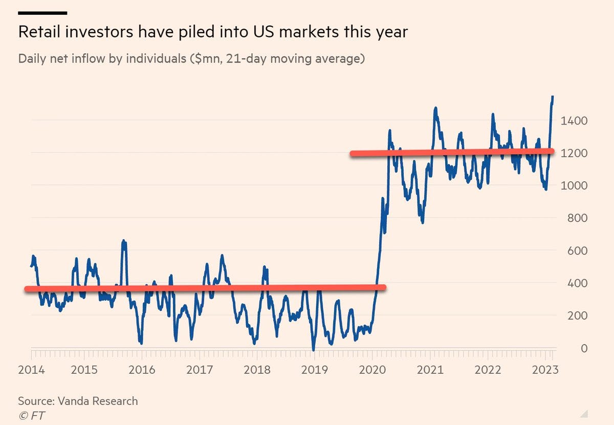
1. The Retail Era: I don’t think you can find a more iconic chart to represent one of the biggest changes in markets of the past decade. Thanks to a combination of stimulus, boredom, greed, and technology: retail animal spirits were ignited, and they’re not leaving.
Source: Weekly ChartStorm 26 Feb 2023 [@pkedrosky]
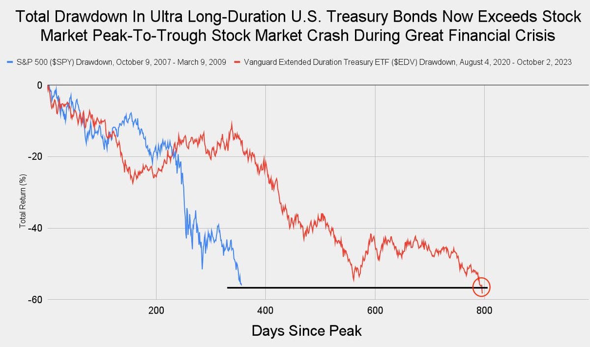
2. Bond Market Drawdown: Another iconic chart — long-term treasuries’ top-to-bottom drawdown matching that of the drawdown in stocks during the global financial crisis.
Source: Off-Topic ChartStorm 4 Oct 2023 [@JackFarley96]
3. Chart Of The Year? And on a similar note, perhaps a candidate for Chart Of The Year — US 10-year bond yield surging… back to *long-term* average.
Source: Off-Topic ChartStorm 4 Oct 2023 [@UrbanKaoboy]
4. Stocks vs Economy: One of the biggest developments in 2023 was something that *didn’t happen* — recession. And the stock market basically nailed the no-recession call. Interestingly, while the stock market bottomed in October 2022, industrial production troughed in December 2022 after a brief downturn (albeit has been rather choppy since — in line with global: global trade and manufacturing has been stagnant/recessionary… echoing the economy-of-winners-and-losers theme where some parts have been doing well, while others have been struggling).
Source: Weekly ChartStorm 5 Feb 2023 [@ssinvestments8]
5. Recessions: And on that note, here’s a curious fact — excluding 2020 (doesn’t really count), there hasn’t been a proper official traditional recession for more than a decade. Have the economic policy technocrats simply solved the business cycle?
Source: Weekly ChartStorm 18 Jun 2023 [@TheIdeaFarm]
6. Lost and Found: If everyone is already all aboard, how much higher can it go? A bit of a hypothetical question, but hits at the notion implied in this chart about how as house hold equity allocations approach the highs, historically (n = 2) it has presaged a lost decade for the stock market (or less dramatically: a decadal range-trade).
Source: Weekly ChartStorm 2 Jul 2023 [Hi Mount Research]
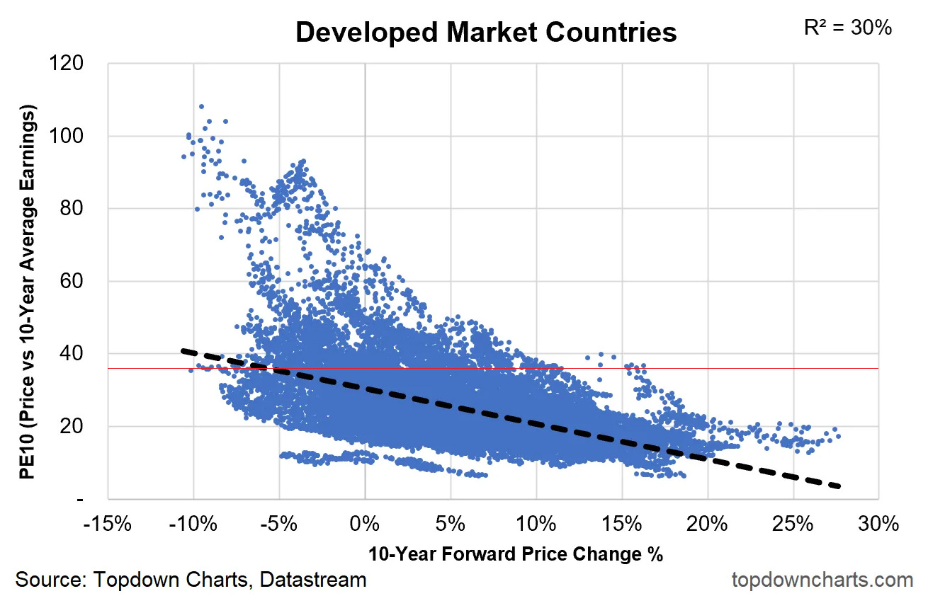
7. Bad or Mediocre? And a similar note — this chart shows the PE10 (price vs trailing 10 year average earnings) and subsequent 10-year returns across all develop market country equity benchmarks (for the longest history available). Simple logic: the higher the price you pay, the harder it is to get decent returns as a long-term investor.
I have put a red line in where the current US PE10 is …and going off historical data, you would expect next 10-year returns to be low single digits at best, with much of the historics skewing negative.
Source: Weekly ChartStorm 7 May 2023 Topdown Charts
8. Surviving: Across recent decades, as a public company, your chances of survival is about 60-70% across the first 5-years (which drops to 50-60% over a 7-year window). Mauboussin quips “public companies have a half-life of about 10 years” — makes you think: buy-and-hold works at the aggregate index-level, but the implication of this data is many individual companies drop-off along the way.
Source: Weekly ChartStorm 6 Aug 2023 [@mjmauboussin]
9. Aging Well: On a similar note, if you do survive, you’ll probably survive a long time… the average age of Fortune 500 companies (which includes both public and private companies) has kept going up — now 90-years. Goes to show, despite all the hype about new tech/internet/software stocks, there’s still a lot of old boring companies keeping the lights on for the rest of the economy (albeit, worth also reflecting that IBM is 112 years old, and even Microsoft is 48). Maybe the takeaway is to never underestimate the importance of scale (and inertia/incumbency, and perhaps alongside that: innovation and ongoing reinvention to maintain relevancy as things both change and stay the same).
Source: Weekly ChartStorm 27 Aug 2023 [Edward Conard - Macro Roundup]
10. That’s Odd! One for the weird-but-fascinating bucket — turns out that (historically) even-dated days outperformed odd-dated days.
I’m not even going to try and explain why!
Source: Weekly ChartStorm 14 May 2023 [Build Alpha]
Thanks for reading, I appreciate your support! Please feel welcome to share this with friends and colleagues — referrals are most welcome :-)
Reminder: 2023 End of Year Special Report
In case you missed it, check out my 2023 End Of Year Special Report from Topdown Charts — a collection of 51 original charts (my best, worst, favorites of 2023 + ones to watch in 2024).


That is an exceptional collection of charts.
Great summary of markets in 2023. Chart #1 about the heightened level of retail participation since the pandemic could explain so much about how markets have moved over the past few years.