Weekly S&P500 ChartStorm - Timeless Classics
This week a look at some timeless charts from the past couple of years
Welcome to the Weekly S&P500 #ChartStorm — a regular selection of 10 interesting and useful charts which I hand pick from around the web.
This week it’s a slightly different focus than usual given the quieter time-of-year — looking at a collation of some of the more timeless and thought provoking charts of the weekly ChartStorms of the past year or so.
Hope you enjoy!
1. Lost Decades: Plenty of folk out there telling you to buy and hold and dollar cost average and focus on the long-term. Which is all well and good, but just be mindful that lost decades are actually relatively common... (especially if you expand the sample to other countries’ stock markets).
Source: @MikeZaccardi (ChartStorm 3 July 2022)
2. Long-Term Perspective on Earnings: Yes the chart is out of date, but the key takeaway is that overall, longer-term: the trend is your friend. But also note the cycles around the trend (the cycle is an active investor’s best friend!).
Source: @SamRo (ChartStorm 12 September 2021)
3. Another Long-Term Perspective: Legendary investor Warren Buffett made his first billion in his early 50's. It wasn't until he was 65 that he would make his first $10 billion (and surpassing $50B at age 77).
Source: @DividendGrowth (ChartStorm 21 November 2021)
4. Long-Term Shifts: The US stock market went from 15% of global equity markets in 1899 to 56% in 2021. Makes you wonder, what will the next 122 years bring?
Source: @MacroAlf (ChartStorm 6 March 2022)
5. Index (no)Effect: Used to be that when a stock got added/deleted from an index you'd see a big bump/dump, no more. Perfect example of a market anomaly getting arbitraged out of existence.
Source: @drtimedwards (ChartStorm 19 September 2021)
6. S&P500 Labor Intensity: "In 1986, it took 8 employees to generate US$1 million in revenue. Today, the S&P 500 is 70% less labor intensive than it was in the 80s"
Source: @ISABELNET_SA (ChartStorm 20 June 2021)
7. CEO Pay of S&P500 Companies: Snapshot is from a year or two ago, but pretty interesting to see the clustering, range, and tails of the distribution...
Source: @chriswmayer (ChartStorm 6 June 2021)
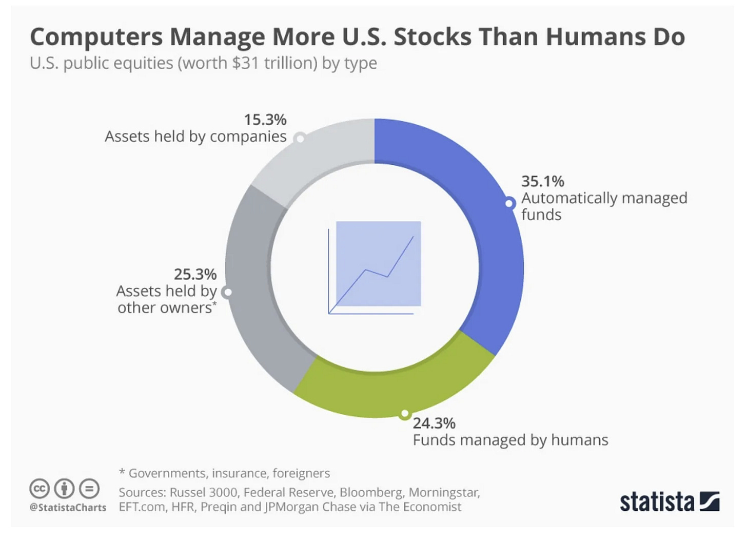
8. Computers vs Humans: Apparently computers got more AUM than humans... (maybe a debate to be had around semantics on this e.g. automatic rebalancing is designed by humans, even passive investing is essentially following the decisions of the humans at the index providers, and algo/quant traders are still the product of armies of PhD bearing humans). Intriguing development anyway, with most likely intriguing impact on market structure/function.
Source: @StatistaCharts (ChartStorm 19 September 2021)
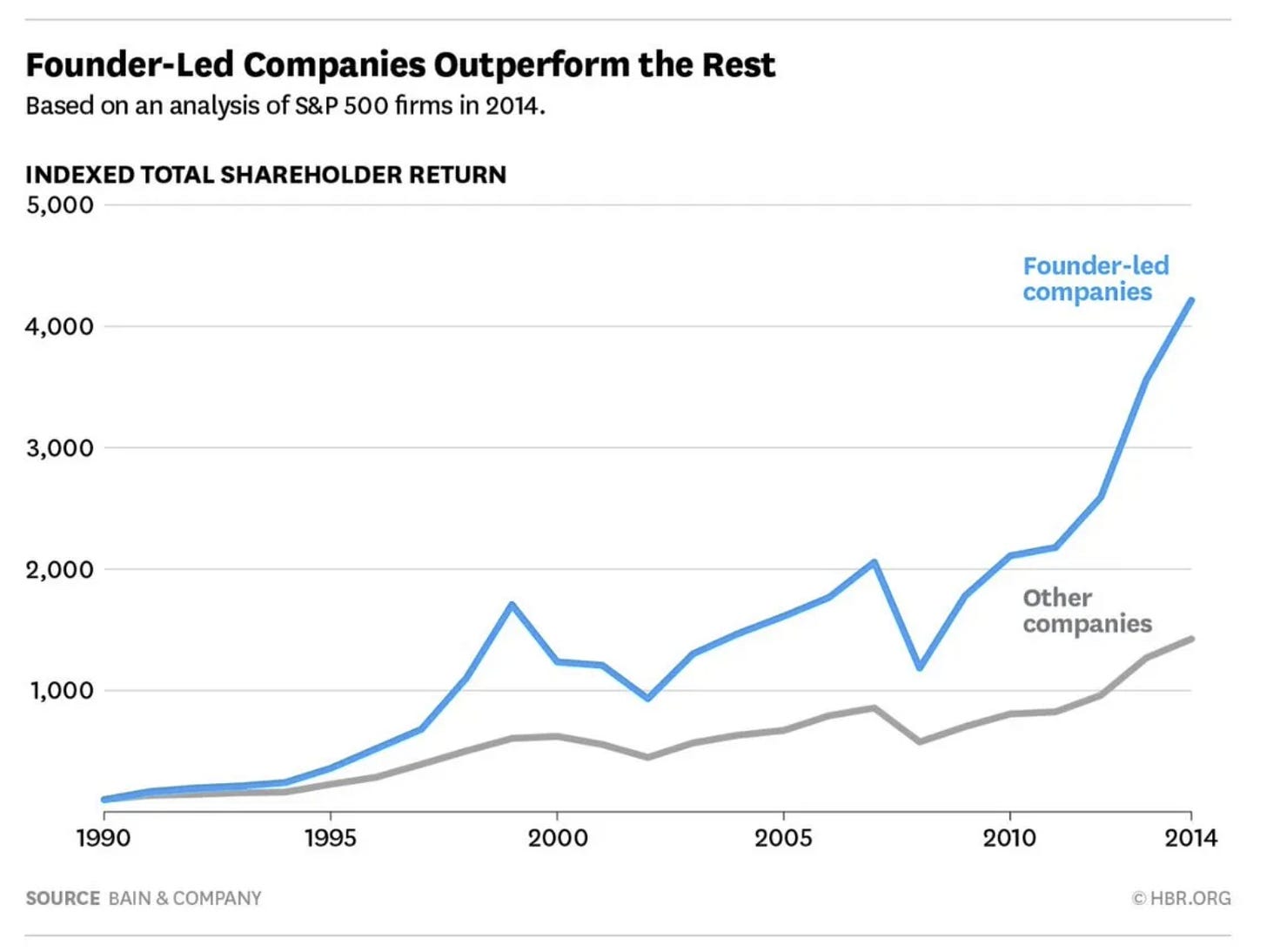
9. Founders vs Flounders: Founder-led companies have historically outperformed the rest. Makes sense (incentives, vision/mission, culture, growth stage, etc).
Source: @_inpractise (ChartStorm 28 March 2021)
10. Founder Age: Interesting further food for thought on founders... "the older you are, the more likely you are to succeed as a startup founder" (sweet spot seems to be 50's). Not only is it never too late to start, it might even be better to start later.
Source: @ASvanevik (ChartStorm 16 October 2022)
BONUS CHART >> got to include a goody for the goodies who subscribed.
End of Year Special Report: this week’s bonus chart is… 47 charts!!
That’s right, as a holiday treat I’m making my 2022 End of Year Special Report from Topdown Charts available as a one-off free download for followers and supporters.
The report includes 47 of my best, worst, and favorite charts of 2022 and the must-see macro/market charts to have on your radar in 2023.
Specifically, the contents:
Charts That Worked
Charts That Didn't Work
My Favorite Charts
Charts to Watch in 2023
Honorable Mentions
People's Choice Charts
I hope you enjoy this selection of charts which I have meticulously handpicked from reviewing all of my Topdown Charts “Weekly Macro Themes” reports of the past year. And what a year it was!
Happy Holidays!
—
Best regards,
Callum Thomas
My research firm, Topdown Charts, has a NEW entry-level service, which is designed to distill some of the ideas/themes/charts from the institutional research service to provide the same high quality insights at a more accessible price.
Give it a try and let me know what you think! :-)
For more details on the service check out this recent post which highlights: What you get with the service; Performance of the service; and importantly: What our clients say about it…


Thank you!
Thanks for sharing cool stuff , merry Xmas 🎄