
Weekly S&P500 ChartStorm - 17 August 2025
This week: sentiment snippets, seasonality, buybacks, real earnings yield, valuation indicators, negotiating with the facts, emerging markets...

Welcome to the latest Weekly S&P500 #ChartStorm!
Learnings and conclusions from this week’s charts:
Sentiment is slipping (a sense of skepticism and skittishness).
We’re heading into a seasonally slippery part of the year.
Valuation indicators are reaching extreme expensive levels.
(and we’re seeing more people “negotiating with the facts”).
Emerging Market equities are cheap and breaking out.
Overall, it’s just another day in the late stages of the market cycle. Aside from the bull market in stocks and speculation there’s a bull market in the number of charts showing valuation extremes and pressure points. And with more and more people negotiating against those facts, and more people saying “valuations don’t matter” — ironically that tends to give valuations a greater weight and meaning...
n.b.: check out the new “Getting Started” section (how to make the most of your subscription to the Weekly ChartStorm), and Reviews & Testimonials page.
1. Sentiment Slip: Here’s something interesting — for all the late-cycle signals and various excesses and pressure points building up: sentiment is fairly muted. Yes things have snapped back bigly from the April lows, but there is a sense of skepticism and skittishness. Almost like mentally folk have one foot out the door…
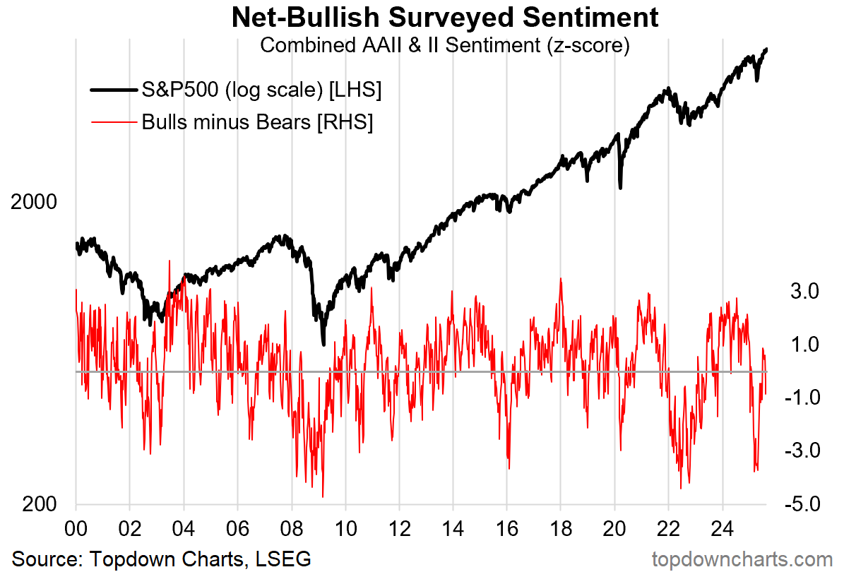
Source: Topdown Charts
2. Investment Manager Sentiment: Similar thing in the Investment Manager survey; risk appetite and near-term market outlook have dropped back to quite pessimistic levels. The key causes for concern are valuations, politics, and macro. The only bright spot in the survey is earnings (which I also highlighted last week that indeed earnings look unequivocally good for now).
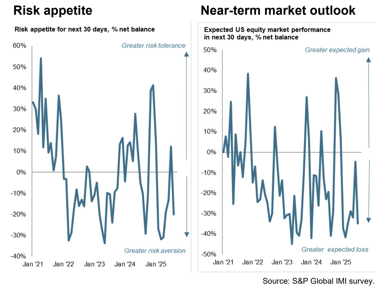
Source: Investment Manager Index
3. Volatility Season: I’m going to keep updating this chart either until people start complaining or until volatility resurges! (…other than that it speaks for itself)
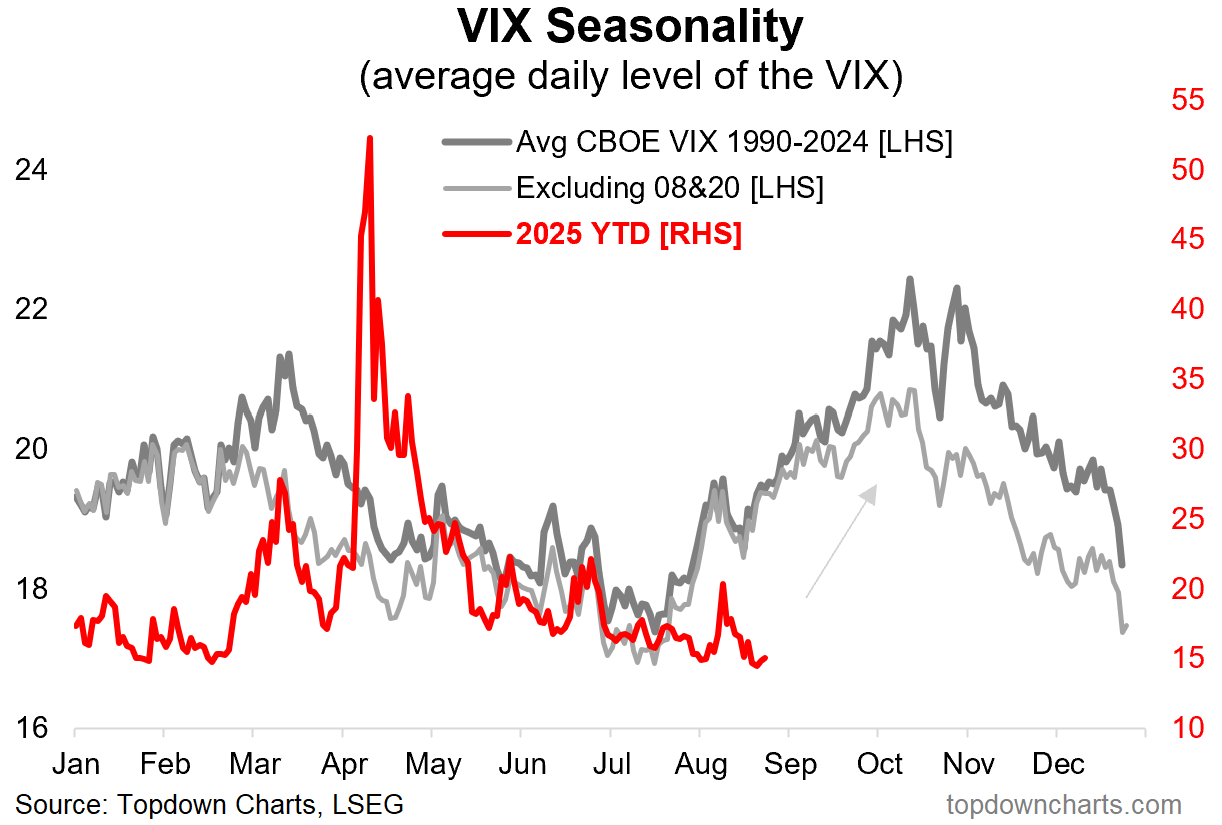
Source: Topdown Charts Professional
4. Seasonal Buybacks: Interesting snippet on seasonality — the next couple of months have historically been a seasonal dry patch for buybacks. And indeed, it’s Sep/Oct which have historically tended to see the worst seasonal stockmarket performance.
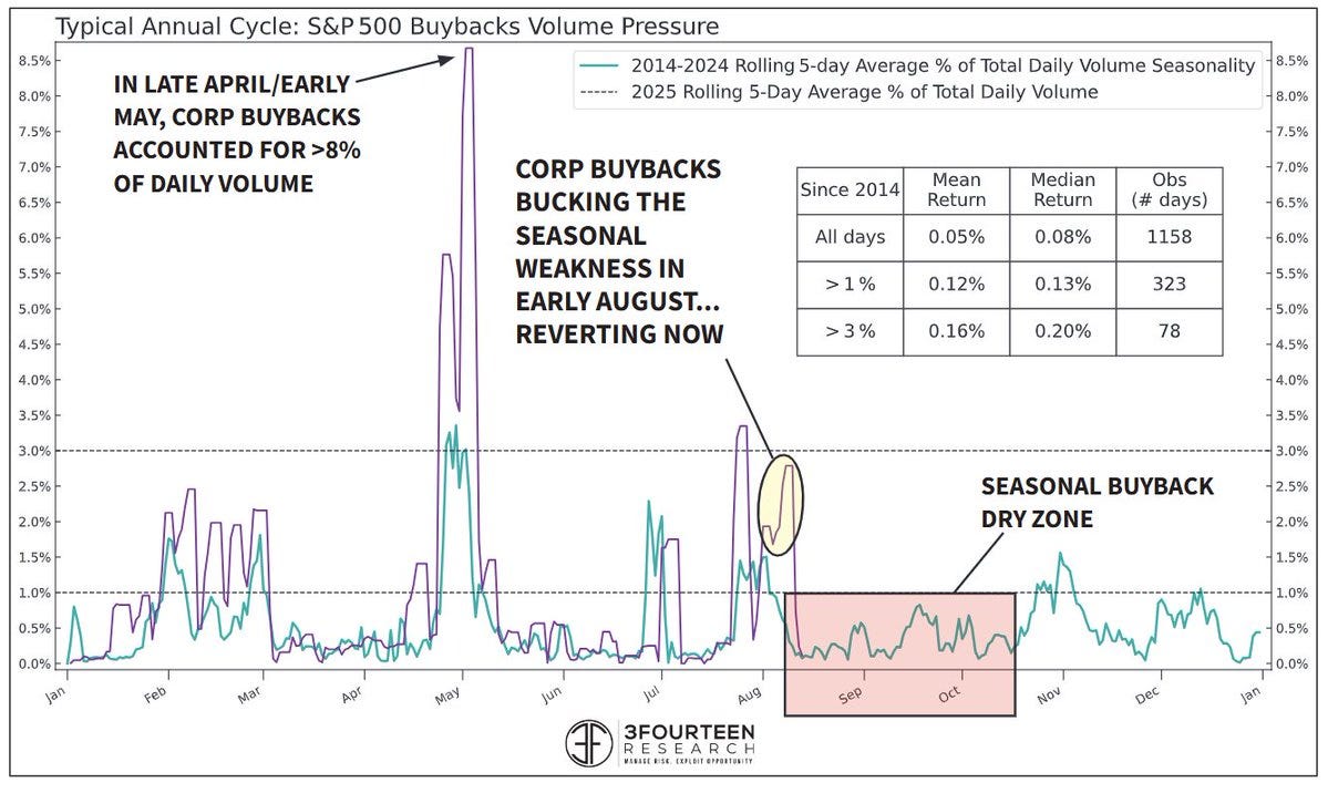
Source: @WarrenPies
5. The Real Earnings Yield: …is Real Low.
Adjusting the CAPE earnings yield for market based inflation expectations shows the real earnings yield at levels where we have seen the emergence of major market volatility in the past (e.g. 1997 prior to the Asian financial crisis, 2000 at the peak of the dot com bubble, 2021 stimulus bubble peak). Different this time?
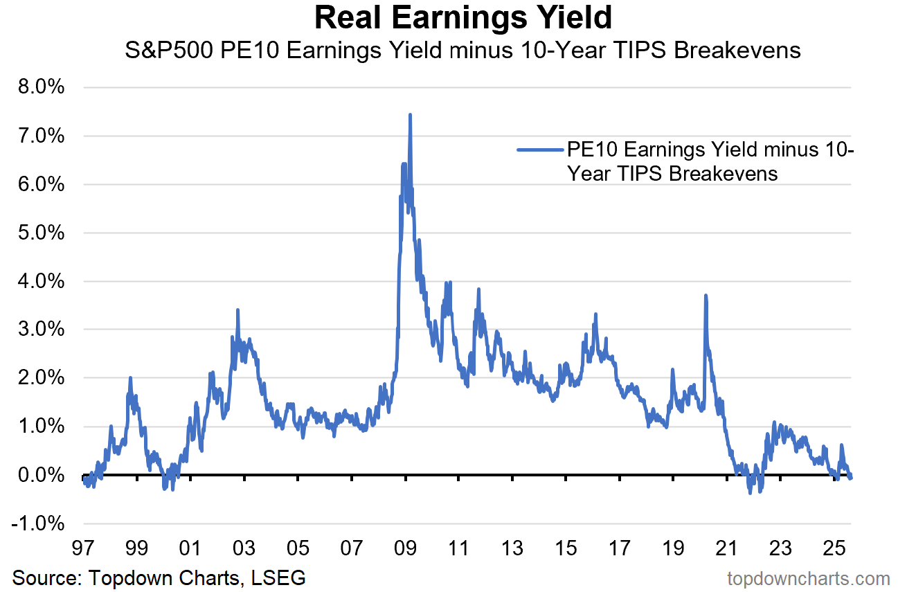
Source: Topdown Charts
6. Price-to-Book Ratio: One thing I’ve noticed when you get to the late stages of market cycles is you have an increasing incidence of people negotiating with the facts e.g. for this chart you can argue or negotiate with the observation of extreme high valuations with points like: profit margins are higher now (true), or that the largest companies are less capital intensive (true) and have a greater proportion of assets in intangible (also true), and that the index composition is also now different and skewed much more into companies with those characteristics (also true).
But as I’ve said before, these things always start with good reason and end when they get unreasonable…
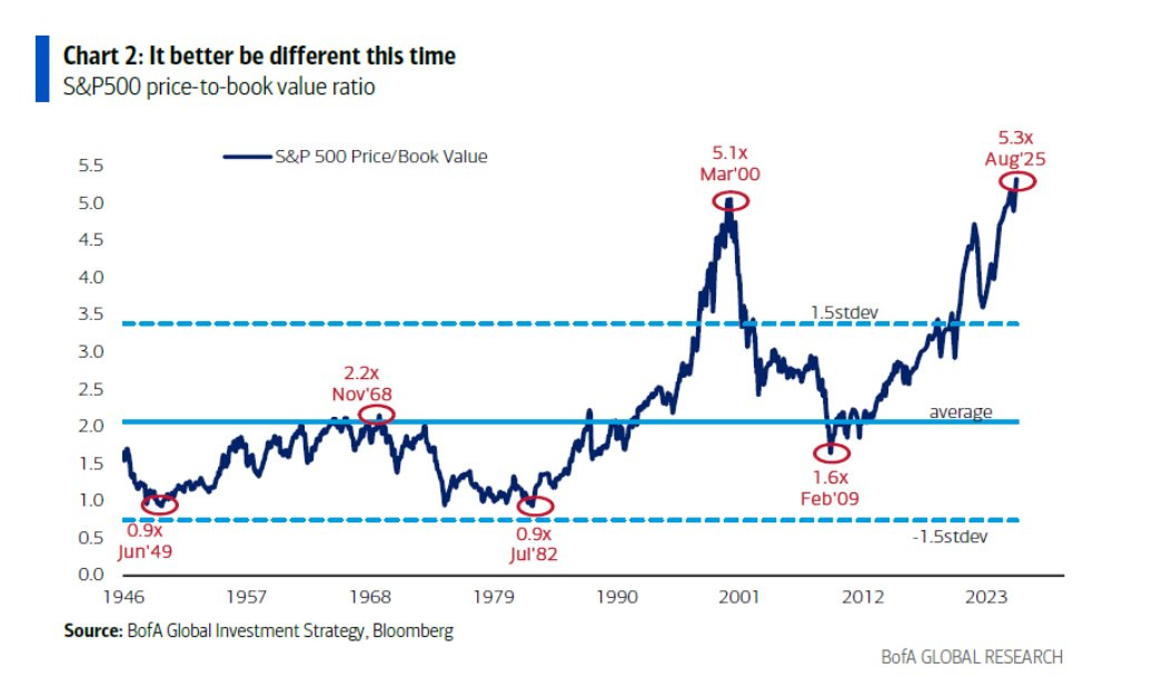
Source: @GrasslandFund
7. Money Supply Adjusted Stockmarket: Here’s a different angle, this indicator instead of using the ostensibly flawed price vs book ratio approach instead deflates the S&P500 by M2 money supply. For those who think it’s all about the Fed and money supply, I have bad news — the market is overpriced relative to the current level of the money supply (and the Fed is probably not going to cut rates any time soon).
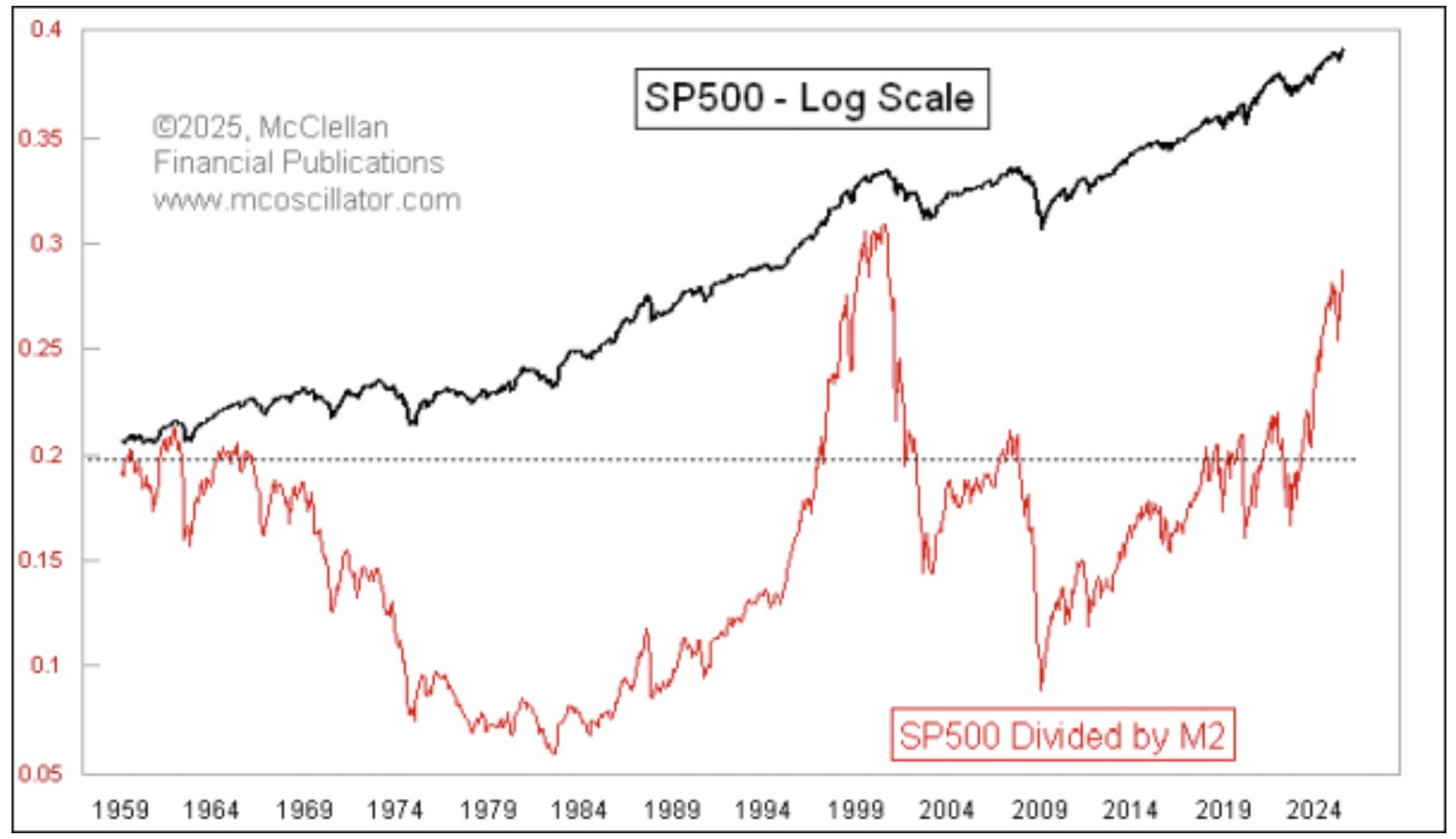
Source: SP500 Now Really Overvalued Versus M2
8. Price to Sales Ratio: OK, on the topic of negotiating with the facts, there is an actual flaw with using this ratio; it ignores the significant increase in profit margins since 2000 (albeit as a side note, the dot com peak also saw a cyclical local maxima in profit margins; which subsequently collapsed during early-2000’s recession — profit margins are cyclical after-all).
Now that raises an interesting point: if you sit here and negotiate against this chart by pointing to profit margins, the inconvenient truth is that profit margins are actually at cyclically stretched levels (and vulnerable to slowdown/recession). So not really “negotiating” from a point of strength…
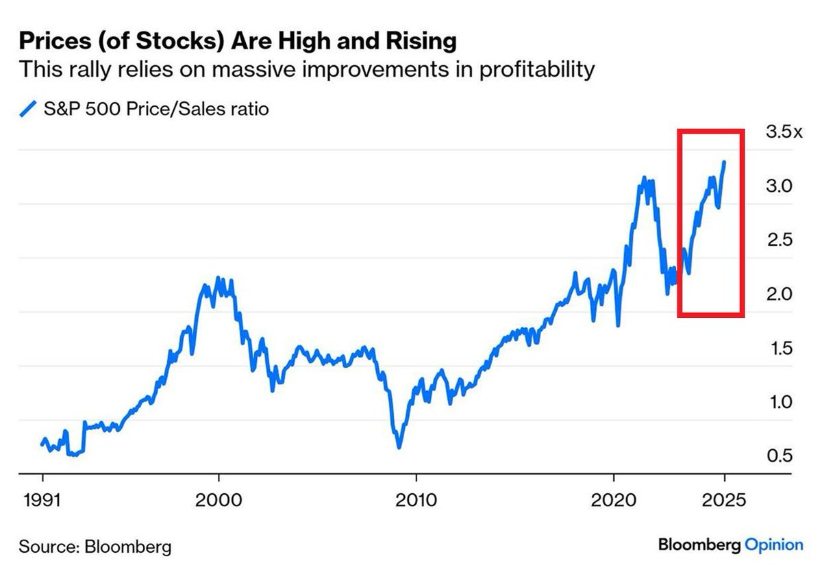
Source: @GlobalMktObserv
9. Price-to-Sales Standouts: I like this chart because it adds an extra dimension to the previous chart; by tracking the breadth of overvaluation you can see when things get particularly extreme — when the red flags are waving loud and clear.
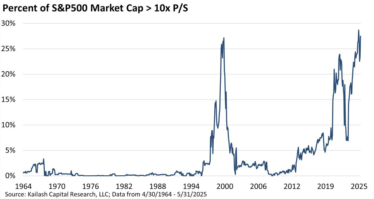
Source: @KailashConcepts
10. Global PE10 Valuations: But because we don’t look at markets or asset classes in a vacuum and because we are also interested in detecting opportunities as well as risks, it’s interesting to compare and contrast US vs global. While US is already about as expensive as it gets, the rest of the world still has ample room to run.
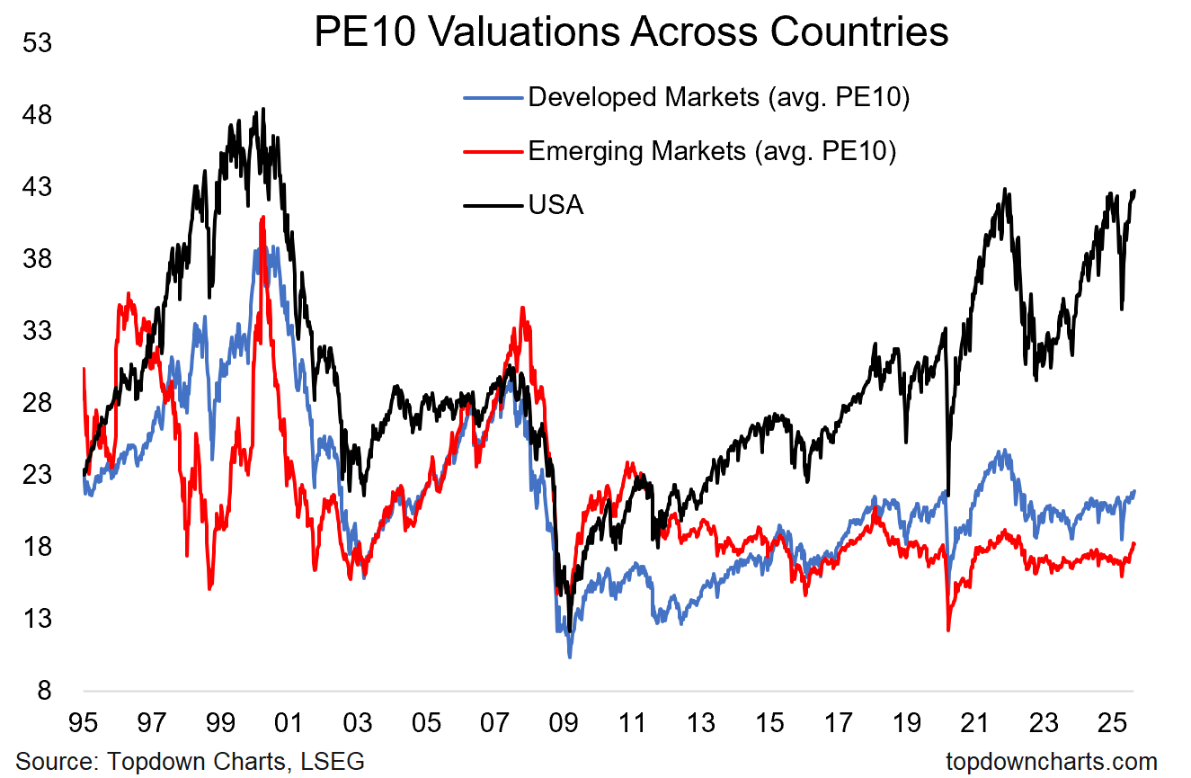
Source: Topdown Charts Professional
Thanks for reading, I appreciate your support! Please feel welcome to share this with friends and colleagues — referrals are most welcome :-)
BONUS CHART >> got to include a goody for the goodies who subscribed.
Emerging Markets Emerging: …I think I hear a few people shouting at me from behind their computers that Emerging Markets are a value trap, so I thought it would be good to share this VIC (Very Important Chart).
Emerging markets have actually already broken out and are entering into a big beautiful bull.
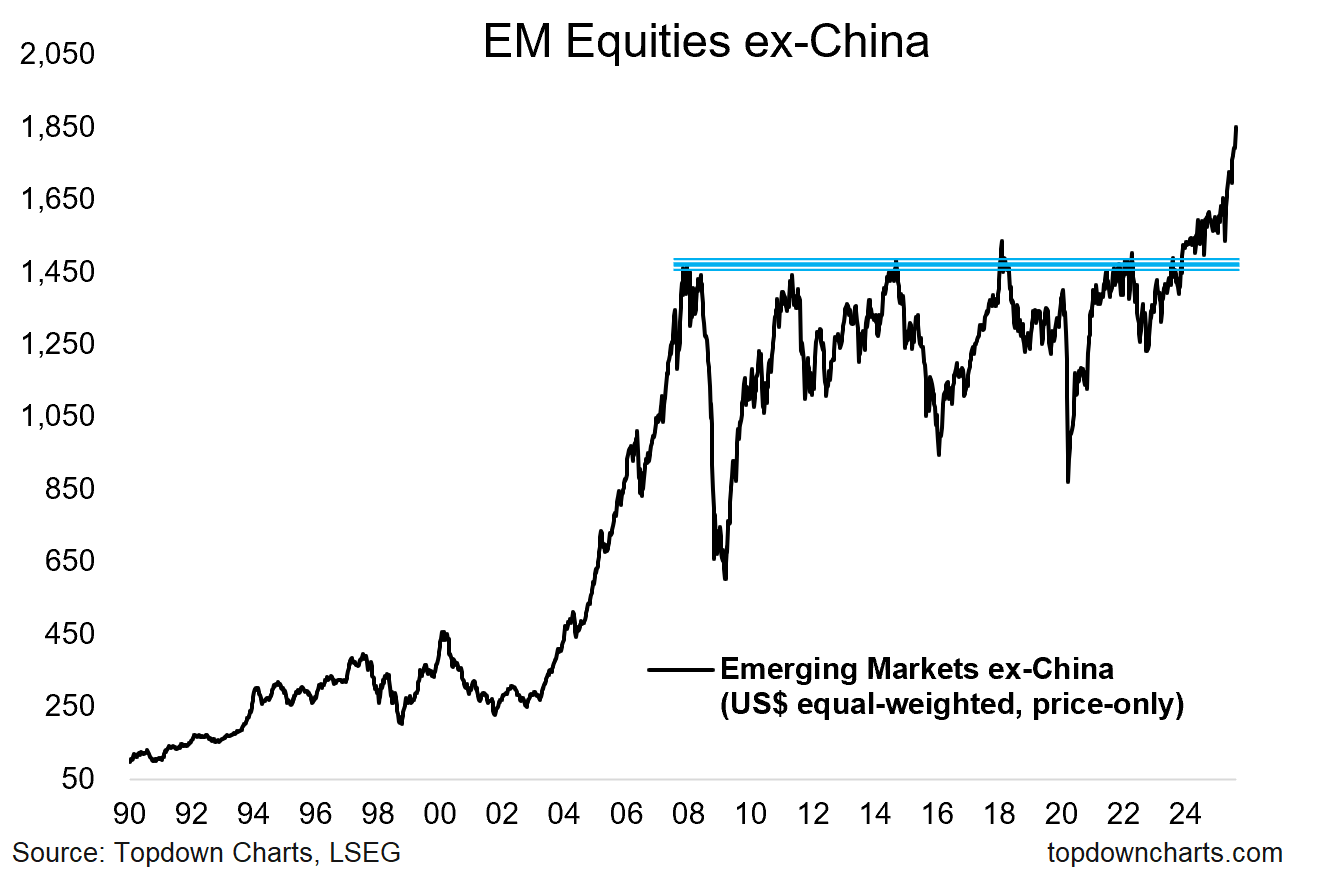
And look, this is not to dismiss the value-trap argument, because valuations can be a trap both at the highs and the lows. I always say that valuations are only one piece of the puzzle …and often a highly important puzzle piece, but still only one part of the picture.
But when you have the valuations puzzle piece saying bullish and the technicals puzzle piece saying bullish, you kind of get the picture, right? I mean any more puzzle pieces from there is just an exercise in conviction building (and maybe risk management).
—
Best wishes,
Callum Thomas
Founder & Editor of The Weekly ChartStorm
and Head of Research at Topdown Charts
Twitter/X: https://twitter.com/Callum_Thomas
LinkedIn: https://www.linkedin.com/in/callum-thomas-4990063/
NEW: Other services by Topdown Charts
Topdown Charts Entry-Level — [TD entry-level service]
Topdown Charts Professional — [institutional service]
Monthly Gold Market Pack — [Gold charts]
Australian Market Valuation Book — [Aussie markets]
Wow. Didn't realize just how overvalued the US market has become. Btw, Howard Marks wrote about US overvaluation days ago too. My favorite point from his memo:
"The last sustained market correction ended in early 2009, meaning it’s been over 16 years since risk bearing was seriously punished and “buying the dips” wasn’t rewarded. That means no one under 35 or so – professional and amateur investors alike – has ever experienced a prolonged bear market. Older investors have experienced one or more, but, with the passage of such a long time, some may have been lulled into a false sense of security."
Yup! There have been a good number of stalling days in recent sessions, which could be reflective of a market top or possible pullback. Watching these indexes feels like watching Nik Wallenda walk the wire without a tether and the wind is starting to pick up! One gust from the wrong direction and...