
10 Charts to Watch in 2026 [Q2 Update]
Key charts and issues to keep track of in the year ahead and beyond...

This “Off-Topic ChartStorm” provides a Q2 Update to my 10 Charts to Watch in 2026.
In the original article I shared what I thought would be the 10 most important charts to watch for global multi-asset investors in the year ahead (and beyond). In this article I have updated the charts + provided fresh comments.
[Note: I have included the original comments from the start of the year, so you can quickly compare what I’m thinking now vs what I said back then]
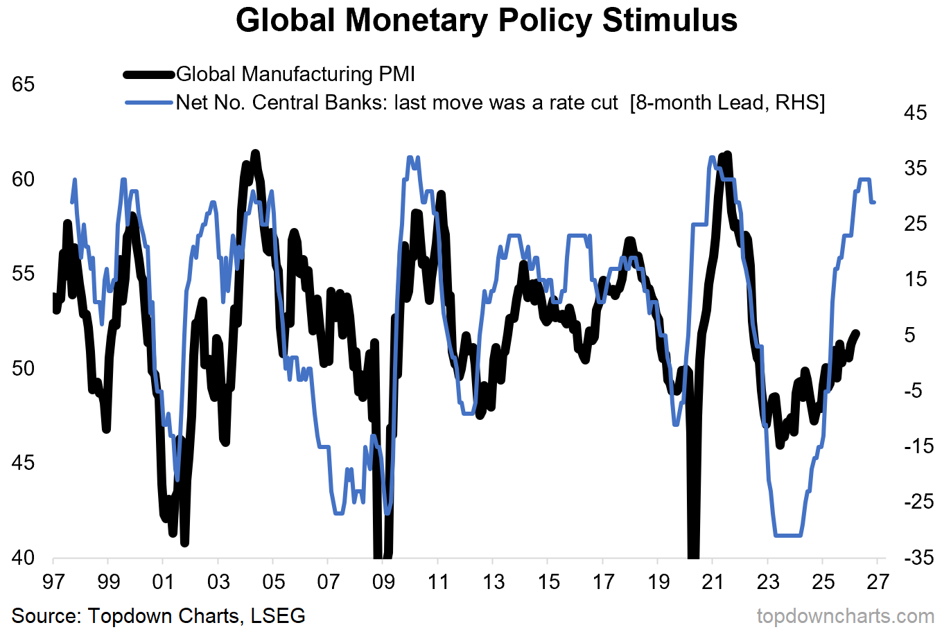
1. From Tightening to Tailwinds: the macro data pulse is looking so-far-so-good despite all the bad news and market volatility, and the key reason is all the monetary easing tailwinds from 2024/25 are having their maximum impact right now. So as far as I can tell, for now, the global economic reacceleration theme remains on-track.
“the biggest story in macro of the 2020’s echoes on into 2026, with monetary policy going from tailwind in 2020 to tightening in 2023, and back to tailwinds again now. This is coming at a time where nascent signs are showing an upturn in the macro pulse from previous stagnation (e.g. the global manufacturing PMI pictured below). The path laid out by the monetary policy leading indicator here is a very interesting one indeed, and it’s not the only sign.”
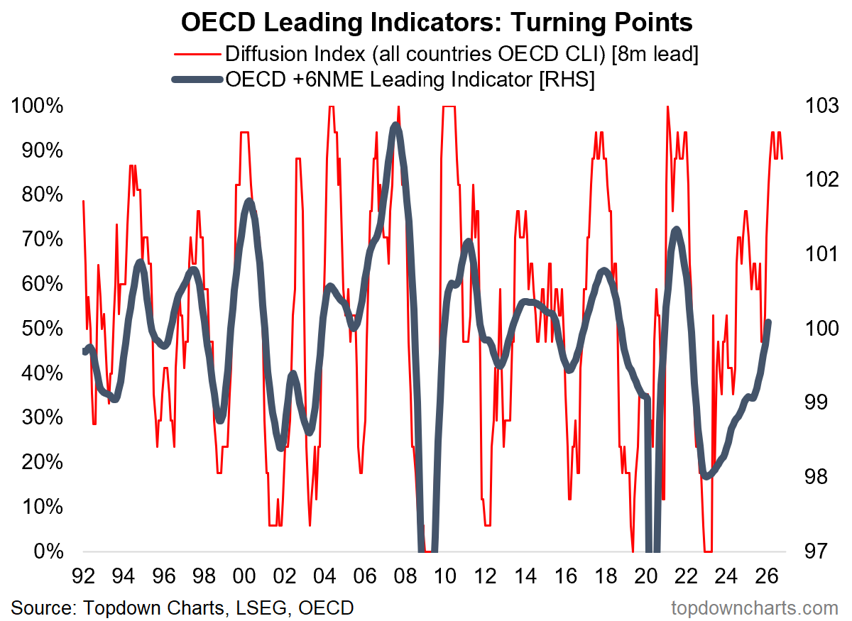
2. Global Growth Reacceleration: reacceleration remains a key word for me, but I am definitely mindful of the global energy markets disruption and potential financial conditions tightening + confidence effects of the Iran War. It probably does take some steam out of it, but ironically that may ultimately mean that the global growth reacceleration ends up less inflationary than it might have otherwise been (stronger growth but no overheating).
“the OECD leading indicators are also pointing to a major improvement in the global economy; we are going to need to get used to the term “reacceleration” (i.e. a big upturn out of previous slowdown; but not recession). Aside from monetary tailwinds there are several other factors working into this thesis such as fiscal stimulus, thematic capex, inventory cycles, and so-on. But there are a couple of logical flow-on effects we need to watch should this playout as planned.”
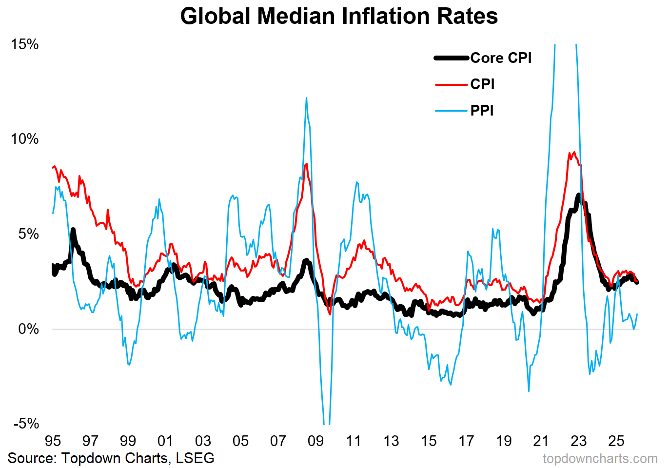
3. Inflation Resurgence: for now inflation remains contained. I’m still very much keeping tabs on inflation upside risks (energy market disruption + growth reacceleration + commodity bull market), but at least as of February the trend was one of declining inflation (compare and contrast that to 2021/22 where inflation was accelerating).
“one key flow-on will almost certainly involve inflation resurgence. We’ve already seen global inflation rates settling into a new higher range and even begin to turn up. Psychologically there’s also going to be a greater sensitivity to any signs of renewed inflationary pressures given what we’ve just gone through in the early-2020’s.”
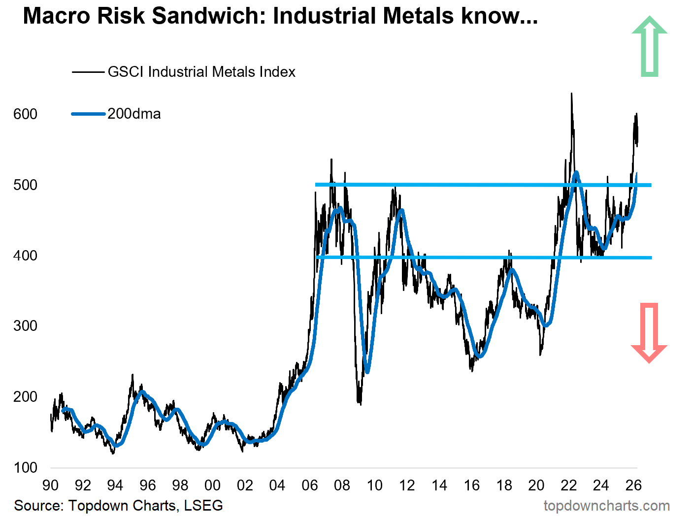
4. Macro Metals: the growth-sensitive industrial metals complex are confirming the optimistic take on global growth (they broke out late last year, and have held steady so far. Keep an eye on this market!
“this one joins the list of charts to watch in the year ahead once again as it’s going to be a key real-time indicator to track whether the reacceleration and resurgence theme is playing out as planned (i.e. an upside breakout).
And interestingly enough, it’s already made a sharp upside breakout. As noted the other day, base metals are playing catch-up vs monetary metals, and this is as much a positive sign for commodities as it is the global economy.”
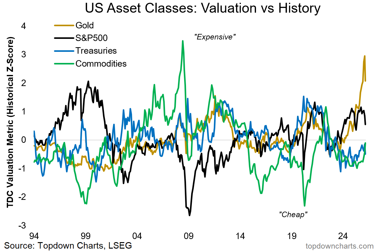
5. Cheap vs Expensive: expensive US stocks and gold have rolled over and neither are cheap yet, meanwhile commodities are turning up (still bullish on commodities in general), and bonds remain cheap.
“with gold (and stocks) already tracking at expensive levels, the obvious beneficiary from this macro prognosis is going to be cheap commodities. Indeed, if we see global growth reaccelerate and inflation resurgence, commodities are going to be a great hedge against that scenario.
But at the same time, don’t forget about that other cheap diversifier (bonds) in case things don’t quite work out as planned (more on that in a minute: chart 10).”
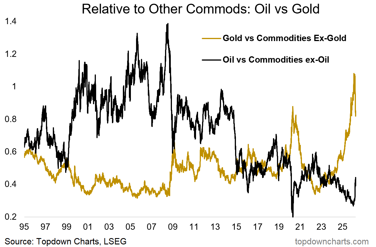
6. Tail of Two Commodities: it seems the rubber band is snapping back — as I noted at the start of the year, you always want to pay attention to extremes like this in financial markets because sooner or later they’ll find a reason to move, and move big.
From here, I think gold probably continues to struggle while oil likely is a case of higher for longer as the Middle East mess stays messy (which is very bearish for oil in the longer run as it likely accelerates the energy transition: more EVs, more solar, more work on energy innovation and independence; next-gen nuclear, etc — which is a good thing for humanity and civilizational progress).
“within commodities, as noted, gold has already had a very strong run, and may well continue given the strong monetary tailwinds behind it and strong technical momentum. But this chart shows a sort of stretching of the rubber band as oil lags and gold leads. A strong inflationary upturn is going to boost more cyclical commodities like oil (and may take some steam out of gold).”
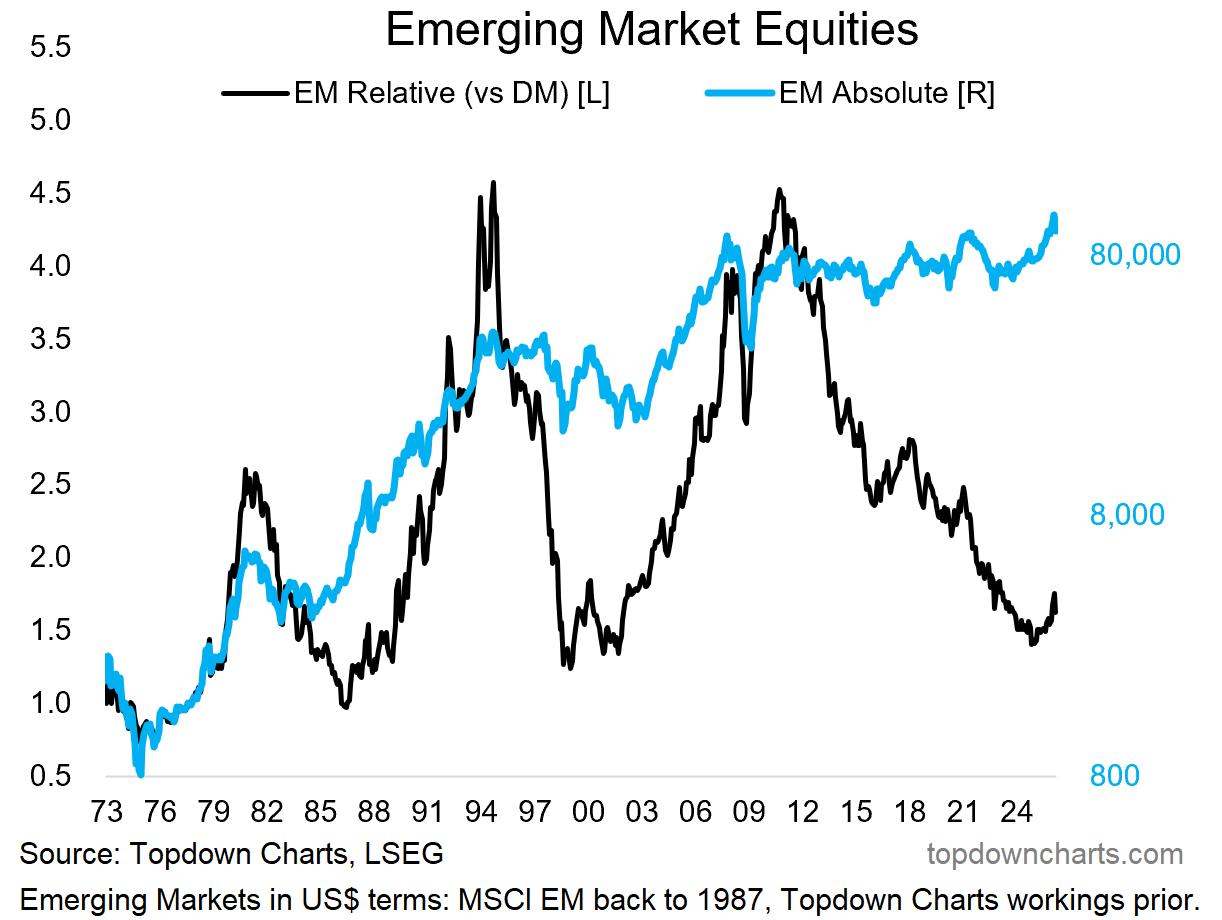
7. Emerging Inflection Point: Q1 saw emerging market equities rise AND fall by double digit percentage points. It was almost inevitable that we would get a decent pullback in EM at some point given how far and fast they had gone and how consensus and extreme the bullish sentiments had become.
But I think the EM pullback is in the “healthy correction” category and I see nothing to negate the big inflection point that we have clearly seen in this chart — this one is going to be measured in years not months or weeks.
“it’s also the type of conditions under which emerging markets and global ex-US equities in general do well. And we’re already witnessing what looks like a major decadal turning point for EM equities.”
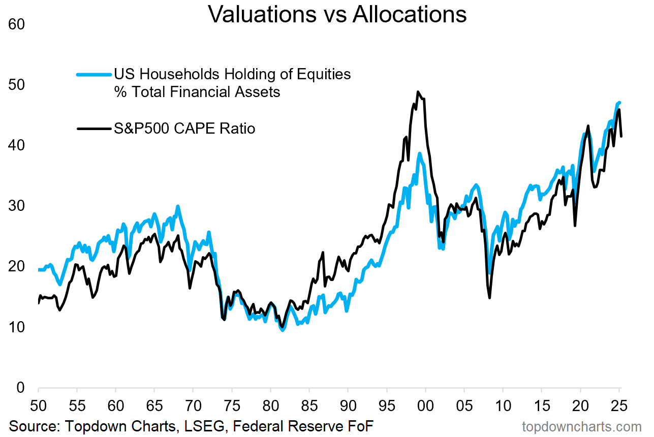
8. Newer Higher Plateaus: on the bearish side, the biggest risk right now [for US stocks] is that the current stockmarket correction ends up triggering a bigger reset in valuations and positioning (from generational highs) and into a bear market.
The strong/stable macro probably helps offset this risk, but when you come from a starting point like that in the chart below, small issues can quickly compound and things can deteriorate faster than you expect. So even though I’d say my comments so far have a bullish hue, this chart tells us to respect risk.
“one problem is that US equities are already very richly priced and household allocations to equities are at a record highs. Also consider that this is all heavily concentrated in tech, and it points to one thing…”
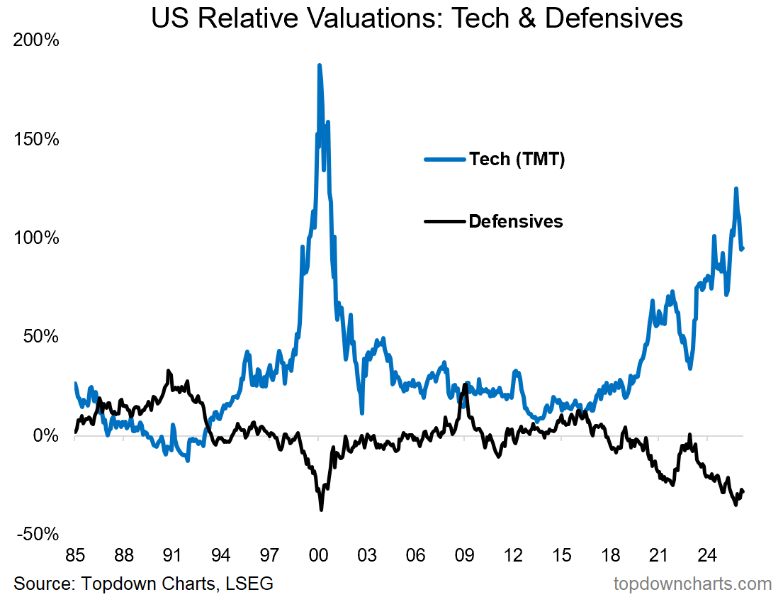
9. Dot-Com Echoes: same thing here, tech is rolling over from its most extreme overvaluation since the dot com bubble and defensives are turning up from similar extreme cheap relative value. Respect risk —have a plan, and have a think about capital defense and smart diversification.
“with US tech stocks trading at the most expensive relative valuations since the height of the dot com bubble – and defensives trading at the same deep discount, it almost looks too simple... If you want a harbinger chart, if there were ever going to be post-mortem clues that flagged the peak of this market cycle, it’s probably going to be this chart.
While an orderly economic upturn is likely to be supportive, a rapid reacceleration and resurgence in inflation is likely to trigger two things: rotation into beneficiary assets (traditional cyclical stocks, commodities) and out of tech + potentially an upswing in interest rates; which has historically hurt the more long-duration growth-tech stocks.
Hence a rethink on asset allocations is going to be required as the things that worked well in the past few years are unlikely to keep delivering in this type of scenario.”
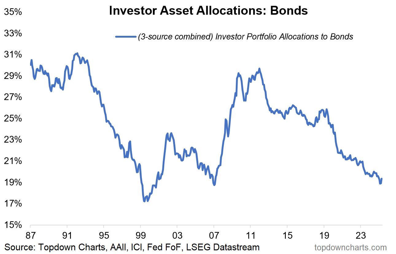
10. Market Cycle Signal: on the flipside, bond allocations say similar things about the state of the market cycle and the inherent risks [last time bond allocations were this low was just prior to the dot-com bubble burst AND again just before the financial crisis].
But also, for contrarians, it says: hey maybe bonds are actually good (seems like everyone hates bonds these days — everyone is saying how they no longer act as a diversifier to stocks, fiscal problems, low yields, etc etc).
You know what they say when everyone says the same thing…
For me, bonds are a case of when, not if (and yes I am working on and monitoring the tactical outlook and timing aspect for bonds: e.g. see recent report on treasuries here).
“lastly, this one not only adds to the cautionary tone on the market cycle, but also provides a prompt to have another think on bonds. There’s two ways we can be wrong on that “reacceleration” idea I’ve been going on about: e.g. more of the same middle-porridge (not too hot, not too cold), or: recession.
With bonds trading on cheap valuations and investor allocations to bonds at cycle lows, it makes them a classic contrarian play –not something to forget about (and yes: bonds are still downturn diversifiers). So again, the defensive barbell would be bonds to protect against recession and deflation, vs commodities to protect against a rapid reacceleration and inflation resurgence.
The good thing is we’ll probably get clues along the way, so we can scale-up exposure as evidence unfolds and we build clarity on the next big risks/opportunities.”
Quarterly Strategy Pack
For more detail and recommendations on the macro/market outlook in 2026 (particularly as it relates to asset allocation and top-down global investment strategy), check out our Q2 2026 Quarterly Strategy Pack — which will be published later this week (+webinar and Q&A sessions for our Institutional/Professional service clients).
Thanks for reading, questions/thoughts welcome in the comments section + be sure to like and share this post on Substack.
—
Best wishes,
Callum Thomas
Founder & Editor of The Weekly ChartStorm
and Head of Research at Topdown Charts
Twitter/X: https://twitter.com/Callum_Thomas
LinkedIn: https://www.linkedin.com/in/callum-thomas-4990063/
In case you missed it, also see the latest Weekly S&P500 ChartStorm:

Not a subscriber yet? Be sure to sign up for more Updates and Charts to help you stay on top of the Stockmarket Outlook.

.
It will be interesting to see if the Iran bombing and higher oil prices will affect inflation very much. My analysis of farmer costs from higher diesel and fertilzier says that crops are going to be more expensive to grow this year
There’s something appealing about how neatly this frames the landscape. Growth firming, inflation behaving, commodities waking up right on cue. It reads like a system finding its rhythm again. But markets tend to get uneasy when everything starts to sound that orderly.
What stands out is how widely accepted this “reacceleration” idea has become. When a narrative settles in that cleanly, it often means positioning has already leaned in that direction. The market doesn’t reward consensus for long. It tests it.
You can feel that tension underneath the surface. Equities are still priced for strength, commodities are beginning to stir, and bonds are sitting there unwanted. Those pieces don’t naturally sit together without friction. Eventually something has to adjust.
Lately, price has been giving quieter signals. Supports that used to produce sharp reactions are starting to feel softer. Bounces come, but they lack urgency. That kind of behavior matters more than any macro label. It tells you where conviction is fading.
The framework here is thoughtful, but the market rarely moves in a straight line from thesis to outcome. It moves through pressure, through positioning, through moments where things stop behaving the way they should. That shift is usually where the real opportunity begins.