Weekly S&P500 ChartStorm - 7 August 2022
This week: technical check, new bull market, dumb money, momentum, market analogs, recession vs bear market, equity flows, valuations, ecommerce trends...
Welcome to the Weekly S&P500 #ChartStorm — a selection of 10 charts which I hand pick from around the web and post on Twitter.
These charts focus on the S&P500 (US equities); and the various forces and factors that influence the outlook - with the aim of bringing insight and perspective.
Hope you enjoy!
NEW: Sign up to the (free) Chart Of The Week over at the new Topdown Charts Substack entry-level service: Subscribe to the Chart of the Week
Each week we send you one of the most interesting charts on our radar, along with commentary/context and a key takeaway — so you’re never left guessing on why the chart matters ...and the charts matter! > > > Subscribe Now
1. Resistance: There will be no new bull markets until that key resistance level is broken (and even then, astute observers will note that the next line of resistance lies at 4300 (and then there is also the 200-day moving average (so there are a few hurdles to jump))). I would say the market is particularly vulnerable to bad news or any bearish excuses at this point.
Source: @Callum_Thomas
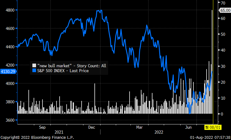
2. New Bull Market: Seems like there is a surge in news stories talking about a possible new bull market (hmm, I wonder if I just added to the count with this here article, and for that matter, I wonder if you can get an exponential increase in story count if stories start talking about stories talking about new bull markets……). Anyway, just goes to show how ready people are to jump back on the wagon.
Source: @MichaelKantro
3. Dumb Money Confidence: As the market rebounds, “dumb money“ has become more bullish. Typically this is a contrarian signal, but there does seem to be some nuance to this… like many sentiment indicators, it gets more and more bullish coming out of a correction and into a new bull. But within a bear/ranging market, reaching the upper ranges like this is a tactical warning sign (folk are already back on the bus?).
Source: Bloomberg Opinion @sentimentrader via @johnauthers
4. Momentum… (but not the momentum you were expecting!)
All “alpha“ generated by MTUM 0.00%↑ has round-tripped since inception.
Source: @MikeZaccardi
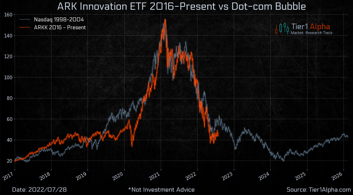
5. Arc of ARK: Past =/= Future. (but sometimes rhymes)
Source: @t1alpha
6. Choose Your Own Adventure!
<< Bear Market Edition >>
Source: @NDR_Research via @DayHagan_Invest
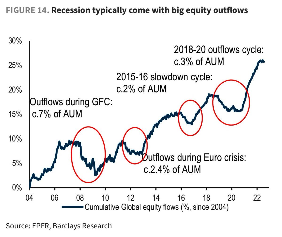
7. Recession Flows: Good follow-on from the previous chart, this one shows during recessions there tends to be substantial outflows from equities — which is probably both a cause/effect of the pattern in the previous chart (i.e. recessionary bear markets tend to see a deeper drawdown and a more drawnout recovery).
Source: @WallStJesus
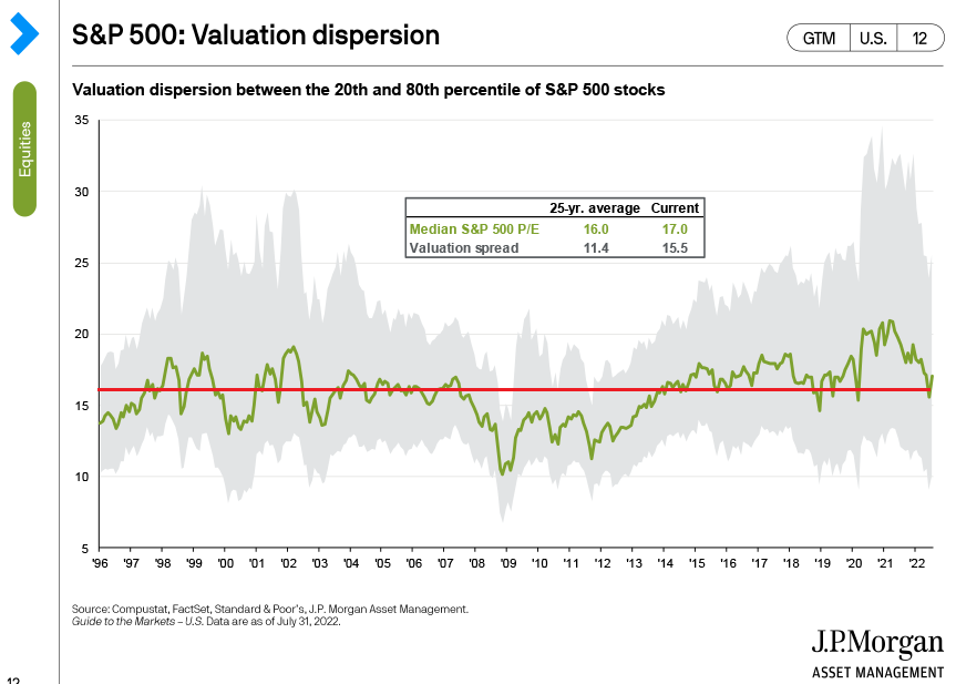
8. Valuation Dispersion: The Median PE ratio has come down to long-term average, but interestingly there is still significant "dispersion" (i.e. some relatively cheap and relatively expensive stocks out there).
Also of note: the Median PE = no longer expensive (but not cheap as such yet either).
Source: @MikeZaccardi
9. Price to Book Ratio Trends: Another one on valuations — that old price to book ratio chart of mine updated. This one echoes the points from the previous chart, i.e. there is still a big gap between the cheapest vs most expensive parts of the market, and P/B ratios are generally still elevated vs history (no big overshoot to the downside like in previous major market bottoms).
Source: @topdowncharts
10. Peak E-Commerce?
Almost certainly not in absolute terms, but almost certainly so relative to trend. This is one reason I was bearish tech/growth last year — as a group they got this big fat one-off pulling forward of growth (even if it was part of a structural trend) that was never going to be replicated any time soon. Reminds me of one of my own macro/market lessons or observations: know the trend, but also know the cycle around the trend…
Source: @chartrdaily
Thanks for following, I appreciate your interest!
BONUS CHART >> got to include a goody for the goodies who subscribed.
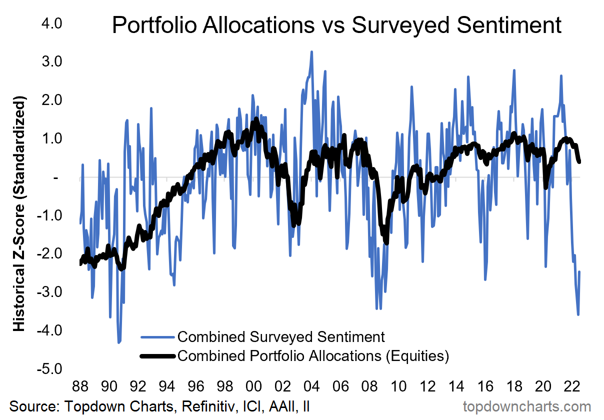
Sentiment vs Positioning: As I have previously highlighted, there has been a big disconnect between investor sentiment and actual positioning.
The chart below shows a composite view of sentiment (using the AAII and Investors Intelligence surveys) and a composite view of portfolio allocations to equities (using the AAII portfolio survey and ICI AUM stats).
The big standout of course is that while investors are apparently the most bearish in a decade, allocations to equities haven’t moved all that much.
Another similar chart I had also previously highlighted was the one showing investor sentiment vs economic sentiment (composite of small business, big business, manufacturing, services, housing, consumer confidence).
Similarly, that chart showed investors as pessimistic as they were during the depths of the financial crisis.
Up until recently, economic sentiment was humming a different tune, but now things are changing. Recession looks likely on the back of monetary tightening, surging costs, and a weakening global economy — and this appears to now be showing up in this chart.
As a reminder, the market is generally ahead of the economy, and the leading parts of the economy are usually the next to know (e.g. PMI, new orders) — while the lagging parts of the economy are usually last to know (e.g. inflation, labor market). Pay attention to the wrong piece of this machinery and you will get a wildly different signal on what’s really going on…
But going back to investors, investor sentiment, and positioning… cash allocations have crept up to near decade-highs.
According to the AAII asset allocation survey, investor portfolio allocations to cash are up 8.5 percentage points to 22.2% (vs the low point of 13.7% and long-term average of 22.4%). Still 4 points shy of the March 2020 peak of 26.1%, and a long way off the October 2002 peak of 38.6% or March 2009 peak of 44.8%.
So is it “enough”?
If this is just a non-recessionary correction then maybe.
If it is a recessionary bear market then probably not.
—
Best regards,
Callum Thomas
My research firm, Topdown Charts, has a new entry-level Substack service, which is designed to distill some of the ideas/themes/charts from the institutional research service to provide the same high quality insights at a more accessible price.
Give it a try and let me know what you think! :-)
Relevant Tickers Discussed: SPY 0.00%↑ VOO 0.00%↑ IVV 0.00%↑ MTUM 0.00%↑ ARKK 0.00%↑ ACWI 0.00%↑ SHOP 0.00%↑









As long as Mice, Men, and Bots confuse Powell with Rodney Dangerfield and/or Powell stops taking careful aim at his own feet with unscripted remarks, then crab-ways it is as likely as not. Then again, maybe the SPY is the latest meme-stock? Suppose we'll know the answer to that when the SP500 gets close to 4800. Either way there are trillion$ more squirreled-away, I suppose, of that manna from helicopters (or heaven for those that insist on Thanking the Lord, despite copious evidence one way or the other, for all things good and bad, great and small) yet to be destroyed. Just part of the process (like when the Wiley Coyote runs unawares off a cliff's edge, pauses with a bewildered look down, and then looks back up at the fourth-wall, just before his creator(s) pencil in the atmospheric laugh-lines symbolizing a precipitous decent) every great (w/r)eckoning goes through? In the end, we each probably should count ourselves lucky to be here for the greatest show on Earth. Interesting times.
Good chart selection as usual. Here's humble head-scratcher for your consideration: https://fred.stlouisfed.org/series/STLFSI3
No stress. It's rhetorical. As an aside, we are told this the third ("3") iteration (of improvement?) for this indicator.