
Weekly S&P500 ChartStorm - 5 October 2025
This week: monthly charts, analogs, valuations, bulls and breakouts...

Welcome to the latest Weekly S&P500 #ChartStorm!
Learnings and conclusions from this week’s charts:
The S&P500 made its 5th monthly gain in a row in September.
1990’s analogs say there may yet be room to run for this bull market.
However ever-loftier valuations suggest tempering enthusiasm.
The “S&P493” is overvalued vs global peers (which are breaking out).
There’s a growing list of big bullish breakouts globally.
Overall, the bull market bulls on — and while there are various warning signs starting to light up, there’s also numerous bullish developments popping up globally; pointing to bullish broadening and highlighting the merits of looking further afield and beyond the obvious most popular parts of the market...
n.b. check out the “Getting Started” section for help/FAQs + how to make the most of your subscription to the Weekly ChartStorm (see also: Reviews & Testimonials)
1. Happy New Month! Another month another gain, and still a picture of strength here (clean and clear uptrend, price above 10-month average). The S&P500 notched up +3.53% on the month in September — its 5th monthly gain in a row…
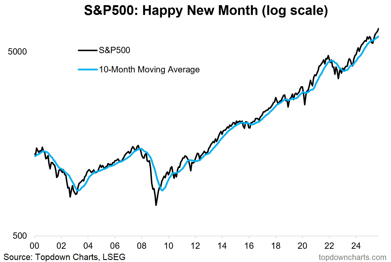
Source: Topdown Charts
2. Monthly Gains: Curiously, there has only been 5 times since 2009 that the S&P500 has had monthly win-streaks of greater than 5 months in a row (vs 6 times when the win-streak ended at 5 months in a row) …pretty close to 50/50 odds of up (45%) vs down in October on that alone (but worse odds than when you get to 4 in-a-row [65% chance of next month up]). And then there’s also the point that seasonality tends to be a bit rough and tumble in October, so we’ll see.
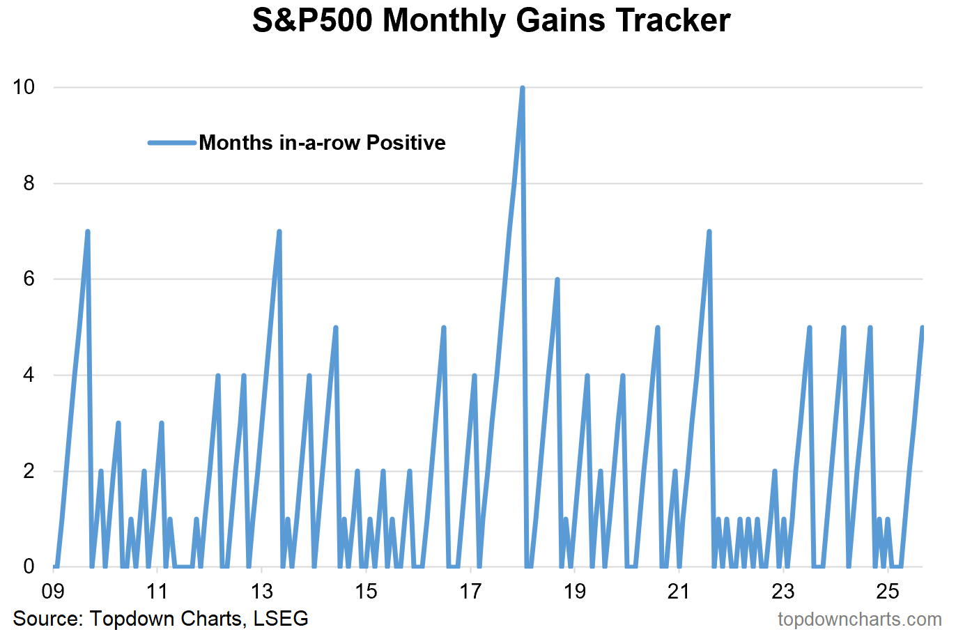
Source: Topdown Charts
3. Bull Market 1990’s Analogs: On the bullish side, many have been highlighting the 1990’s bull market analogs, and there sure does seem to be some similarities on first glance, but also many differences (good and bad) in terms of macro, value, rates, earnings, tech cycles, etc. Certainly something to think about in terms of what could be possible.
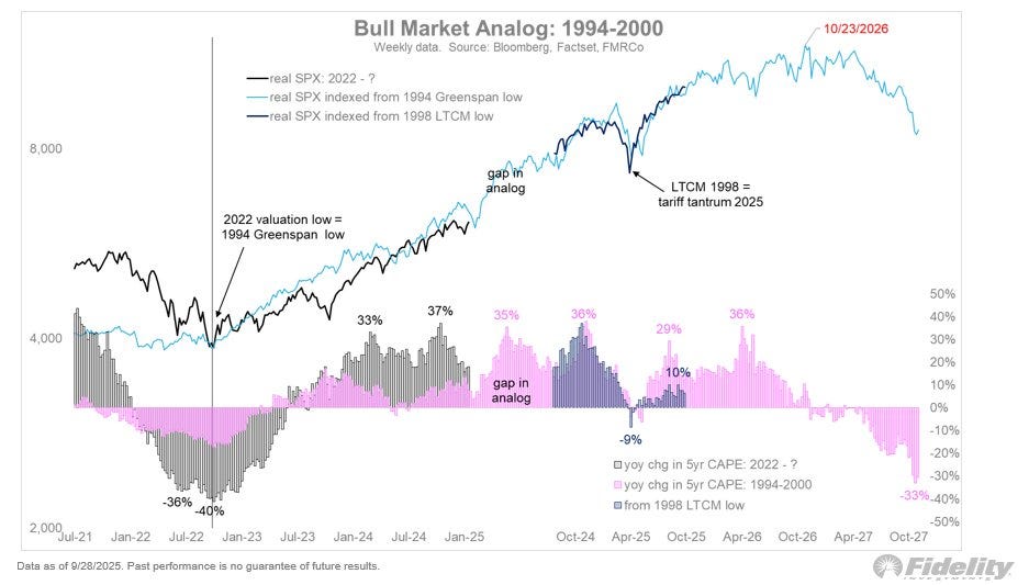
Source: @TimmerFidelity
4. Lofty Heights: One point against that is the combined PE ratio (average of trailing 12m PE, forward 12m PE, and PE10 — intended to try accentuate signal vs noise and overcome the shortcomings vs strengths of each of those 3 methods) has reached its third highest point in recent history outside of the dot com bubble and 2021 stimmy bubblet. Not good company.
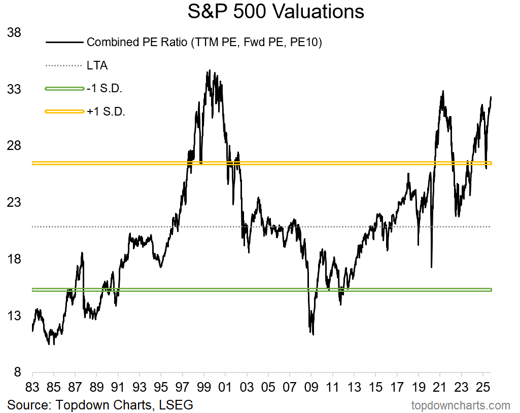
Source: Topdown Charts Professional — see also on this topic: Chart of the Week - Drift Risk Rising
5. Developed ex-US vs US ex-Mag7: On the topic of valuations, things do look a bit more reasonable when you exclude Mag7, but the “S&P493” is not exactly cheap, and in fact there is better value if you look at global ex-US …and p.s. the whole “superior earnings” argument for US also goes out the window when you look at it this way as SP493 EPS look actually similar to DM ex-US.
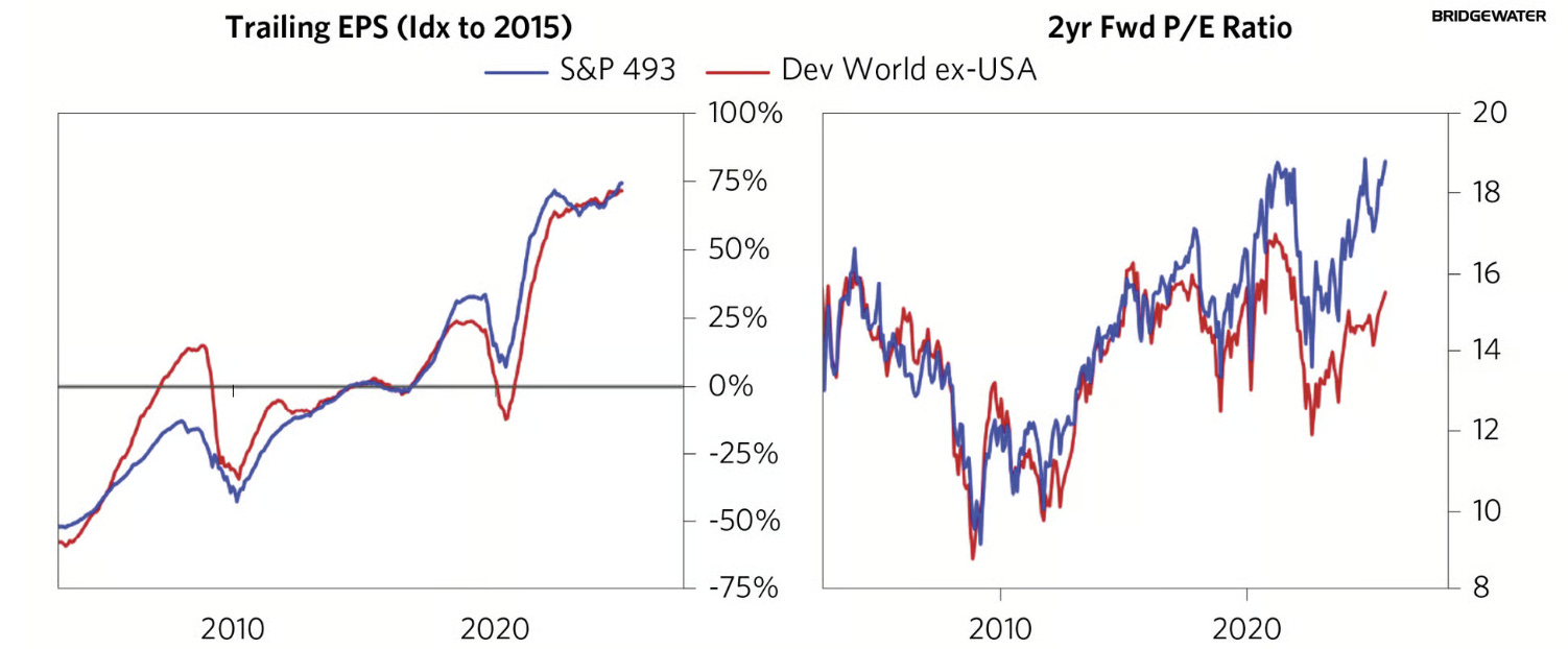
Source: Bridgewater via Daily Chartbook
6. Bulls & Breakouts — Developed Markets: The next 5 charts document some very interesting bullish breakouts, and the first one is closely related to the previous chart.
