
Weekly S&P500 ChartStorm - 29 June 2025
This week: what-if charts, late-cycle resets, hyping on, market cap weight perspectives, the blessing of delisting, and the big relative value opportunities in global equities...

Welcome to the latest Weekly S&P500 #ChartStorm!
Learnings and conclusions from this week’s charts:
The price action of H1 is characteristic of a “late-cycle reset”.
US Semiconductors’ market cap weight reached a new record high.
The biggest stocks are much bigger than usual (and vice versa).
Risk pressures continue to build up (but also opportunities).
ETF delistings have a habit of sending bullish signals.
Overall, probably the key theme of this week is a bit of reflection on the state of markets in terms of the pressure points and risks that are evidently building up — but also on the prospect that we may have just witnessed a historic late-cycle reset, with several charts this week proffering some food for thought on the “what-if” bull-case front…
n.b. check out the new “Getting Started” section (how to make the most of your subscription to the Weekly ChartStorm), and Reviews & Testimonials page.
1. Great Rallies: Here’s an interesting what-if chart. It shows past instances when the US stockmarket rallied to a 1-year high within 3 months following a major decline… i.e. big and fast recoveries. This is exactly the type of behavior you see around major market bottoms. But perhaps the best historical analog of all these examples is the late-90’s (i.e. a late-cycle reset, rather than a bear market bottom).

Source: @SubuTrade
2. Raging Bull: And here’s another version, instances of 2-monthly gains in excess of 20% — it’s again typically either a sign of a market recovering (which is usually when it’s easier to make big and fast gains), or strong momentum and tailwinds… so it’s only logical that you tend to see upside follow-through.

Source: @RyanDetrick
3. The Arc of ARK: And along similar lines, it’s interesting to see ARKK breaking out despite (or because of?) heavy shorting. It’s one of a number of speculative tech pockets breaking higher (e.g. NVDA/semiconductors) — which brings me to the next point…
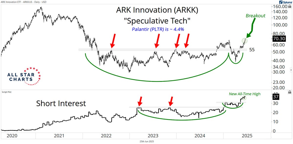
Source: @sam_gatlin
4. Semi Surge: After a period of consolidation around the previous all-time highs, US semiconductor stocks’ market cap weighting has surged onto fresh record highs (looking rather like a bull flag!). So, who knows, maybe we’re still early in the hype cycle? (and maybe that was all just a healthy correction/consolidation…)

Source: Topdown Charts
5. Keep Calm and Bubble On: One thing worth reflecting on is if you consider the April correction to be similar in nature to the late-90’s late-cycle reset, then speculative tech could have much further to run… just looking at how Cisco traded. And that’s the thing, when you get into bubbles and speculative episodes, there’s really no telling how far it will go —despite any misgivings you might have.
And as another observation on this one, it also goes to show how the hype cycle can leave very high hurdles for long-term investors… despite a long bull market in Cisco stocks, it’s still yet to recapture the all-time high.

Source: @mnkahn
6. Heavy Weights: Back onto the topic of market cap weights, this one is interesting for a couple of reasons, first — the bull side: that light blue line (earnings weight) has had a habit of catching up to the dark blue line (market cap weight). In other words, the big tech stocks have managed to earn their way into the big shoes priced in; price leads fundamentals. And yet, it is also still quite a big gap (the bear side) —the gap between those lines represents over/under-valuation, and that’s the thing: tech stocks are still very richly priced, which is fine if earnings keep keeping up, but a recipe for sudden slumps if earnings stutter or stumble.
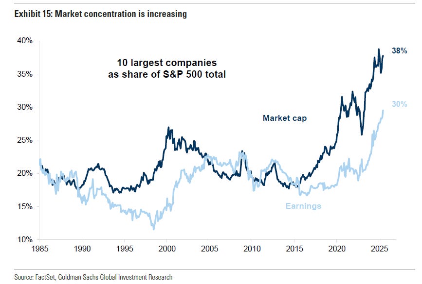
Source: @zerohedge
7. Light Weight! Here’s another interesting way of looking at it; the market cap weights of the US S&P stock indexes — the S&P100 (mega caps) is sitting at 65.7%, the S&P500 minus the 100 largest (large caps) is 26.6% [and the S&P500 in total is 92.3%], the S&P400 (mid caps) is 5.2%, and S&P600 (small caps) just 2.5%.
But it’s more the trends that are interesting; the largest 100 are near 50-year highs, the other 400 of the S&P500 are at record low weightings, and small/mid are also much smaller than usual. It reflects a sort of winner-takes-all dynamic, but also echoes where the risks and opportunities are in terms of sentiment/positioning/valuations.

Source: Topdown Charts
8. Echoes of History: Another chart more on the risk management side of things is this intriguing innovative chart, whose creator remarks: “If history is any guide, this is definitely not the best time for a long-term allocation to U.S. equities. Or maybe this time is different… Who knows.”
Well, yep, I would say maybe it is different, but I would also say with regards to market cycles it’s more often less different than we are sometimes tempted to think.
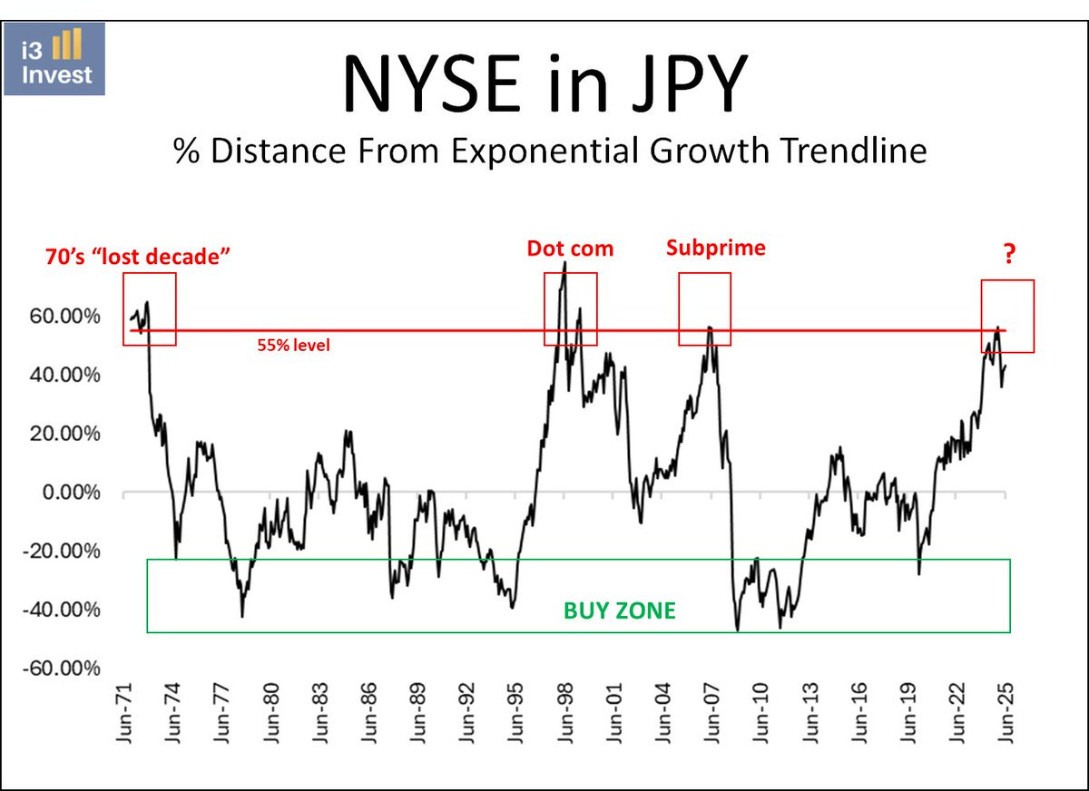
Source: @i3_invest
9. Blessed by Delisting (1/2): This is something I’ve noticed too, and it’s not just about ETF delistings, you also see things like index reshuffles and fund launches marking the top/bottom or turning points. But as the chart author notes, this particular ETF delisting marked a key inflection point in markets: “Best April fools of the year goes to KPOP being delisted just as South Korean stocks EWY soared nearly 1% EVERY DAY for 50 DAYS.”

Source: @hihotraders
10. Blessed by Delisting (2/2): One I picked up on (because I’ve been routinely covering Frontier Market equities at Topdown Charts), is the closure of the only US listed FM equities ETF coincided with a key breakout in the MSCI Frontier Markets index. Very bittersweet news for those who used to follow that ETF.

Source: Topdown Charts Professional
Thanks for reading, I appreciate your support! Please feel welcome to share this with friends and colleagues — referrals are most welcome :-)
BONUS CHART/THEME
The Global Equity Relative Value Trinity: I featured this chart in my 10 Charts to Watch in 2025 post, but I thought it would be worth just spelling out exactly what it is and implications for investors.

What we’re looking at is relative value indicators.
When the indicator is very high it means the first mentioned one is more expensive than the second mentioned (e.g. in 2007 global stocks were very expensive vs US stocks). When it is very low, it means the first is cheap vs the second (e.g. right now global stocks are very cheap vs US stocks).
There’s two ways to look at this: 1. US/Large/Growth is expensive vs everything else, and is at risk of catching-down; and/or 2. Global/Small/Value are cheap, and the upside opportunity is they catch-up.
In other words this chart reflects what I think is a multi-decade upside opportunity for those showing up as cheap on this chart (Global, Small, Value), and also tells us to be alert to downside risk on the other side of things (expensive US/Large/Growth).
—
Best wishes,
Callum Thomas
Founder & Editor of The Weekly ChartStorm
and Head of Research at Topdown Charts
Twitter/X: https://twitter.com/Callum_Thomas
LinkedIn: https://www.linkedin.com/in/callum-thomas-4990063/
NEW: Other services by Topdown Charts
Topdown Charts Entry-Level — [TD entry-level service]
Topdown Charts Professional — [institutional service]
Monthly Gold Market Pack — [Gold charts]
Australian Market Valuation Book — [Aussie markets]
Just to nit pick, but I would say tech from the 2000 pricing insanity, SLUMPED its way into improving earnings. Cheers.