
Weekly S&P500 ChartStorm - 27 March 2022
This week: correction drivers, Bitcoin base, seasonality signals, speculative sentiment switch, yield curves, inflation, stagflation, and health of healthcare...

Welcome to the Weekly S&P500 #ChartStorm (by email!)
The Chart Storm is a weekly selection of 10 charts which I hand pick from around the web (+some of my own charts), and then post on Twitter.
The charts focus on the S&P500 (US equities); and the various forces and factors that influence the outlook - with the aim of bringing insight and perspective.
Hope you enjoy!
! ALERT ! Sign up to the (free) Chart of the Week over at the new Topdown Charts Substack entry-level service: Subscribe to the Chart of the Week
Each week we send you one of the most interesting charts on our radar, along with some commentary/context and a key takeaway — so you’re never left guessing on why the chart matters ...and the charts matter! The focus is on illuminating the ever-changing macro-market outlook to help identify incoming risks and opportunities. > > > Subscribe Now
1. Correction Drivers: status check as the rebound plays through...
-EPOL (geopolitics): rebound has stalled, relief rally constrained by uncertainty.
-LQD (credit/duration): bond yields surging, but credit spreads contained for now.
-ARKK (tech burst): bounce also seems to be stalling.
(p.s. also note: “roundnumberitis” at 4550?)

Source: @Callum_Thomas
2. Bitcoin base = S&P500 based: If we think of Bitcoin as basically a barometer for the ebb and flow of risk appetite and liquidity, the apparent base in bitcoin (still needs to break out to the upside though) looks to be a positive sign for broader risk assets such as the S&P 500.
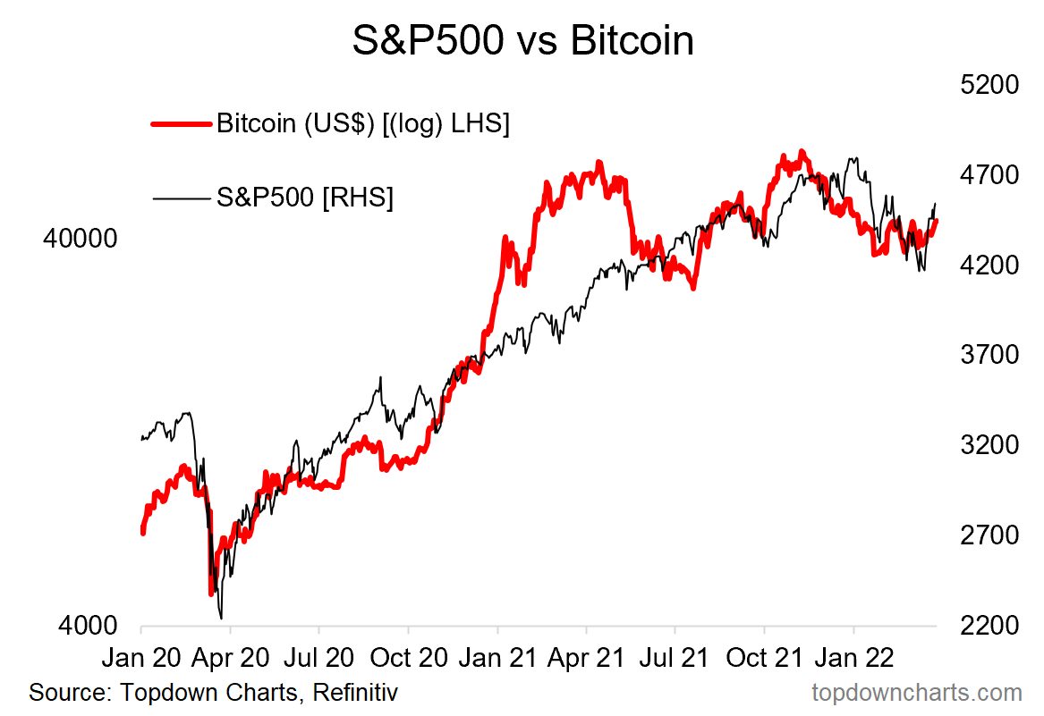
Source: @topdowncharts
3. Seasonality: Yes it is different this time, it is always different, but worth noting that April is historically the best month (highest average monthly gain, and 74% of all Aprils in history were positive).

Source: @topdowncharts
4. Seasonality “Yeah But”… But then again, mid-term election-year seasonality would suggest that any such April rally would be about it, short lived, followed by down-at-best through October.
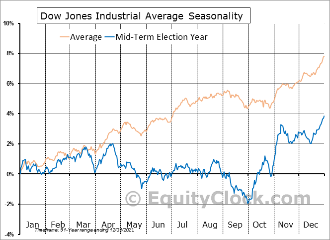
Source: @EquityClock via @MikeZaccardi
5. Hedgers... hedging FOMO risk: Massive pivot from record shorts to now sizable longs. Long live the dip buyers? ¯\_ (ツ)_/¯
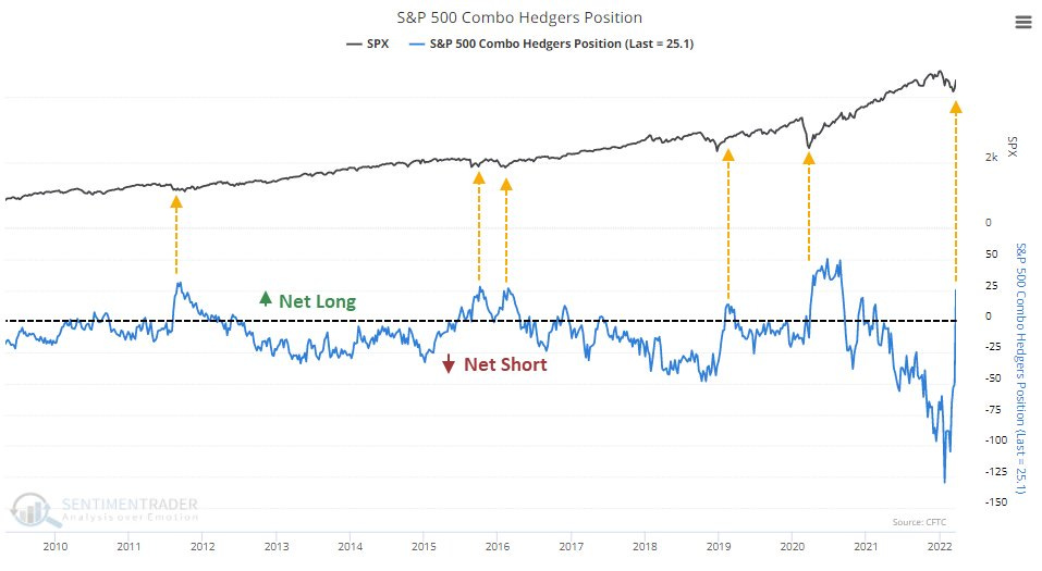
Source: @sentimentrader
6. ETF Speculators: Similarly, trading in leveraged long vs short US equity ETFs has ticked up towards the long side after a hefty rinsing-out of previous speculative fervor.
(albeit n.b. this indicator’s track record in signaling bottoms has been early/false-dawny before... e.g. most notably recently in late-2018)
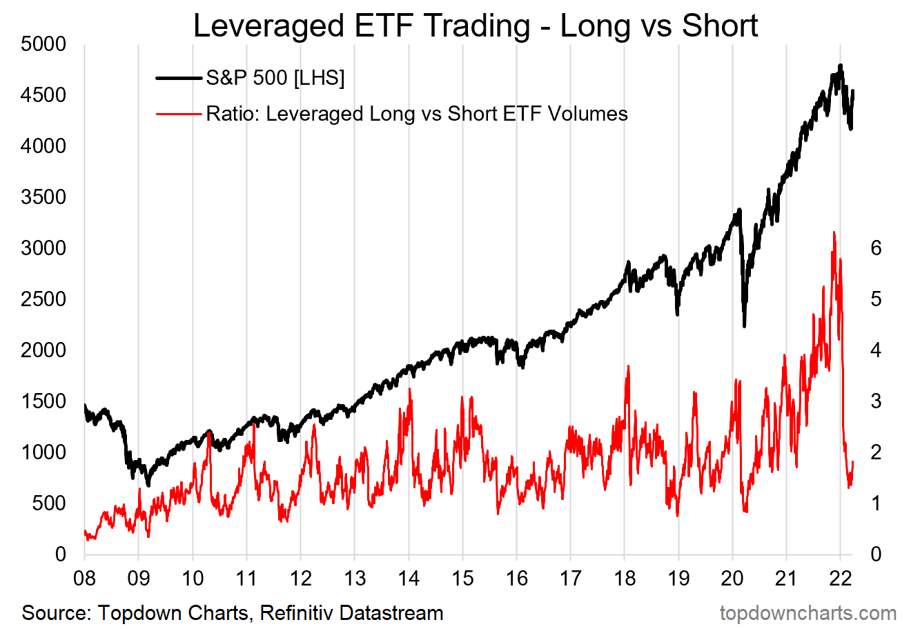
Source: @topdowncharts
7. Yield Curve: A lot of talk on yield curves recently, as this chart seems to show, yield curve flattening/inversion (at least as measured by this version of the yield curve) is not so much an immediate issue... but basically presents a tell in terms of lateness-of-cycle. In other words, most of the time this was the kind of thing you saw later in the cycle, before a turn (but typically well in advance of the turn).

Source: @mark_ungewitter
8. Stocks vs Commodities: Inflation is an equity killer.
Peaks in the S&P500 vs Commodities index ratio have served well in flagging major market tops for stocks. (inflation (where commodities are a key proxy/driver) places pressure on margins, consumers, and drives central bankers to tighten policy)

Source: @exposurerisk
9. Living with Stagflation: So you've decided to move on with your life and just "live with stagflation". Here's what history says about where to allocate...
(n.b. past performance does not necessarily = future, etc)
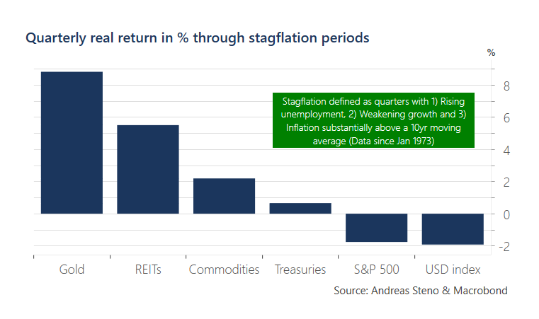
Source: @AndreasSteno
10. Healthy Healthcare: Healthcare relative performance price ratio is bouncing off its very-long-term trendline: fairly reliable signal for a run in healthcare.
n.b. healthier healthcare relative performance is often actually an unhealthy signal for the health of the broader market (being typically a defensive sector).
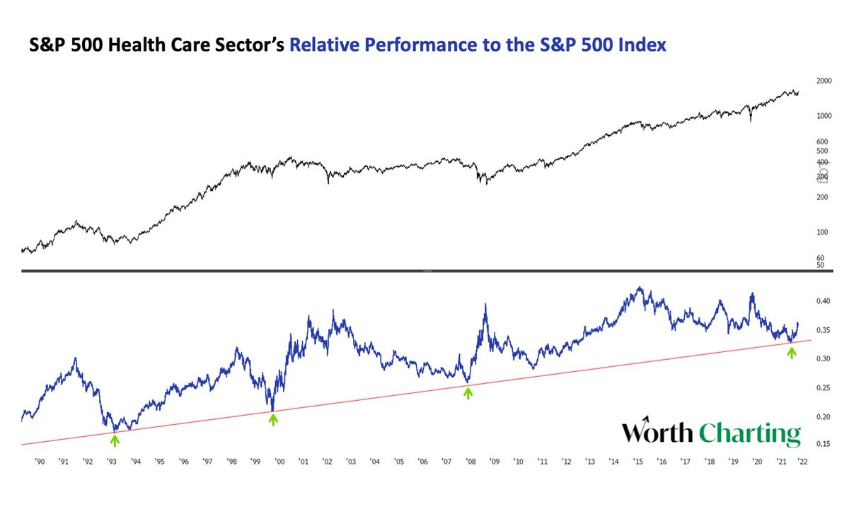
Source: @CarterBWorth
Thanks for following, I appreciate your interest and support!
>>> Please do me a favor and help spread the word — you can simply forward this email to your friend/colleagues and they can sign up [FREE] using the subscribe button below:
oh… that’s right, almost forgot!
BONUS CHART >> got to include a goody for the goodies who subscribed.
S&P500 Valuations: the good news is that some of the steam has come out of frothy valuations, the bad news is that relative value is fading fast…
This chart shows absolute valuations in the black line (average of trailing PE, forward PE, PE10), and relative valuations in the red line [relative to bonds] (i.e. my calculation of the equity risk premium (ERP), *inverted* to align the signal).

As noted, absolute valuations have come off the boil, or at least have vented some steam. But even with the decent reset so far (partly driven by rebounding EPS), it’s still showing up as fairly expensive vs history.
Relative valuations (ERP) were tracking around neutral as rising bond yields had previously offset the rising earnings yield (falling PE), but the ~35bp surge in US 10-year treasury yields last week has pushed relative valuations into expensive territory.
Some have compared the current environment to 2018 (where rate hikes and rising bond yields ultimately scuttled the market later in the year), and with regards to the chart above I think there are certainly some parallels to be drawn.
As long as bond yields keep rising *and* stock prices also rise (pushing down earnings yields), then the ERP metric is going to get further squeezed and the risk of further downside incrementally increases.
—
Best regards,
Callum Thomas
SPONSOR: ( …he’s me!)
My research firm, Topdown Charts, has a new entry-level Substack service, which is designed to distill some of the key ideas and themes from the institutional fund manager service to provide the same high quality insights at a more accessible price.
Give it a try and let me know what you think
Lots of good information, thanks for your work! Two things that stood out for me last week were the weak breadth of the SPX and the discrepancy between a declining VIX and a rising MOVE.