
Weekly S&P500 ChartStorm - 21 December 2025
This week: the presidential cycle, global stocks, rotation, cycles and peaks, cash allocations, valuations, profit margins, and dealing with bad indications...

Welcome to the latest Weekly S&P500 #ChartStorm!
Learnings and conclusions from this week’s charts:
The “Presidential Cycle” points to a volatile and ranging 2026.
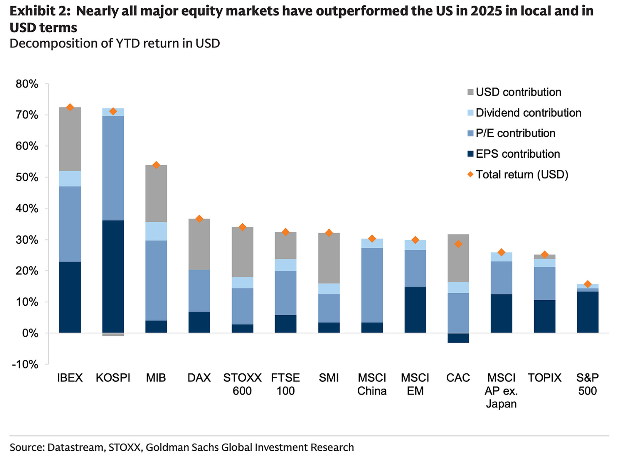
Global stocks have significantly outperformed vs US stocks this year.
Fund managers are running record low cash allocations.
Mid-Cap stocks look cheap in absolute and relative terms.
Rotation inflection points are emerging (US vs global, equal vs cap-weight).
Overall, it’s been a very interesting year so far on both the risk and return fronts, and there’s a few key inflection points in play that are going to be worth keeping close tabs on into 2026…
p.s. check out my “Best Charts of 2025” from my work at Topdown Charts [link]
1. Presidential Cycle: Here’s another seasonality-cycle chart that’s pointing to the prospect of volatile and ranging price action ahead in 2026. It echoes the Decennial Pattern discussed a couple of weeks ago, and again; these are just statistical descriptions of the past and there’s no hard tangible reason to expect a repeat, but we now have 2 different series suggesting similar scenarios.
Of course things like Fed rate cuts, potential tariff tax refunds, AI investment, and global growth reacceleration might help make it different this time, but it’s enough to prompt a closer look (particularly as valuations remain elevated, geopolitical risk simmering, and various other macro issues lurking on the radar).
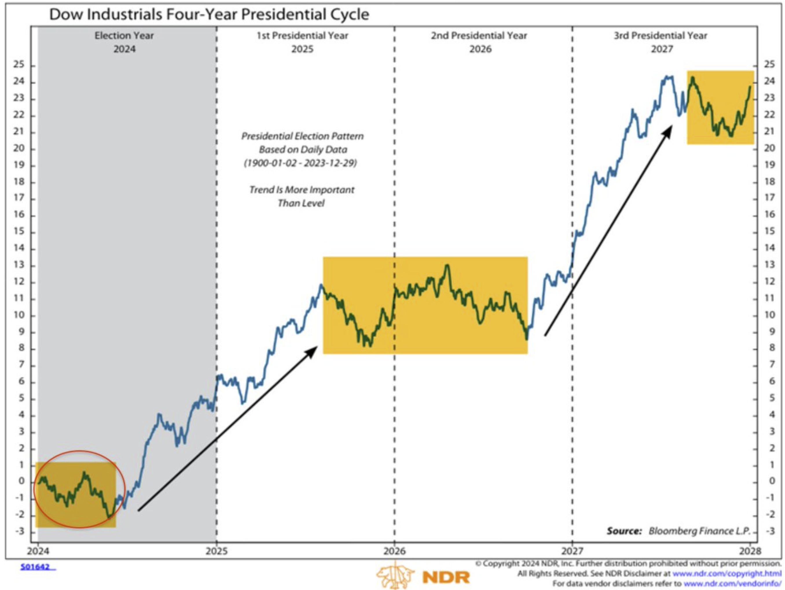
Source: @jfahmy
2. USA vs the World: Despite all that went on this year, the USA is sitting on a respectable double-digit return for 2025 (albeit with 7 trading days left). Rest of the world meanwhile did exceptionally well this year thanks to a bit of rotation, re-rating, and dollar depreciation.
Source: When last place is still pretty great
3. Global ex-US Equities: This brings me to one of my favorite charts of 2025; global ex-US equities broke-out to new highs after a short-sharp wash-out in April. As things stand the breakout remains on track —and all that time spent in consolidation pre-breakout (+ strengthening breadth), to me says it probably still has plenty of room to run (especially as global stocks are still cheap).
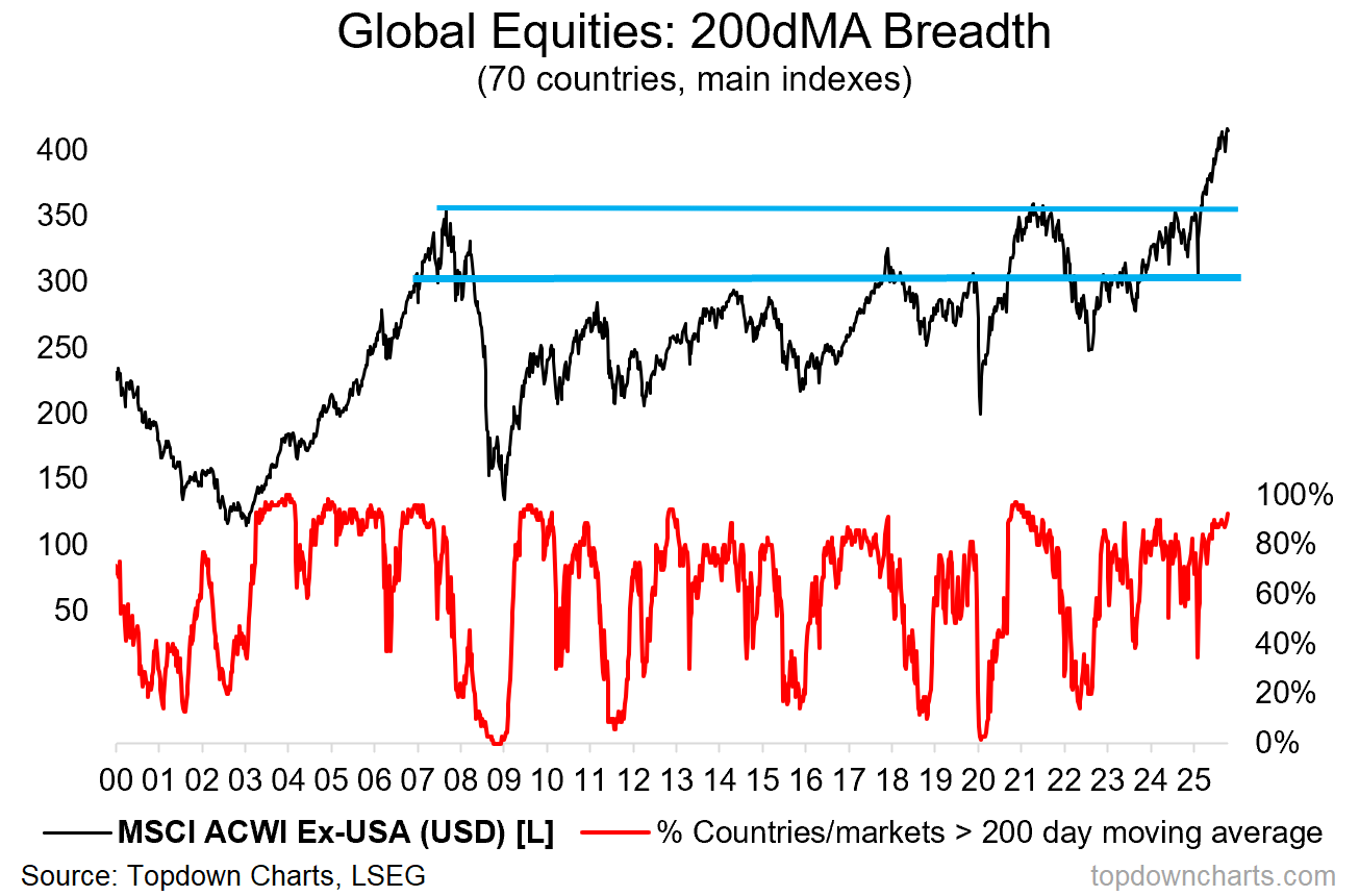
Source: Topdown Charts
4. Fund Manager Cash Allocations: The strong returns in global equities has boosted investor sentiment and contributed to a plunge in fund manager cash allocations to record lows (after-all cash just serves as a drag on performance when global equities are booming like this). That said, I would also note that with bonds looking attractive on some indicators, it probably makes more sense to hold bonds than cash on the defensive side of things.
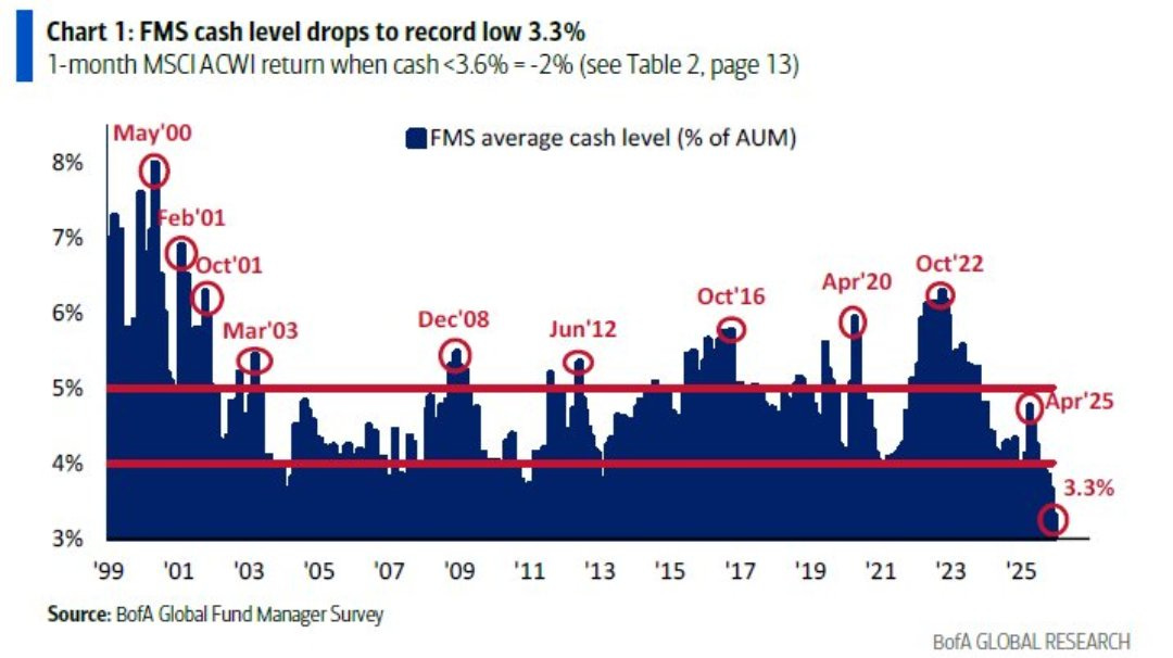
Source: @RyanDetrick
5. US vs Global Equities — Cycles and Peaks: Back on the topic of global vs US, it sure is starting to look a lot like the big bull run in US vs global stocks has peaked. There is an apparent cyclical aspect to the global vs US equity relative performance lines, and after such a magnificent and prolonged run of US outperformance, it’s probably not surprising to see things at least take a breather (especially as global equity technicals improve, global valuations remain cheap, policy supportive, and USD also looks to be rolling over into bear market).
It’s definitely something to keep an eye on, but also something that can take a few years to really turn the corner (with many false alarms along the way so far).
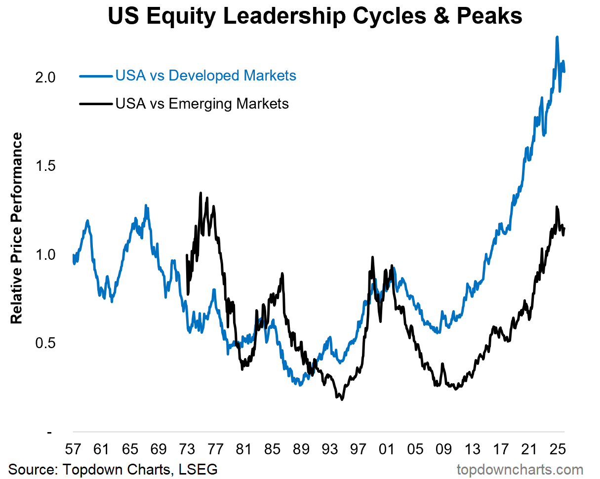
Source: Topdown Charts 2025 End of Year Special Report
6. The Second Great EW/MCW Anomaly: On a similar note the equal-weighted vs market cap-weighted relative performance line is ticking up after its second great anomaly. Over the long-run, the equal-weighted version of the S&P500 has historically outperformed vs the market-cap weighted version. The dot com bubble presented the first big anomaly vs trend, and the more recent mag-7/big-tech/AI boom has driven the emergence of a second great anomaly.
Much like the global vs US situation, there also appears to be some cyclicality around the trend here, so it’s another big rotation in waiting to keep an eye on.
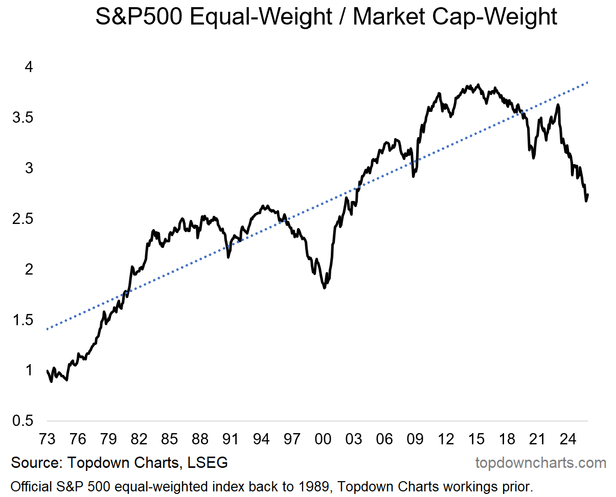
Source: Topdown Charts Professional
7. Mid Caps *not* Mid: Speaking of rotation, there is an exceptional relative value case for mid caps vs large caps (the relative value indicator tracking around levels last seen at the heights of the dot com bubble).
The only issue with things like this is that you can get catch-up rotation (where mid caps catch-up to large caps) or catch-down rotation (where large caps catch-down to mid caps). It’s not yet obvious which way we go.
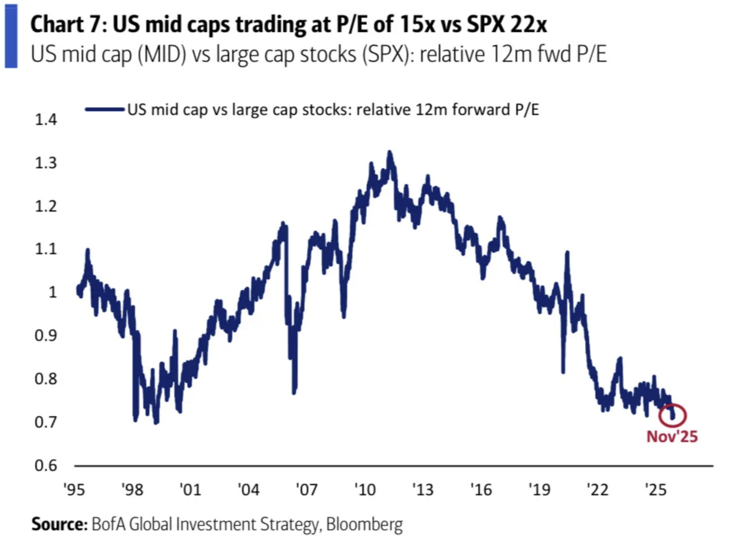
Source: David Marlin
8. Mid Cap Absolute Valuations: One argument in favor of catch-up is that mid caps are still trading on reasonable absolute valuations (tracking around the low end of the range of the past couple of decades). Yet, the opposite can be said for large caps (which given lofty valuations could be liable to catch-down risk).
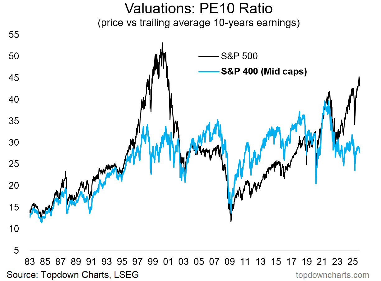
Source: Topdown Charts
9. Valuation Heights: On the topic of expensive large caps, it seems about a 3rd of the market is trading on extremely high price-to-sales ratios.
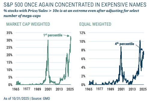
Source: @MebFaber
10. Greedflation? High price-to-sales ratios can be “OK” for a time, provided that you either have strong greater-fool-dynamics going on, or just plain good fundamentals like strong sales growth and high profit margins.
On the latter point, it appears US corporate profit margins might have peaked already — are we about to see an unwinding of the great 2020’s “greedflation” era?
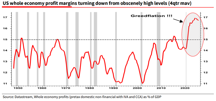
Source: Off The Charts
Reminder… in case you missed it, be sure to check out my 2025 End of year Special Report from Topdown Charts (free download).
Portfolio Strategy Notes — Dealing With Bad Indications
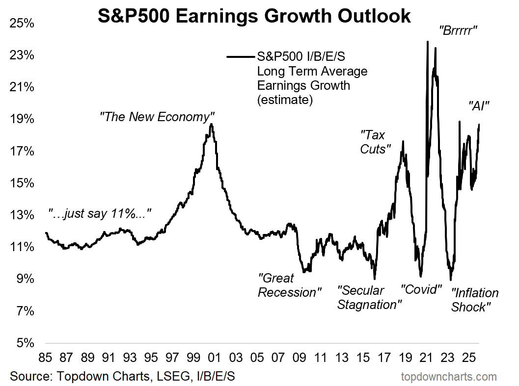
Thanks to the excellent Mike Zaccardi for flagging this chart (and providing a prompt to address some issues with indicator design and selection). It shows the “PEG” ratio (or at least one version of it), which is something that a lot of bulls are pointing to as a reason to dismiss expensive valuations (due to high expected earnings growth).
In my view you can dismiss valuations for a few good reasons (e.g. down-weighting valuation signals under conditions of policy tailwinds and strong technicals), but the PEG ratio not a good reason. Firstly, for reference, the PEG ratio is the familiar Price-to-Earnings ratio — adjusted for earnings growth (i.e. PE ratio divided by expected earnings growth).
It’s something that sounds intuitively sensible, but in practice is problematic and not very useful for market cycle analysis.
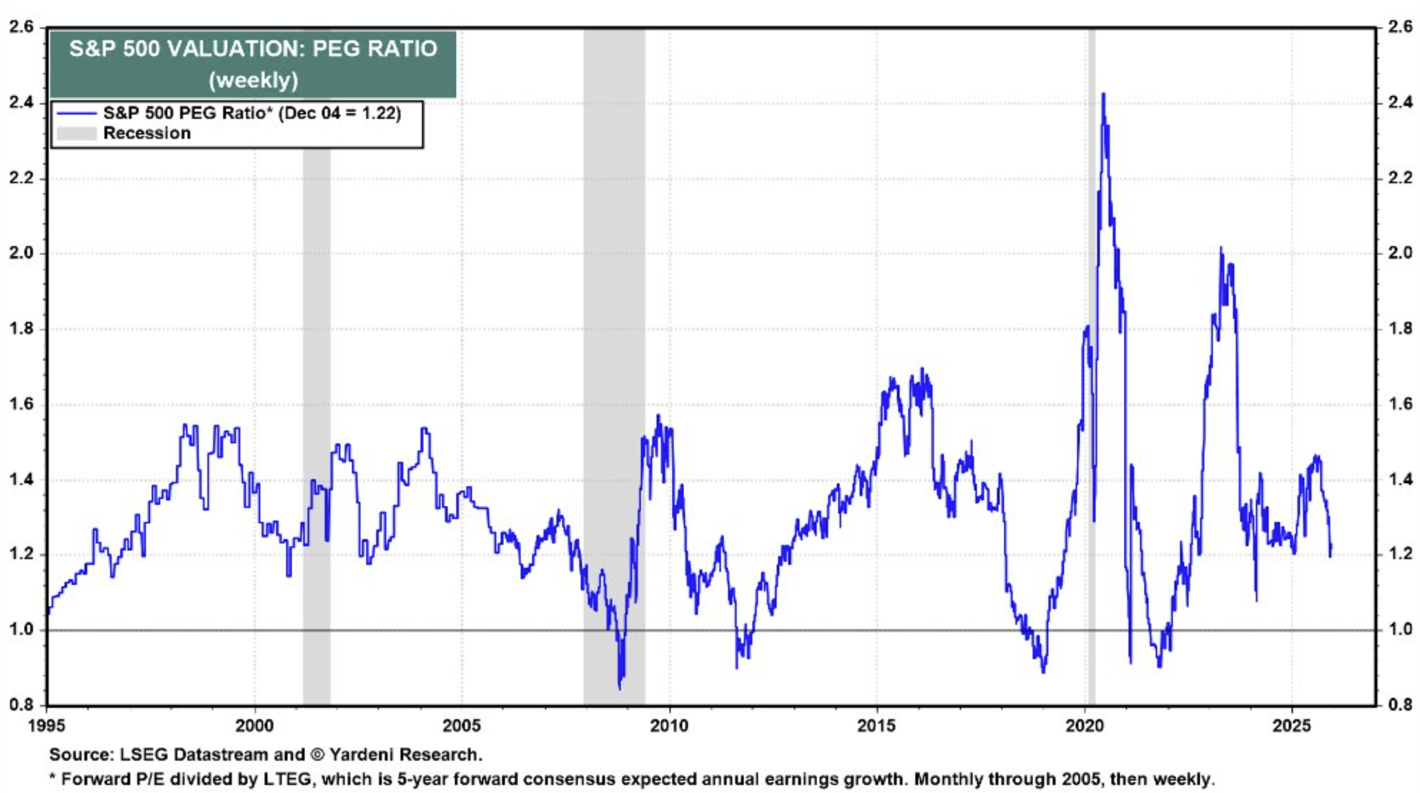
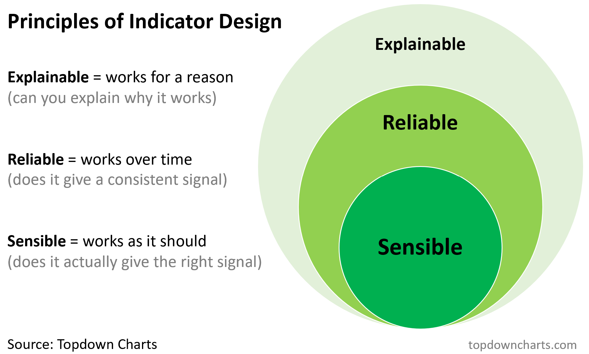
Indeed, if you eyeball the chart above it becomes clear that this is basically the perfect example of an indicator that is highly explainable (has strong intuition, it seems to make sense), but is unreliable (is a bit all over the place) and most importantly is nonsensible (does not give the right signal at the right time). I’ve discussed this before when covering the principles of Indicator Design.
If your indicator doesn’t give the right signal at the right time (and ideally consistently over time), then it doesn’t matter if it sounds reasonable — if it doesn’t pass on those first two criteria you either need to go back to the drawing board on operationalizing that idea, or just outright discard it.
And that brings up the denominator in the chart above… This is not a good thing to divide a valuation ratio by because it basically has the same information as a valuation ratio. Ultimately valuation ratios reflect sentiment (when investors are highly confident they will bid up stock prices and valuations, when they are depressed or panicked they will sell and valuations will fall) — but so too do analyst expectations (Wall Street analysts are people after-all and the tyranny of price and narrative hold great sway on their forecasts).
If anything you should scan the chart below and realize that it confirmed the signals that high valuations were sending us (both pointing to excessive optimism at the height of the dot com boom, and pessimism at the 2009 lows).
So there’s a few takeaways that come to mind here:
Just because something sounds sensible doesn’t mean it is.
Some good ideas don’t translate well into practical application.
Make sure that your indicators are sensible and reliable above all else.
Use indicators to help support your thinking (not substitute for it).
Ideally have a sound overarching framework and process that brings together indicator signals into a larger coherent picture to support good decision making.
On reflection, it’s as much about the nitty gritty details in getting good info as it is about also keeping perspective with your overall process.
—
Best wishes,
Callum Thomas
Founder & Editor of The Weekly ChartStorm
and Head of Research at Topdown Charts
Twitter/X: https://twitter.com/Callum_Thomas
LinkedIn: https://www.linkedin.com/in/callum-thomas-4990063/
NEW: Other services by Topdown Charts
Topdown Charts Professional —[institutional research service]
Topdown Charts Entry-Level Service —[entry-level version]
Weekly S&P 500 ChartStorm —[US Equities in focus]
Monthly Gold Market Pack —[Gold charts]
p.s. next weekend's ChartStorm is going to be the "best-of 2025"
Looking forward to pulling it together, it's always an interesting exercise... [and open to write-ins!]
Great post, Callum
Adding weight to the presidential cycle is the midterms effect. I think the average drawdown is like 18% in the 12 months leading up to midterms. This goes back about 100 years. Can share the source if interested and haven't seen it.
I find the EW/MCW plus the SP500/400 charts to tell a similar story on valuation and risk, so I appreciate them all being in one post here. Including the % of index > 10x P/S just adds more weight. On one hand - we certainly have a VERY high quality (margins & ROIC) index, but we're also quite stretched, clearly.
Finally, love the final point on PEG weakness as an indicator and the earnings growth outlook. That may be one of the best sentiment gauges. I'd love to see the earnings growth outlook with forward 10 yr returns overlaid it. Or simply the S&P price overlay may be illustrative as well. Have you ever seen this, or made this?
Blake