Weekly S&P500 ChartStorm - 10 November 2024
This week: Trumped-up, Nov-April bull season, tech and bitcoin, risk-on, transports, small caps, surges, generational opportunities, global small value, rainy days, what's different now...
Welcome to the latest Weekly S&P500 #ChartStorm!
Learnings and conclusions from this week’s charts:
Stocks went from de-risking to re-risking this week.
We’re now into a typically strong seasonal patch.
Crypto/Tech/Transports show speculation revival.
US large caps look tired, global/small/value look wired.
Stocks tend to do well when it rains in New York.
Overall, the mood is well and truly risk-on. Part of this is a reversal or unwinding of the de-risking and caution in late-October, an element of “stealth corrections” resolving to the upside, optimism for a repeat of 2016-17 run in stocks, and a generalized continuation of the underlying market mood of bullish euphoria. But there are a few key conditions that are quite different now vs 2016, and we may need to rethink about how to navigate things in the coming years…
REMINDER: the new Weekly ChartStorm Chat-Room is now up and running — I will host a live Q&A session on Sunday evening about 7pm EST.
1. 6000: As flagged last week, the de-risking we saw at the end of October sure enough did set the scene for a bit of re-risking post-election with uncertainty resolved and hope for a repeat of the 2016-17 run in stocks boosting things.
Source: Callum Thomas using MarketCharts.com Charting Tools
2. Return in November: Also front of mind is the prospect of the typical year-end rally, and of course we’re now into the Nov-April period, which has historically been the best performing part of the year in terms of probability of positive returns and magnitude of returns. It’s basically the other side of the “Sell-in-May” saying….. you’re supposed to come back in November.
Source: Off-Topic ChartStorm - Sell in May?
3. Speculation Awakening: While Bitcoin is likely getting a boost from a prospectively more crypto-friendly incoming administration, it does echo and add to the wider speculation revival. It also is in effect a dual-resolution in the chart below to the multi-month stagnation or stealth bear in bitcoin and tech stocks… in other words, sometimes you don’t need to have a correction in price, but a correction in time in order to set the scene for the next leg up.
Source: Topdown Charts
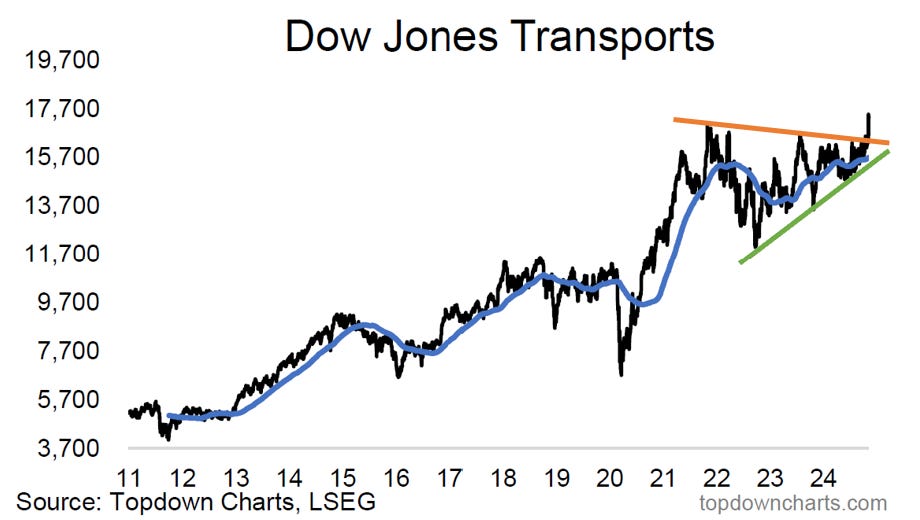
4. Transported Higher: Another key segment of the market; transports (a key sentiment/macro barometer in that these stocks are at the cross-currents of multiple macro and (geo)political trends) has made an initial breakout out of a huge triangle formation. The fact that this comes against the backdrop of an underlying overarching uptrend through the period in the chart below is quite bullish, and adds to the developing risk-on theme.
Source: Weekly Insights - Edition 183
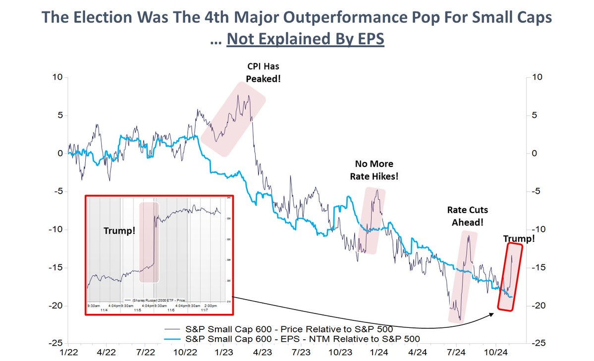
5. Mind the Hype: However, as Kantro points out below, at least in the case of small caps relative performance, there have been many false starts and bouts of premature speculation. While price does tend to move faster than fundamentals, the point he makes with this chart is that you need real fundamental follow-through if things are going to sustainably turnaround for this specific case, but also for wider bullish follow-through (and on that note, check out the bonus chart section…!)
Source: @MichaelKantro
6. Mind the Surge: Another aspect is that we are actually quite progressed in the current cyclical bull market, and in the middle of an extended surge in stocks —which may need to take a bit of a breather at some point.
Source: @sentimentrader
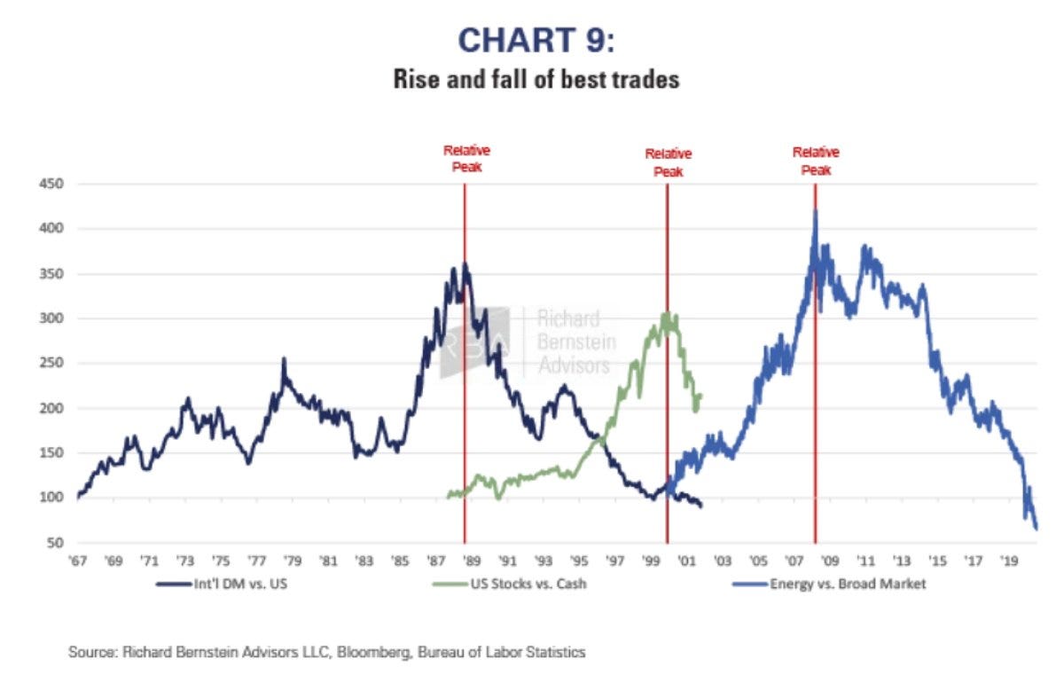
7. Generational Opportunities: This chart comes from a note by Dan Suzuki which highlights some of the best trades of the past 50 years, and how the latest one (US/tech stocks) is looking extended, and noting how these things don’t just go on forever; this too shall eventually pass. Meanwhile he, like me, sees better opportunities in the coming years for global/small/value, and inflation beneficiaries.
Source: @MikeFritzell of Asian Century Stocks
8. Global Small Value stocks: Speaking of such, here’s the relative performance chart of Global ex-US Small Value stocks vs US Large Growth stocks. It has been pretty much a one-way street over the past 15-years; a massive relative bear market for Global/Small/Value. And one that has created major relative value gaps.
Source: Topdown Charts Professional
9. US Small Caps — Priced for Imperfection: Closer to home, even just US small caps are looking good; trading at a 25% discount to large caps, and looking like they are nearing the low point in the long-term cycle of relative performance.
Source: @JeffWeniger
10. When it Rains: This chart from the excellent Tom McClellan shows an apparent link between New York City rain fall and stockmarket returns, he quips: “Watching the rainfall data for New York City and its relationship to the stock market is one of the funnier relationships I have discovered in the few decades I have been doing this. There is no reason I can think of for why such a relationship should exist, and yet there is a large amount of evidence showing that the two are related.”
The takeaway? Maybe be cautious on stocks if you expect a dry spell in NYC!
Source: New York Rain and Stocks — Silly, But Accurate
Thanks for reading, I appreciate your support! Please feel welcome to share this with friends and colleagues — referrals are most welcome :-)
BONUS CHART >> got to include a goody for the goodies who subscribed.
Then and Now: One thing I’ve been looking at is the differences/similarities in 2016 vs now — as I commented earlier, it seems a lot of folk are focused on the 2016 election of Trump and the subsequent rally in stocks and concluding something like “this is how stocks usually trade under Trump” (i.e. that one time).
But aside from the small sample size, there’s a few key issues; specifically, the background context and starting point in terms of valuation and sentiment is entirely different this time. Case in point below.
The hurdle is very high for large caps (PE10 valuation ratio is near-double that of 2016). Though interestingly, echoing my previous observations; small caps are actually cheaper now vs back then… so there is an absolute + relative value case for them. But that large cap PE10 is kind of concerning, a few things need to really go right for large caps to keep chugging-on from here.
I looked a few other key charts (credit spreads, sentiment, equity risk premium, relative value, etc) on this theme in my latest weekly report over at Topdown Charts Professional — I’ve decided to share that report as a one-off free look because I think it’s quite telling, with important implications (…and a good chance to give an insight into what I do with my day job, especially as annual research budget reviews are kicking off for many fund managers: it could be worth a look! :-)
(click the download button above to download the PDF, and see topic 5 specifically for more charts on this theme — also if you’re an institutional investor be sure to let me know if you’d like a corporate trial or help with billing/onboarding, etc)
—
Best regards,
Callum Thomas
Looking for further insights? Check out my work at Topdown Charts


