


Off-Topic ChartStorm: US Treasuries (part 3)
Bond market update: momentum, drawdowns in context, corporate bonds, long-term rates expectations, intermarket indicators, macro, search for yield, and the cure for higher yields...

Here’s a another “Off-Topic ChartStorm” on US bond yields — things are moving further and faster (e.g. the US 10-year yield is mere basis points away from breaching the 5% level at the time of writing) and more interesting charts are showing up which will likely be helpful in putting the moves into context. So I thought it timely and useful to present yet another set of charts on treasuries.
Unlike the usual weekly ChartStorm (which focuses on the S&P500 and related issues), the “Off-Topic ChartStorm” is a semi-regular focus piece with topics spanning macro, markets, stocks, bonds, commodities, regions, and various other issues of interest.
Learnings and conclusions from this session:
The recent drawdown in treasuries is the worse in recorded history, and even almost on par with the drawdowns in Bitcoin(!)
Corporate bonds have also taken a beating, but mostly due to the effect of rising interest rates as credit spreads slumber.
The growing consensus among fund managers and strategists is that longer-term bond yields will be lower next year.
Macro (PMIs) and intermarket indicators (copper/gold) affirm that view.
Rising interest rates are presenting headwinds to real estate and risk assets, prompting the question whether the cure for higher rates will be: higher rates...
Overall, there’s an ongoing tension between the growing size of drawdowns vs the growing expectations that the bottom is here or near for bonds …vs the relentless momentum on display. There’s also the macro tension between growth and inflation, and within the economy the tension between higher borrowing costs vs higher nominal growth, lower household leverage and greater incidence of fixed rate borrowing. These tensions are understandable but unsustainable — and that which is unsustainable cannot be sustained. Personally, I agree with the folk in charts 5 & 6.
1. Momentum: We are living through most persistent rise in yields of the past half century, and it’s probably going to have to take some sort of exogenous shock or crisis to derail this kind of momentum.
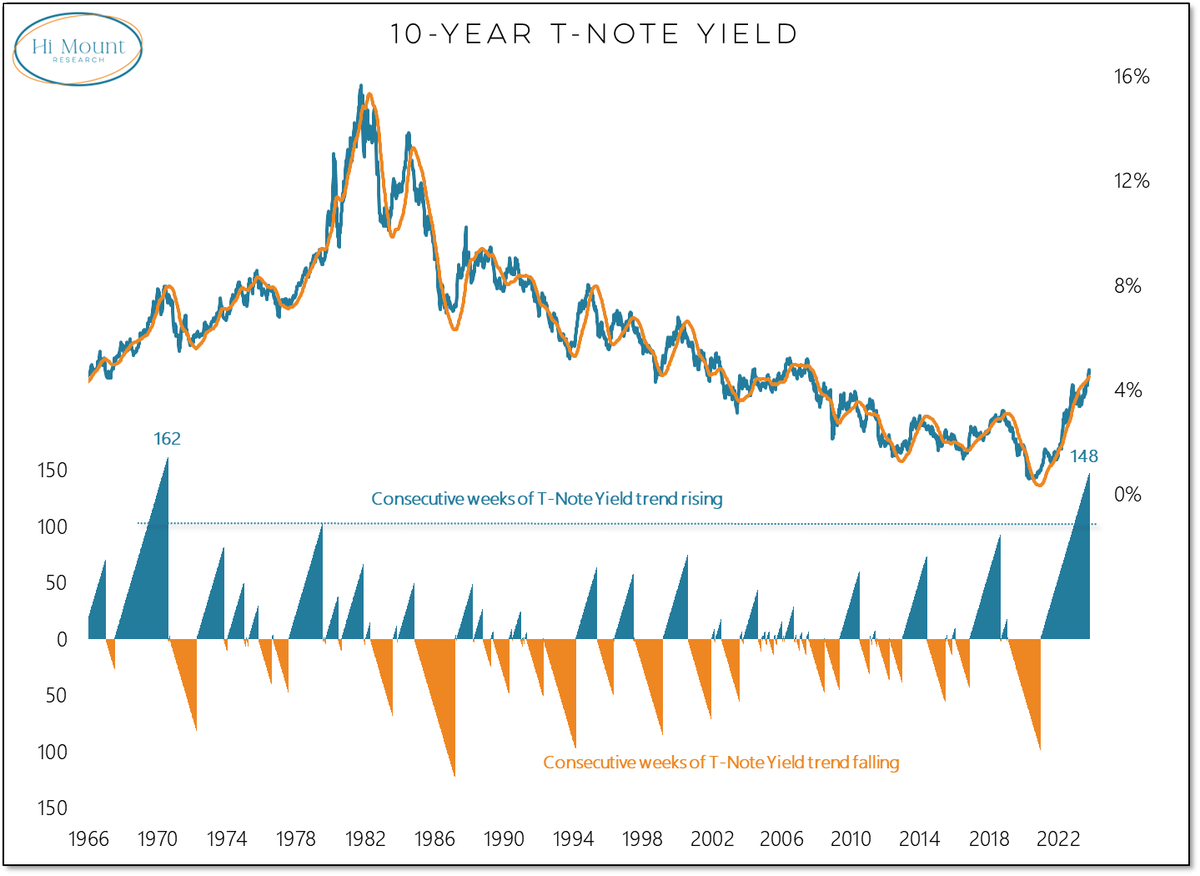
Source: Willie Delwiche
2. The Worst (nominal) Drawdown in History: For 10-year treasuries this has been the worst drawdown in history in nominal terms (albeit not quite so in real terms as the dual inflation shocks of the 70’s set a high (low?) bar).
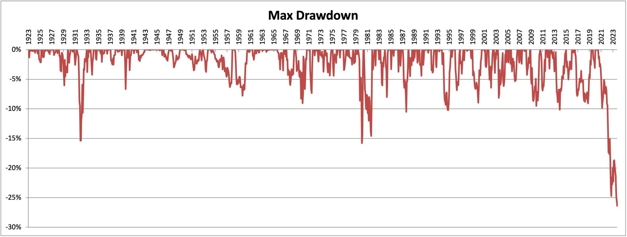
Source: @MebFaber
3. Treasuries vs Bitcoin: Longer-term treasuries drawdown (price only — and on that note, unlike Bitcoin, treasuries pay guaranteed/credit-risk-free interest coupons to the holder, and in total return terms are “only” down -47% (vs -51% price-only)). But the key point of interest in this chart is the fact that long-term treasuries are facing drawdowns similar in scale to that of Bitcoin! I wonder if that will change perceptions around the legitimacy of the various asset classes…

Source: @DylanLeClair_
4. What About Corporate Bonds? Investment Grade corporate bonds have also seen significant drawdowns, but this has primarily been a duration thing — i.e. a consequence of rising interest rates pushing down the price of bonds. The credit side of things has been completely contained so far in the scheme of things (compare and contrast to 2020 and 2008/09 — where the losses where driven by credit risk; large spikes in credit spreads).

Source:
(chart originally appeared in 2022 end-of-year report)5. ZEW crew still Expecting Lower Bond Yields: As highlighted in the previous Bond Chart Storm (chart updated to latest below), the ZEW survey respondents are increasingly pounding the table on their call that US longer term rates are headed lower. They have historically had a decent track record, so there is an element of “wisdom of the crowds” going on here, but equally it is an increasingly consensus viewpoint…

Source: (updated chart from the previous Bond ChartStorm)
6. Everyone Knows Bond Yields are Going Lower: Exhibit 2 — the majority of fund managers surveyed expect bond yields to be lower in 12-month’s time. Of course that doesn’t preclude the possibility that “lower” may mean only slightly lower, and/or that bond yields could head higher in the interim.
Further, to carry on the point from the previous chart, the crowd can and does get it right from time to time — sometimes the consensus is the consensus because it’s right and obvious. But there have been plenty of times where the consensus gets it dead wrong, and the anchoring of the multi-decade bond bull market of 1980-2020 no doubt influences the expectation for lower yields.

Source:
Notes Post7. Intermarket Correlation — Spurious or Curious? One of the best intermarket indicators for US 10-year bond yields over the previous decade has been the copper vs gold ratio. The reason is that copper is basically a proxy for global economic activity, while gold a proxy for risk sentiment. So in a downturn gold goes up, copper goes down, the ratio of copper to gold goes down and so do bond yields (which are likewise determined by the economic pulse and risk sentiment). But that correlation seems to be suffering from long covid. The Pandemic supply + stimulus shocks may have broken the correlation by anchoring inflation expectations higher.
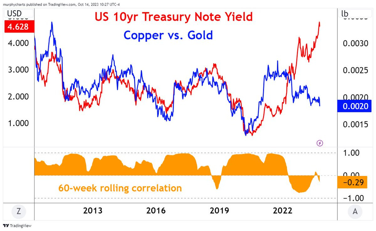
Source: @murphycharts
8. Broken Correlations or Delayed Reactions? Another example of an infirm correlation is the US 10-year yield vs developed market manufacturing PMIs. This and the previous chart arguably give a certain element of evidence to suggest that bond yields head lower, or at least that they will head lower in the event of a recession.
It is interesting to reflect on the period immediately after the pandemic crash, where it took bond yields quite a while to catch-up to the PMIs (maybe we can at least partly blame this on QE?). And it does raise a question as to whether this is simply the “Wile E. Coyote Effect” — and that bond yields will drop down to meet the PMIs.
Confounding factors though include the influence of QT, higher government debt loads (concerns around fiscal sustainability), ghosts of inflation, and maybe even inventory cycle and base effects messing up the PMI signal.

Source:
9. Search For Yield —> Yield Found: Those who were around in the pre-pandemic years, especially 2014-17, will remember there was the “Search For Yield” theme — where cash rates were basically zero, and bond yields bouncing along the bottom. Investors were searching for yield by reaching out to longer duration bonds or taking on greater credit (or equity) risk. But now? Cash provides greater yield than many of the traditional yield oriented assets and without any of the same credit/equity/interest rate risk. And hence now the level of interest rates is a headwind vs previous tailwind to income assets.

Source: @JeffWeniger
10. The Best Cure for Higher Rates = Higher Rates? This brings us to the final chart of this session, and an open question — will the cure for higher interest rates be …higher interest rates? Can a world where valuations are still largely priced to perfection across real estate and equity markets withstand the higher risk-free hurdle rates? (or will people adjust? will a new normal higher nominal growth rate offset the higher for longer level of interest rates? or is this all, what we’ve talked about today, what you should expect to see with the long and variable lags of monetary tightening?)

Source: Chart Of The Week - US Housing Market
Thanks for following, I appreciate your interest!
Looking for further insights? Check out my work at Topdown Charts
The Bonds Chartstorm is really helpful as the bonds market is experiencing the biggest pivot in market regime since 40 years. Unfortunately many charts make the fundamental mistake of comparing different regimes of falling and now rising yields. To better understand this market, anchoring has to be overcome and comparisons starting in the 40ies and 50ies are needed.
According to Powell, we can and we will withstand higher rates. He’s made it clear he won’t hesitate to hike rates until the economy slows down enough to keep inflation at 2%. However, I’m not sure we’re in for a soft landing.