Off-Topic ChartStorm: US Treasuries (part 2)
Bond market update: deep drawdowns, broken models, real yields, Japanese, Chinese, Fed policy, macro risks, economist forecasts, and long-term mean reversion...
Here’s a another “Off-Topic ChartStorm” on US bond yields — I kept seeing interesting charts pop up on the bond market, and things are moving fast, so I thought it timely to present another set of charts on treasuries.
Unlike the usual weekly ChartStorm (which focuses on the S&P500 and related issues), the “Off-Topic ChartStorm” is a semi-regular focus piece with topics spanning macro, markets, stocks, bonds, commodities, regions, and various other issues of interest.
Learnings and conclusions from this session:
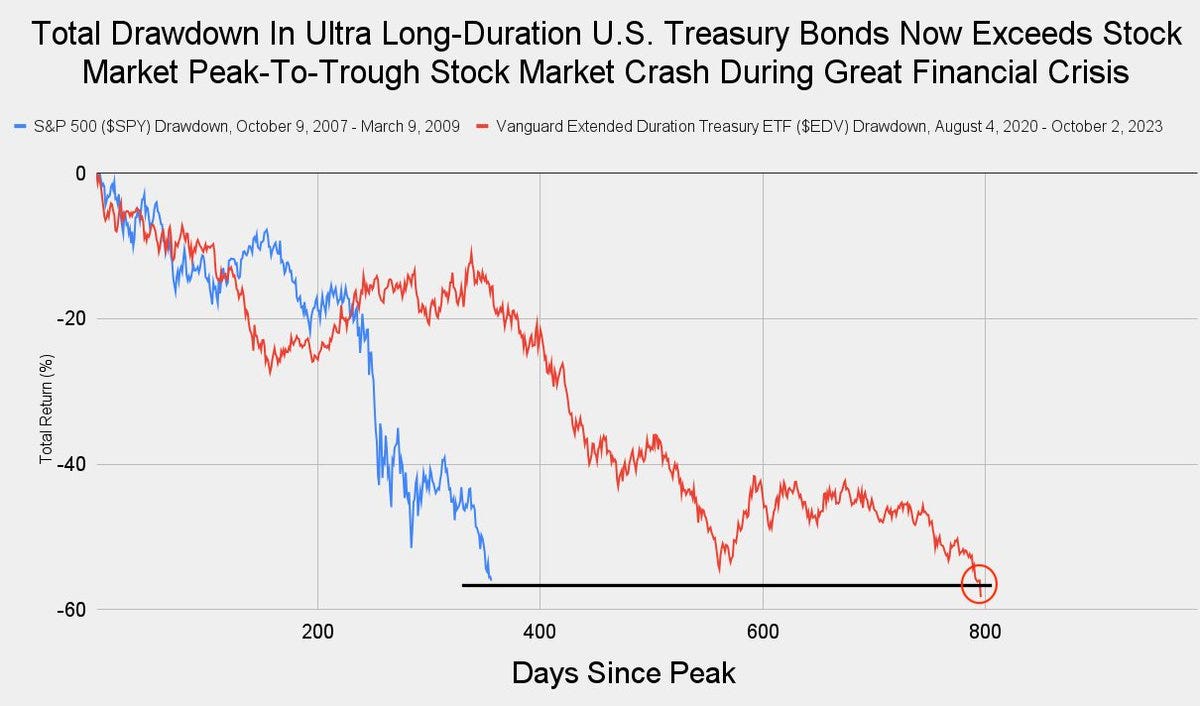
The 2020-23 drawdown in treasuries is now worse than the drawdown in stocks during the 2008 financial crisis.
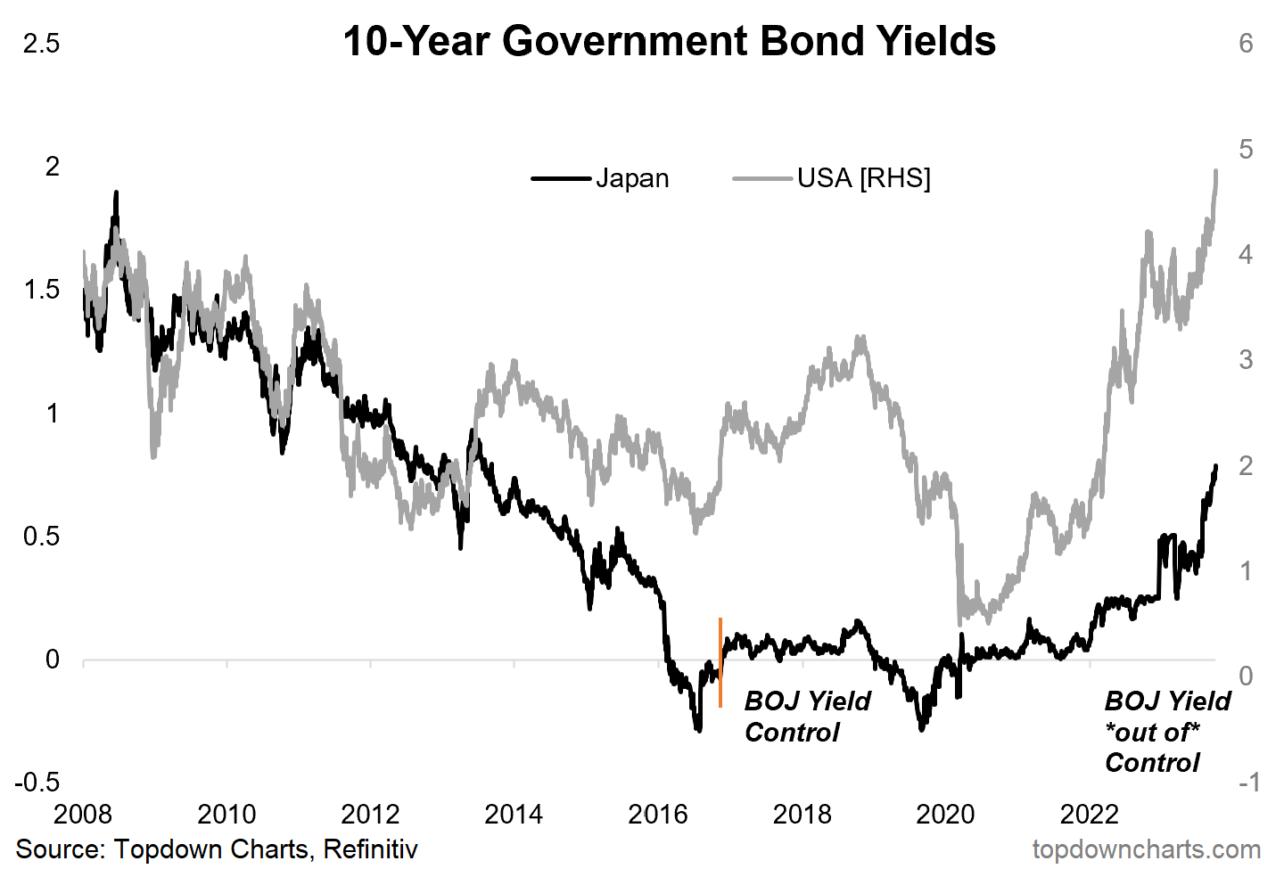
Rising real yields and JGB changes have been a key driver of the recent push higher in US treasury yields.
Lower demand from China/Fed have contributed to the bond bear.
Bond bear markets usually only end when a crisis occurs (bond bulls need to believe a crisis/recession and/or Fed pivot is on the way).
Bond yields are back to their 230-year average.
Overall, there’s plenty of reasons to explain in hindsight the recent push higher in yields, and currently the momentum is clearly one-way. Sentiment is also becoming increasingly consensus bearish on bonds and in some cases flamboyantly bearish (e.g. the 13% rant). The price adjustment has already been substantial (catastrophic), and bonds are looking cheap. So at some point it will make massive sense to buy bonds. But as highlighted in this week’s charts (and the previous bond chart-storm), you need to see: better technicals, change in macro tension from inflation risk to growth risk (crisis/recession), and change in Fed policy. Until then bond market beatings will continue until morale improves.
1. Deep Drawdown: A “wow-chart” to kick-off this session — turns out long-term treasuries are suffering a deeper peak-to-trough drawdown than what happened to stocks during the great financial crisis. I would note that this is price only, and the total return is slightly less bad (albeit only by 5 ppts). But still, simply catastrophic.
Source: @JackFarley96
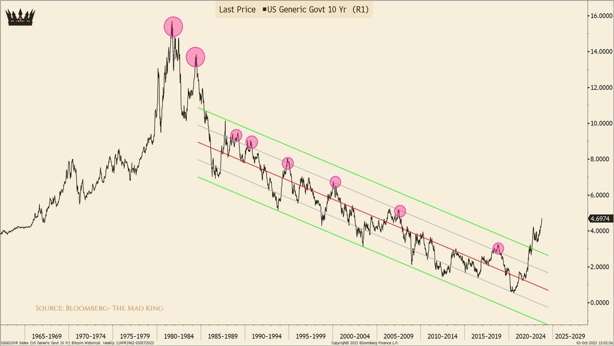
2. Broken Mental Models: The playbook of the past few decades during the secular bull market in bonds has been to just fade it when yields push higher. This trend has clearly come to an end.
n.b. just in case we might have any new people here, I do want to emphasize that elementary bond/finance math means if bond yields go up, bond price goes down (so moves higher in bond yields = bearish for bond prices).
Source: @TheKingCourt
3. Getting REAL: A big part of the most recent surge in bond yields (more than 150bps up off the April low) has been the breakout in real yields (inflation expectations are more or less unchanged). From a technical standpoint, this chart shows what looks like a solid breakout, and from a macro perspective… if this thing keeps going it is going to do some damage as real yields deeply effect the opportunity cost calculus of holding various other assets like gold and tech stocks, not to mention real world economic decisions.
Source:
@topdowncharts4. Turning Japanese: It’s not just the US, Japanese yields are also surging. I pick on Japan in particular with this chart as arguably the BOJ shift in policy has been a key catalyst to the global push higher in bond yields. And interestingly enough, given the BOJ changed its ceiling price for JGB 10yr yields to 1%, there is still upside room to move. I would also note, as I shared in a note at with clients the other day, Japan’s nominal GDP has broken out from basically a 2-decade range (driven yes by inflation, but also stimulus and the dividends from previous structural reforms) — in other words, this is a real move with real upside risk to global sovereign yields.
Source:
Topdown Charts5. Beijing Bond Buy Bye Bye: While it’s hard to precisely disentangle in this chart what might be outright selling vs just the downward shunt of market movements in mark-to-market valuations of US treasury holdings, one thing is clear… they are not buying, and certainly not the same relentless source of buying that they used to be. So the absence of foreign demand from buyers like China is one of a many factors at play in the rise and rise of US treasury yields.
Source: @TaviCosta
6. Fed Out: The other previous notable buyer of treasuries, the Fed, is also not only not buying, but outright running down their holdings of treasuries. Quantitative tightening is a headwind to bonds on the demand side, while fiscal profligacy means supply is as high as ever… ECON 101? (Demand down, Supply up = Price ____)
Source: @AlfredoJPinel
7. Out With Bang: Bond bear markets rarely end with a whimper, and most often with a bang. The bond market intimately effects all facets of macro and markets, so if bond yields go high enough fast enough, sooner or later something somewhere breaks. We saw this earlier this year with the regional bank blowup, and that crisis was quickly swept under the rug by the Fed… but what if something happens that is harder to fix? Basically, bond bulls beg for blow-up.
Source: @bcaresearch via @MichaelAArouet
8. It ain’t Over ‘til the Fed Says it’s Over: Bond bear markets are logically usually driven by Fed hiking (because cash rates directly and indirectly drive bond prices). Much in line with the previous chart, for the bond pain to end, the Fed needs to pause/pivot on rate hikes. Again, to be clear, to be bullish bonds — you need to expect some combination of crisis, recession, fed pivot to QE/rate cuts.
Source: @FrancoisTrahan
9. Expecting The End: Speaking of any potential eventual return lower in yields and end to bond bear market, the ZEW survey of economists has been increasingly shifting to the bond bull side… i.e. this group of people expect US long-term interest rates to head lower. over the past few decades, they have as a group had a reasonable track record — when the blue line turns sharply lower, the black line typically follows. At times this group have been very early e.g. the 2006-08 period, but never outright wrong. Will it be different this time?
Source:
Topdown Charts10. Maybe it’s Maybelline, Maybe it’s Mean Reversion: Last one, and maybe one for the higher for longer crew — maybe it’s all just been one big reversion to the LOOONG-term mean. Maybe the past couple of decades were actually the anomaly, and maybe the current price action is actually not abnormal but a return to normal.
Maybe we should rebrand “higher for longer” to “average for longer”…………
Source:
@UrbanKaoboyThanks for following, I appreciate your interest!
Looking for further insights? Check out my work at Topdown Charts


Great set of charts. Thanks.
One comment. 40 years of bull market for bonds (yes there were a few hiccups and also for equities) seems to have come to an end. While bond shorts are at extreme and we may get a short term correction, I somehow doubt we stay at the average for too long. Usually when the pendulum swings back, it doesn’t stop at the mid point.
Great nuggets as usual. That last point on us reframing away from higher for longer to accepting that this might just be us getting back to normal is not to be underestimated. Kind of makes me wonder (and scary thought at that) of what happens when something eventually breaks and the Fed Put is gone for real. I don’t think people are taking risks with that as part of the possible scenarios.