
Off-Topic ChartStorm - Fixed Income in Focus
This session: bond volatility, credit spreads, FX volatility, Japanese government bonds, treasuries, higher for longer risk, bonds return outlook, asset allocation issues...

Here’s a quick “Off-Topic ChartStorm” on Fixed Income markets.
Unlike the usual weekly ChartStorm (which focuses on the S&P500 and related issues), the Off-Topic ChartStorm is a semi-regular focus piece with topics spanning macro, markets, stocks, commodities, regions, and various other issues of interest.
Learnings and conclusions from this session:
Bond market volatility has dropped significantly.
FX volatility has also plunged (signals a macro stalemate).
Japanese government bond yields are in higher-for-longer mode.
US treasuries also face higher-for-longer risk (for longer).
Yet bonds retain (nuanced)value as diversifiers & downside dampeners.
Overall, there’s a good few charts worth noting in this session from a macro-market analysis standpoint (e.g. higher for longer risk; which impacts the outlook for both bonds and stocks; if it becomes disorderly), but also some important food for thought on the asset allocation front…
1. Bond Volatility: we’ve seen a major drop in bond market volatility (the MOVE index). This simply maps to the fact that realized volatility has dropped significantly (bonds haven’t really been doing all that much). But really what we are talking about here is the setting in of a major macro stalemate and consolidation.
The stalemate is basically a tension between competing macro risks e.g. recession and deflation (which would send yields lower) vs reacceleration and inflation resurgence (which would send yields higher). In absence of clear evidence either way, the bond market naturally has been locked into a stalemate.
But one thing you learn early on in financial market analysis is that stalemates don’t last + periods of low volatility are often good predictors of future higher volatility (and vice versa). The interesting thing is this not the only space we see this sort of setup developing…
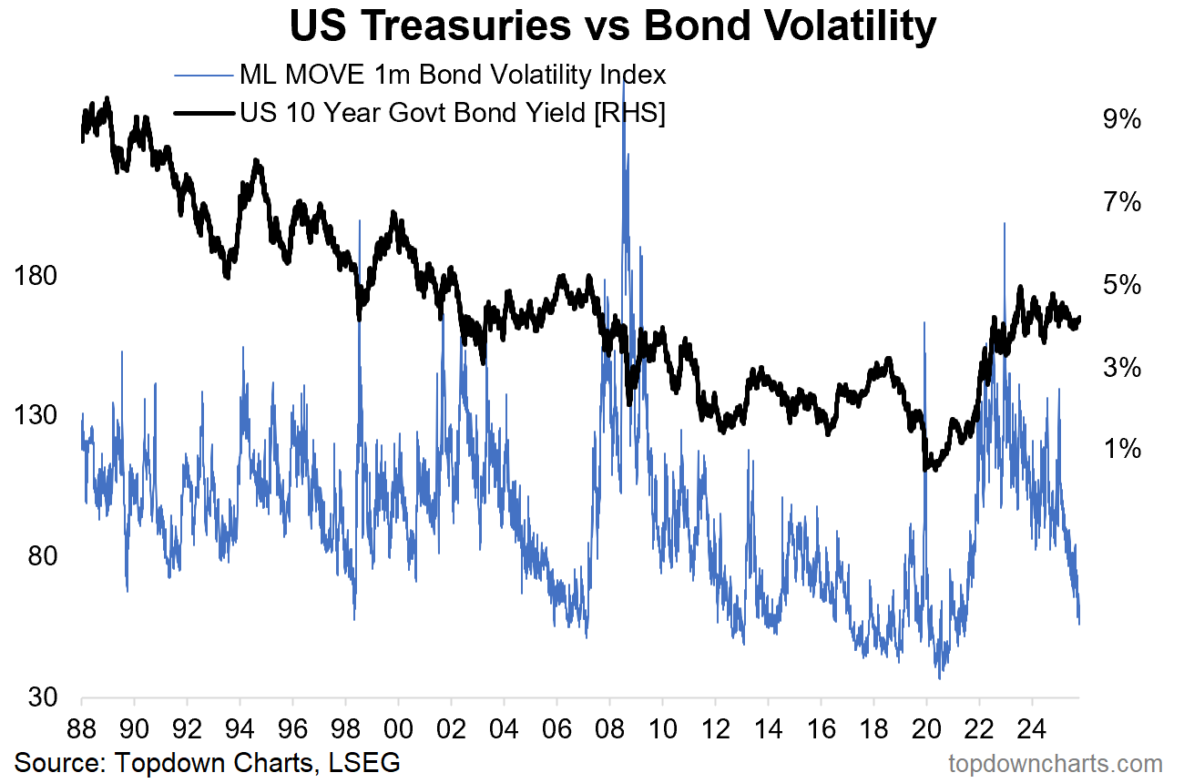
Source: Topdown Charts
2. Credit Spreads: globally credit spreads have likewise crunched down toward the lows. This is totally natural in absence of any new bad news, downturn, or crises, but it does show a market that is priced for continued calm.
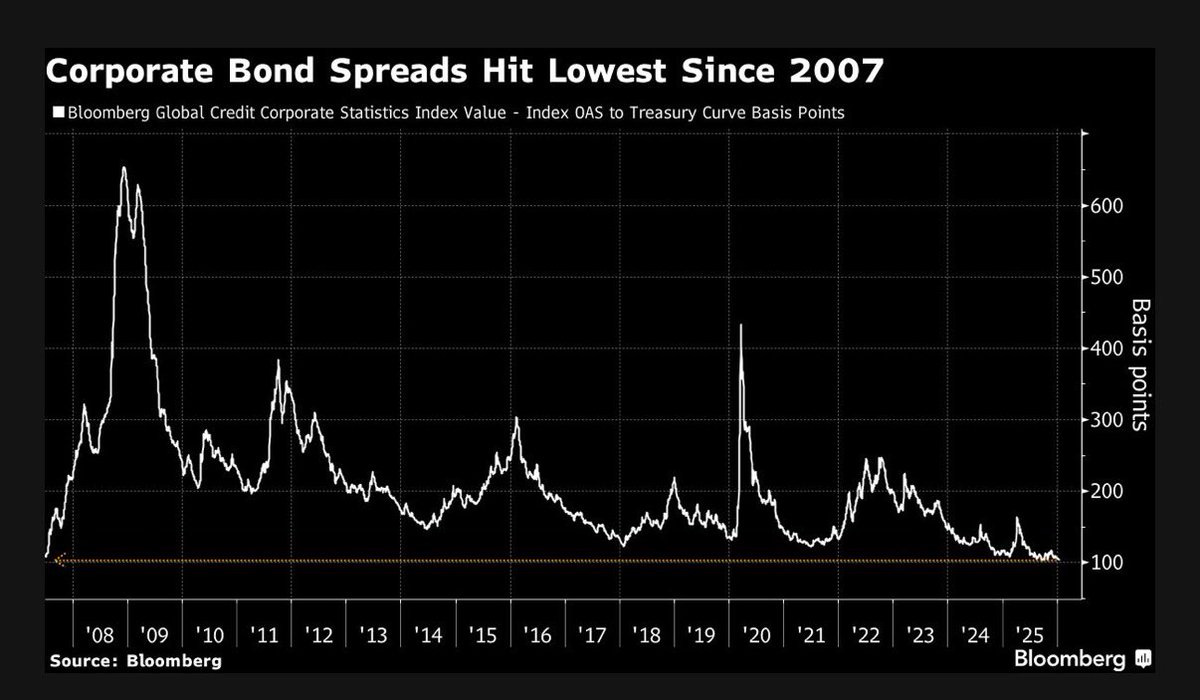
Source: @elerianm
3. EM Bonds: similarly, emerging market bond yield spreads vs treasuries have crunched down to decade+ lows as EM central banks have been cutting rates and macro/political conditions remain largely benign.
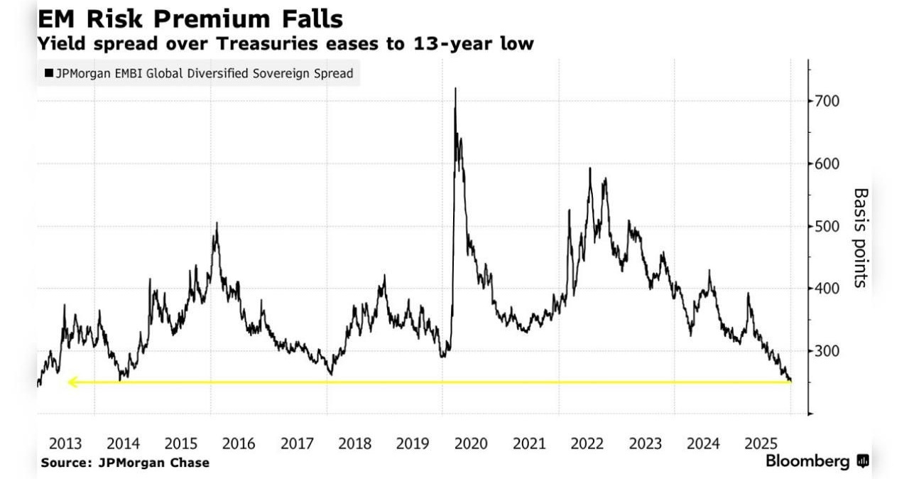
Source: Ryan Lemand
4. FX Volatility Too: average option implied volatility has crunched lower in FX markets too. Again, I would suggest this represents more of a momentary stalemate than anything, and in that respect it really is a calm-before-the-storm type of indicator (e.g. DXY has been locked in a tight range in lieu of a catalyst or clear directive on next steps). This too shall pass.
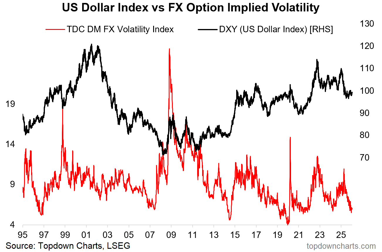
Source: Topdown Charts
5. BOJ Yield Curve (out of) Control: one area within the global bond markets that is -not- calm is Japanese government bonds. Bond yields are surging in Japan as the BOJ has taken it’s foot off of the market, and the macro winds in Japan steadily shift.
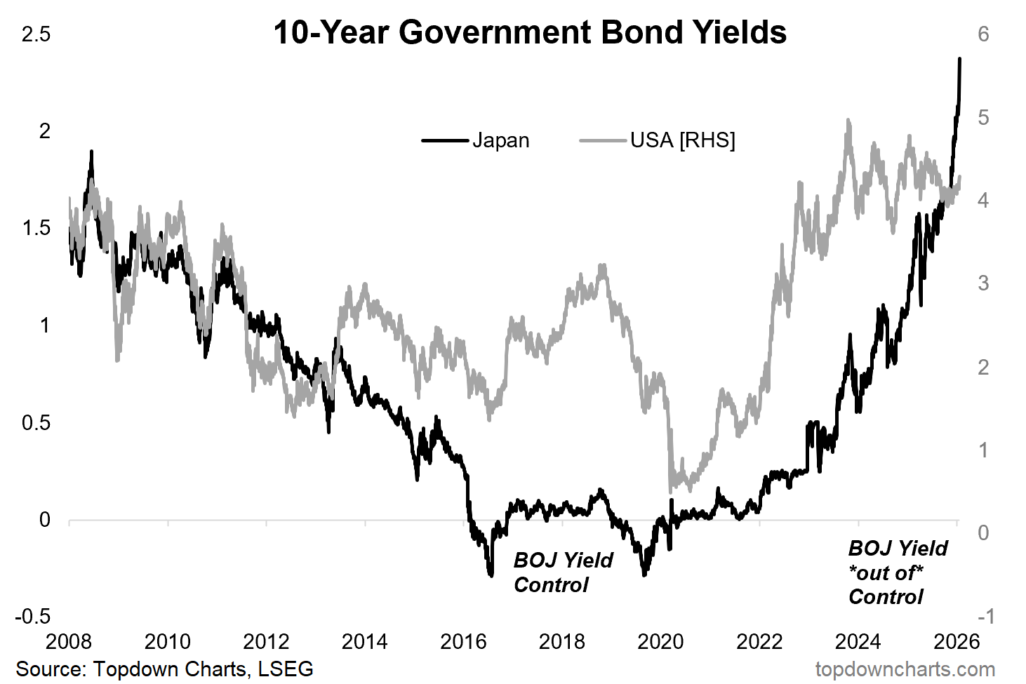
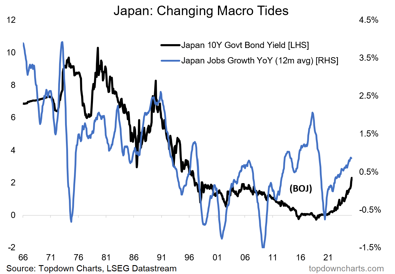
6. Japan’s Macro Tides: the thing is it’s not just about BOJ policy, it’s also a reflection of basically a macro breakout in Japan. They have shaken-off the stagnation and deflation of the previous couple-decades, and are now seeing a major upturn in nominal growth. This has meant great things for Japanese equities, but also means a reality of a new normal higher-for-longer dynamic playing out in the Japanese government bond market.
This has the potential to ripple into global markets due to the traditional importance and influence of Japan in carry trades (prospect of spillover into higher global yields, different FX market behavior than the past, and possible repatriation flows from carry-trade unwinds if domestic yields get attractive enough).
In other words, I don’t think we can look at Japan the same way we grew used to over the past couple of decades.
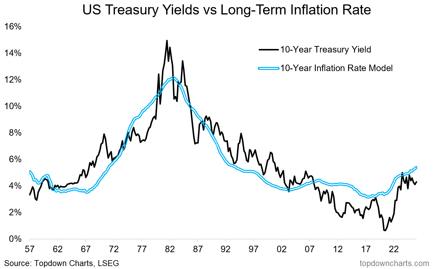
7. Higher for Longer risk: over to the USA, higher-for-longer risk is arguably also lingering longer, with the long-term rate of inflation still trending higher.
In practical terms, unless you get a recession and period of deflationary pressures to derail it, it’s likely we see bond yields tending to drift higher — and especially so if you get a growth rebound this year both globally and in the USA (with stimulus tailwinds hitting the sails this year).
To be clear, I think treasuries will perform well in a downturn and will serve a strong role as diversifiers and downturn-dampeners, but they are still at risk in an environment of stronger growth or rising commodity prices.
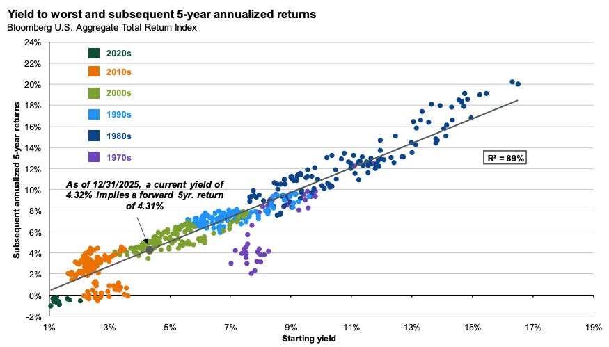
8. Low Yields, Low Returns: but one good thing about higher yields is the clear (and economically obvious point) that higher yields are a good predictor of higher future returns for bonds (albeit the journey to higher yields can be painful).
(also, n.b. on this one I would point out that while a 4% predicted return for bonds is not great in absolute terms… in certain environments you’d rather take a small positive than a big negative — which again goes to the point about the value of bonds in diversification and asset allocation)
Source: J.P. Morgan Asset Management via @TheIdeaFarm
9. Declining Duration: another interesting point to consider is average maturities have been steadily declining for key global bond benchmarks — as Torsten Slok at Apollo notes: “Governments are issuing more short‑dated paper to minimize debt‑servicing costs. As a result, the average maturity of the sovereign bond index is declining rapidly”.
This means the typical duration or interest rate sensitivity is also falling, which is a double-edged sword. Lower duration means smaller capital losses as rates rise, but also smaller capital gains when rates fall. And if you hold bonds for downside protection then you’d generally want longer-duration to maximize gains as bond yields decline —in order to help offset likely equity market declines in such a scenario (bond yields usually fall during deflationary recessions; which are bad for stocks).
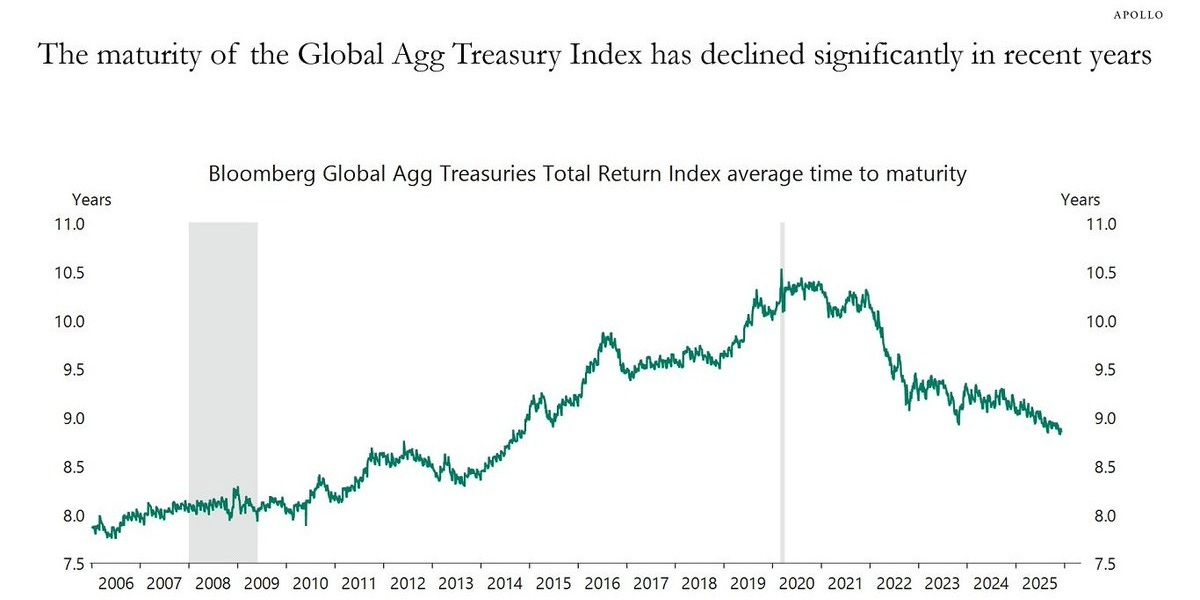
Source: Apollo via @MikeZaccardi
10. Decade-to-Date Returns: speaking of returns and asset allocation, here’s how some of the major asset classes are tracking so far in the 2020’s. Gold (+large/growth) is at the top, and bonds are at the bottom.
It makes you wonder how the rest of the decade will unfold… in 5 years time will this chart look the same, or opposite, or something entirely other?
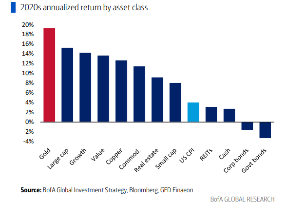
Source: @MikeZaccardi
Thanks for following, I appreciate your interest and support!
What did you think of this note?
As previously mentioned my intention is to put out semi-regular fixed income ChartStorms like this — feedback/suggestions are welcome (my thinking is I’ll vary it between deep dives into particular sub-asset classes when there are interesting risks/opportunities vs general insight-tours through fixed income markets).
—
Best wishes,
Callum Thomas
Founder & Editor of The Weekly ChartStorm
and Head of Research/Founder at Topdown Charts
Twitter/X: https://twitter.com/Callum_Thomas
LinkedIn: https://www.linkedin.com/in/callum-thomas-4990063/
Other services by Topdown Charts
Topdown Charts Professional —[institutional macro/multi-asset research]
Topdown Charts Entry-Level Service —[entry-level version of the above]
Weekly S&P 500 ChartStorm —[US Equities in focus]
Monthly Gold Market Pack —[Gold charts]
Perfect timing, 2d more and you could have covered the complete movement around JGB and USD/JPY.
Fantastic set of charts to keep the 2020s in perspective and with the layering in now of the geo risks and usd debasement, then hedging equity downsides with gold vs bonds has a whole new sense to it.