
Off-Topic ChartStorm - Emerging Markets
Weighing the prospect of a "large-scale multi-year run" for Emerging Markets...

Here’s a quick “Off-Topic ChartStorm” on Emerging Markets.
Unlike the usual weekly ChartStorm (which focuses on the S&P500 and related issues), the Off-Topic ChartStorm is a semi-regular focus piece with topics spanning macro, markets, stocks, commodities, regions, and various other issues of interest.
Learnings and conclusions from this session:
Technicals: EM is at a bullish inflection point.
Valuation: EM equity valuations are still cheap.
Positioning: investor allocations to EM are still historically low.
Macro: EM earnings are breaking out +strong monetary tailwinds.
Sentiment: some signs of complacency, increasingly bullish sentiment.
Overall, there’s a growing body of evidence to suggest that we are going through a major bullish inflection point for emerging market equities. The below set of charts looks at the key technical developments, macro-fundamentals, behavioral aspects, and weighs what could go right/wrong for EM equities from here…
ICYMI: check out the Weekly S&P500 ChartStorm — Best-of 2025 Edition.
1. Emerging Inflection Point: an inflection point is underway in emerging market equities. Skeptics will say that it’s just another false dawn. But pattern recognizers will highlight the tendency of EM to go on large-scale multi-year runs.
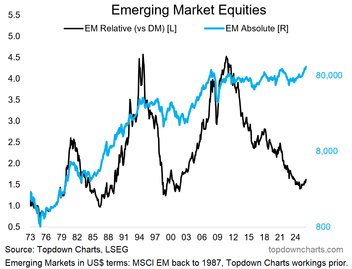
Source: 10 Charts to Watch in 2026
2. Big Beautiful Breakout: probably the most significant development in EM equities, at least from a technical analysis standpoint has been in an index that is not event publicly available.
The below chart is an equal-weighted index I’ve put together using EM country index returns in US$ and excluding China (although I would note the outlook for Chinese stocks is quite bullish). This is what you call a Brobdingnagian Breakout — a long period of ranging, consolidation, reform, resetting, base-building, and then a decisive breakout. Just look to the early-2000’s for how this type of breakout can unfold.
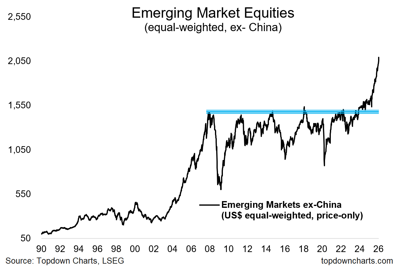
Source: My Best Charts of 2025
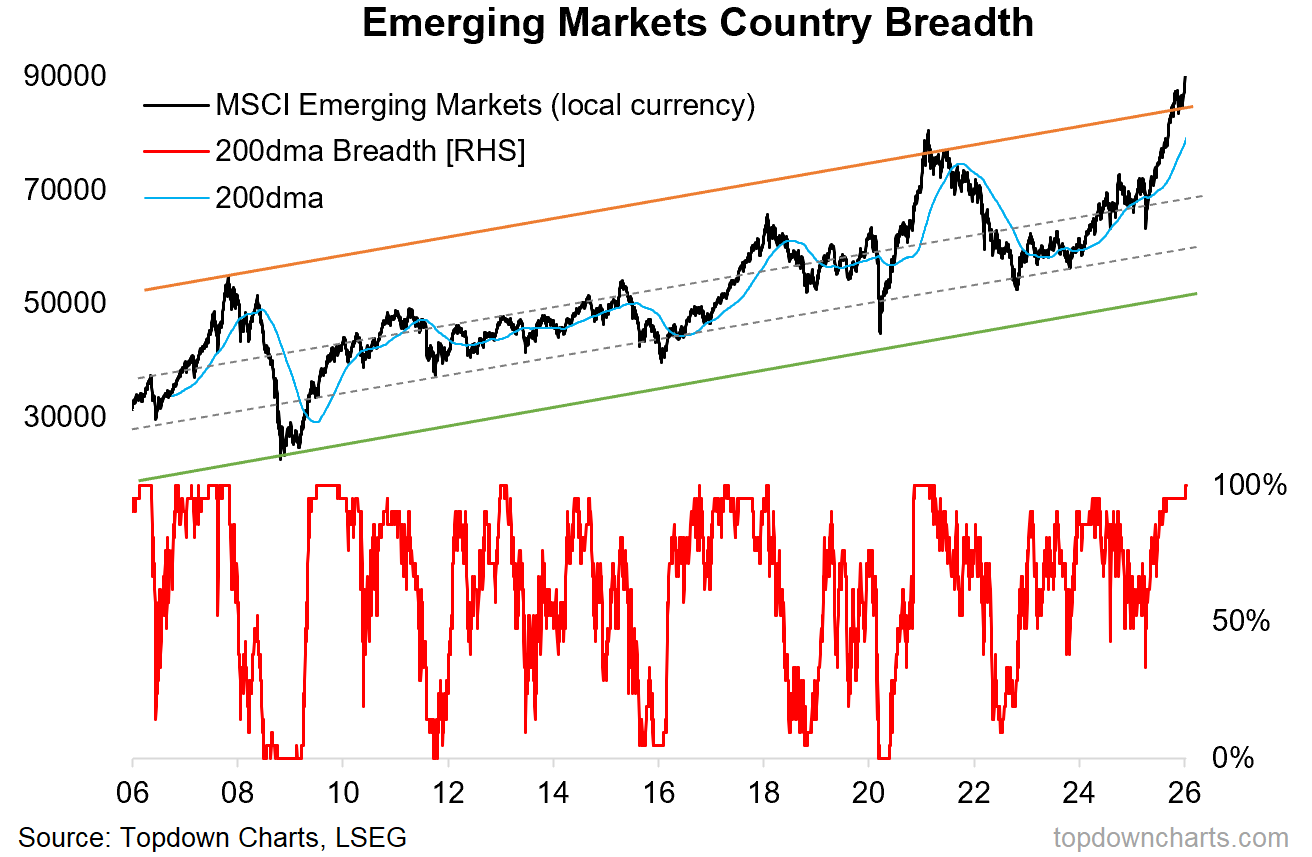
3. Broadening Participation: one of the most compelling things about the chart above is that it’s equal-weighted, so it’s not unduly driven by a single large country. Then add to that the country breadth chart below, which is showing the majority of EM local stock indexes running above their 200-day moving averages (i.e. uptrend) and a breakout of trend-channel for the MSCI EM index.
The technicals are very compelling.
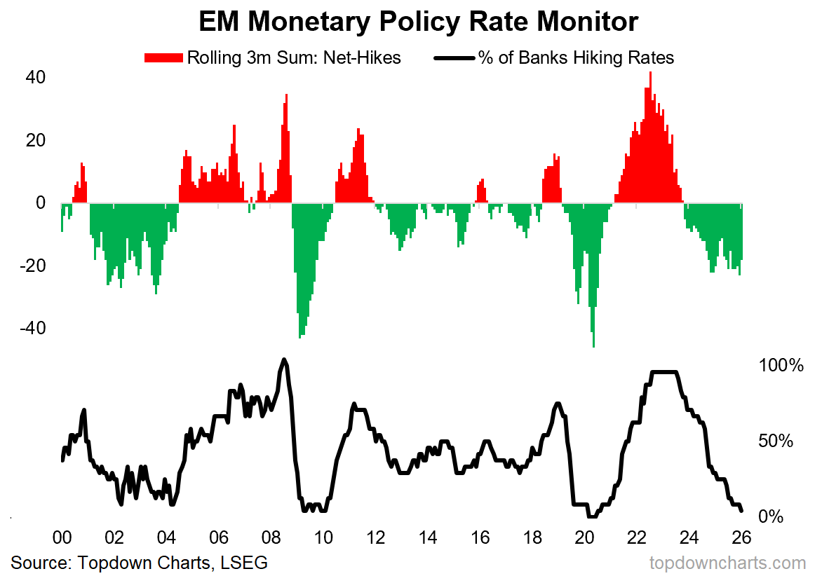
4. Policy Tailwinds: but then you have to ask, what’s behind the technical developments, and is it sustainable? One key cyclical force in play is the big pivot to easing in emerging markets. We are seeing increasing monetary tailwinds in force here (which also include a transition from bull to bear market in the US dollar, and generally buoyant funding conditions).
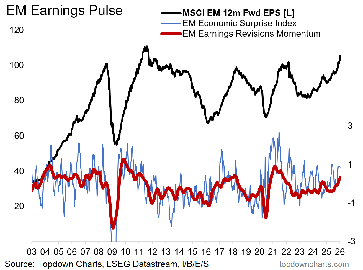
5. Earnings Breakout: another key development on the macro/fundamentals side of things is a clear upturn in the earnings pulse for emerging markets. The consensus 12-months forward earnings estimate for the MSCI Emerging Markets Index (black line below) is basically breaking out as well.
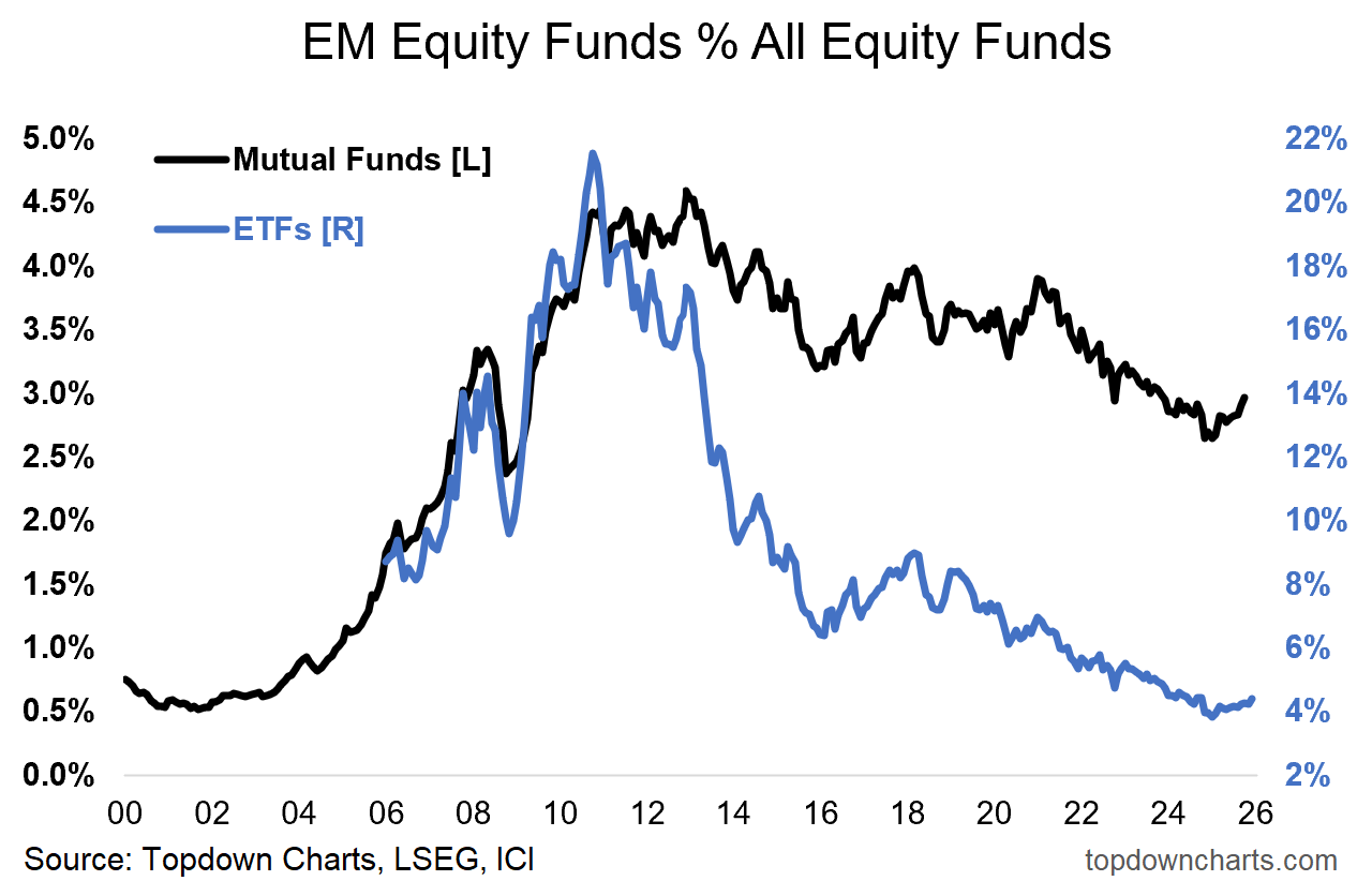
6. Light Allocations: meanwhile investors are still running historically light allocations to EM equity funds. Plenty of room to run here.
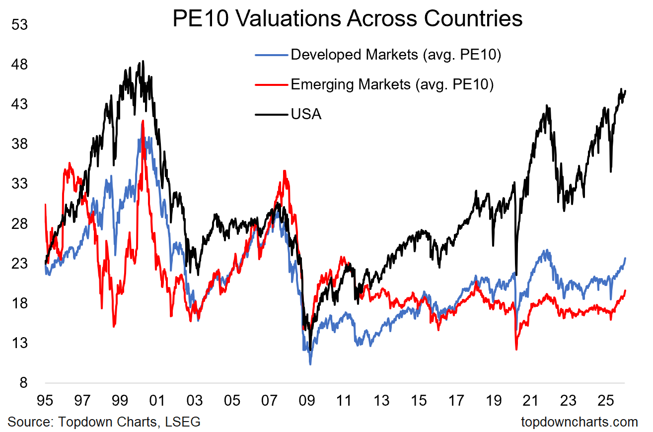
7. Cheap Valuations: and valuations are still at the low end of the historical range (+ are also tracking below developed markets, and well below US valuations).
So it’s a case of undervalued, underallocated, and underappreciated upside as the macro-fundamentals undergo compelling improvement.
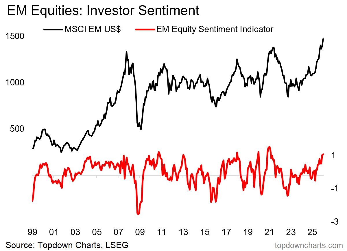
8. Bullish Sentiment: yet, sentiment is starting to get elevated. And there is the curse of the consensus —people are starting to get increasingly bullish on emerging markets: this is precisely the kind of false-dawn dynamics that have played out a number of times over the past decade.
But with the breakouts, tailwinds, and genuine macro-fundamental improvement that we have seen, I have greater confidence that this is a genuine transition out of range-trading and into a new uptrend and bull market for EM equities —— and it’s entirely normal to see sentiment turn bullish; and sometimes extremely bullish during a trend change like this.
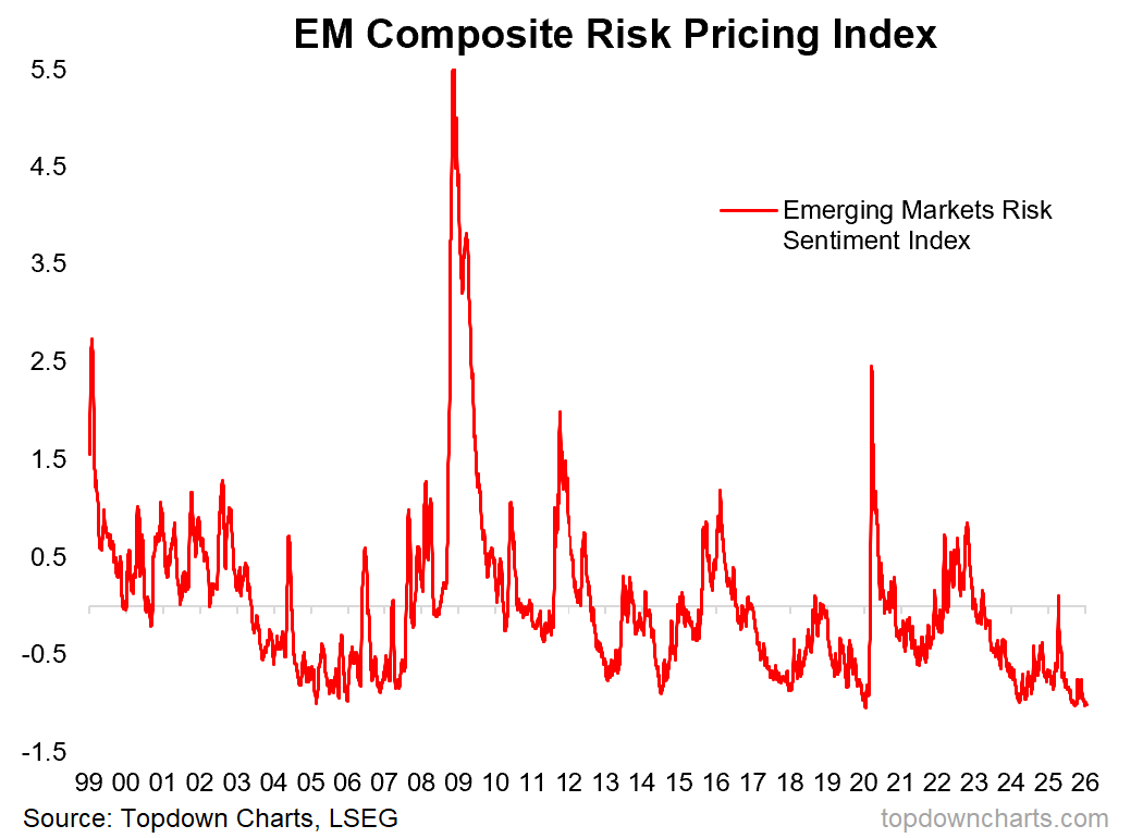
9. Confidence vs Complacency? one complicating chart is the composite risk pricing sentiment index below (tracks equity volatility, sovereign CDS pricing, currency volatility, and credit spreads). The good thing is that it represents confidence and calm, which is helpful in keeping financial conditions supportive, macro/earnings momentum strong, and reinforcing the uptrend in stocks.
But it can also represent complacency at these sort of levels (and hence constitute a contrarian bearish signal). To that end, probably the key risks for emerging markets would be: USD resurgence (USD is currently in a bear market, which is supportive for EM), geopolitics (currently a mixed bag), global recession (currently there is evidence for the opposite; I expect global growth reacceleration).
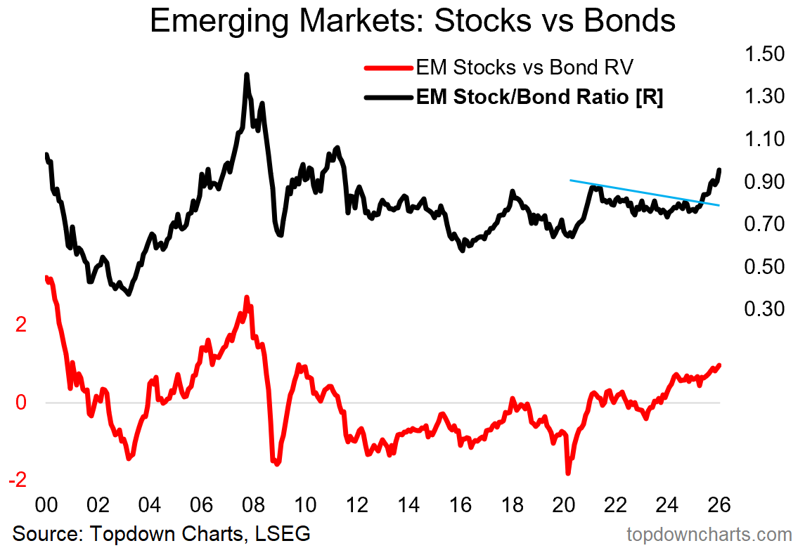
10. EM Stock/Bond Ratio: lastly, I also wanted to highlight how the EM stocks vs bonds ratio has also broken out — this is a key development on the bullish side as the last two big false-dawns in EM equities did -not- feature a breakout here.
So while there are a few credible downside risks, and some signs of excess optimism or complacency appearing, I’d say the balance of evidence points to the upside for emerging markets. In other words, yes: this probably is the big inflection point we’ve all been waiting for. Bullish emerging markets.
Source: Topdown Charts Professional
If you found this post interesting/useful, please share it on social media or forward it to a friend or colleague — also be sure to check out my post: Commodities “Off-Topic ChartStorm” from a couple of weeks ago (very similar dynamics underway in that space too).
Off-Topic ChartStorm - Commodities

By popular request, here’s a quick “Off-Topic ChartStorm” on Commodities.
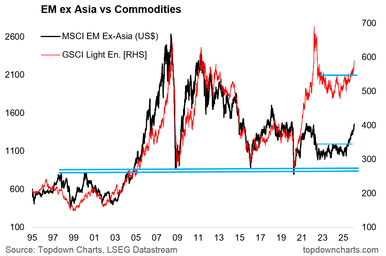
Bonus Chart — EM & Commodities “Confirmation”
On the topic of Commodities, we’ve seen a breakout in the more commodity-sensitive Emerging Markets ex-Asia along with the breakout in commodity prices. These two themes (emerging markets and commodities) are closely interlinked, and so it’s a very good sign to see the cross-confirmation in this chart.
Thanks for your interest & support.
—
Best wishes,
Callum Thomas
Founder & Editor of The Weekly ChartStorm
and Head of Research at Topdown Charts
Twitter/X: https://twitter.com/Callum_Thomas
LinkedIn: https://www.linkedin.com/in/callum-thomas-4990063/
Other services by Topdown Charts
Topdown Charts Professional —[institutional macro/multi-asset research]
Topdown Charts Entry-Level Service —[entry-level version of the above]
Weekly S&P 500 ChartStorm —[US Equities in focus]
Monthly Gold Market Pack —[Gold charts]
p.s. I had a question offline on what I think about EM fixed income... I like EM sovereign (USD + local cxcy) because cheap valuations, sentiment turning up, decent yields. Like the stocks better than the bonds, but the bonds definitely interesting.
Might cover this next week a bit more in my scheduled/intended semi-regular Off-Topic ChartStorm on fixed income
Like your “ Off Topic Chartstorm “ offerings!! The last two have been very timely for me. Please continue!!