ChartStorm - Perspectives Pack
Our Biggest Report yet: an in-depth look at the US Stockmarket featuring perspectives on price, fundamentals, valuations, styles, sectors, global, asset allocation + market curiosities...
This report takes you on a journey through markets and offers timeless principles, historical cautionaries, and practical takeaways for investors — with a charts + data-driven look at the biggest risks and opportunities in the coming years.
The online version is presented below, alternatively the pdf slide pack is available as a free download for your convenience. Please also be sure to subscribe for regular updates if you have not yet. Questions and comments are welcome.
ChartStorm: Perspectives Pack — Contents
Price: stock prices in perspective (return drivers, trends, path)
Earnings: the driver of stock prices (earnings drivers, profitability trends)
Valuations: navigating the cycle (what to look at, what moves markets)
Sectors & Styles: cycles of winners and losers (risks, opportunities)
Global Stocks: winners and losers across the world (+impending shifts)
Asset Allocation: stocks vs bonds (long vs short term, smart diversification)
Curiosities: selected issues and charts on market trends, upcoming changes.
1. Price
Studying the path of the stock market through history…
Price in Perspective: “over the long-run stock prices go up...” But there’s a bit more to it than this boilerplate line that’s often parroted out. The next few charts give the full picture both in terms of the case for long-term optimism, but also in navigating the sometimes treacherous journey.
Long Waits and Deep Holes: These two charts tell you about the actual path. Setting aside the extreme outlier of the 1930’s, as an index investor you will definitely see numerous 10-20% drawdowns on your path, and most likely at least one -40% downturn during your lifetime. And sometimes you will need to wait years before the market makes a new high.
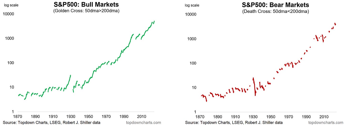
Mostly Bulls, Mostly: Using a loose proxy for bull vs bear markets as “gold/death crosses” (defined by when the 50-day moving average moves above/below the 200-day moving average), we can see however that bull markets are way more common than bear markets. But there are ways to help minimize exposure to bear markets and maximize upside capture in bull markets (see valuations section).
Total Returns: Meanwhile, switching focus – factoring in the impact of dividends (and reinvesting those dividends), the picture is a little smoother, and a lot higher. This ignores the impact of any fees, taxes, and other expenses, but it shows the raw impact of long-term compounding and the capacity of Stockmarket returns in beating inflation over the long-run (Real Returns).
The Real Story on Total Returns: Even including the impact of dividends though, you are still going to be subject to longer-term market cycles. Total returns can be broken down into dividend yield + earnings growth + change in valuation. The business cycle and structural changes will greatly impact earnings growth, while the market cycle will swing the valuations component back and forth.
The Long-Term = Many Short-Terms: Over the longer-term earnings trump valuation changes most of the time, but in the shorter-term there are plenty of examples where earnings either detracted in the short-term or were swamped by valuation changes. Gauging the earnings component hinges upon understanding the macroeconomic outlook, while changes in valuation relies partly on reading the market tides, and especially on being valuation-aware (starting point valuations matter!).
Price — Reflections…
Long-Term Optimism: The US post-war Stockmarket experience is one of mostly bull markets.
Path Realism: The path however featured cycles, drawdowns, and bear markets.
Total Returns = dividend yield + earnings growth + valuation change.
Compounding: Dividend reinvestment sees greater long-term wealth growth.
Beating Inflation: Over the long-run stocks beat inflation (but again, the path is not smooth).
Overall, my take on this section is that yes the US experience since 1950 (and even going back earlier in history) is that stock prices go up over the long-run. But history also implores us to acknowledge that the path is not smooth (and to have a plan/psychology to deal with that).
2. Earnings
Studying the path of earnings and profitability through history…
Earned: Over the long-run the trend in earnings has been mostly up in the post-war period – albeit with due volatility around the economic cycle. Dividends meanwhile enjoy a smoother, but not entirely straight line. The tendency for stock prices to go up over the long-run is entirely dependent on these two charts, and everything else is short-term volatility and variation around the trend.
Stating the Obvious: Earnings growth mostly comes from growing revenues faster than expenses, rarely from cutting costs (n.b. there are 2 episodes in the past 40 years where cost cutting resulted in outright drops in expenses). Operating expenses are the main component of expenses, and although tax, interest, depreciation and amortization are small by comparison, they can still greatly impact net profits.
Mind Your Margins: The other way to think about it is how much of the top line makes it to the bottom line i.e. profit margins. Over time profit margins have drifted higher thanks to tech stocks. But even ex-tech margins have drifted higher in recent decades – perhaps helped in part by tech driving efficiency gains but also lower interest rates and falling tax rates. In the short-run however, profit margins at the index level are highly cyclical and mostly influenced by revenue growth.
DuPont Breakdown: Aside from earnings and profit margins, we should also care about profitability as measured by the return on equity. The classic DuPont RoE Breakdown shows the flow of Profit Margins x Asset Turnover ratio to get to Return on Assets, and then bringing in use of debt (equity multiplier) to turn that into the Return on Equity. You can see how changes in these drivers impact RoE across USA/Emerging/Developed.
The Only Certainties in Life: Over the past 40-years US corporate net profits have seen tailwinds from falling effective tax rates and the secular decline in interest rates. These trends however are both coming to an end. This will mean companies will need to work harder on innovation, revenue, and cost control to defend let alone expand margins.
Earnings — Reflections…
Long-Term Optimism: The story of rising stock prices is ultimately one of rising earnings.
Earnings Growth: Depends mostly on growing revenues faster than expenses.
Expenses: Are mostly comprise of operating costs, but the other smaller stuff still matters.
Interest and Taxes: The trend of historical tailwinds from falling rates is coming to an end.
Leading the World: US stocks have shown superior profitability in recent years.
Overall, it’s important to acknowledge that the long-term growth in stock prices has really been an echo or mirror image of rising earnings. Understanding the drivers of earnings growth brings in important context in detecting what may further underpin or threaten future earnings growth.
3. Valuations
Navigating the path…
Navigating Market Cycles: Thinking back to the total return breakdown, in simple terms one way to avoid valuation changes being a detractor to returns is by reducing exposure to equities when the market is expensive [and increasing exposure when the market is cheap]. See below for a simple (vs nuanced) diagram of this. Think of it less as timing and more of an exercise in path management.
Long-Term View: The widely referenced CAPE ratio (Cyclically Adjusted PE) is a useful starting point with several historical instances of obvious extremes in either direction, but there have also been changes in ranges. One way to navigate that is to bring in other indicators, e.g. my price-based value indicator (mean/trend reversion), and use more puzzle pieces to build a clearer picture.
It’s all Relative: Another way to generate useful signals is by bringing in key macro-financial information such a bond yields and interest rates. On both these charts the logic is simple – stay invested when equities are offering a higher premium over risk-free rates, reduce exposure or take greater care on risk management when risk-free alternatives provide a better yield than stocks. Also think in terms of “smart diversification” (see the asset allocation section).
Historical Perspectives on Yields: The dividend yield on offer from the US Stockmarket has varied over time, spiking during market downturns (math: lower prices = higher yields), and trending lower as index composition changes and corporate finance practices shift (in recent decades buybacks have become a major way to return capital to shareholders). But also worth noting is the level and trend of bond yields has been an important factor in the path of prices in recent decades.
People and Positioning: Valuations in the aggregate are the product of individual investor decisions, therefore valuations are essentially a confidence indicator (higher valuations mean higher confidence in the present and future earnings/growth). But we can also see how opportunity cost impacted investor allocations and therefore valuations over time. When interest rates went up significantly, people moved into cash/bonds, when rates went down they moved into stocks. So valuations are as much a tool for navigating cycles in crowd psychology as navigating macro-financial cycles and trends.
Valuations — Reflections…
Cycles vs Trends: The long-term trend treads a path of cycles in the short-term.
Path Management: Valuation indicators help in managing the path, navigating the cycle.
Absolutes: Market states of Cheap vs Expensive require the context of history to be known.
Interest Rates: Macro-financial data also matters in making judgements about the market.
People: Valuations are the product of individual decisions (confidence gauge, opportunity costs).
Overall, valuations are a vital tool for navigating cycles and paths for even the longest-term minded investors. History shows us there is ample and sometimes obvious information there to help us on our way if we are willing and able to look for it. The current cycle is extended/at-risk.
4. Sectors & Styles
The Stockmarket is a market of stocks…
Not Created Equal: The first clue in why this section is worth thinking about is in the unequal path of the S&P 500 in equal-weighted (each stock gets a vote) vs market-cap weighted terms (the biggest have the biggest say). Over the long-run equal-weight has beat cap-weight, but there have been significant punctuations and cycles around that trend that echo important sector themes.
Returns and Rankings: There are clear winners and losers across the years. Most notably, winners rarely stay winners for long, losers rarely lose for long, and they often switch places! Sectors matter.
The Cheapest are Cheaper than Usual vs Expensive: Seeing the market through the lens of the cheapest stocks reveals a clear cycle in relative total returns, entirely different from the usual upward sloping lines. Clues to the peaks and troughs in price are found in the extremes of relative valuations. And as of mid-2024, it sure looks like a trough in that long-term cycle. One point to note is sector skews: growth is heavily skewed into tech, value is skewed into defensives and old cyclicals.
Small vs Large: The past 5 years have seen significant underperformance by Small cap stocks vs Large cap stocks. A big reason for this is the rise and rise of Big Tech and sector skews. But the key standout to me is the generational low point in small cap vs large cap relative valuations. It may take some time to turn the corner, but history is on the side of the small.
Smaller Smalls: Similarly, the market capitalization weight of the S&P 600 small cap index in the S&P 1500 universe has dropped to the low end of the historical range. Meanwhile not only are small caps cheap vs large caps, on a price to trailing average 10-year earnings basis the S&P 600 looks cheap vs recent years (and large caps look outright expensive).
Sector Skews Say it All: In recent years large caps have become increasingly concentrated in tech, while small caps are heavily skewed to cyclicals (AND a lower weight to defensives). This means small caps *should* lag behind in a Big-Tech Bull-Market, but by contrast small caps should outperform in a traditional cyclical upturn featuring increased investment and real activity.
Index Skews and Dispersion: The current market cap skews in the index basically mean you are making big sector calls even if you are just index/passive investing, so you better understand those sectors! Second, the average correlation of returns across sectors is around 0.5 – and much lower at times where macro factors take over. Also, the gap between best/worst sectors is often large.
Tech — Different This Time: The dot com bubble was an entirely different beast than today, the rise in tech stocks was much sharper, frenzied, and resulted in valuation extremes that broke records. But as things stand in mid-2024 tech stocks are in the danger zone. Valuations are extremely expensive no matter which way you look at it, and the crowd is all-in. Tech stocks are priced for perfection and perpetual exponential earnings growth. The good news is in the price, and then some: we are now standing on risky ground.
All About US Big Tech: This time is also different because of the degree to which global investors have crowded into US tech stocks. US tech stocks have outperformed global some 4x off the low point in 2008, and now trade at a 2-3x premium vs global. Again, this trend will eventually end, and it will either end in a whimper with a new higher range, a quiet retreat as earnings simply meet exponential expectations …or with a bang should this extreme confidence be disappointed against.
Defensives — Consumer Staples, Healthcare, Utilities: This basket of sectors make up the defensives category because they typically outperform the index during bear markets and corrections. They can help dampen volatility during downturns, as well as yielding contrarian insights into timing market peaks and troughs (e.g. the relative value indicator shows up cheap around market peaks, and expensive at market troughs – compare and contrast the 2000 peak vs 2009 trough).
Financials — a Case Study for Tech? There is a lot to say about financials, but one point to ponder is that in the 1980’s when banks were hot; extreme expensive vs the rest of the market (like tech today) – it would have been unthinkable at the time that they could go on to drastically underperform and ultimately succumb to the savings and loan crisis. And that’s the thing with valuations, they tell us about risks and probabilities but they will not tell us the future story or narrative – that only becomes obvious in hindsight (key lesson for today as folk remain focused on recent trends).
Relative Value in Energy: The energy sector has lagged behind vs the rest of the market and deviated from its usual path set by oil prices. Similar to financials and defensives, the cheap relative value situation is as much a statement about expensive tech stocks as anything else. Energy stocks are trading in-line with long-term valuations, but are cheap vs the market. Longer-term we probably do move away from fossil fuels, and in some ways that has already been reflected in the (relative) price.
Interesting Properties: REITs have undergone major boom-bust cycles of relative performance vs the index, at once mirroring boom-bust cycles in the property and banking sector, but also tech bubble in 2000 (and the current bubble-like conditions in tech). Currently REIT valuations are in-line vs history on an absolute basis, while cheap vs the rest of the Stockmarket, and expensive vs fixed income as bond yields went from tailwind to headwind for this yield-focused sector.
Sectors & Styles — Reflections…
Not Equal: Long-term the equal-weighted index beats the cap-weighted (but with clear cycles).
Sector/Style Returns: Every sector/style eventually has its day in the sun (best vs worst returns).
Sector Things: The opportunities in Small vs Large and Value vs Growth are basically sector bets.
Big Tech: Tech sector valuations have reached extreme expensive levels (vs history/market/global).
Defensives: Have reached the third cheapest level in history vs the index (contrarian signal/hedge).
Overall, history shows sometimes wild gyrations in relative and absolute performance across sectors and styles. Paying attention to this and valuation signals across sectors/styles can therefore be useful in both understanding the risk outlook as well as uncovering opportunities.
5. Global
Studying cycles of risk and return outside of the USA…
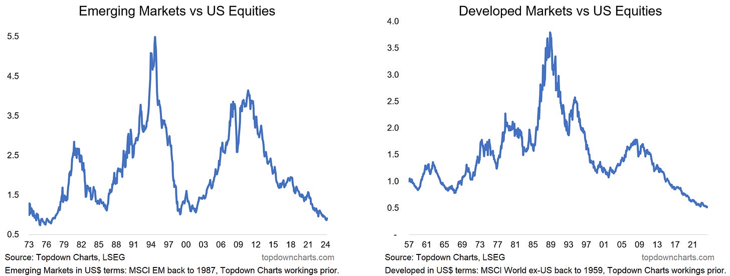
Long-Term Cycles: If you only looked at the past decade you might wonder why bother with global equities when the US has been the place to be… but a longer-term perspective shows the apparent tendency for cycles of relative performance across emerging and developed market equities. On both counts you might argue we are due for a turn, and maybe we are, but it is worth noting that these ships have taken a long time to turn in the past and we need to look at the bigger picture.
Cross Country: The previous slide might have led you to think that it’s only a one way street where the US always wins, but a scan across annual returns over the major buckets/countries/regions of global equities shows a similar picture as in sectors. Winners and losers do see streaks, but again, they more often switch places, and eventually just about every market has its day(year!) in the sun.
This by itself is probably the most compelling piece of evidence in the case for diversification into global stocks, but ideally “smart diversification” given the clear tendency for twists and turns.
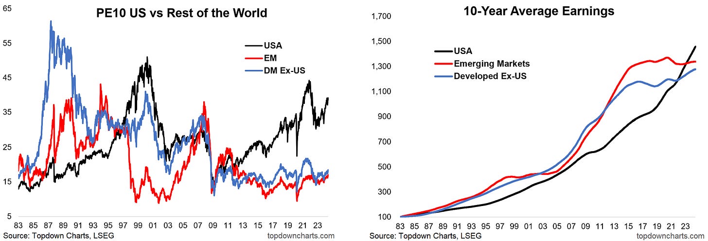
Cheap and Cheaper: The post-2009 period has really been an exceptional time in global equities, it saw a now almost 15-year period of US outperformance, and a long-standing + widening valuation gap (global ex-US is cheap outright, cheap vs US, and US is expensive). This speaks to the crowding into US big tech stocks, but also to the opportunities here (keeping in mind the previous page).
In The Price: Continuing, the US looks expensive vs history, and Emerging + Developed look cheap. A big reason for this is the trend in earnings. Emerging + Developed have seen earnings plateau over the past decade vs US traveling a pretty much exponential path. It is precisely these type of fundamental trends that drive changes in valuations and create these opportunities in the first place. In other words, those who want the highest growth typically end up (over)paying for it.
Cycles in Earnings: Ultimately in the long run earnings drive stock prices (up or down). So it should come as no surprise to see that the cycles and trends in relative price performance are echoed and reinforced by cycles and trends in relative earnings performance. For the trend in price to change sustainably, the trend in earnings needs to also change.
Catalysts — Sectors and Dollars: Global vs US has been a value trap for the past ~decade. Aside from changes in earnings performance, sectors will likely have a key impact given global has basically twice the exposure to traditional cyclicals (while the US has almost twice the exposure to tech). Macro trends that favour cyclicals will favour global. Meanwhile the US dollar has a direct and indirect influence on global vs US stocks (a weak dollar boosts global asset returns (and flows), a weak dollar often reflects strong global vs softer US macro, a weaker dollar tends to ease global financial conditions).
Past =/= Future: Comparing past 5yr total returns vs 5yr future projections (based on dividend yield, expected growth, expected valuation change) the strongest is set to see the weakest returns, while the weaker ones inf the past are projected to see the strongest future returns. This is largely a quantitative exercise – the possible explanation/story/narrative likely only becomes obvious in hindsight and may not yet be knowable to us, but the starting conditions are observable facts.
Global vs US — Reflections…
Global vs US Bear Market: Global has gone through a ~15-year relative bear market vs USA.
Countries and Groups: There has been significant variation in returns across countries over time.
Global is Cheap: Global stocks are cheap vs history and cheap vs (expensive)US stocks.
Value Trapped: Global vs US has been a value trap, but there are clues/signs to watch for a turn.
Forward Projections: Some of the past worst performers may become tomorrow’s best performers.
Overall, it is very clear that there is scope for (smart)diversification globally and across countries. Much like with sectors, just about every country/region/group index has its day in the sun as the top performer. There is also a tendency for persistence and cyclicality in returns across countries.
6. Asset Allocation
Thinking further about opportunity cost and path…
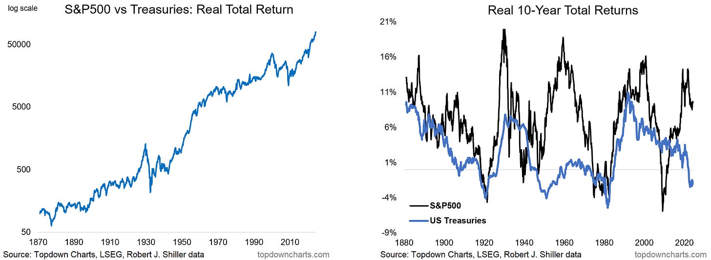
Over the Long-Term Stocks Beat Bonds: Including dividends and interest, stocks beat bonds over the long run, but the path has been treacherous – at times almost a vertical line, at others nearly horizontal, and sometimes taking a decade+ between new highs. So the answer simply can not be to own stocks, only stocks, and never bonds: there is scope for return boosting and path smoothing.
Over the Short-Term Bonds are a Diversifier: While stocks beat bonds on average (63% of years), bonds beat stocks 98% of the time when stocks went down [n.b. the left hand side of the line in the scatter plot is when bonds beat stocks] – so bonds serve an important diversification role, but again, we want to do smart diversification: to raise exposure when bonds are cheap (+stocks expensive).
Bond Market Valuations: In the valuations section we saw how extremes in Stockmarket valuation indicators can help flag peaks and troughs in the Stockmarket, which can help investors recognize periods of increased downside vs upside risk. The same is true in the bond market, and as you might expect, the bond market is often cheap when the Stockmarket is expensive, and vice versa (albeit there are exceptions e.g. 2021 when both were expensive ( –just before both fell in 2022!)).
Smart Diversification: Unlike set-and-forget diversification, smart diversification involves looking at the real-time risks vs opportunities and “raising diversification” when it makes more sense. For example, when stocks are expensive vs bonds (and bonds outright cheap), and then cycle signals are turning, it makes sense to increase exposure to bonds as a diversifier. Meanwhile when stocks are cheap (+cheap vs bonds), it makes sense to hold more stocks, less bonds (less need for diversifiers).
Asset Allocation — Reflections…
Long-Term: Stocks beat bonds most of the time, and over the long-run outperformed notably.
Short-Term: (however) Year-to-year there is substantial variation in stock vs bond returns.
Diversification: Bonds almost always beat stocks when stocks go down.
Bond Value: Bond market valuation indicators help detect risks and opportunities for bonds.
Smart Diversification: Involves leaning harder into diversification when relative value is attractive.
Overall, while stocks beat bonds over the long-run, the path is far from smooth, and there are times (e.g. now) when capital can be protected and returns boosted by understanding the risk vs opportunity outlook for both the stock market and the bond market (and relative to each other).
7. Curiosities
What else is interesting…
Dumb vs Smart Diversification: Speaking of smart diversification, back in 2021 it was the opposite – the 60/40 portfolio was simply a combination of poor risks – both stocks and bonds were showing up as expensive, so neither were good nor could be expected to diversify in the sense of providing a positive return to offset a negative return. Commodities filled that role, and were showing up as cheap in 2021. So sometimes it requires creative alternatives, and always requires thoughtfulness.
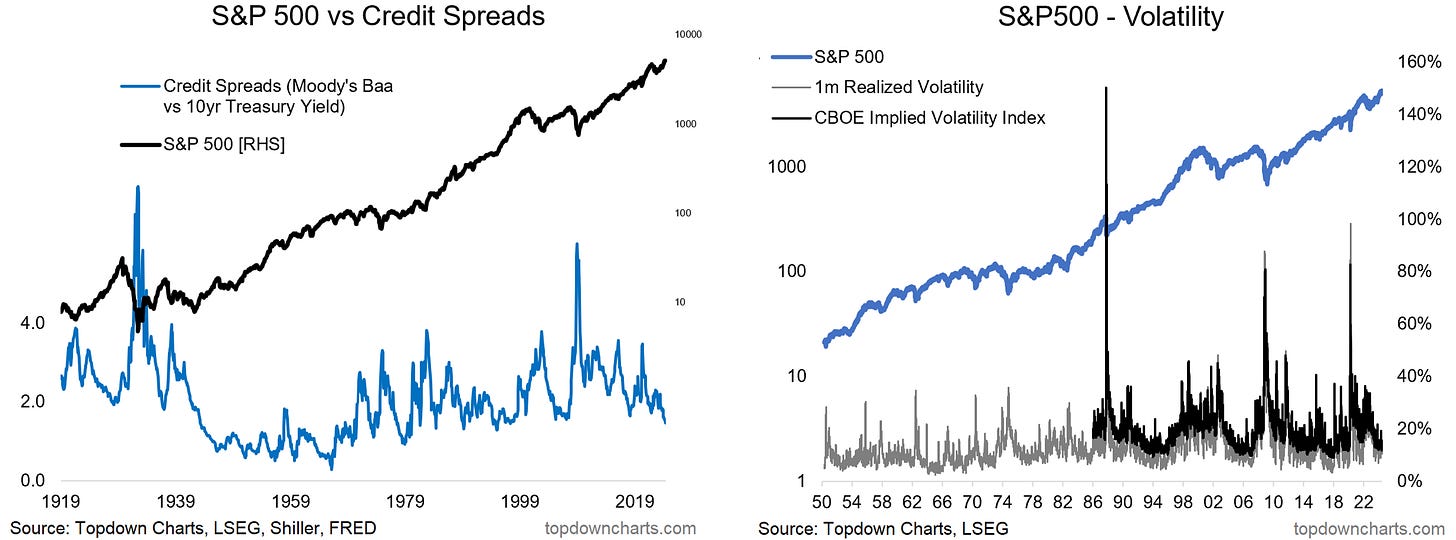
Thinking Upside Down: Corporate bond spreads (credit risk) and volatility (equity risk) have 1 thing in common – they’re both low when real risk is high (when the market is expensive, peaking), and both high when real risk is low (when the market is cheap, bottoming). It’s an example of bringing in further puzzle pieces to further build the full picture.
Corporate Investment Trends: The pace of corporate capex has been in structural decline, this is likely a key reason for the uptick in inflation but also likely to turnaround as multiple themes come into play (energy transition, onshoring, geopolitics, space, infrastructure). The tech vs commodity capex share chart is interesting because there’s only so long that tech can expand without commodity producers digging up the stuff they need to make things or the energy to power them.
Imagine all the People: Foreigners have significantly increased their exposure to US equities – compare and contrast the 2008 low vs 2000 high. Makes sense that they would prefer to hold US big tech stocks rather than US big debt. On a related note, emerging and more-so frontier markets are set to see the fastest population growth, this has important implications for expected returns (as population growth influences economic growth) and maybe even fund flows.
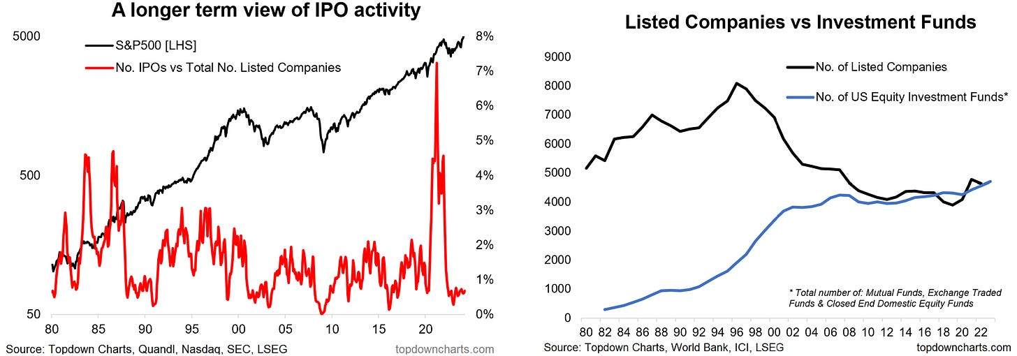
IPO Cycles and Fund Markets: Cycles of IPO activity match the cycles in stock prices – when doing an IPO you want to sell high; you want a market that is frothy, overvalued, and overhyped to get the maximum proceeds or raise capital at the cheapest cost and best terms. IPO activity then should tell us something then about the stage of the market cycle. Meanwhile, it is curious to note that there are about as many different ways to invest in stocks as there are individual stocks!
Themes & Takeaways
Price: Stocks go up over the long-run, dividends and earnings are key drivers, but valuation changes can drive significant deviation from long-term trend (the path is not smooth).
Earnings: In the long-run it comes back to earnings, the entrenched trend supports the case for long-term optimism, but there are some tailwinds coming to an end.
Valuations: Markets go through cycles – valuations help navigate those cycles and ultimately can help smooth the path for investors. The current cycle is extended and at risk.
Sectors & Styles: There is significant variation in returns across sectors/styles over time, this presents risks and opportunities even for index investors. Tech is over-valued, at risk.
Global Stocks: There is also significant variation in returns across countries over time, this presents risks and opportunities. Global stocks are cheap (vs history, vs US); watch catalysts.
Asset Allocation: Stocks beat bonds over the long-run, but short-term sees major variation - and smart diversification can help smooth the path. Bonds are cheap (vs history, vs stocks).
Curiosities: 60/40 is dumb diversification (commodities can offer smart diversification at times), credit spreads and volatility offer further insight to the cycle (contrarian).
Thanks for reading, comments and questions are welcome.
Be sure to subscribe to receive regular updates and support my work.
—
Thanks and best regards,
Callum Thomas
Founder & Editor of The Weekly ChartStorm
Twitter: https://twitter.com/Callum_Thomas
LinkedIn: https://www.linkedin.com/in/callum-thomas-4990063/












p.s. In Case You Missed It -- here's the pdf download link: https://www.chartstorm.info/p/chartstorm-perspectives-pack-802
An amazing amount of work went into that one. I just restacked it myself!