
Chart of the Week - The Bigs and the Big Nots
Chart in-focus from the latest Weekly S&P500 ChartStorm

Note: this is a new series for free subscribers and is intended to give an insight into the work that goes into The Weekly ChartStorm + provide a little further explanation on charts and concepts.
From a valuation perspective this market is divided into the Bigs (top 100) and the Big-Nots (everyone else).
If you’re big you attract all the flows, have a much lower cost of capital (aka very high valuations), you suck up a lot of small companies through M&A, and to be fair if you got big in the first place you probably have pretty decent earnings and growth.
If you’re small you’re off the radar, under-covered, under-valued, under-performing and probably underestimated.
And even if you’re large —but not the largest, you still trade at a discount to the largest companies.
As alluded, this is partly selection effects (successful companies get big), but also reinforced by the relentless rise of passive/index investing.
But where things are sitting now is what you would call extreme. And whenever you see an extreme in markets you want to pay attention because that’s where some of the biggest risks and opportunities can be found.
This chart highlights the risks on the one hand with mega caps as a group trading at the most expensive levels since the dot com bubble. Even if it is different this time (and it definitely is in many respects), this presents a very high bar and shows investor confidence is extremely high (investors expect the top 100 to continue to grow at an aggressive clip).
It also shows the opportunities on the other hand, with SMID caps trading at cheap valuations vs recent history and cheap relative valuations vs large and mega caps.
The interesting thing is we are starting to see early signs of a shift in relative performance — after lagging long behind, small caps are starting to play catch-up with the Russell 2000 making new all-time highs this week, while MAG-7 peaked in mid-May and are just treading water at the moment.
As discussed in the latest Weekly S&P500 ChartStorm, I reckon this could be the start of a bull market broadening and bullish rotation…
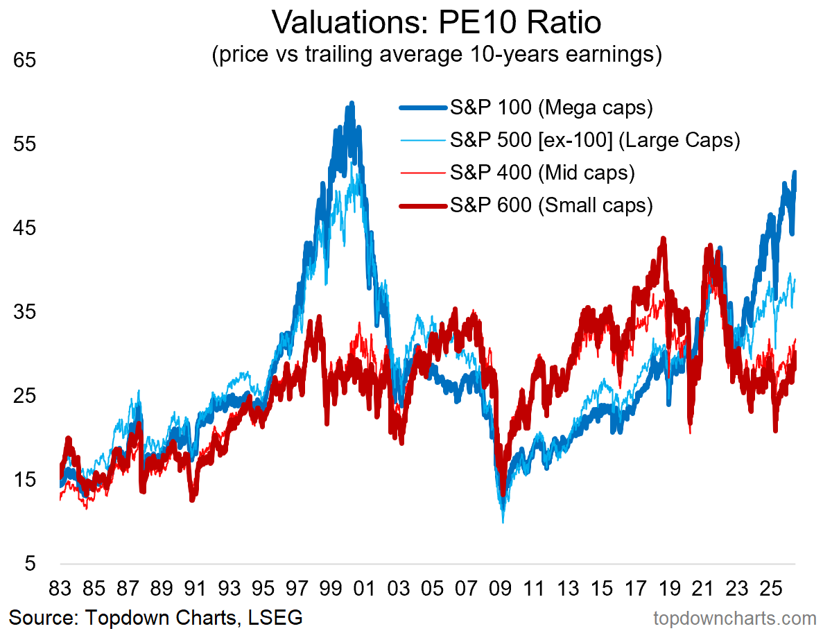
Bottom line: big stocks are trading on big valuations while smalls are trading at a big discount.
Bonus Chart: aside from valuations, it’s also interesting to track market cap weightings. The below chart shows the market cap weight of the top 100, the S&P500 minus the top 100, the 400 (mid caps), and 600 (small) — as a percentage of the S&P1500 (which is the 500 + 400 + 600 indexes).
Key thing to note is that the biggest stocks are much bigger than usual …but ONLY the very biggest (top 100). The S&P 500 excluding the top 100 is actually at a record low market cap weighting. Meanwhile small and mid caps are likewise much smaller than usual. Again, let’s keep an eye on extremes like this as things unfold, because as interesting as life in markets has been these past few years, I think things can get interestinger still…
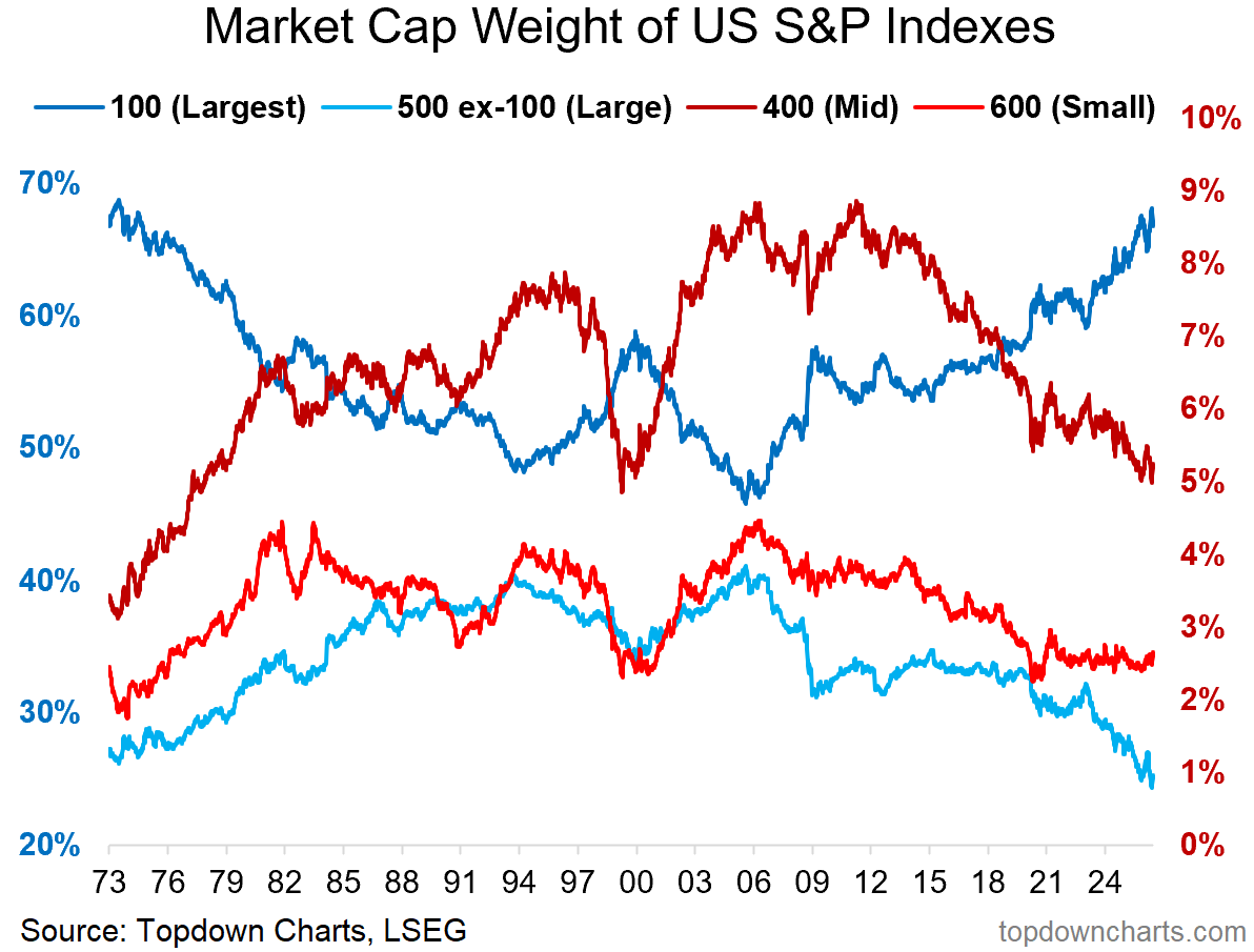
n.b. the blue lines are on the left axis, and the red lines on the right axis (so the top 100 are about 68% of market cap, and the small 600 about 2.5%).
Thanks for reading!
For more info on the Weekly ChartStorm see:
Be sure to reach out at any time if I can help with anything. I promise to leave no questions unanswered and no problems unsolved.
—
Best wishes,
Callum Thomas
Founder & Editor of The Weekly ChartStorm
and Head of Research at Topdown Charts
Twitter/X: https://twitter.com/Callum_Thomas
LinkedIn: https://www.linkedin.com/in/callum-thomas-4990063/
Already a paid subscriber?
Log-in and read the latest report here:
