

Note: this is a new series for free subscribers and is intended to give an insight into the work that goes into The Weekly ChartStorm + provide a little further explanation on charts and concepts.
This obscure sentiment indicator just sounded another topping signal.
The chart shows the ratio of trading in leveraged long vs short US equity ETFs. It surges when people are disproportionately betting on upside, and collapses then greed gives way to fear and bearishness.
As you can see in the chart below, spikes in the indicator have flagged several short-term peaks over the past couple decades.
Meanwhile plunges have helped flag numerous market troughs.
Like most market timing indicators it does slightly better at picking bottoms than tops (as you might expect during a secular bull market).
The key point is it’s surged to levels last seen during the 2021 stimulus frenzy as a scramble of desperation to try and get rich “like everyone else” kicked-off in the wake of the Q1 correction. It adds to a growing list of topping signals, so I think at this point the burden of proof is with the bulls and caution is warranted.
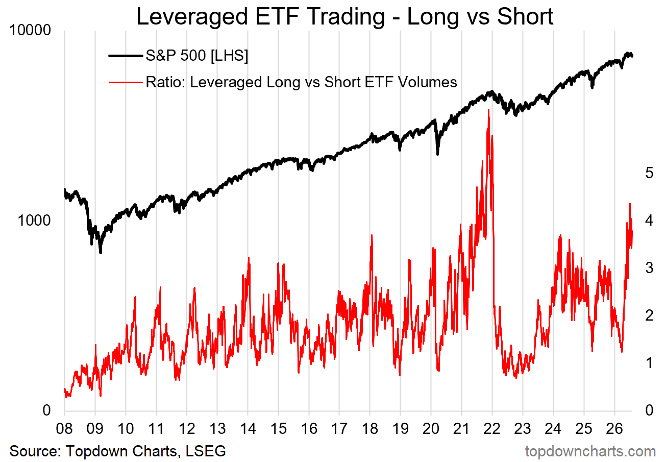
Bottom line: leveraged ETF trading activity adds to the growing list of topping signals.
ICYMI: The Bond Bear Market (chart + survey)
In case you missed it, earlier this week I sent out a post on Topdown Charts which showed the extent of the 6-year -50% bond bear market that is still in progress… but also how it provides clues on the next steps. [Read the Post (free)]
Also be sure to sign up to Topdown Charts to get more macro insights & ideas for global multi-asset investors [click here].
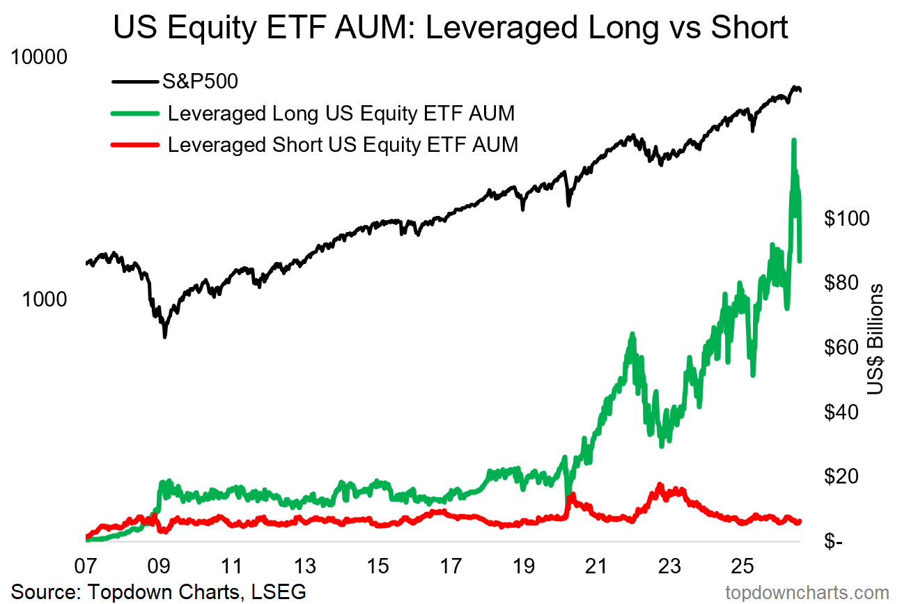
Bonus Chart: leveraged ETF AUM
Assets Under Management in leveraged long US equity ETFs surged to a record high shortly after the market rebounded from the Q1 correction, but has since slipped back just as sharply. Meanwhile AUM in leveraged short ETFs has barely blipped up off the lows.
This is one of those charts to keep tabs on if the market does actually roll over into a deeper and more drawn-out downturn, as it will help us know when it’s “done” (i.e. when the green line comes down and the read line surges).
It also adds a bit of a cross-check to the chart above, as it showed the relative surge of assets in longs vs shorts as greed became the dominant mood.
Thanks for reading!
For more info on the Weekly ChartStorm service see:
If you’re new to The Weekly ChartStorm, or you’ve been thinking about a subscription but want to see more first, here’s something for you to try — a 1-month Free Trial.
Note: that link will prompt you to go through the usual subscription process, but you will not be charged until the end of your 30-day trial period — and you will not be charged at all if you cancel prior to the trial end (and yes, you will receive reminders closer to the time).
Lastly, be sure to reach out at any time if I can help with anything. I promise to leave no questions unanswered and no problems unsolved.
—
Best wishes,
Callum Thomas
Founder/Editor of The Weekly ChartStorm
and Head of Research at Topdown Charts
Connect: LinkedIn | Twitter/X | Substack
VIDEO: update on KOSPI Crash [+Case Study]
This video provides a timely update on the Korean stockmarket following a -40% crash. I provide context as to what's going on (and why) + a worked example on how I approach markets (research framework).
n.b. Already a paid subscriber to The Weekly ChartStorm?
Log-in and read the latest report here:

Wow crazy how it’s reached same 2021 euphoric levels