
Chart Of The Day - Japan vs USA
Taking a long-term perspective on cycles of relative country performance...

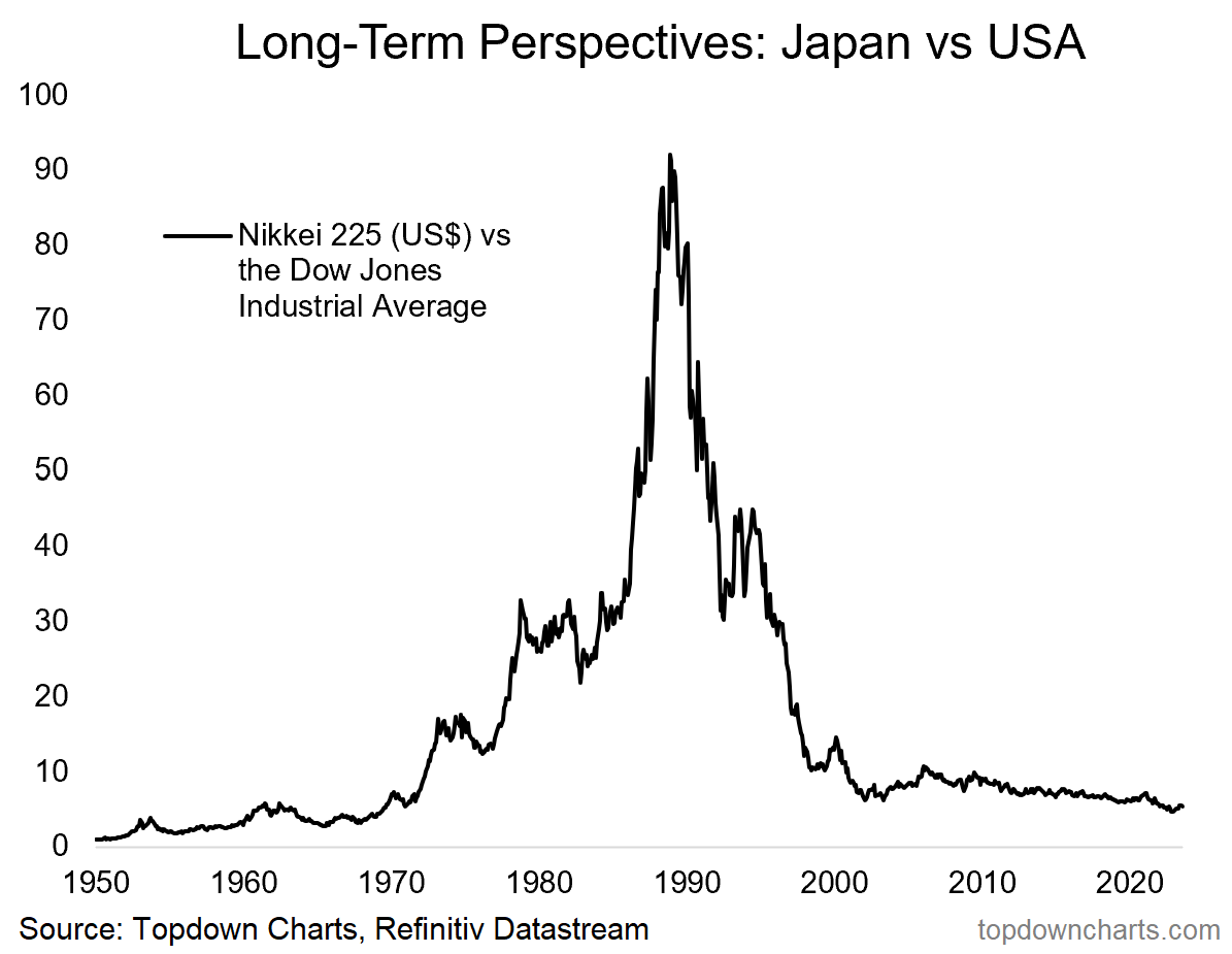
Long-Term Perspective: today’s chart shows the wild history of relative performance for Japan vs US stocks. It’s interesting for sure because of the obvious “wow factor” …but hidden in the chart is a couple of important points for reflection.
First a quick technical note, the chart tracks Japanese equities (the Nikkei 225 — which I converted to US dollar terms, so as to be a like-for-like comparison) vs USA (Dow Jones Industrial Average — notably both of these indexes are price-weighted). Also, for clarity, if the line goes up it means Japanese stocks are outperforming, and if it goes down it means US stocks are outperforming.
The first point of reflection is just how stark the numbers are: Japan outperformed the US by over 90x during the period from 1950 to the peak in 1988 (and since the 1988 peak the US has outperformed Japan 15x). One takeaway from that is how country-selection can make a big difference.
But what I thought was particularly informative is how that relative performance line looked stretched in the 70’s vs the previous couple decades… and then it looked even more stretched in the 80s, and even much more stretched in the late-80s. Which is a lesson in terms of how far things can go when they get going. But also, all of a sudden the 90s saw just about all of that outperformance reversed. Which is equally a lesson in terms of how fast things can go when the mean reversion kicks in.
SUBSCRIBE —> Important Note: if you would like to subscribe to receive the Chart of the Day series straight to your inbox;
1. first subscribe to the Weekly ChartStorm as either a paid or free user;
2. navigate to Account Settings, and turn on emails for the Chart of the Day section.
(alternatively you can bookmark the Chart of the Day section page and check-in daily for an interesting variety of timely + timeless updates on the market)
Thanks for your interest. Feedback and thoughts welcome.
Also, please share this free publication with your friends/colleagues :-)
Sincerely,
Callum Thomas
Founder and Editor at The Weekly ChartStorm
Follow me on Twitter
Connect on LinkedIn
NOTE >>> The Chart Of The Day series is brought to you by
The Weekly ChartStorm…
Subscribe to the Weekly ChartStorm for a carefully selected set of charts and expert commentary to help you stay on top of the evolving market outlook —> see why over 31,000 people choose the ChartStorm as their filter on a noisy world ↓