
Weekly S&P500 ChartStorm - 21 June 2026
This week: MAG7 vs the S&P 493, equal vs cap weight rotation, valuations and profitability, cash allocations, margin debt, seasonality, industrials, and why treasuries...

Welcome to the latest Weekly S&P500 #ChartStorm!
Learnings and conclusions from this week’s charts:
Mag-7 has been underperforming vs the “S&P493”.
Valuations are high because profitability is high (profitability is cyclical).
Investor cash allocations are very low (which is a warning sign for stocks).
Margin debt acceleration has reached warning levels.
Stockmarket seasonality turns negative from July-Oct.
Overall, we are witnessing continued bull-market-broadening and bullish rotation as the S&P500 ex-Mag-7 makes new highs and the equal vs cap weight relative performance line ticks up. But there are a few warning signs to keep in mind and the bear case would be that Mag-7 underperformance turns into something sinister…
1. Mag-7 vs the Rest: the prevailing narrative in markets over the past few years is that it has been all about Mag-7, so it’s probably a surprise to see that Mag-7 have been floundering through June while the S&P500 ex-Mag-7 (aka the S&P493*) is out to new all-time highs.
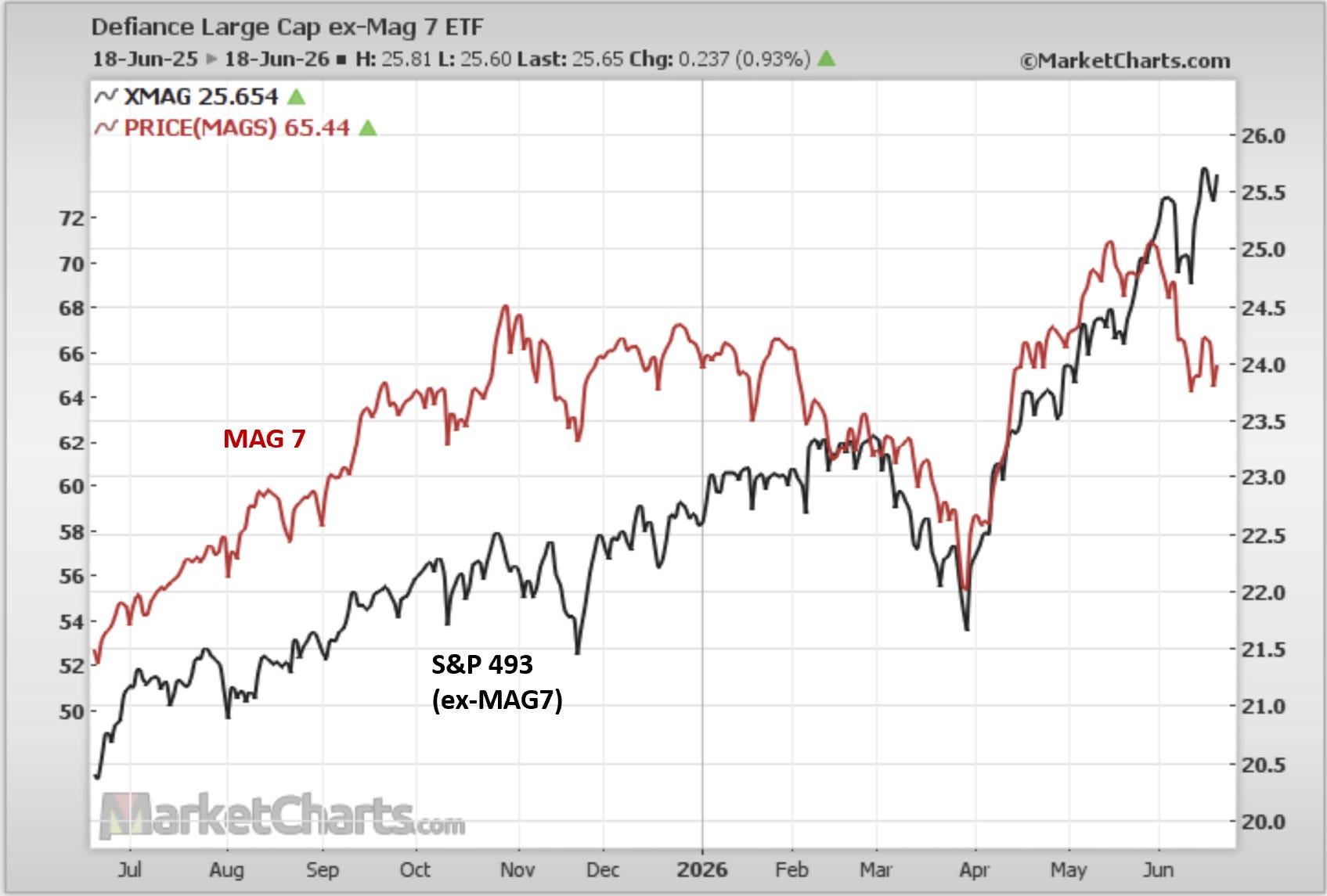
Source: MarketCharts.com (*inspired by The Morning Print)
2. MAGS vs XMAG: looking at the relative performance of Mag-7 vs the rest it’s been a similar scale collapse in relative performance for Mag-7 as was seen in Q1. That Q1 decline was basically bearish rotation where the previous market leaders led the market lower. What we are seeing right now is what I would call bullish rotation as the previous leaders pass the torch to the previous laggards.
And that’s probably the most bullish pathway for the US Stockmarket right now; bullmarket-broadening and bullish rotation. Maybe the headline cap-weighted index doesn’t rise as fast, but instead you see a bunch of rotation under the surface.
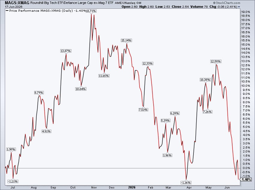
Source: @MikeZaccardi
3. Equal-Weight vs Cap-Weight: another angle on this is the relative performance line for the equal vs cap weighted S&P500.
A few things to note on this: firstly, it’s actually normal for the equal-weighted index to outperform the cap-weighted index over the longer term; second, wild deviations from trend in this line can indicate/confirm structural weaknesses or vulnerabilities in the market, third, this line looks to be attempting to bottom (double bottom?) — which again would bring the rotation theme to mind.
It also whispers that we need to be wary of bearish rotation where the previous leaders run out of steam after an extended bull market, and due to their larger weight take the index down.
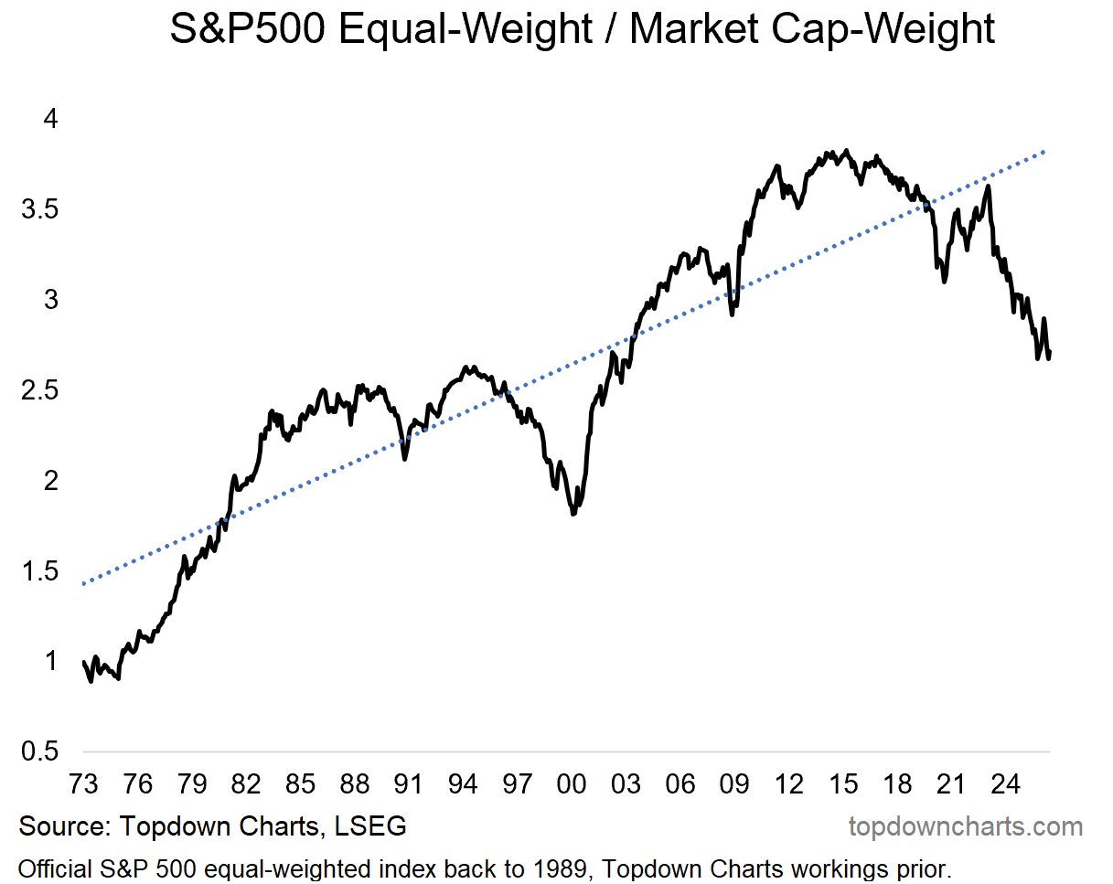
Source: Topdown Charts Professional
4. Cycles in Valuations (and Profitability): one reason to be alert on that front is if you look at the extremes in the chart above, they map to some of the periods of higher than usual valuations in the stockmarket (seen below).
Drilling into this chart, it is very interesting because it confirms the bullish narrative that valuations are high for a reason (high profitability).
But the bearish counterpoint would be that return on equity is cyclical, so if profitability gets damaged (e.g. AI capex bust, economic downturn, some other shock/crisis), then the reason for high valuations will fade away and valuations will mean revert. That’s the bear case. And we can monitor specifically for signs of that (none yet).
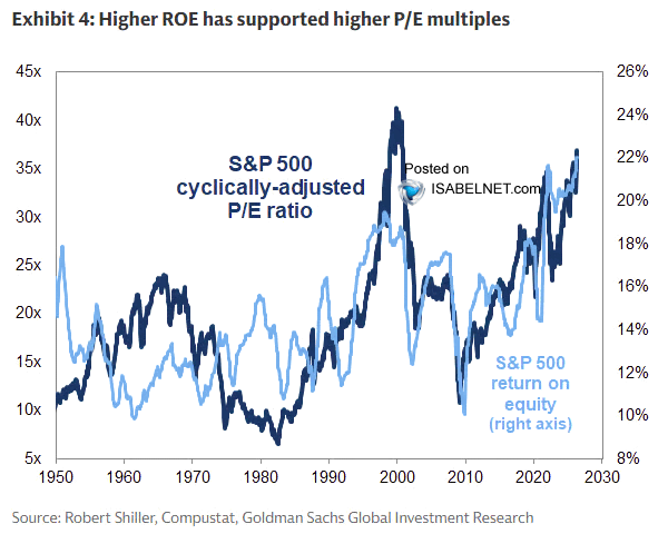
Source: @ISABELNET_SA
5. Cashed Out: another echo on this theme is investor cash allocations bouncing along the bottom (which has often been a topping sign in the past).
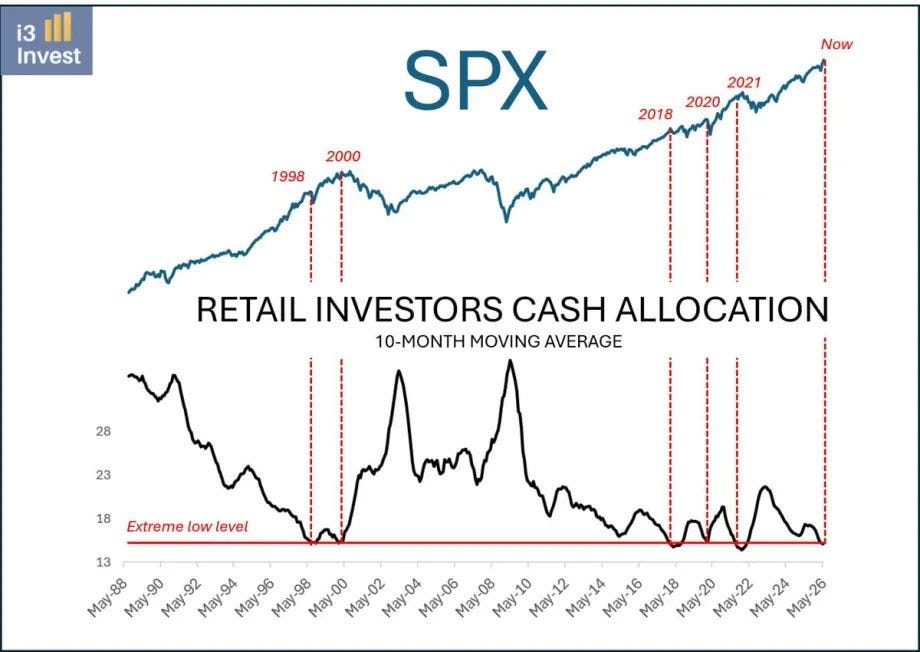
Source: @i3_invest via @TheChartReport
6. Margin Debt Warnings (1/2): another bearish warning flag is the surge in this margin debt vs M2 indicator (i.e. margin debt normalized vs the money supply).
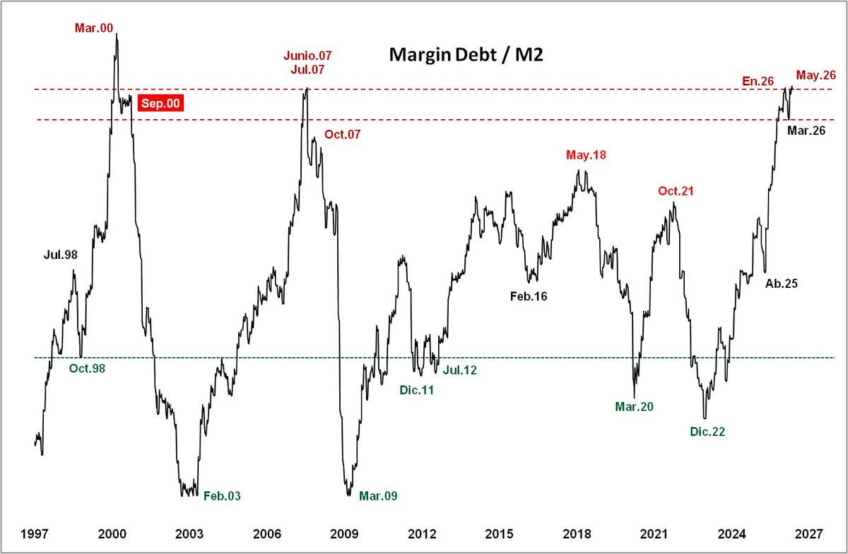
Source: @VISUALDATAT
7. Margin Debt Warning (2/2): and here’s my own margin debt risk indicator updated to the just released May data. The rate of expansion in margin debt is the 4th fastest in recent history, and is consistent with a heightened downside risk alert. I would note that the pervious 3 major topping signals on this indicator did take a few months to work, but the message is pretty clear here.
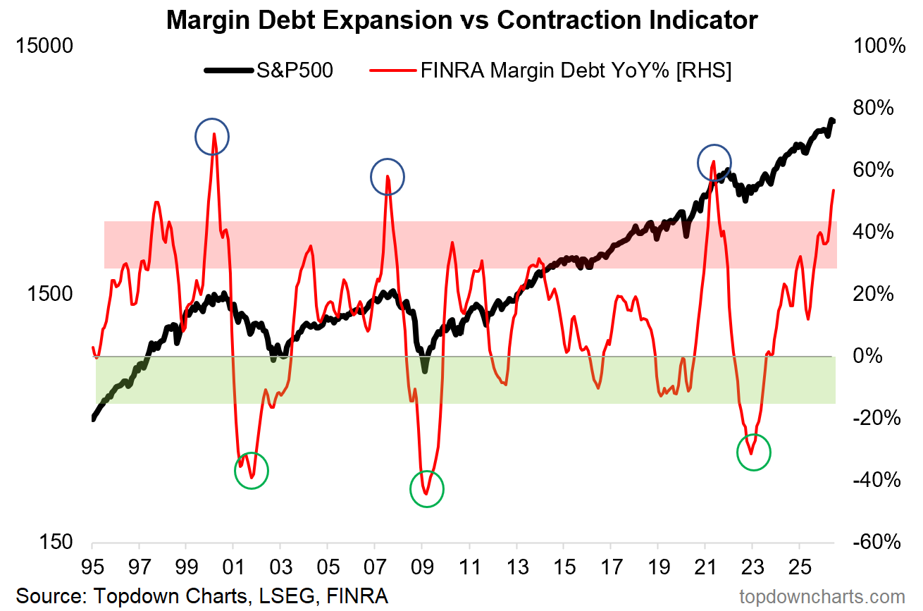
Source: Topdown Charts Professional
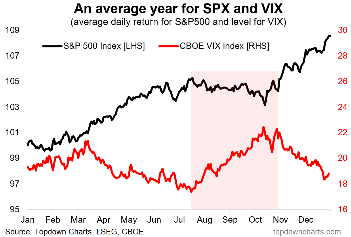
8. Seasonally Slippery: zooming back in to the more immediate term, seasonality sours from late-July into Oct/Nov (albeit stocks have a habit of rallying from mid-June to late-July; so maybe there is a bit of a seasonal bull trap being set here!).
9. Seasonal-Cycle Surge? on the other hand, when you look at the election-cycle seasonal pattern, yes you get the same conclusion that it could be a bit of rough and tumble for markets heading into the mid-terms… but afterwards the historical tendency has been for stocks to put on a solid rally.
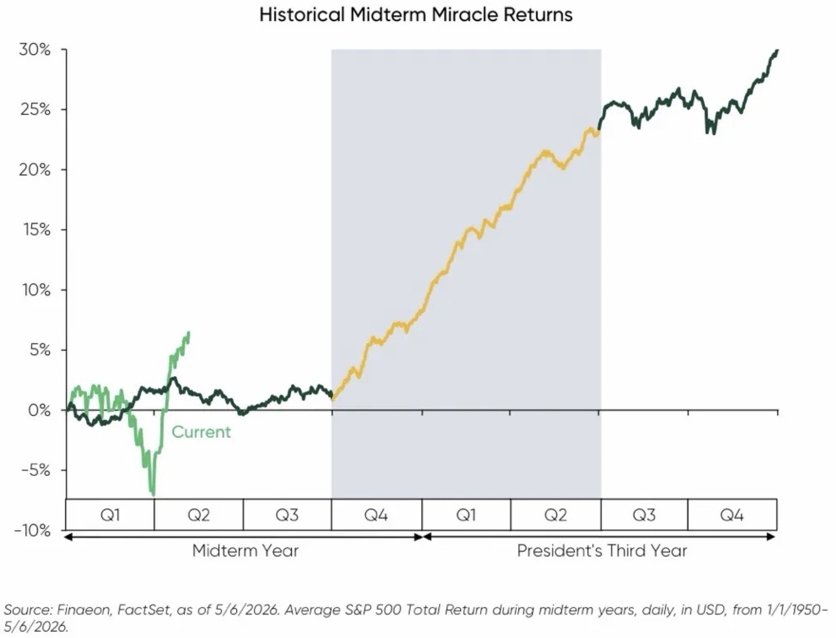
Source: SnippetFinance
10. Industrial Revolution: another silver-lining and in line with the bullish rotation theme, industrial stocks have broken out (industrials benefit from stronger real activity, hard capex, and improving global growth — all things that are currently underway in earnest).
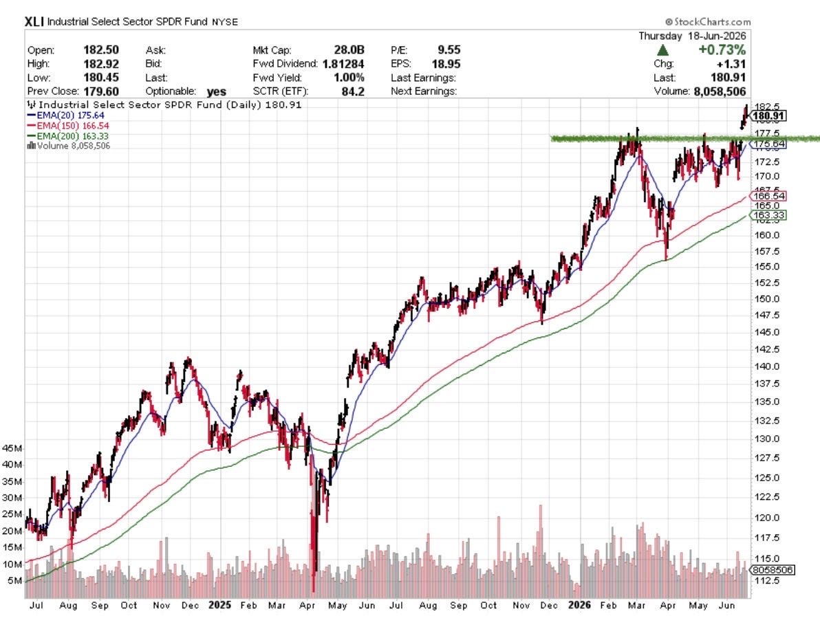
Source: @DrJStrategy
Thanks for reading, I appreciate your support! Please like/comment/share :-)
Portfolio Strategy Notes — Treasuries are NOT Trash
Similar to what we saw with investor allocations to cash probing the lows, investors in aggregate are running record low allocations to treasuries.
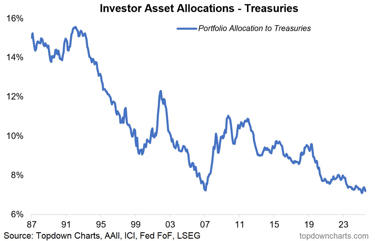
You can see why in the chart below, with stocks having had a dream run while bonds have had a disastrous run. But you can also see something else in this chart. Both series look cyclical —one is in the middle of an upcycle, the other in the middle of a downcycle, and the next steps seem logical.
The key takeaway is that investors are heavily underexposed to bonds in general but especially treasuries. Bonds had a bad run since 2020, and this has lead some people to incorrectly assert that bonds are no longer a good diversifier —but what they miss is that 2022 for instance was an inflation shock, bonds never perform well in an inflation shock (and investors need to use commodities for defense in that situation).
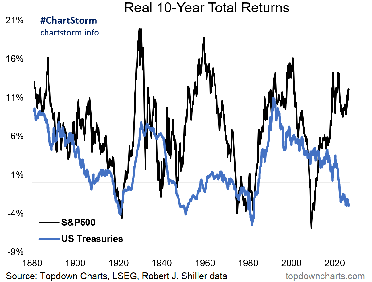
Rather bonds do well during deflationary downturns, situations where economic activity declines, inflation shrinks (or even tips into deflation), and the Fed takes rates lower and expands the balance sheet. In those environments investors sell risk assets and buy defensives like bonds… often when it is too late. I would suggest looking at gradually building exposure to bonds at the cost of stocks (e.g. putting new money into a bond allocation, and thinking about rebalancing profits from risk assets).
And one last thing, AI might well be a key swing factor here. Eventually the AI capex boom will turn to bust (and that will dampen economic growth), but also as AI adoption increases the deflationary effects will be felt. If you get those two things happening at the same time it could be a recipe for strong returns for bonds.
—
Best wishes,
Callum Thomas
Founder & Editor of The Weekly ChartStorm
and Head of Research at Topdown Charts
Twitter/X: https://twitter.com/Callum_Thomas
LinkedIn: https://www.linkedin.com/in/callum-thomas-4990063/
In case you missed it, also see last week’s edition:


.
Rhetorical question: how much of the equal weight performance is the semis and memory? Great chart on the treasuries and bonds theme and its cycle eventually driven by AI inspired deflation, nice steer.