Weekly S&P500 ChartStorm - 9 May 2021
Your weekly selection of charts...
Welcome to the Weekly S&P500 #ChartStorm (by email!)
The Chart Storm is a weekly selection of 10 charts which I hand pick from around the web (+some of my own charts), and then post on Twitter.
The charts focus on the S&P500 (US equities); and the various forces and factors that influence the outlook - with the aim of bringing insight and perspective.
Hope you enjoy!
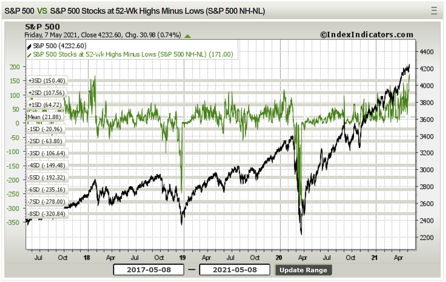
1. New ATH and a surge in Breadth: Interesting times in markets, and an interesting chart I reckon - we’ve got another All Time High for the S&P 500, and the 52-week New Highs minus New Lows breadth indicator surging to levels last seen in early 2018 … note the price action that followed back then.
Source: @MarketCharts
2. S&P 500 Earnings Pulse: Analysts are furiously upgrading earnings estimates (earnings revisions ratio shows upgrades are dominating, and both forward + trailing EPS growth are turning up). The cynical take is they are just catching up to price (but the economic pulse also looks increasingly strong).
Source: @topdowncharts
3. Global Equities - Earnings Revisions Ratio: This chart shows the median earnings revisions ratio (which is simply = revisions up minus revisions down, divided by total revisions) across countries, and in the blue line: the breadth of earnings revisions… so at the moment we can see over 2/3rds of countries are seeing positive earnings revisions ratios (strong). Notably, the global median hit an all time high this week.
Source: @topdowncharts
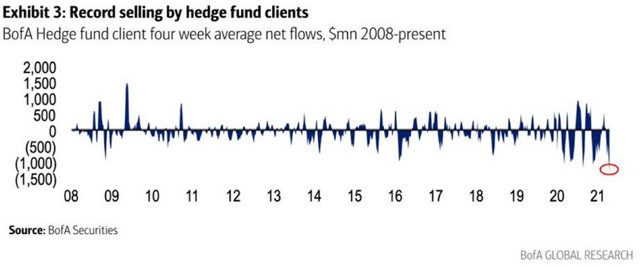
4. Hedge Fund Flows - Significant Selling: Seems like hedge funds are selling at a record clip. Problem is, we don’t really have much color… it could be a variety of things: e.g. they might be selling as a directional view, to realize profits, to reduce leverage, to rebalance into other bets, to meet client redemptions, etc. Perhaps a mix.
Source: @LizAnnSonders
5. Most Shorted Stocks Index: This index tracks the performance of a basket of the most shorted stocks. You can see the surge in it during the infamous short squeezes earlier this year (GameStop et al), but since then, it has given back a lot of absolute and relative performance (blue line tracks the relative performance). So perhaps some of that hedge fund selling in the previous chart was simply profit taking!
Source: @topdowncharts
6. Seasonality: This chart gives a sense for the seasonal pattern in stock prices across the year. This is where sayings like “sell in May“ and the “Santa Claus rally“ come from. In practice, it’s a fairly unreliable/unprofitable strategy to sell in May… but as I always say, when it comes to seasonality, if the seasonal signal aligns with the existing evidence, then it helps build conviction. That’s all.
Source: @zerohedge
7. Neutral Sentiment: As discussed last week, by itself it is a very intriguing chart, but in terms of the takeaways: to (over)simplify, when neutral sentiment collapses like this early in the market cycle it tends to be a good thing, and when it does this late in the cycle in tends to be a bad thing. Of course, this is with the benefit of hindsight, and we don’t have a huge sample size. But along with expensive valuations, I guess it’s just another sign we are late in the cycle.
Source: @topdowncharts
8. Household Allocations to Equities: Just another sign of the times, as a result of market movements and increasing participation/interest in the markets, US household exposure to the stockmarket as a proportion of their total assets has reached a new all time high. Certainly not something you see at the bottom.
Source: @followtheh
9. Ownership of Equities by Wealth Percentile: In many respects, markets are becoming more democratized (easier access via online trading apps and lower fees, greater participation, greater access to data), but it's still a case of “to the victor goes the spoils” — the richest 10% own 90%.
Source: @adam_tooze
10. Domestic vs International Revenue: This interesting chart shows the proportion of S&P500 revenues generated offshore. It is heavily skewed by the tech sector (where over 50% of revenues are generated internationally). I guess you could say that corporate America’s revenue is not entirely “made in America“.
Source: @FactSet
Thanks for following, I appreciate your interest!
oh… that’s right, almost forgot!
BONUS CHART >> got to include a goody for the goodies who subscribed.
Backlogs and Pricing Pressure: This is one of my favorite charts of the macro-moment.
It shows the composite backlogs/delays indicator across the global PMIs (through April), and the same for pricing pressure. First of all, we can see a clear historic link between backlogs (basically a leading indicator) and pricing pressure.
I’ve been talking about the backlog/logistics/supply chain disruption theme since late last year, and well, it’s only gotten worse. There is ample anecdotal evidence about how this is impacting industries and day to day life — I am sure you even have some anecdotes to share. Whether it’s appliances out of stock, delays on mountain bike orders, severe shortage of parts, chip shortages, etc… this is a big issue, and it’s not going to go away quickly.
So we are going to see further upward pressure on inflation in the short-term. Sure it might be transitory, but the larger the spike and the longer it lasts, the more likely it oozes through to broader price negotiations and exerts upward pressure on core inflation. Not something to dismiss, and certainly not something to miss!
—
Best regards,
Callum Thomas


