


Weekly S&P500 ChartStorm - 9 June 2024 [free version]
This week: low volatility, low correlations, low performance, market concentration, NVDA things, TMT stock valuations, market peaks, penny stocks, long-term global earnings outlook...

Welcome to the latest Weekly S&P500 #ChartStorm! [free preview version] — the Weekly ChartStorm is an easily digestible selection of charts which I hand pick from around the web and my own files. These charts focus on the S&P500 (US equities) with a particular emphasis on the forces and factors that influence the outlook, to bring you insight and perspective.
Learnings and conclusions from this week’s charts:
Risk pricing is extremely calm (credit spreads, VIX).
Stock correlations are extremely low (a risk flag).
The market almost* never peaks in June (*only once before).
Tech stocks are expensive vs history and vs the rest of the market.
Buying the biggest stock has historically been a poor investment.
NEW: Market Cycle Guidebook
FYI, I sent out the May Market Cycle Guidebook late last week (part of my day job as Head of Research/Founder at Topdown Charts) — check it out!
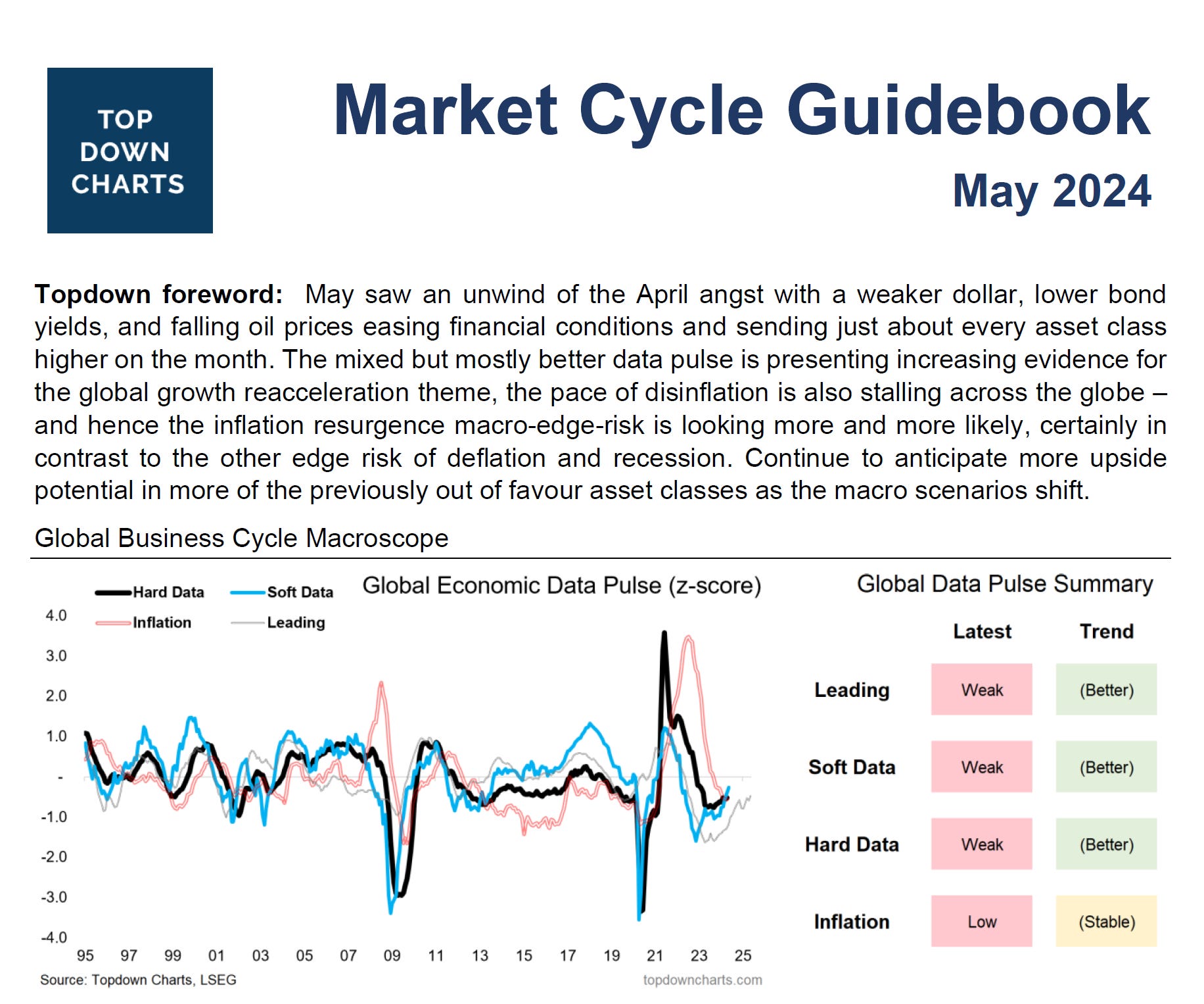
The monthly Market Cycle Guidebook is designed to be a practical + tactical asset allocation guidebook for global multi-asset investors and those who require visibility and insight on the big picture outlook…
1. The Calm: Volatility is low and credit spreads are tight. This is a deeply calm risk-on market. We are also in the neighborhood of where both of those things tend to find a floor…
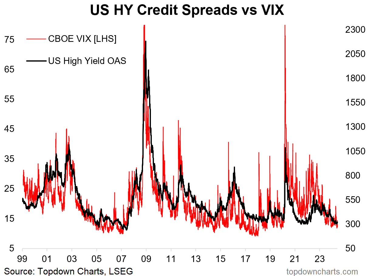
Source: Chart of the Week Topdown Charts
2. Low Volatility Regime: But as the very sensible Mark Ungewitter observes, “low-volatility regimes can last longer than you think”. In other words, low volatility itself is not a bad thing, but low volatility when things are deteriorating and risks are underestimated +rising: that’s bad, that’s when it’s called complacency.
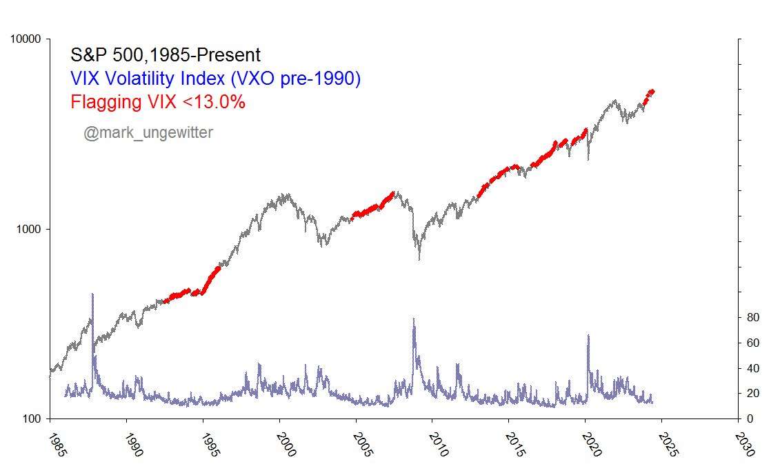
Source: @mark_ungewitter
3. Low Correlations: On the other hand, periods of low correlations do not tend to last long, and are often a flag to pay closer attention to risk.
n.b. the chart shows S&P 500 stock correlations *inverted* — it works as a buy signal when correlations spike (which is typically a situation when investors ‘sell everything’).
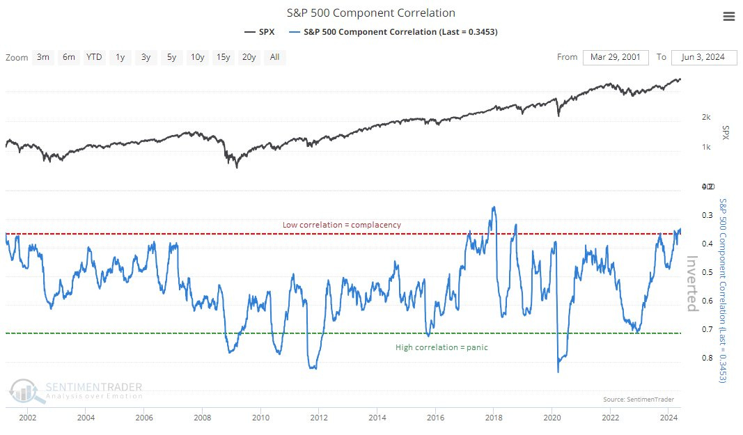
Source: @jasongoepfert
4. Stocks Outperforming the Index: …are at extreme lows (another risk flag?). This chart prompts Richard Bernstein Advisors to remark, “investors who think today’s market is somehow vastly different from 1999/2000’s bubble simply aren’t paying attention.” I am inclined to agree.
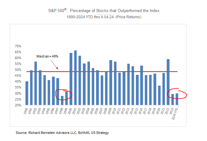
Source: @RBAdvisors
5. Fun With Analogs: OK, so analog charts are troublesome for a number of reasons (curve fitting, bias confirming, redrawing, etc) — but, they can serve a function when the past analog that you are comparing to shares true similarities. In essence it serves as a scenario, a possible pathway, and if the period of comparison is well-selected it can be a useful lens to view risks and possibilities. Anyway, I think it’s fair to say that NVDA is definitely echoing dot-com bubble energy on a number of fronts, and here’s a reminder of how things can unfold (possibility, not prediction).
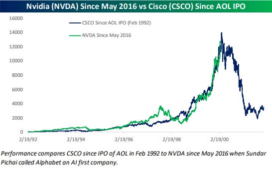
Source: @bespokeinvest
6. The Biggest Stock Sucks: This interesting chart from the latest Mauboussin paper shows that in the past the biggest stock has historically not been a good investment (although number 2 and 3 can be decent, yet mileage varies notably through time). NVDA is not quite number one, but very close, just ahead of AAPL now, but still behind MSFT (the 3 top stocks).
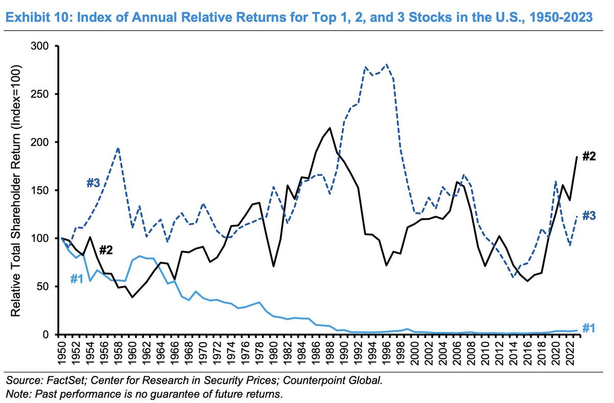
Source: @HiddenValueGems
7. Not Dot Com: (not yet, but getting closer)
One thing that is objective about this chart is that tech stocks are expensive vs history and expensive vs the rest of the market. One thing that is entirely open to judgement though is whether this marks a peak like in 2021, or a path to higher glory like in the final frenzied stages of the dot com bubble.
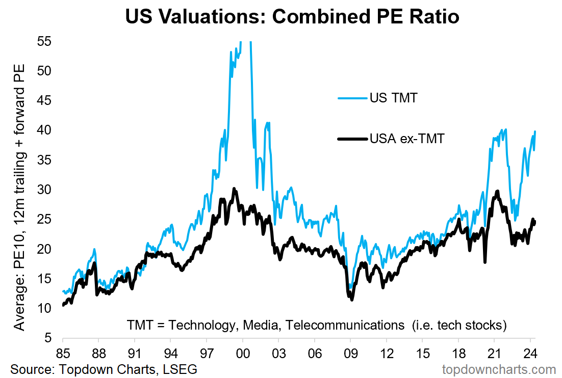
Source: Chart of the Week - Tech Value Echo Topdown Charts Professional
ALERT: Subscribe to my [Free] Chart Of The Week report
Gain access to original macro/market charts + insights (and tangible investment implications) from my work at
8. Bigness Through the Ages: A reminder that it’s not actually too abnormal to see the top 10 stocks being a big chunk of the index market cap, and it’s not even necessarily a bad thing or warning sign. Kind of logical to see when new industries and technological innovation and adoption processes are underway.
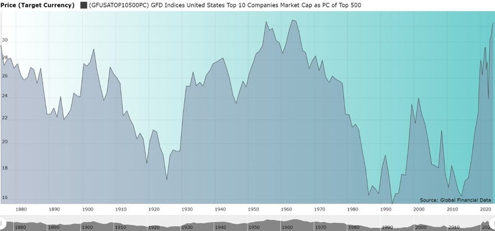
Source: @MebFaber
9. When Will the Market Peak? Another bull/bear Rorschach test — the bullish take = stocks almost never peak in June (only once: June 1948), and therefore they wont …the bearish take = June is underrepresented, and is due for another peak. Either way, it sure is interesting to note that statistically the highest odds of a peak has been Dec (followed by Jan, Nov) — so bears may need to wait a little longer.
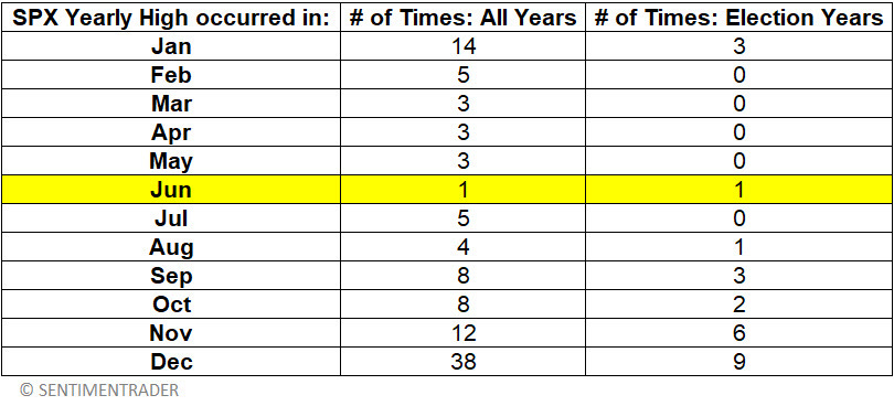
Source: @jaykaeppel via Daily Chartbook
10. Picking up Pennies: GRQ (Get Rich Quick) culture is alive and well and making its way into the penny stock arena in hopes of quick gains. Call it a risk indicator, maybe even a fraud indicator as penny stocks are notorious for pump and dumps.
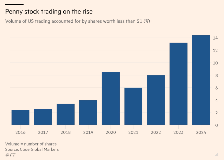
Source: @Barchart
RECOMMENDATION — some of my favorites
Daily Shot (global macro charts)
- (studies in markets)
- (stock fundamentals)
Snippet Finance (investing snippets)
BONUS CHART SECTION
(upgrade to paid to access)
This week paid subscribers received a mini-blog and chart on Global vs US Long-Term Earnings Growth estimates.
—> upgrade your subscription to paid now to unlock the full report
Paid Subscriber Benefits:
Access to the Bonus Chart section (exclusive chart/theme/insight)
Access/Participation in the Comments Section (paid subscribers only)
Have your Questions Answered (by email or in the comments)
Quick+Responsive Customer Service (no issues unresolved)
Ad-free (no ads in the way, no marketing emails)
Priority access (no delays in distribution)
Upgrade to paid for instant access to these benefits — gain a greater level of insight and join a community of intelligent investors
Thanks and best regards,
Callum Thomas
Founder & Editor of The Weekly ChartStorm
Twitter: https://twitter.com/Callum_Thomas
LinkedIn: https://www.linkedin.com/in/callum-thomas-4990063/