Weekly S&P500 ChartStorm - 9 January 2022
This week: tech market technicals, cycles and seasons, investor confidence, and a mini-special on valuations (and value vs growth for the bonus chart)
Welcome to the Weekly S&P500 #ChartStorm (by email!)
The Chart Storm is a weekly selection of 10 charts which I hand pick from around the web (+some of my own charts), and then post on Twitter.
The charts focus on the S&P500 (US equities); and the various forces and factors that influence the outlook — with the aim of bringing insight and perspective.
Hope you enjoy!
p.s. if you haven’t already, subscribe (free) to receive the ChartStorm direct to your inbox, so you don’t miss out on any charts (you never know which one could change the whole perspective!)
***ALSO p.p.s. check out my (Topdown Charts) 2021 End of Year Special Report (includes 50 of my best, worst, and favorite charts of 2021 + the must-see macro/market charts to have on your radar in 2022…)
1. Just Resting: The S&P 500 is "just resting" slightly above the 50-day moving average, and that’s after putting in a failed breakout (i.e. the index broke above that key line in the sand that we’ve been tracking here the past couple of months, but has since broken back below — proceed with caution!).
Source: @Callum_Thomas
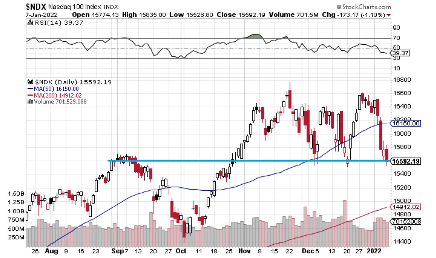
2. Nas… duck! The Nasdaq 100 meanwhile has cleanly broken down through its 50dma and is currently toying with the 15600 level (again). This is *not* a sign of strength, and certainly warrants closer attention to risk management.
Source: @Callum_Thomas
3. Nasdaq Bad Breadth: Speaking of the Nasdaq, what a mind boggling statistic in this next chart: almost 40% of Nasdaq stocks are down at least -50% from their respective 52-week highs.
Seems like more and more traffic lights are turning yellow...
Source: @sentimentrader
4. Seasons and Cycles: The election cycle + decennial cycle (i.e. that “years ending in 2“ line) suggest some challenging months ahead... (as opposed to the usual unconditional seasonal pattern).
Source: @MrBlonde_macro
5. Confidence Lost: North American institutional investors lost confidence in December. The State Street index of risk exposure showed significant de-risking on the back of Omicron concerns, high inflation/Fed tightening, and high valuations... but as I noted last week: the European Index fell much further (by a record amount) as European investors went fully risk-off [similar concerns about Omicron/lock-back-downs, and of course geopolitics].
Source: @topdowncharts
6. Valuation Charts: Speaking of valuations -- and kicking off a look at a selection of valuation charts is a very interesting and familiar perspective of the biggest 10 stocks in the index. History rhymes?
Source: @business via @alykhansatchu article: Bloomberg
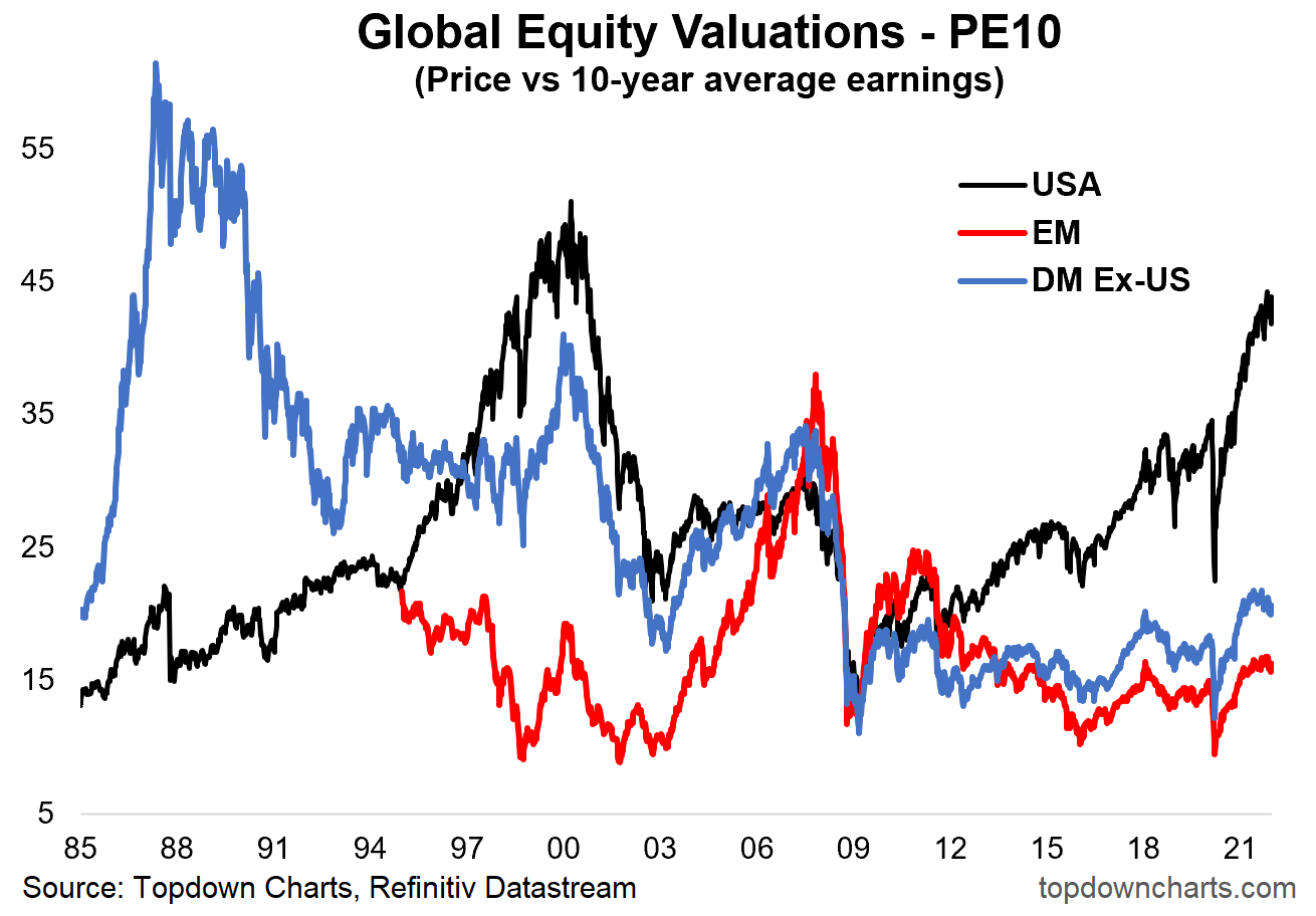
7. Global Equity Valuations: Staying with valuations, here’s one of my all time favorite charts — the PE10 ratio across the major chunks of global equities — shows the USA out there in a league of its own…
Source: @topdowncharts
8. Valuations and Allocations: Perhaps unsurprisingly, investor allocations are (like valuations) at multi-year highs too. Overvalued and overallocated.
Source: @PinpointMacro article: CMC Markets
9. Price vs “Integrated Equity“ This next chart makes me uncomfortable (mostly because I am fasting and it says "pie" !!) — the P/IE = "Price to Integrated Equity" ratio. Here’s the thread outlining the detail, but it’s basically yet another indicator showing the market is extreme/historically expensive.
Source: @hkeskiva
10. Unicornucopia! The total number of Start-Ups privately valued at more than $1B more than tripled last year. That’s a nice valuation chart to round out this mini-special on valuations… and another lens on how the wash of easy/cheap money and speculative fervor (and perhaps even an element of “scarcity of growth” or scarcity of start-ups?) have taken valuations to vertiginous levels.
Source: @michael_venuto
Thanks for following, I appreciate your interest!
oh… that’s right, almost forgot!
BONUS CHART >> got to include a goody for the goodies who subscribed.
Value vs Growth Rebound: just as the index made a failed break-OUT, the Value vs Growth relative performance line looks to have made a failed break-DOWN.
For a while there it looked like the beginning of a new wave down in value vs growth stocks, but for now the latest rebound has the S&P500 Value vs Growth line reclaiming that lower support level, and even making an attempt on the 200-day moving average.
Here’s some longer-term perspective on the relative performance of value vs growth - this time on a total return basis (i.e. including dividends).
Clearly things have reached an extreme, there’s no doubt about that.
The latest rebound also looks fairly significant in the scheme of things, particularly given the reclamation of support, the bounce from such extreme levels, and of course the background information such as tech/growth stocks appearing to be correcting from extreme expensive valuations.
But again, I would proffer a piece of caution to ponder in passing: there have been numerous false dawns in the past (sometimes substantial).
That said, I like what I see so far…
—
Best regards,
Callum Thomas
SPONSOR: ( …he’s me!)
My research firm, Topdown Charts, has a new entry-level Substack service, which is designed to distill some of the key ideas and themes from the institutional fund manager service to provide the same high quality insights at a more accessible price and easier to digest weekly email.
Give it a try and let me know what you think :-)
(and be sure to tell your friends!)


