
Weekly S&P500 ChartStorm - 9 April 2023
This week: Q1 vs full year, Coppock, Pessimism Persistence, Nasdaq technicals, big tech vs small caps, earnings macro, revisions, EM vs DM, debt loads, fund flows...

Welcome to the latest Weekly S&P500 #ChartStorm!
Learnings and conclusions from this week’s charts:
When the market ends up in Q1 it has historically always ended up on the year.
There are a couple of longer-term bullish signals developing e.g. the Coppock Index, and survey pessimism persistence.
The Nasdaq is currently exhibiting bearish breadth divergence, and is historically stretched vs small caps (and small caps are at historic lows vs large caps).
Weaker macro data is likely to reinforce downward momentum in earnings revisions and downside surprises to growth stock revenues.
Historically a weaker US dollar has been good for emerging market equities (relative to developed markets).
Overall thoughts: one interesting point to note is that it is starting to become easier to find bullish charts (vs mostly bearish charts previously). But the evidence still mostly points to bigger picture the bear/range-trade being a more drawn out process. And along those lines I would say be very careful if you have informed your mental models only on the last couple of years (e.g. compare and contrast 2000-2003 vs 2020).
ALERT: Twitter has started blocking links to Substack — so I need your help: can you please forward this email to your friends/family/colleagues and recommend they subscribe? (thank you very kindly in advance! :-)
1. Quarter Quip: Starting off this week with an interesting set of statistics — historically whenever the S&P500 has been positive in Q1 (like it just was), the full-year return has also always been positive (at least in the time period covered, and at least for this market). I would point out however that this does *not* necessarily mean smooth sailing… indeed, check out years 1971, 1986, 2012 (where the market only gained an extra 1-2%), and especially 1987 (where the market still ended higher, but lost significant ground after Q1). And of course there’s always the point that history is still being written (exceptions are always an option!).

Source: @RyanDetrick
2. Coppock Signal: Another one for the bulls, this indicator has apparently put in a buy signal, and with a win rate of 92% it’s certainly not something to be ignored (but similar precaution to the previous: sucks if you’re living in the 8% timeline).
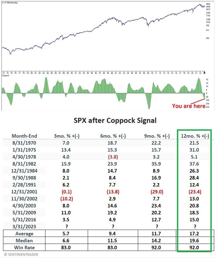
Source: @jaykaeppel
3. Sentiment Signals: This chart shows the rolling 52-week proportion of time where bears outnumbered bulls in the AAII survey… basically a measure of how persistent pessimism is. The key takeaway is that stocks tend to do well after persistent pessimism fades. But 2 things: a. signals like this can be early, and b. the peak in pessimism persistence could be more of a process than a well-defined sharp peak.
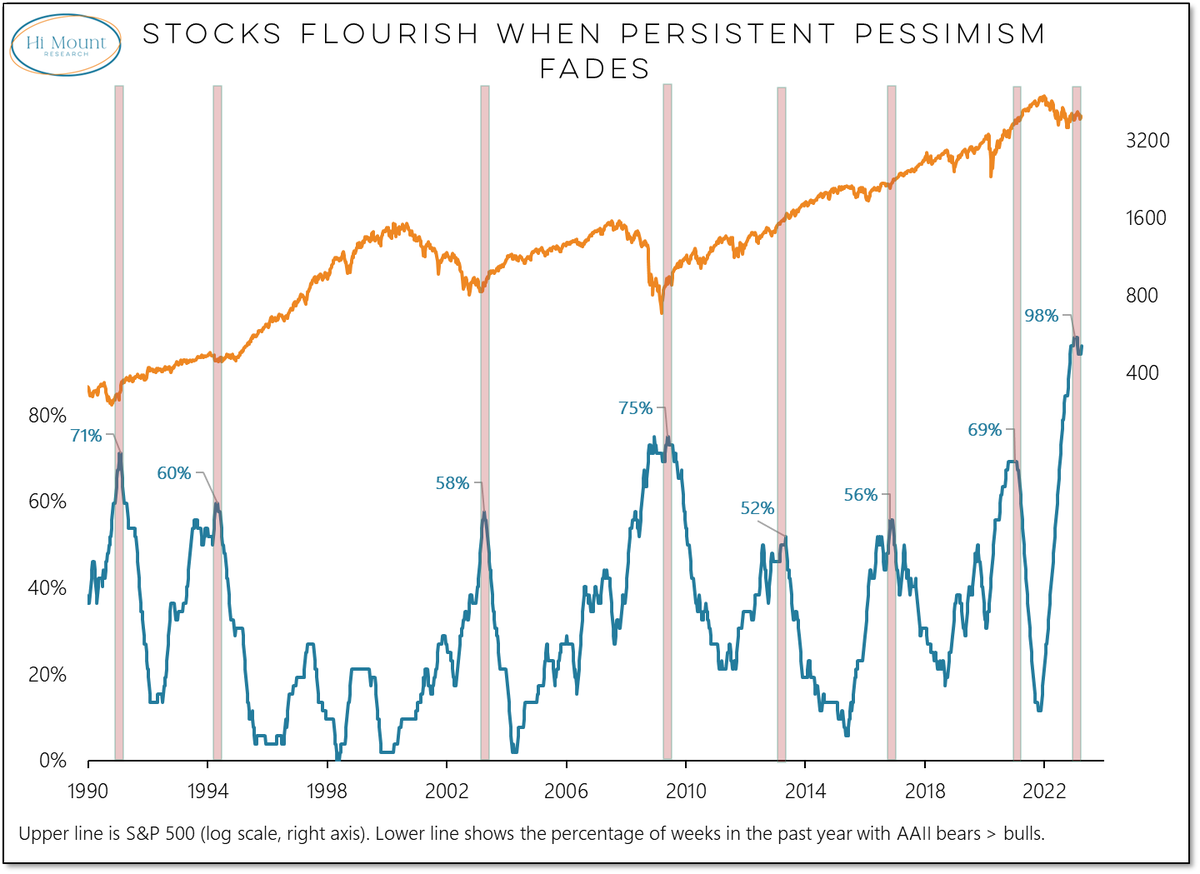
Source: @WillieDelwiche
4. Nasty Nasdaq: On first glance the recent price action in the Nasdaq 100 looks promising — the index is making higher highs and higher lows, and the 100-day moving average is turning up. But taking a look under the hood, it has not been a broad-based move, indeed, this chart highlights a bearish divergence in play.

Source: McClellan Financial
5. Nasdaq vs Small Caps: Speaking of the Nasdaq, here’s a chart of the Nasdaq’s relative performance vs small caps. Big Tech looks stretched vs small caps…
