
Weekly S&P500 ChartStorm - 8 September 2024
This week: tech trouble, all-in flows and positioning, valuations, seasonal rotation, defensive technicals, recession risk, yield curves, volatility, China, cash allocations...

Welcome to the latest Weekly S&P500 #ChartStorm!
Learnings and conclusions from this week’s charts:
Tech stocks are in technical trouble.
Tech flows/positioning reached an extreme.
Tech stock valuations are extremely expensive.
Rotation opportunities are gaining traction.
Recession risk is rising.
Overall, many of the contentions and cautions I and others had around tech (expensive valuations, stretched sentiment) have not mattered as the technicals had been so strong. But the technicals are turning now — bringing to mind the old tautological wisdom that “it doesn’t matter until it matters”.
REMINDER: the new Weekly ChartStorm Chat-Room is now up and running — I will host a live Q&A session on Sunday evening 7pm EST.
Also, ICYMI, recommended read: 12 Charts to Watch in 2024 [Q3 Update]
1. Tech Troubles: After failing to breach that key overhead resistance level, tech stocks have rolled over again — at this point now notching up a lower high. From a classical technical analysis standpoint this is not a good sign, you want to see a series of higher highs and higher lows to be confident in the bull trend, whereas a transition to lower highs brings into prospect the possibility of a bear trend establishing.
To remain constructive at all on tech stocks and by extension US equities as a whole, it is going to be critical for the Nasdaq to avoid making a lower low (and avoid breaching that rising bar of the 200-day moving average).
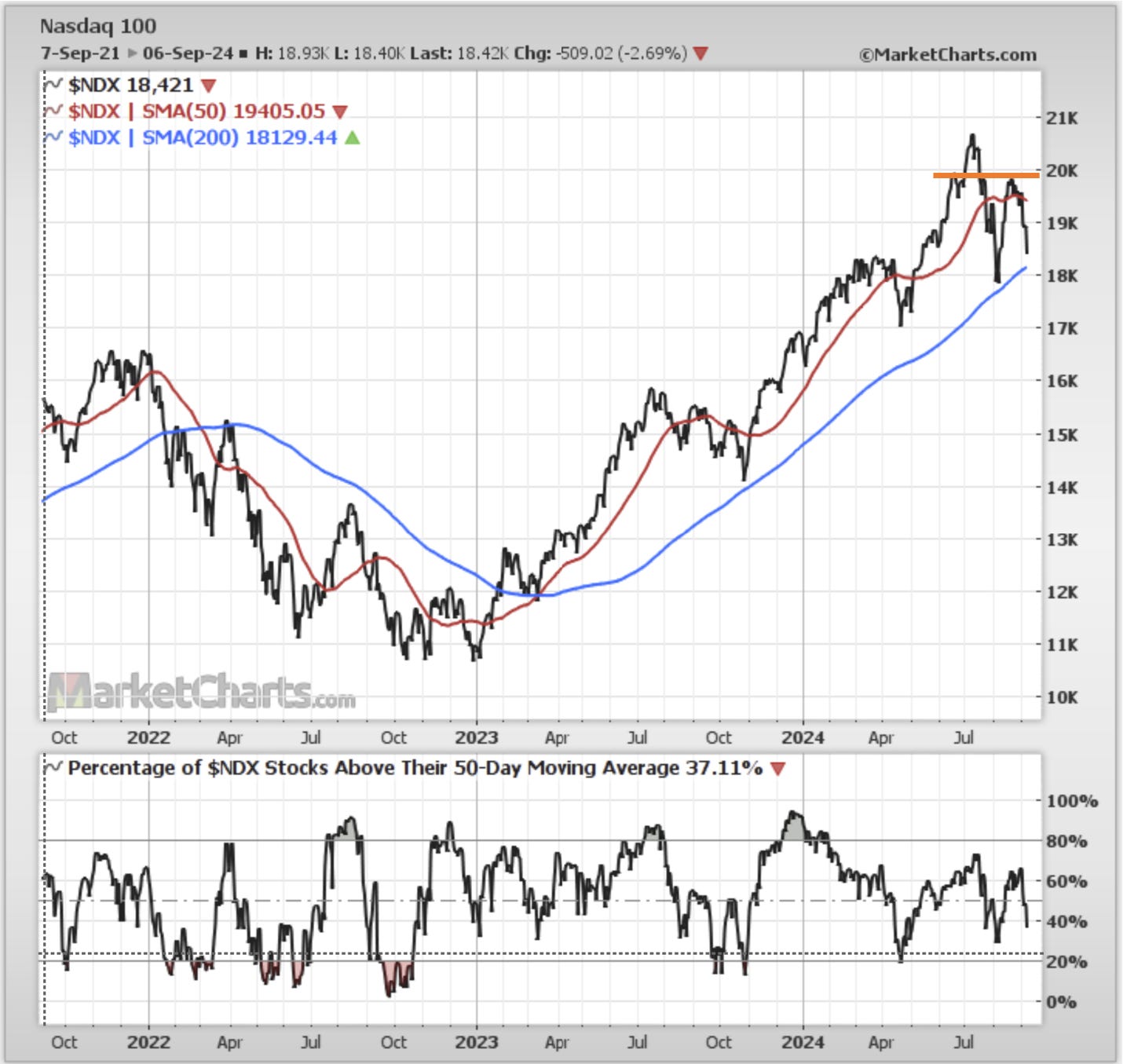
Source: Callum Thomas using MarketCharts.com Charting Tools
2. Starting Point — Flows and Positioning: One reason we fixate on tech stocks instead of the namesake S&P 500 (ChartStorm) is first of all because tech has become such a massive weight in the index and key driver of strength, but second because there has been so much hype and piling into tech, that it makes the biggest source of strength also the biggest vulnerability. And this chart shows just how all-in investors have been on tech. That by itself is not necessarily a tactical sell signal, but it does represent a risk — there are many minds that could change, and if those minds all change at once things can go further and faster than you think.

Source: Topdown Charts + Topdown Charts Professional
3. Starting Point — Valuations: The other issue of course which I have gone on about at length is the valuation side of thins, and it’s very clear that tech stocks are extremely expensive, which again speaks to the confidence that folk are expressing in their future revenue potential. The problem is, while people might be right that tech will turn in ever higher earnings, it’s kind of already in the price, and it sets a very high bar for upside surprise… and again makes it all vulnerable to any even minor disappointment or rattling of eternal exponential earnings expectations.

Source: Chart of the Week - Tech Value Echo
4. Rotation Ready: On the bright side, it’s still entirely possible that you could see some virtuous rotation — that previous chart even actually shows US stocks ex-tech valuations starting to play catch-up. Meanwhile the chart below shows seasonally speaking, we’re heading into what has traditionally been a very strong period for rotation (Dow tends to outperform the S&P500).
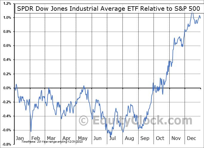
Source: @EquityClock
5. Bearish Rotations: That said, back to the bear side, the other type of rotation you can get is that of the bearish sort. The chart below shows traditionally defensive sectors steadily gaining ground vs the S&P500 — technically speaking, defensives are looking bullish, and that’s basically bearish for the index.
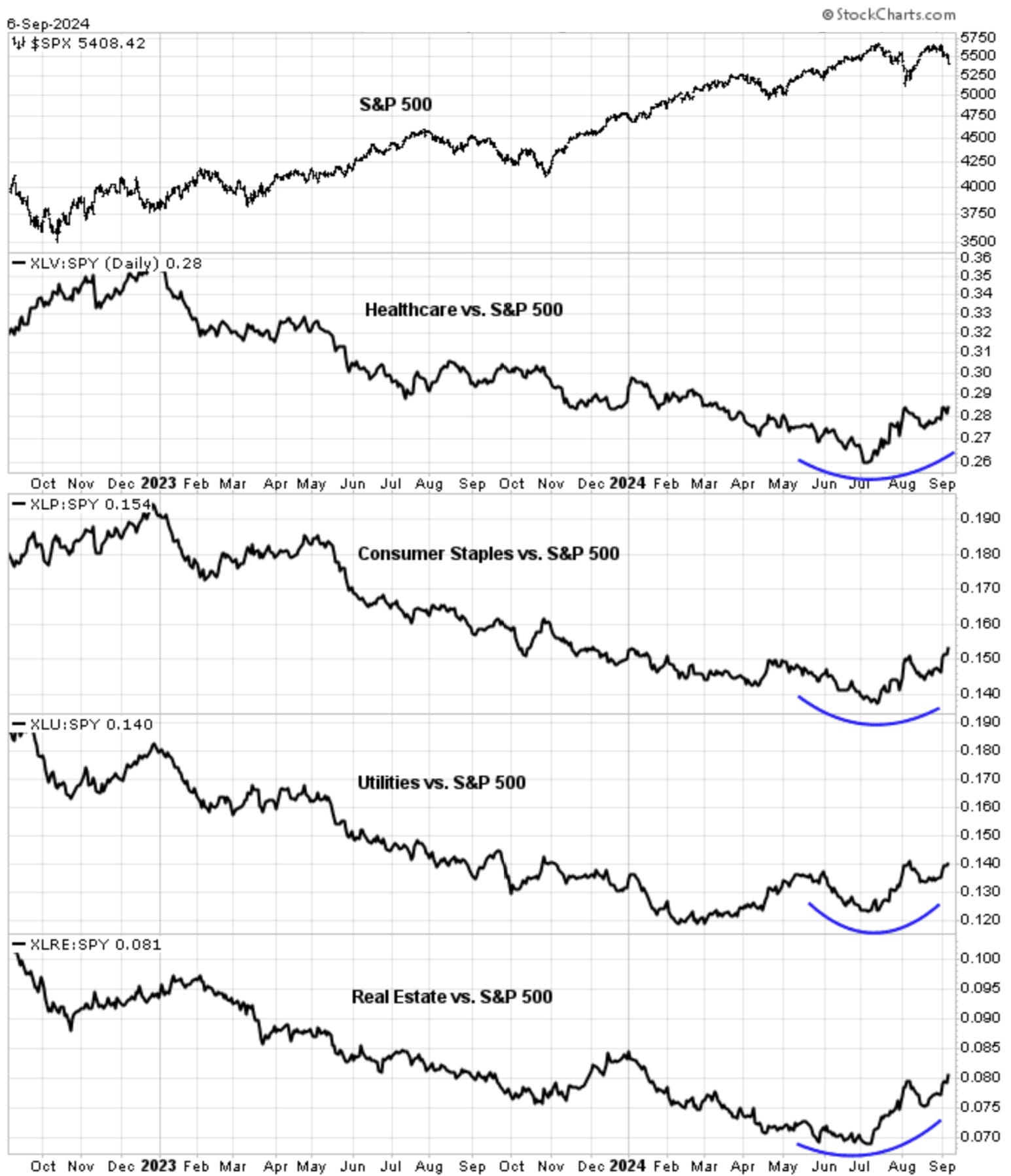
Source: Cam Hui — Humble Student of the Market
6. Recession Signals: Add to that all 3 indicators in the chart below are signaling heightened risk of recession. Maybe they are wrong and it’s different this time (for instance the pandemic distortions may still be playing through), but it does kind of line up with some of the price action we’re seeing in both risk assets and defensive assets.

Source: 12 Charts to Watch in 2024 [Q3 Update]
7. Yielding to the Curve: One of those 3 lines above is the yield curve, and in case you missed it, the yield curve is starting to “un-invert” (it’s not the inversion that gets you, it’s the un-inversion as bonds price recession and central banks get into action).
