
Weekly S&P500 ChartStorm - 6 March 2022
This week: geopolitics/spillover risk, sentiment snapshot, investor positioning, insider transactions, junk funk, intermarket analysis, longer term market stats...

Welcome to the Weekly S&P500 #ChartStorm (by email!)
The Chart Storm is a weekly selection of 10 charts which I hand pick from around the web (+some of my own charts), and then post on Twitter.
The charts focus on the S&P500 (US equities); and the various forces and factors that influence the outlook - with the aim of bringing insight and perspective.
Hope you enjoy!
! ALERT ! Sign up to the (free) Chart of the Week over at the new Topdown Charts Substack entry-level service: Subscribe to the Chart of the Week
Each week we send you a chart along with some commentary + context and a key takeaway — so you’re never left guessing on why the chart matters ...and the charts matter! The focus is on illuminating the ever-changing macro-market outlook to help identify incoming risks and opportunities. > > > Subscribe Now
1. Spillover Risk: Tracking performance of equities close to the frontline, so to say. This is perhaps one of the most direct measures of investor perception of spillover risk. Definitely one to keep an eye on as the situation evolves.
n.b. spillover basket = US listed ETFs: EWD, EFNL, EPOL
also n.b. RSX (and all other Ru ETFs) has been suspended/halted, and probably fair to say there is fundamental uncertainty to the viability of those funds (but I am no product expert, and this is *not* product advice!!).

Source: @topdowncharts
2. Sentiment continues to Sink: Here's another datapoint on the sentiment front — the National Association of Active Investment Managers exposure survey has dropped close to pandemic panic levels.
But again, with regards to sentiment, n.b. 2008. In other words, sentiment goes like this during a short-sharp (and then back to business) correction… but it can also go like this during the transition to bear market. I would say that with sentiment this repressed that the odds of a rebound is high, but also noting that bear markets are basically downtrends that do have plenty of short-lived rebounds and rallies.

Source: @granthawkridge
3. Surveyed Sentiment vs Portfolio Allocations: On the topic of investor sentiment, check out the chart below — *surveyed* sentiment (close to historical lows) vs *actual* portfolio allocations (close to historical highs). Investors might be saying they are extremely bearish, but their portfolios say they are still wildly bullish.

Source: @topdowncharts
4. Insiders Out: No appetite by corporate insiders to "buy the dip" at this stage. Perhaps waiting for better prices... (and/or they see the pointy end of increasing inflationary pressures and rising bond yields).

Source: @DiMartinoBooth
5. Corporate Bond Yield Momentum: When orange line going down/below zero = bullish. When orange line going up/above zero = bearish. Currently bearish. (logic would be that higher corp bond yields reflects weakening financial conditions as a result of rising interest rates and widening credit spreads).

Source: @WillieDelwiche
6. Junk Funk: Another angle on the Junk Funk...
(slowly at first, then all of a sudden)
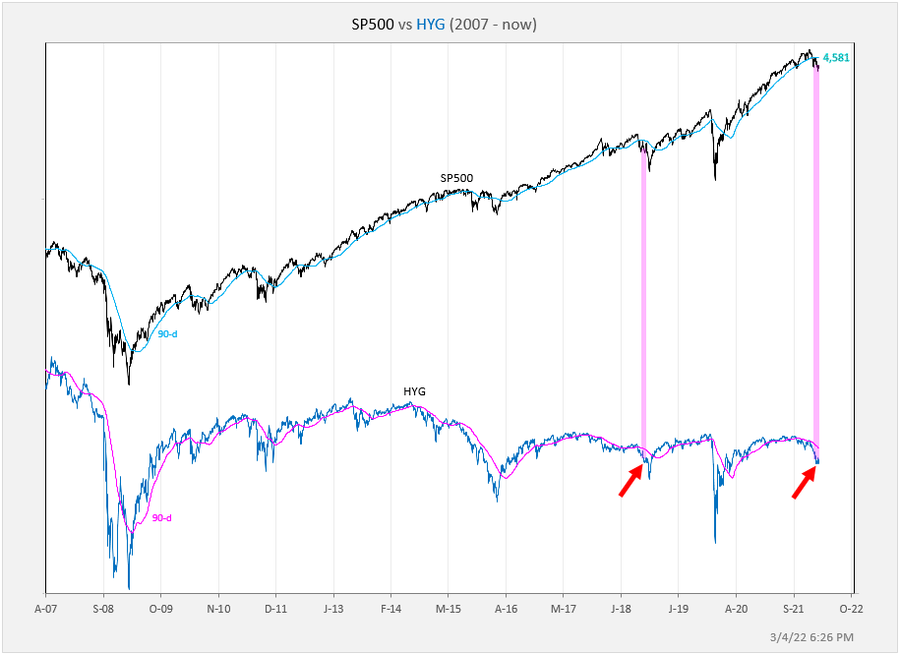
Source: @exposurerisk
7. Slumbering Spreads: Following on, worth noting that “High Yield“ (aka junk bond) credit spreads haven’t even gotten that spready yet. Again, there is 2 ways we can look at this: a. there is another shoe to drop yet; or b. things aren’t actually that bad if credit spreads are still largely shrugging off the volatility. (albeit they could both be right, but in sequence…)

Source: @topdowncharts
8. Risk Flows: If you are looking for further “shoes to drop”, I would say this is arguably one example: flows have clearly turned south as you would expect, but it still seems kind of light or perhaps underreaction vs what we saw in 2020 and vs the ostensibly shocking sentiment situation that seems to have set in...

Source: @MikeZaccardi
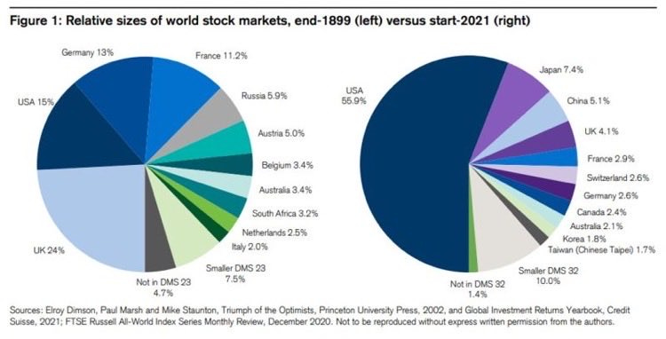
9. Monster Market: US stockmarket went from 15% of world in 1899 to 56% end 2021. Some think it's the only game in town, but it doesn't take much studying to realize there are many other and very different games out there too...
Source: @MacroAlf
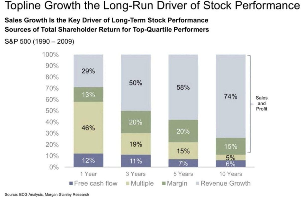
10. Sales = King. (albeit, that is an old chart, I would hazard a guess that margins and multiples might have taken greater weight in returns over the past decade)
Source: @MaverickBogdan
Thanks for following, I appreciate your interest!
oh… that’s right, almost forgot!
BONUS CHART >> got to include a goody for the goodies who subscribed.
Technical Thoughts: regime change. (…market regime change!)
As a student of the market, it is both an extremely unsettling — and fascinating time to be involved. Sentiment has turned on a dime, and there are clear shifts underway in the underlying behavior of multiple markets. These *two* bonus chart(s) offer an insight or perspective on this thought.
First: bullish risk taking via leveraged long vs short US equity ETFs has absolutely collapsed, and that comes after previously breaking well beyond the range of the past decade… almost one of those classic “up the stairs, down the elevator“ sort or situations.

Strictly speaking, and viewed in a vacuum, the leveraged ETF indicator in the chart above is flashing a buy signal (albeit it has been early before e.g. 2018). This adds to the notion I outlined earlier that when sentiment gets like this, the market can easily bounce bigly.
But here’s another one, and it needs some explanation: what it shows is the spread between the rolling annual count of days up more than 1% vs days down more than 1%. So basically tracking whether upside vs downside volatility is dominating.

You probably didn’t need this chart to know that upside volatility was decisively dominating in the latter part of 2020 and earlier in 2021. But things are changing now.
Why I think this chart is interesting, and perhaps instructive, is to look at the way it transitioned around the peak of the dot com bubble — from raging and frenzied bull market to perhaps the classic/textbook bear market.
In other words, it may be an early sign of (market) regime change.
And if that’s the case then we’ll need to start reading and interpreting things a little differently than what we’ve been patterned into doing over basically the entire past decade.
—
Best regards,
Callum Thomas
SPONSOR: ( …he’s me!)
My research firm, Topdown Charts, has a new entry-level Substack service, which is designed to distill some of the key ideas and themes from the institutional fund manager service to provide the same high quality insights at a more accessible price.
Give it a try and let me know what you think