
Weekly S&P500 ChartStorm - 6 June 2021
Your weekly selection of charts...

Welcome to the Weekly S&P500 #ChartStorm (by email!)
The Chart Storm is a weekly selection of 10 charts which I hand pick from around the web (+some of my own charts), and then post on Twitter.
The charts focus on the S&P500 (US equities); and the various forces and factors that influence the outlook - with the aim of bringing insight and perspective.
Hope you enjoy!
n.b. sending this early this week as I’m on the road (the writing is a bit more on the brief side this week too!)
1. S&P500 50-day Moving Average Breadth: Another test and bounce from that arbitrarily drawn trendline... onwards and upwards?
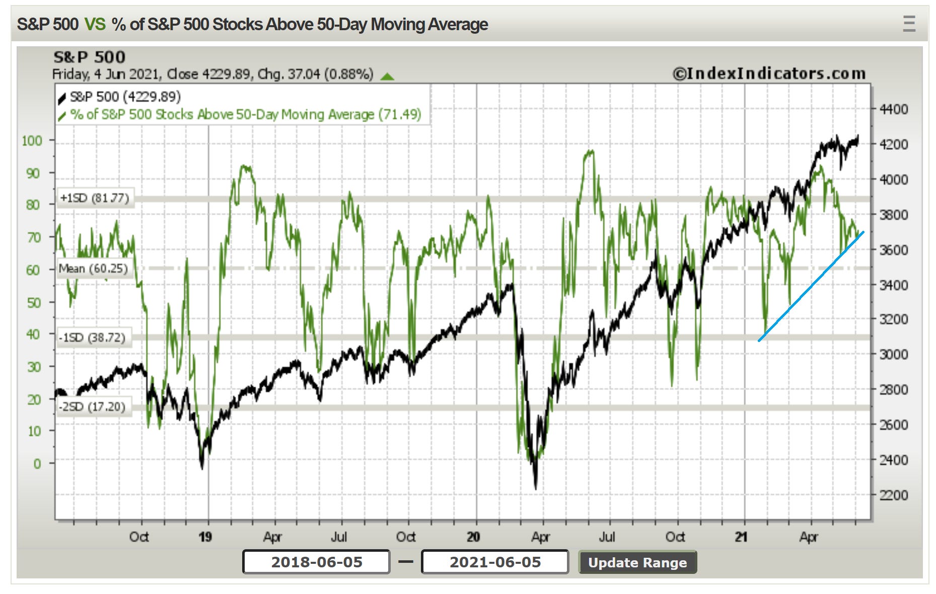
Source: @Callum_Thomas
2. Credit vs S&P500: short-term bearish divergence… (basically looking at a rough proxy of credit spreads inverted vs the market). Definitely worth keeping an eye on credit as spreads are at rock bottom and the Fed is wrapping up some of its corporate bond covid response facilities.
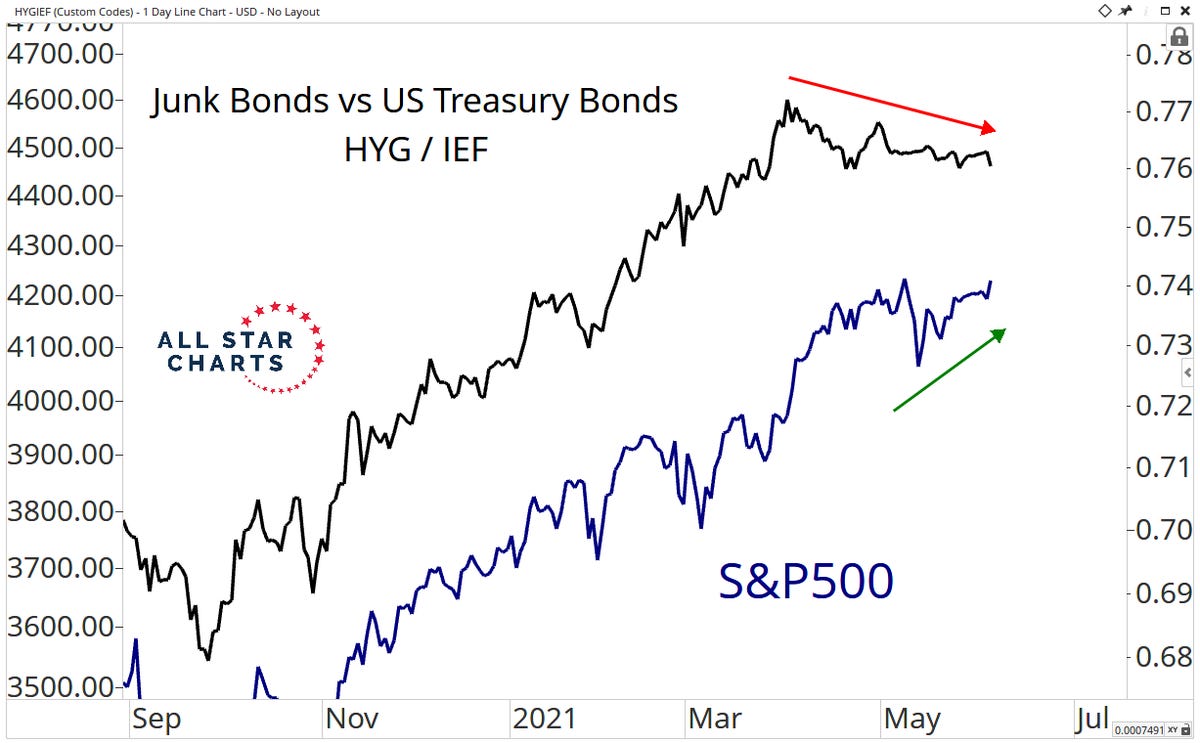
Source: @allstarcharts
3. Inflation rate + P/E ratio: TBH, not sure how much stock I would put in this indicator, but then again I don’t disagree that inflation risks are skewed to the upside and valuations do generally look expensive in absolute terms…
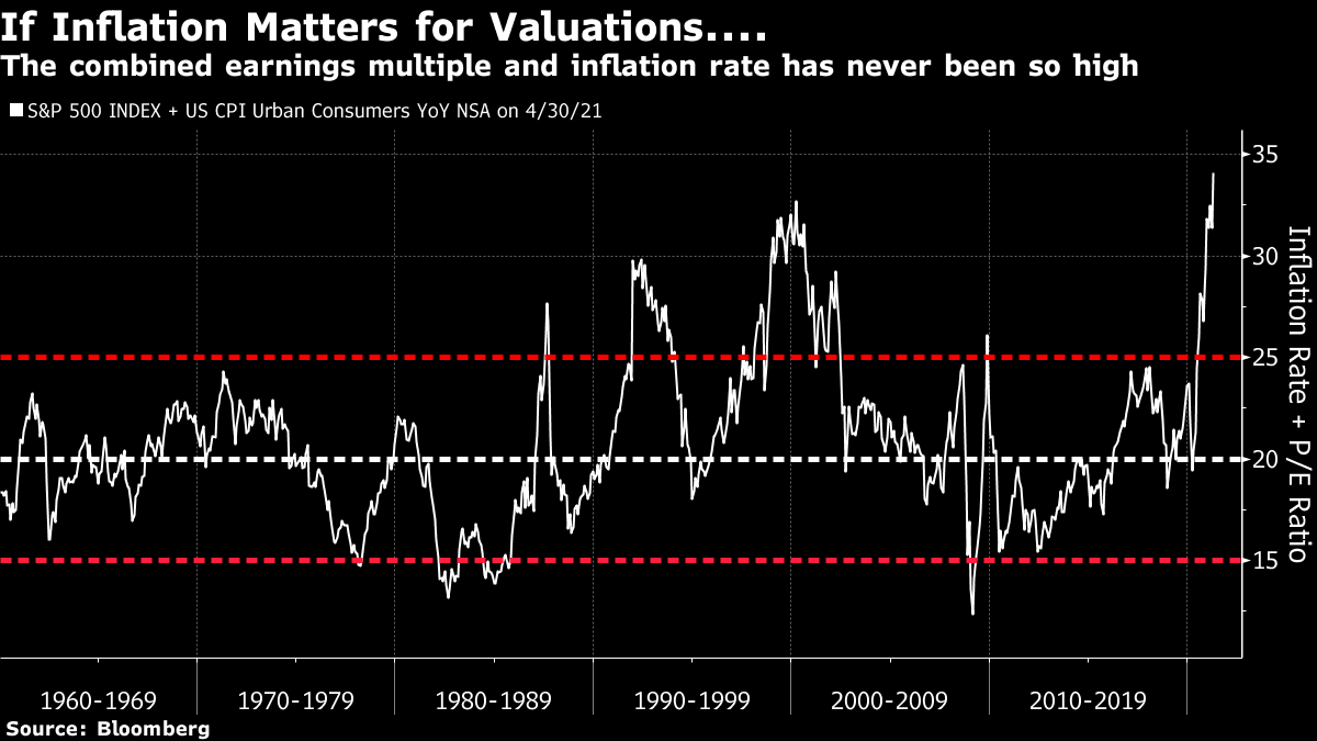
Source: @johnauthers and @JCastroValdivia
4. "Long Duration Equities": Extreme expensive. (IMO: partly a reflection of how expensive bonds are …also shows at least a pocket of the market which could get shaken up if bond yields head higher)
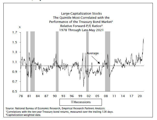
Source: @RBAdvisors
5. S&P500 Valuations: Absolute valuations = extreme expensive. Relative to bonds (ERP valuations) merely neutral. (aka why bond yields matter)
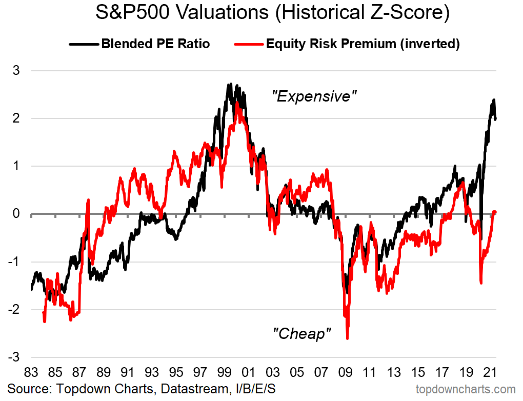
Source: @topdowncharts
6. Fund flows into European Equities : ...go with the flow?
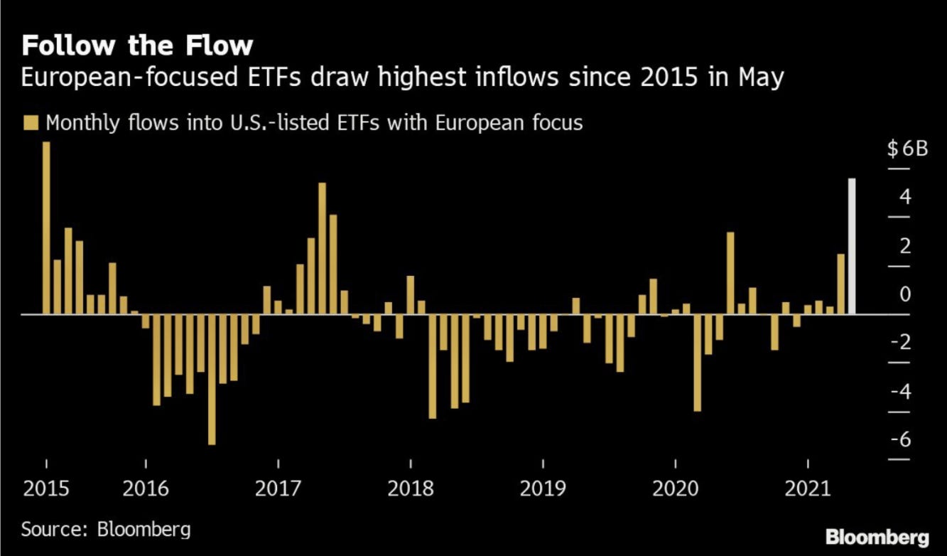
Source: @markets
7. Speaking of European Equities... BREAKOUT !!
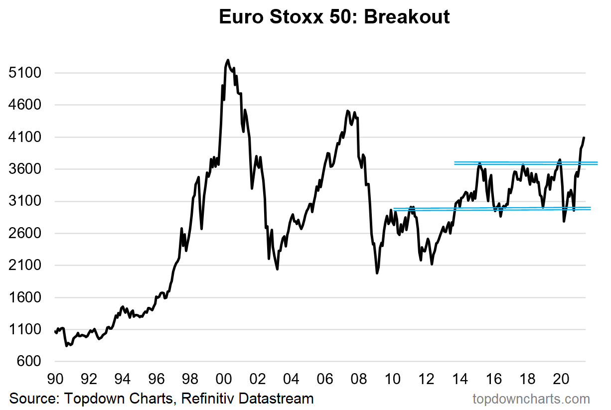
Source: More notes on European Equities
8. Commodity Stock Valuations: perhaps one of the more direct/attractive inflation hedges; commodity producers look extremely cheap vs the S&P500.
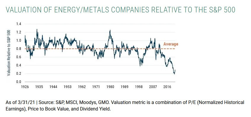
Source: @jessefelder
9. ESG to the moon! Mentions by S&P500 companies of ESG — there is definitely a movement here, and that probably means a real impact on market pricing.
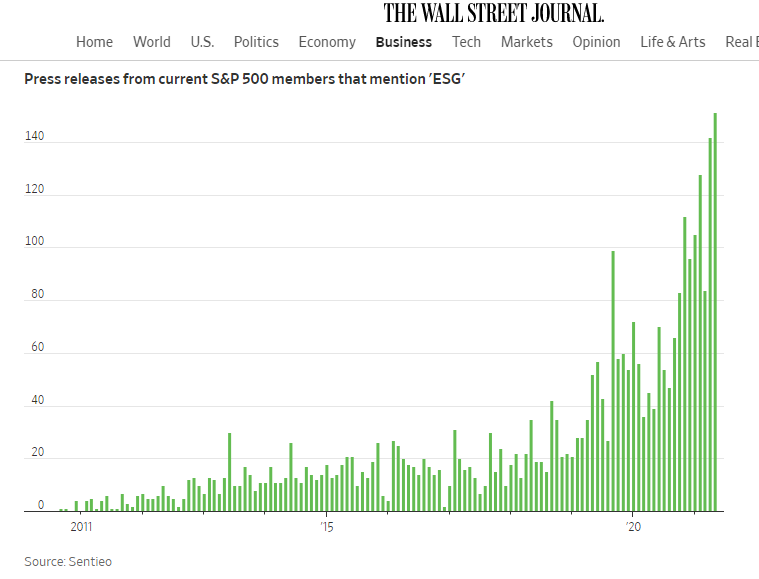
Source: @MikeZaccardi
10. CEO Pay of S&P500 Companies: interesting snapshot of CEO compensation.
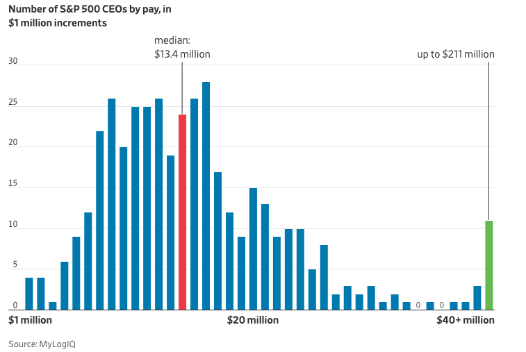
Source: @chriswmayer
Thanks for following, I appreciate your interest!
oh… that’s right, almost forgot!
BONUS CHART >> got to include a goody for the goodies who subscribed.
US Equities Effective Tax Rate: all the more relevant as the G7 attempts to wrangle the world into a new global minimum tax rate - partly in response to the fiscal splurge during Covid, and partly in response to long-running concerns around tax havens and companies paying their fair share (especially internet/tech stocks).
But it’s more than just an interesting chart — what you see in this chart is a 2-decade tailwind to earnings as companies have enjoyed falling effective tax rates.
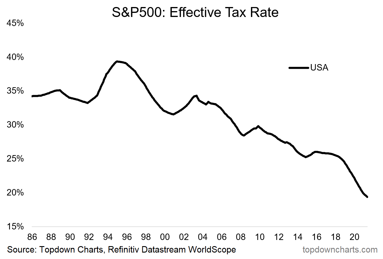
Going forward though it seems fairly clear that this trend will come to an end. The G7 tax agreement, the fiscal overhang from the pandemic, the Biden tax hike proposals… society seems to want companies to pay more tax.
It doesn’t necessarily mean that effective tax rates start going sharply higher, but at the very least this 2-decade tailwind to corporate earnings is almost certainly over and done with for now.
—
Best regards,
Callum Thomas
SPONSOR: ( …he’s me) My research firm, Topdown Charts, has a new entry-level Substack service, which is designed to distill some of the key ideas and themes from the institutional service to provide the same high quality insights at a more accessible price.
Give it a try and let me know what you think