Weekly S&P500 ChartStorm - 6 February 2022
This week: technicals check, liquidity, earnings, seasonality, fed rate hike effects, market correction map, value vs growth turning points, and midnight bulls...
Welcome to the Weekly S&P500 #ChartStorm (by email!)
The Chart Storm is a weekly selection of 10 charts which I hand pick from around the web (+some of my own charts), and then post on Twitter.
The charts focus on the S&P500 (US equities); and the various forces and factors that influence the outlook - with the aim of bringing insight and perspective.
Hope you enjoy!
! NEW ! Sign up to the (free) Chart of the Week over at the new Topdown Charts Substack entry-level service: Subscribe to the Chart of the Week
Each week we send you a chart along with some commentary/context and a key takeaway — so you’re never left guessing on why the chart matters ...and the charts matter! The focus is on illuminating the ever-changing macro/market outlook to help identify incoming risks and opportunities. Subscribe Now
1. S&P500 Sandwich: The market is currently sandwiched between support & resistance — AND the 50dma vs 200dma. It’s all a bit of push and pull, tug of war between bulls and bears playing out in the markets right now.
Source: @Callum_Thomas
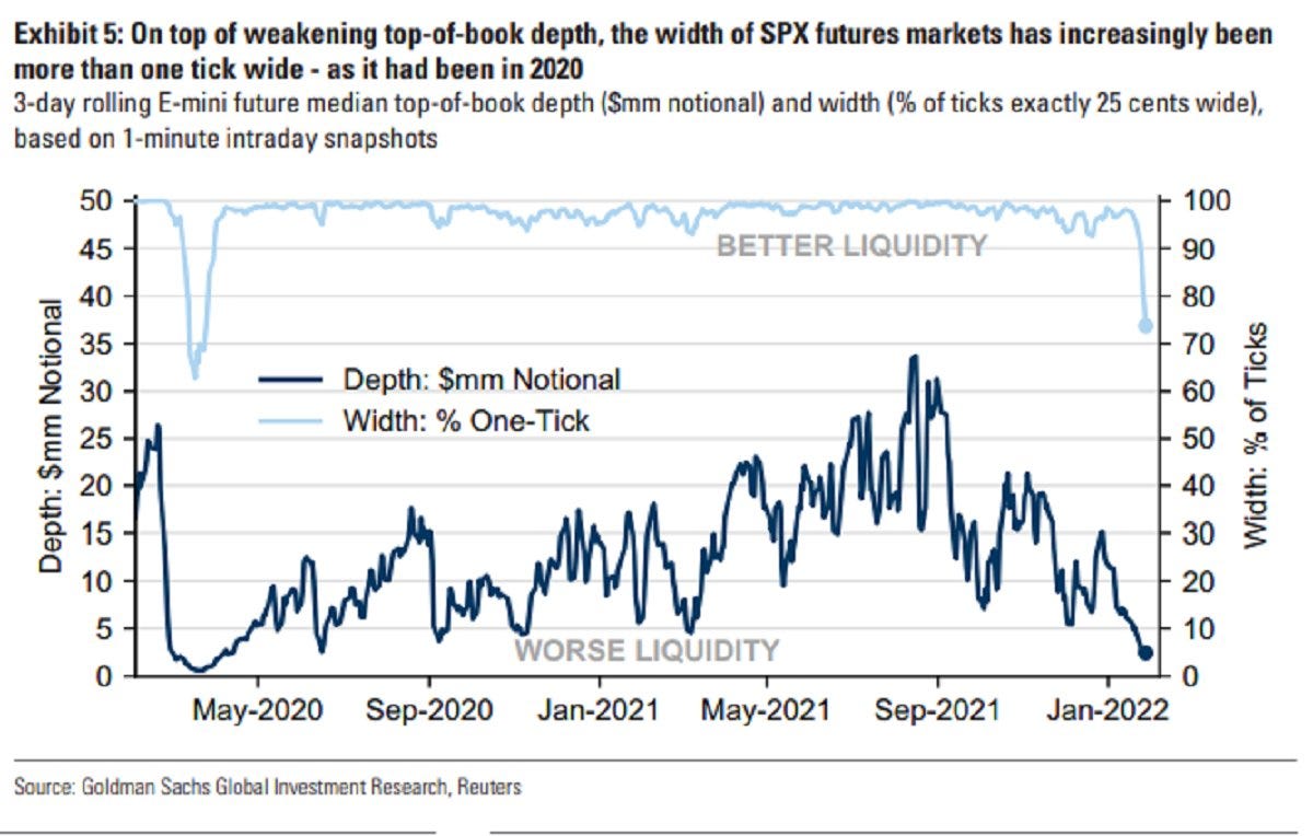
2. Lacking liquidity: This chart puts on display a few key features of the current market environment — e.g. indecision, uncertainty, lower participation, and therefore: higher price gyrations.
Source: @averygrrl
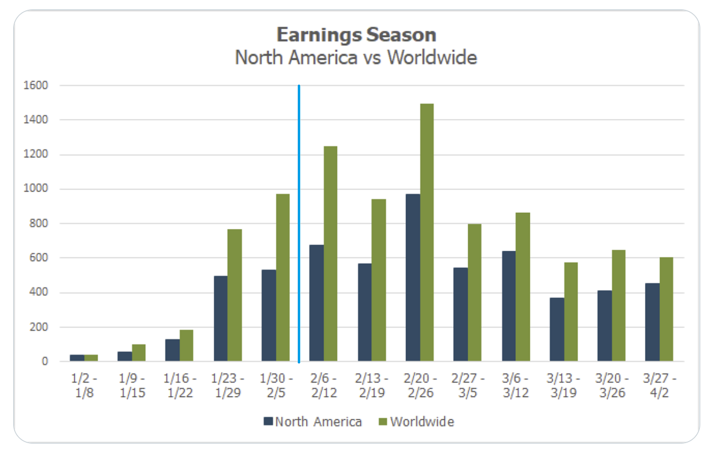
3. Earnings Season Calendar: Looks like we’ve got more Earnings Season fun and games ahead the next few weeks both in the US and abroad...
Source: @MikeZaccardi
4. Election Cycle Seasonality: Pay attention to the red and green lines…
Source: @AlmanacTrader
5. Fed Hiking Cycles and the Stockmarket: Speed matters!
This cycle is likely to be fast as the Fed is behind the curve, and easing was in response to a shock vs garden variety recession. Either way, pay close attention to the Fed because “don’t fight the Fed“ takes on a different meaning on the way out…
Source: @MrBlonde_macro
6. Correction Map: "the average S&P 500 pullback during non-recessionary periods is -15.4% and -36% during recessions"
The current S&P500 correction was about -12% from high-to-low, which is about in line with average ex-recession...
Source: @HumbleStudent
7. Seasonality of Value Vs Growth: Value vs growth relative performance line was up 7% in Jan — which is actually well in fitting with its typical tendency to outperform in January. The seasonal map below says Feb is typically a wash… but Mar/Apr tend to be very strong months historically for value vs growth relative performance.
Moar rotation to come ??
Source: @topdowncharts
8. Volatility Rising — Value vs Growth Edition: This chart reminds me of an earthquake seismometer... also reminds me of the dot-com turning point!
Source: @topdowncharts
9. Stockmarket Regimes: Growth vs Value…
1989 - 2000: Growth Stocks
2000 - 2007: Value Stocks
2007 - Nov. 2021: Growth Stocks
2022 - ???
Source: @JeffWeniger
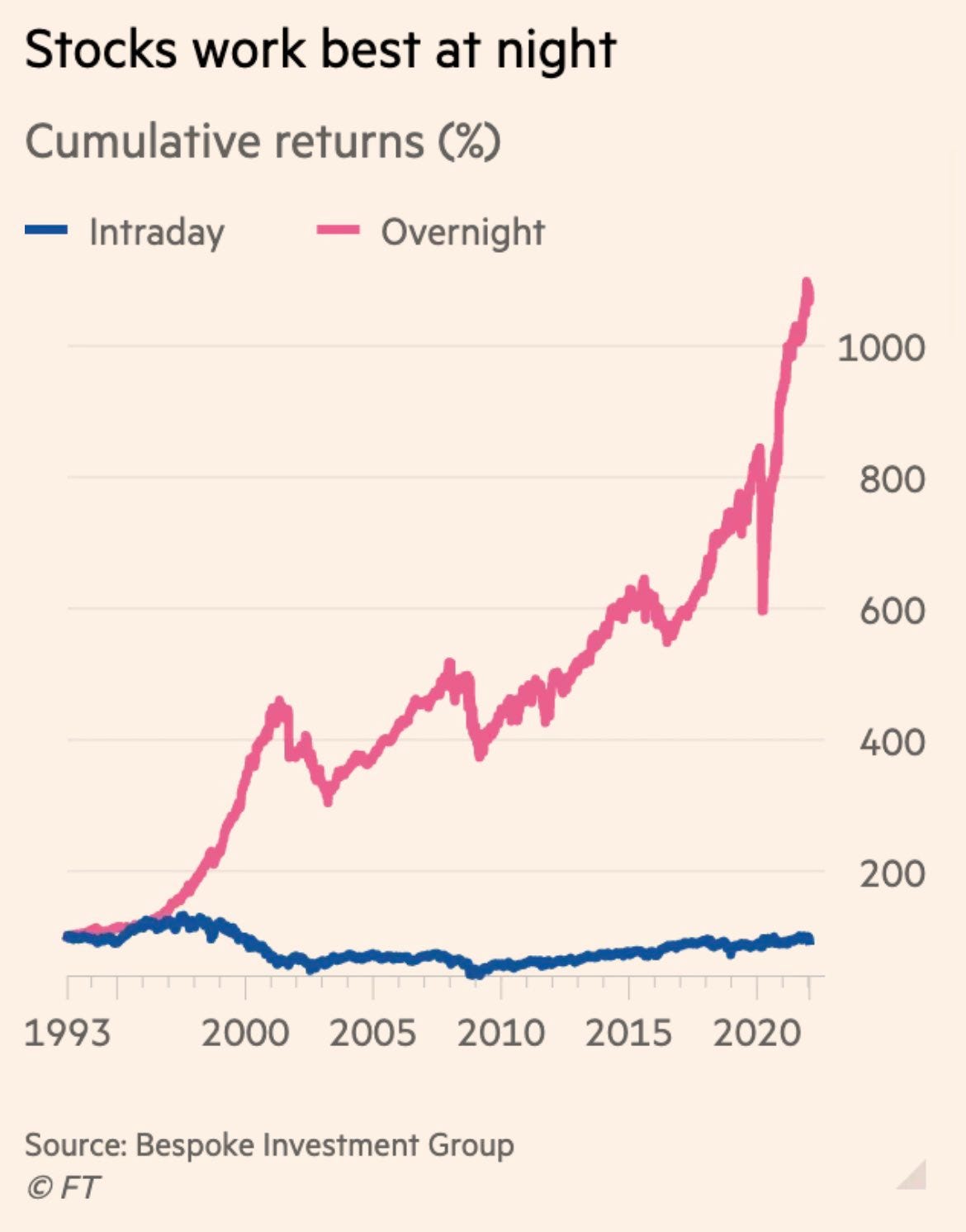
10. Stockmarket Stats: Bulls come out to play at night.
Source: @RobinWigg via @DuncanLamont2
Thanks for following, I appreciate your interest!
oh… that’s right, almost forgot!
BONUS CHART >> got to include a goody for the goodies who subscribed.
Emerging Markets vs USA: another point of rotation.
At one point during the January rotation-correction EM equities were up some 12% vs US equities. Looking at the chart below one might be tempted to say so what? big deal, it’s just a blip in an otherwise well-entrenched downtrend.
But if we zoom out a bit and take a longer-term perspective, we find the EM vs US relative performance line bouncing from similar levels as where it got to around the turn of the millennium (and just before a major relative bull market took hold).
Price is only one piece of the puzzle (along with valuations, positioning, US dollar, economy/earnings, policy, commodities, thematics, and so-on!), but this is a rather intriguing puzzle piece.
It is interesting in and of itself, but also interesting in that it echoes a lot of other big rotations/trends in relative performance e.g. the value vs growth charts we looked at earlier in this week’s session.
Indeed, that aspect (rotation) was probably the most interesting feature of the January correction — it wasn’t just blind risk-off sell-everything, it was a violent rotation.
Perhaps a glimpse of things to come…
—
Best regards,
Callum Thomas
SPONSOR: ( …he’s me!)
My research firm, Topdown Charts, has a new entry-level Substack service, which is designed to distill some of the key ideas and themes from the institutional fund manager service to provide the same high quality insights at a more accessible price.
Give it a try and let me know what you think! :-)


Thank you Callum!