Weekly S&P500 ChartStorm - 5 September 2021
This week: monthly charts, volatility, stocks vs bonds, fund flows, tech sector stats, valuations, and the best stocks...
Welcome to the Weekly S&P500 #ChartStorm (by email!)
The Chart Storm is a weekly selection of 10 charts which I hand pick from around the web (+ a few of my own creations).
The charts focus on the S&P500 (US equities); and the various forces and factors that influence the outlook - with the aim of bringing insight and perspective.
Hope you enjoy!
>>> p.s. if you haven’t already, subscribe (free) to receive the ChartStorm direct to your inbox
1. S&P500 Monthly Chart: Happy New Month! Another month, another update to the monthly chart. Is anyone else’s mind boggled that there are only 111 days until Christmas? August saw the S&P500 up +2.9% on the month and now up just over 20% YTD - that is a solid number. p.s. for anyone wondering, here is the same chart in log, real, and log real terms.
Source: @TopdownCharts
2. Asset Class Returns in August: That steady performance in August was enough to put the S&P 500 at the top of the asset class performance tables on a monthly basis (albeit ‘only‘ 6th on a year over year basis). It continues the recent trend of “unrotation“ - where EM/global had initially outperformed last year/early this year vs US, but that brief outperformance has been given right back.
Source: Asset Class Returns page
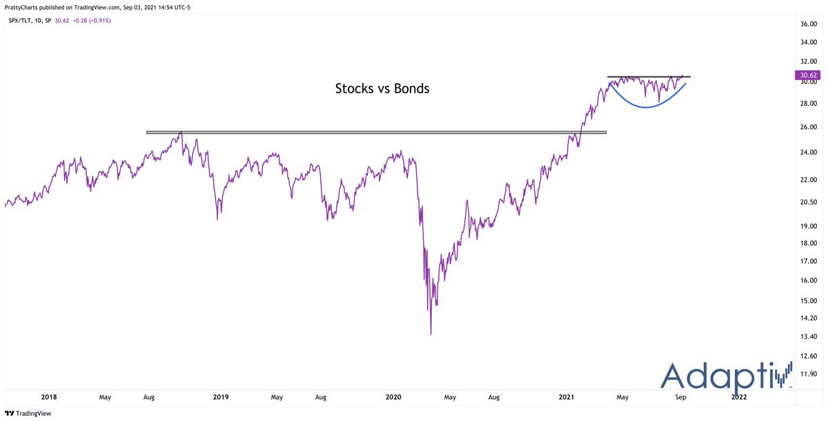
3. Stocks vs Bonds: You might have noticed in the chart above how handily US large cap equities had beaten US treasuries. The next chart shows there has been a little bit of nuance to this in recent weeks where stocks and bonds reached a bit of a stalemate, but this stalemate looks to be ending; with stocks coming out on top…
Source: @PrattyCharts
4. Alternative View of Volatility: This next chart shows basically an alternative lens on rolling realized volatility. It is the rolling 12-month sum of daily percentage changes in the S&P500 which exceeded either 1% on the upside or -1% on the downside. Bulls will probably look at this chart and say this is good because usually large spikes in this indicator and subsequent declines are a sign of the beginning of a bull market…. n.b. check out the bonus chart section at the end where I’ve expanded on this with a couple extra charts using the same framework.
Source: @TopdownCharts
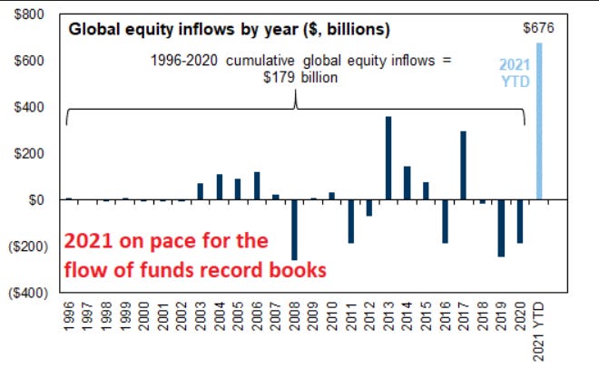
5. Global Equity Flows: Speaking of mind boggling, this chart shows 2021 YTD flows into global equities… which far exceeded the total cumulative flows across the previous 15 years …!
Source: @VLequertier
6. Small Cap Equity Fund Flows: Not so much for Small Caps though... Investors have been dumping US small cap equity funds at a record pace. Looks like a contrarian signal to me.
Source: Case for Small Caps
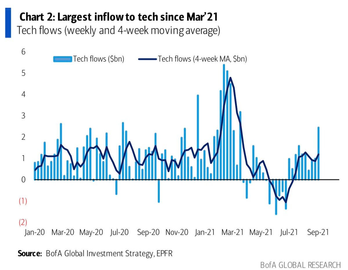
7. Tech Flows: Out of small caps and into big tech! After a brief respite earlier in the year, investors are jumping back on the tech trade. If you recall there was a bit of movement out of the sector as bond yields rose: the narrative being that tech stocks; being more growthy and higher duration, were at risk vs rising rates. Since then bond yields have come down (and bonds now look expensive on my metrics) — maybe this is a sign that bond yields have bottomed!
Source: @Marlin_Capital
8. Tech Sector Insider Purchases: An interesting chart this one; there seems to be contrarian information in this indicator… tends to be higher during selloffs/corrections/risk-off, and lower around short-term market peaks.
Source: @BrightramLLC
9. CAPE vs CAPE (2.0): With this adjusted version of the CAPE (Cyclically Adjusted Price to Earnings ratio) or Shiller PE ratio, the authors attempt to adjust for the impact of changing tax rates and buybacks. The result is a materially lower valuation figure. That said, it doesn’t drastically change the conclusion: i.e. the market merely looks pretty expensive vs extremely expensive.
Source: Adjusted CAPE Ratio
10. The best 30 Stocks of the past 30 Years: A parental advisory for the emotional pain of FOMO on that last column! I always wonder when I see tables and figures and charts like that… sure if you bought Monster at the IPO and put an entire 10k into and held it all the way to today you’d have over $30m …but who would have held all the way? I would say a large number of people would have cashed out after doubling their money, or dropped off when the stock price fell in half along the way… and as we know, the average holding period has dropped significantly in recent decades, so it’s like who among us can/will/does hold for that long anyway? Perhaps some food for thought at the very least, and a pretty interesting and diverse group of stocks!
Source: @charliebilello
Thanks for following, I appreciate your interest!
oh… that’s right, almost forgot!
BONUS CHART >> got to include a goody for the goodies who subscribed.
Upside vs Downside Volatility: I wanted to expand on chart number 4 from today, the charts below build off the same method, but instead show a conditional perspective on volatility i.e. upside vs downside volatility.
The first chart shows the rolling 12-month sum of moves exceeding +1% and separately also shows the same of moves worse than -1%. Firstly, we can see a very clear and distinct gap, we can also see that the red line is perhaps not as extreme as some of the other notable episodes in recent stock market history.
The next chart I would argue makes the previous chart a bit more useable/actionable, by taking the spread between upside vs downside volatility. We can see that surges in this indicator are typically found earlier in the market cycle e.g. at the beginning of the mid-2000’s bull market, and again after the global financial crisis.
One could be tempted to call this a powerful long-term cyclical bull market signal.
I would caution that this signal did light up a little later in the cycle in the late 1990’s, but even then, you could argue that there is still time left on the clock this cycle if we used that episode as the analog.
Anyway, I thought it was quite interesting, and certainly one to keep in the market analysis toolkit for the coming years and decades ahead.
—
Best regards,
Callum Thomas
SPONSOR: ( …he’s me!)
My research firm, Topdown Charts, has a new entry-level Substack service, which is designed to distill some of the key ideas and themes from the institutional fund manager service to provide the same high quality insights at a more accessible price.
Give it a try and let me know what you think


Any charts in particular stand out to you this week? (also, what topics would you like to see more charts on next time?)