Weekly S&P500 ChartStorm - 5 March 2023
This week: monthly chart, stockmarket support group, seasonality, what makes a bull market, earnings vs sales, credit stress, corporate cash, and bonus charts on cash...
Welcome to the Weekly S&P500 #ChartStorm — a selection of 10 charts which I hand pick from around the web and post exclusively on Substack. These charts focus on the S&P500 (US equities), and the forces and factors that influence the outlook - with the aim of bringing insight and perspective.
For more background, see: ChartStorm Origin Story
1. Happy New Month! After closing February down -2.61%, the S&P500 still managed to hold above its 10-month moving average for the second month in a row.
Source: Topdown Charts @TopdownCharts
2. Stockmarket Support Group: But perhaps more interesting is how late last week the market managed to rebound off a whole group of supports — the 200-day moving average, the short-term uptrend line, the previous downtrend line, and from a glance there looks to be a horizontal support line around there too. While it could just be a jump on the diving board, without knowing anything else this looks bullish and probably sets the tone at least until we get any new news to shift things.
Source: Topdown Charts @TopdownCharts
3. Season’s Greetings: Interesting follow-up then to notice that March/April tend to be (historically) seasonally strong months for the market.
Source: @RyanDetrick
4. Conditional Seasonality: While the debate still rages as to whether we are still in a bear market vs bull market, I thought I would at least expand the analysis I did last year on conditional seasonality — this time looking at how seasonality looks in bull vs bear markets during the 3rd year of the election cycle. Again the point to note is that H1 is good (and H2 is typically less good), also that if it is a bear market, the best case is sideways ranging and lots of chop.
Source: Conditional Seasonality Analysis
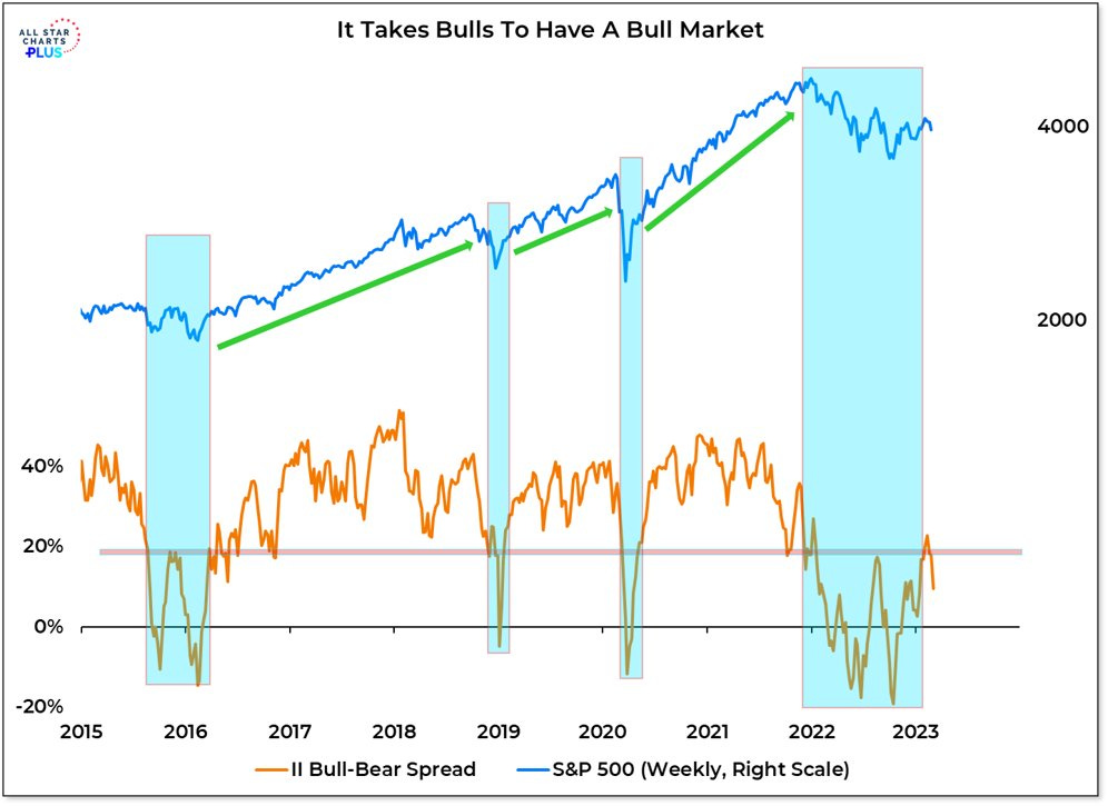
5. It Takes a Bull to Make a Bull: Although it’s arguably a bit tautological, it takes bulls to make bulls. Or perhaps we could say this: market bottoms are found in situations of extreme pessimism, but sustainable uptrends aka bull markets are found in situations where optimism is the prevailing mood. For now the prevailing mood is still basically one of pessimism, skepticism, and indecision.
Source: @WillieDelwiche
6. Volume Battleground: The bull-bear-battle is also playing out in volumes — this chart shows the volume on up days vs down days (how technicians gauge the relative flows in terms of demand and supply in the market). Normally in a bull market demand/up volume would dominate, and certainly after a major/decisive bottom in the market you would expect to see “accumulation“ (more demand volume). So arguably another piece of evidence against the new bull thesis.
Source: @3F_Research
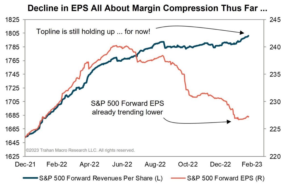
7. Earnings Down vs Revenues Up: Cost pressures have sent earnings into recession, but for now resilient nominal growth seems to be putting a floor under revenues. This is basically another bulls vs bears chart, in that bulls can still point to a current lack of economic recession (maybe later?), while bears can point to a current reality of earnings recession. Both are right, but how things play out from here is going to come down to where that green(?) line goes.
Source: @FrancoisTrahan
8. Off the Bear Lows: This chart shows the top 10 (12-month) rallies from bear market lows since 1950. The interesting point is how for the top 4 instances, earnings were still lower 12-months later. Which goes to show that you can see prices go up even as earnings decline. Albeit I would note March 2020 is an outlier, and March 2009 saw a much deeper and profound reset than what we saw in 2022 (which pales in comparison), and 2009 saw a big shift to stimulus and bail outs vs ongoing tightening at the moment.
Source: @mattcerminaro
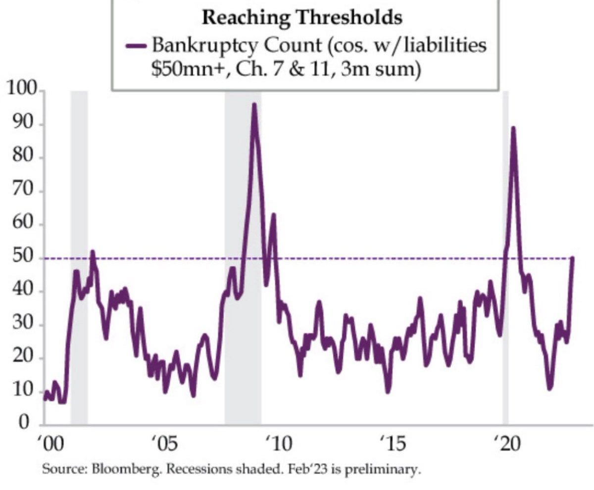
9. Bankruptcy Boom: They say there is always a bull market somewhere, and it looks as if a new bull market is getting underway in the pace of corporate bankruptcies!
Source: @DiMartinoBooth via @joosteninvestor
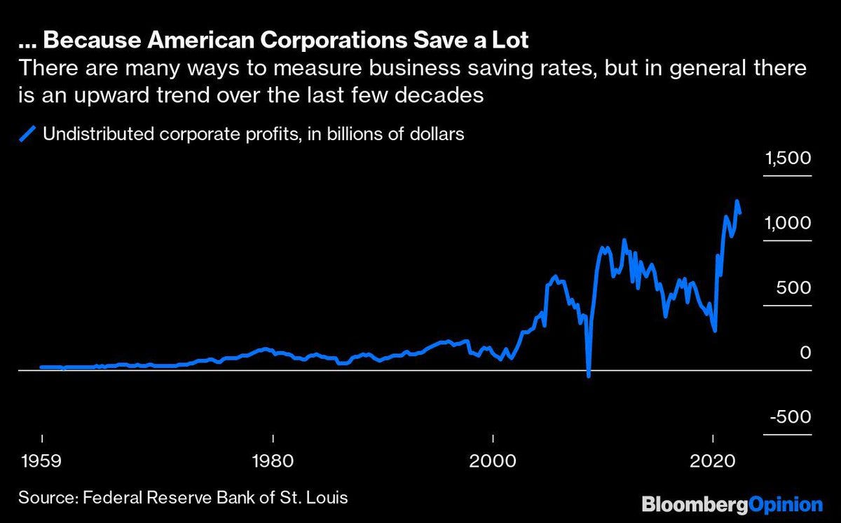
10. Corporate Cash: An interesting juxtaposition to the previous chart, this one shows the rise and rise of corporate cash. Economists might argue that this is basically corporations enabling excess spending and borrowing by consumers and the government. Investors might argue that this is poor capital allocation (well at least it probably was when cash rates were 0%, perhaps less poor now that rates are high again). Meanwhile bankers will argue this is a good thing because it means a cash buffer against credit stress. They’re probably all right.
Source: @acemaxx
Thanks for reading, I appreciate your support! Please feel welcome to share this with friends and colleagues — referrals are most welcome :-)
BONUS CHART SECTION >> got to include a goody for the goodies who subscribed.


