Weekly S&P500 ChartStorm - 5 June 2022
This week: risk drivers, seasonality check, insider indicator, small calls, leveraged ETFs, forward PE ratios, price to sales, Buffett Indicator, no profits, no 2008...
Welcome to the Weekly S&P500 #ChartStorm — a selection of 10 charts which I hand pick from around the web and post on Twitter.
These charts focus on the S&P500 (US equities); and the various forces and factors that influence the outlook - with the aim of bringing insight and perspective.
Hope you enjoy!
NEW: Sign up to the (free) Chart Of The Week over at the new Topdown Charts Substack entry-level service: Subscribe to the Chart of the Week
Each week we send you one of the most interesting charts on our radar, along with commentary/context and a key takeaway — so you’re never left guessing on why the chart matters ...and the charts matter! > > > Subscribe Now
1. Lines in the sand...
The S&P 500 appears to be stalling at resistance after a short sharp rebound. Looking at the “correction risk drivers“ I’ve mentioned previously:
-EPOL (geopolitics) also stalling
-LQD (rates/credit) turning down again
-ARKK (tech bust) bouncing along the bottom
Overall fairly unconvincing.
Source: @Callum_Thomas
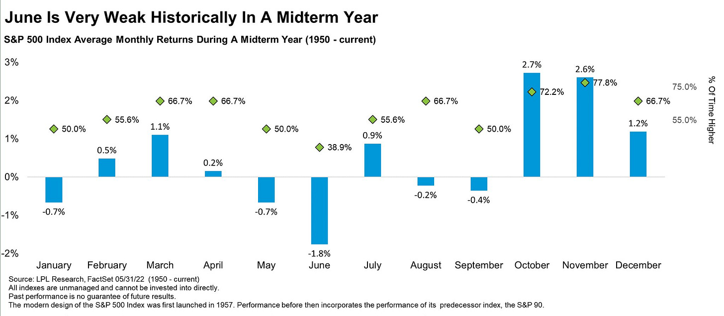
2. Seasonality Check: June is historically the worst month of the year for stocks during a midterm year. Always exceptions to the average, but interesting to note.
Source: @RyanDetrick
3. Insider Timing: This “Insider Big Block Trading indicator” looks to be at or close to a buy signal... as always, note the exceptions (beware of early buy signals).
Source: @SethCL
4. Giving up on Calls: Small trader buying of call options has near evaporated -- stark contrast to the frenzy of 2020/21.
Source: @zerohedge
5. Bullish Speculation Evaporation: Similarly, the degree of trading in leveraged long vs short US equity ETFs puts on clear display the bullish speculation evaporation. Looks like a buying/bouncing signal recently though...
Source: @topdowncharts
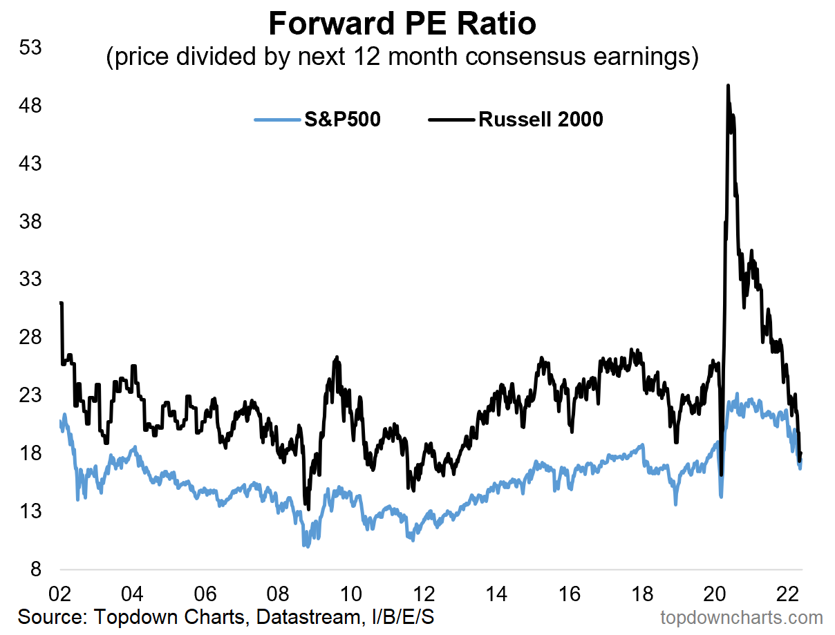
6. Forward PE Ratio: Small Cap forward PE ratio back down to earth.
(albeit n.b. small cap consensus forward EPS crashed -57% in 2020, and have surged +15% this year, and up ~250% off the low point. All good if EPS deliver on analyst expectations — and assuming earnings are sustainable in the face of a potential global recession... )
Source: @topdowncharts
7. Price to Sales Ratio: Good news everyone!
After a big reset, the S&P 500 price to sales ratio is now only as expensive as during the peak of the dot com bubble!
(albeit, margins are also higher, rates lower, etc)
Source: @TaviCosta
8. Value? "Buffett Indicator" also now all the way down to dot-com bubble levels.
Source: @KailashConcepts > > Blog Post Here
9. Number of Money-Losing Companies: No profits, no problem?
(or: no profits, no, problem!)
Source: @LizAnnSonders
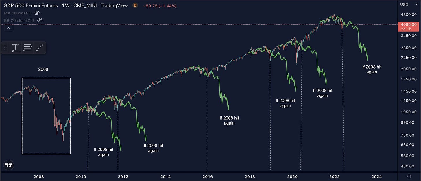
10. aka, The Cost of Recency Bias: "If 2008 hit again" (you always hear some attention seekers claiming this is going to be the next 2008 every time markets get a bit volatile… be careful who you listen to!!)
Source: @FusionptCapital
Thanks for following, I appreciate your interest!
BONUS CHART >> got to include a goody for the goodies who subscribed.
IPO Boom & Bust: Along with the SPAC craze, IPO markets kicked into a rare state of frenzy over the past couple years (helped by the liquidity tsunami of monetary + fiscal policy stimulus flooding across markets).
But that boom has given way to bust as the same forces retreat.
This year 97 IPOs have been withdrawn as funding conditions sour, and filings are averaging a pace of ~30 IPOs per month vs 115/month last year.
Another stark stat is the relative performance of the Renaissance IPO ETF — in relative terms (vs S&P500) up more than 200% from the March 2020 low to the Feb 2021 peak ...and now down -64% from the peak.
Basically this all represents a barometer of the comings and goings of liquidity and speculative fervor. After the party, here’s the hangover.
Until the next party…
—
Best regards,
Callum Thomas
My research firm, Topdown Charts, has a new entry-level Substack service, which is designed to distill some of the ideas/themes/charts from the institutional research service to provide the same high quality insights at a more accessible price.
Give it a try and let me know what you think! :-)


