
Weekly S&P500 ChartStorm - 5 December 2021
This week a check in on tech market technicals, risk indicators, valuations, longer-term outlook, and wine prices...

Welcome to the Weekly S&P500 #ChartStorm (by email!)
The Chart Storm is a weekly selection of 10 charts which I hand pick from around the web (+some of my own charts), and then post on Twitter.
The charts focus on the S&P500 (US equities); and the various forces and factors that influence the outlook - with the aim of bringing insight and perspective.
Hope you enjoy!
p.s. if you haven’t already, subscribe (free) to receive the ChartStorm direct to your inbox, so you don’t miss out on any charts (you never know which one could change the whole perspective!)
1. Monthly Chart: Perhaps not-so-happy new month this time… the S&P500 ended the month down -0.8% m/m. And it was much the same across assets - just about every risk asset fell during November, only bonds managed to eke out small gains.

Source: @topdowncharts
2. Nasdaq: The next few charts cover the tech-heavy Nasdaq (as a reminder it’s the techy parts of the S&P500 that have been doing much of the heavy lifting in driving the index higher). So a couple of things stick out to me on this chart: a. bearish RSI divergence (higher highs in the index vs lower highs in the RSI); b. short-term head and shoulders topping pattern (which has basically been confirmed as of Friday); and c. thus-far successful test of the 50-day moving average. The other thing that stands out is the surging volumes: everyone thinks they will get out at the top.
Source: @Callum_Thomas
3. Bitcoin Flash Crash: Bitcoin flash crashed over the weekend -- I tend to think of Bitcoin as a sort of liquidity/speculation barometer, and hence could provide some information for the hotter parts of the stock market (such as tech/Nasdaq). And on first glance at the chart below, I would say it doesn't bode particularly well for Monday...

Source: @topdowncharts
4. China vs US Tech Stocks: Chinese tech stocks are down about -60% since peaking in February this year. We could explain this away on the basis of liquidity and regulatory tightening in China… but then again, maybe they are just a few steps ahead e.g. prospective regulatory scrutiny of big tech in the US, global tax rules, and recent Fed pivot away from “transitory inflation“ to openly discussing accelerated tapering of QE and rate hikes in 2022.

Source: @SofiaHCBBG
5. Nasdaq vs Dow Jones: To round it off, here’s a look at the spectacular relative performance of the Nasdaq (“new economy“) vs the Dow Jones (“old economy”). I would note that it is an entirely different trajectory this time around — with many macro/fundamental differences, albeit with many echoes from that time too... (e.g. valuations, surging speculation)
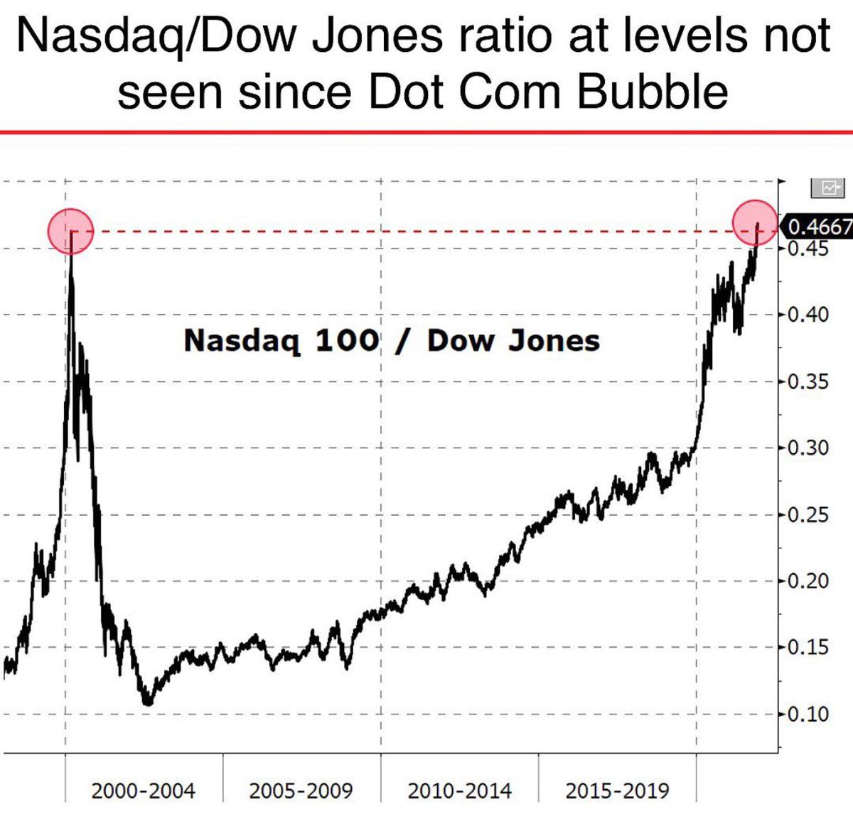
Source: @radar_market via @dissectmarkets
6. Value vs Growth Valuations: For instance, value stocks are looking increasingly cheaper vs growth stocks (or at least less expensive vs extreme expensive growth stocks)… value keeps getting crushed by growth (and the pandemic accentuated that trend - through mostly one-off effects).

Source: @MarketPictorial
7. Breadth of Valuations: More and more stocks are entering a new stratosphere of valuation (albeit profit margins are higher and interest rates are lower).
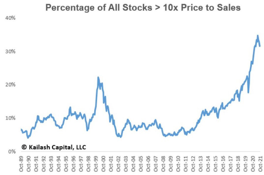
Source: @KailashConcepts
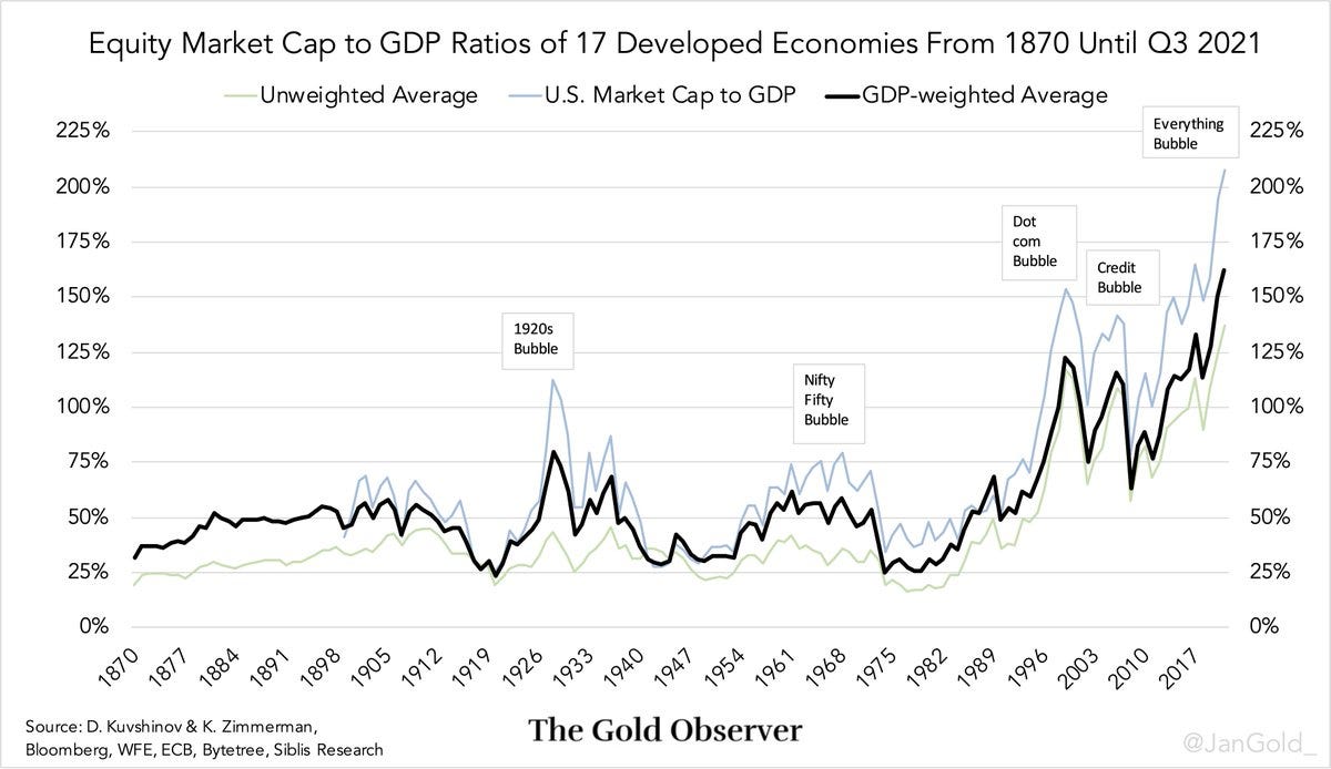
8. Market Cap to GDP Ratio: This interesting chart shows the average “Market Cap to GDP ratio“ across developed economies. As you might expect it has reached new all time highs. I’ve mentioned before that I have a few issues with this indicator, but rather than dwell, I’ll just jump onto one of my favorite valuation indicators…
Source: @JanGold_
9. PE10 Valuations: The PE10 Valuation metric takes price vs trailing average 10 years of earnings - providing a more stable anchor by which to make valuation judgements. I talked this indicator up during March 2020 for this very reason (albeit interestingly I got a ton of pushback because everyone was like “yeah but what will earnings be?“ - which actually kind of missed the point). The other point is that earnings are a very logical fundamental to base valuation judgements on too. Anyway, the key takeaways are: US equities are close to dot-com levels and are trading 2.2x that of the rest of the world (an all-time high). So some pretty interesting takeaways on absolute and relative valuations in this one.

Source: @topdowncharts
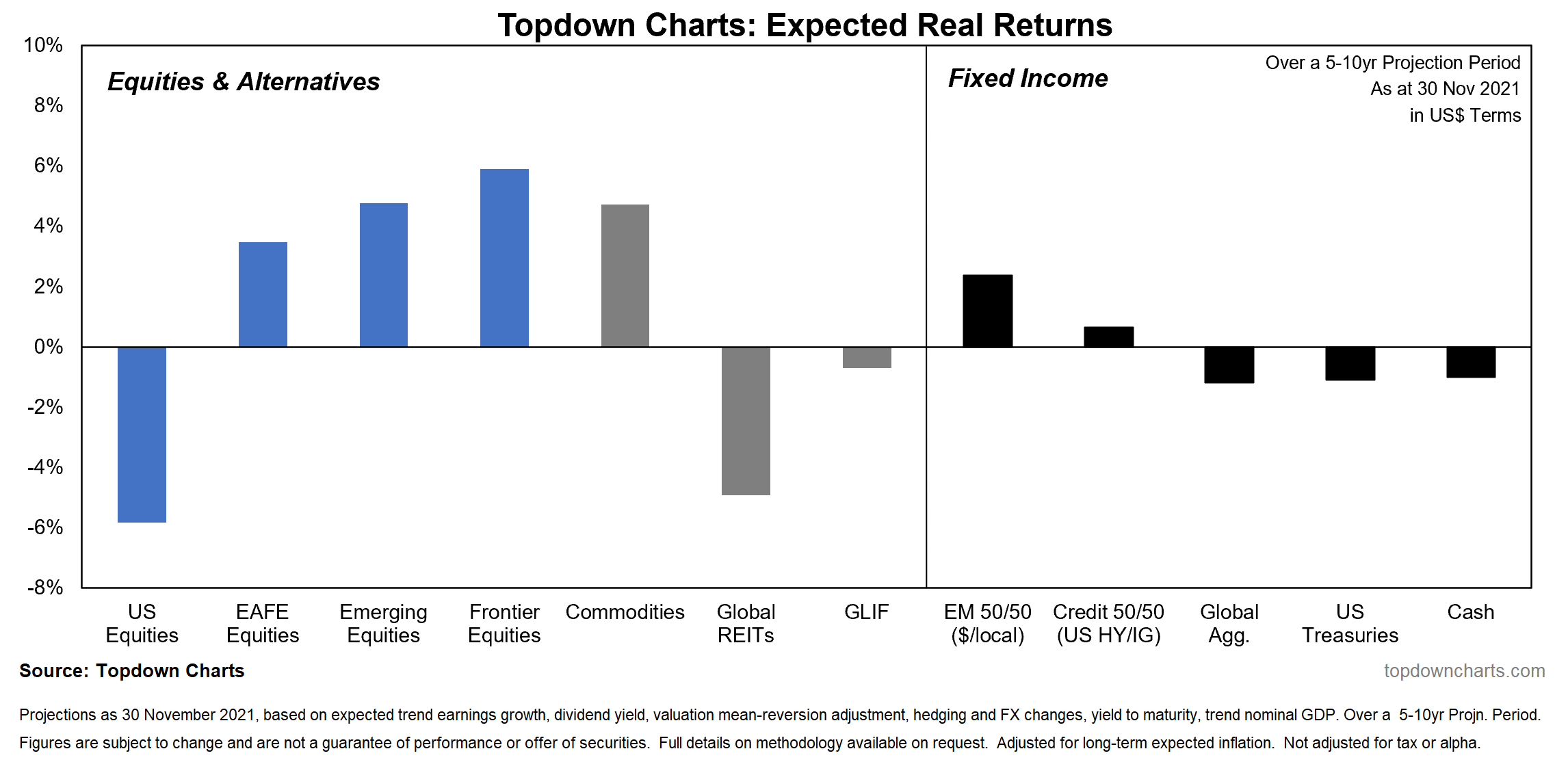
10. Expected Returns: Finally, a check-in on expected returns. Going off this chart you’d skew into global ex-US equities, commodities, and EM fixed income… almost the opposite of what has done the best over the past decade (US equities and treasuries), and certainly - by most people’s estimations: venturing further out the risk curve. Challenging times ahead for asset allocators.
Source: Topdown Charts
Thanks for following, I appreciate your interest!
oh… that’s right, almost forgot!
BONUS CHART >> got to include a goody for the goodies who subscribed.
Wine vs Stocks: would you call it inflation or investment opportunity?
As we head into the festive season, and what looks like a less-than-festive season in stocks, the Liv-ex Fine Wine Index may be a bit more relevant than usual!

Since inception, wine prices have more than held their own vs stock prices (albeit I would note that the above is price-only — so it doesn’t include the impact of dividends from stocks …or any “dividends“ from wine holdings!).
However, the next chart shows in relative terms wine peaked vs stocks in 2011 (much like commodities), and since then has been in a 10-year long relative bear market.

Maybe some relative value in wine?
—
Best regards,
Callum Thomas
SPONSOR: ( …he’s me!)
My research firm, Topdown Charts, has a new entry-level Substack service, which is designed to distill some of the key ideas and themes from the institutional fund manager service to provide the same high quality insights at a more accessible price.
Give it a try and let me know what you think