Weekly S&P500 ChartStorm - 4 September 2022
This week: monthly market performance stats, historical market context and bear markets, consumer mood on the market, earnings degrowth, valuations, trading card price index vs stock market index...
Welcome to the Weekly S&P500 #ChartStorm — a selection of 10 charts which I hand pick from around the web and post on Twitter.
These charts focus on the S&P500 (US equities); and the various forces and factors that influence the outlook - with the aim of bringing insight and perspective.
Hope you enjoy!
NEW: Sign up to the (free) Chart Of The Week over at the new Topdown Charts Substack entry-level service: Subscribe to the Chart of the Week
Each week we send you one of the most interesting charts on our radar, along with commentary/context and a key takeaway — so you’re never left guessing on why the chart matters ...and the charts matter! > > > Subscribe Now
1. Happy* New Month!
The S&P 500 was down -4.24% on the month in August (-4.08% in total return terms). Initial gains in the first part of the month were erased late-month following the Jackson Hole monetary policy tightening double-down. Basically a case of "pivot-hope-ON to pivot-hope-OFF" across markets.
*happiness not guaranteed
Source: @topdowncharts
2. Worst year (YTD) on record for 60/40
thoughts:
-what are the odds of it being mirror image next year (as is often the case with this sort of thing - but not always e.g. early 2000’s)?
-(this is nominal, inflation adjusted would be even 🤮)
Source: @bespokeinvest via @TheChartReport
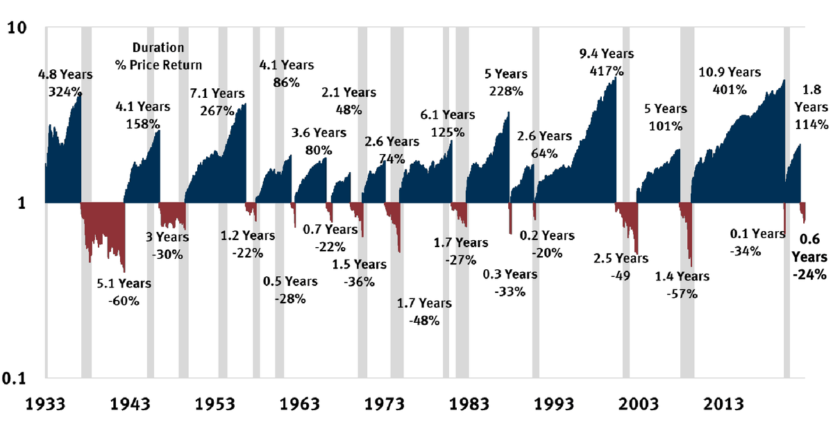
3. Bull vs Bear Across the Ages: This is a pretty interesting chart just in terms of filling out the historical context. Albeit it is hard to draw (m)any meaningful conclusions, but as a starter: a. bears are mostly short and sharp (but note exceptions); b. bull cycles generally been longer since the 80’s (vs very cyclical/rangy in 60’s/70’s); c. the bigger/longer the rise =/= any hard/fast rules about what happens next e.g. 1930’s vs late-50’s vs early-00’s vs (now?); d. most of the time the market is going up/bull; e. (but) there is ample scope/opportunity/value in market timing (or at least asset allocation and diversification); and f. it’s always different (even if it’s similar).
Source: @Mayhem4Markets
4. Bearing Down: On bear markets, it turns out historically most of the damage in a bear market is dealt in the final stages (makes sense on the psychology as people give up on chasing bear market rallies, as well as fundamentals as financial conditions tightening loops trigger-off risk cascades/breaks).
(n.b., also important to note though that the actual duration is only known after the fact, and looking at these instances there is a wide dispersion of durations)
Source: @nicholastreece
5. Moving Average Movement: Volatility is much higher when the market is tracking below the various moving averages.
or i.e. as the old market wisdom goes:
"nothing good happens below the 200dma"
Source: @GameofTrades_
6. Market Regime Change: "For the first time since January 2013, the S&P 500 has not been within 5% of its all-time high for 90 days."
In other words, for those who have been trained to buy the dip, it’s different this time.
Source: @michaelbatnick
7. Market Mood: Consumers have lost confidence in the market according to the Conference Board consumer confidence survey. Historically this has a patchy track record. In 2008 they were right, they were also justifiably bullish in the early 2000’s and even a few years ago. But then again, that about sums up the current environment, there is a lot of justification for weaker stock prices and people for the most part are well aware of these facts… (“it’s in the price”).
p.s. fun fact, "mood" spelt backwards is DOOM
Source: @RenMacLLC
8. Earnings Degrowth: S&P 500 GAAP earnings are down 12% year-over-year, the largest decline since Q2 2020. Obviously some base effects at play here, but also consistent with the general softening in economic conditions and non-repeatable aspect of some of the previous surge in earnings.
Source: @charliebilello
9. The “S&P 490” is cheap?
Seems like if you remove the top 10 stocks of the S&P 500, the rest of the S&P500 or aka the S&P490 is cheap (at least compared to recent history, and at least as defined by being below its 1996-2022 average).
Source: @MikeZaccardi
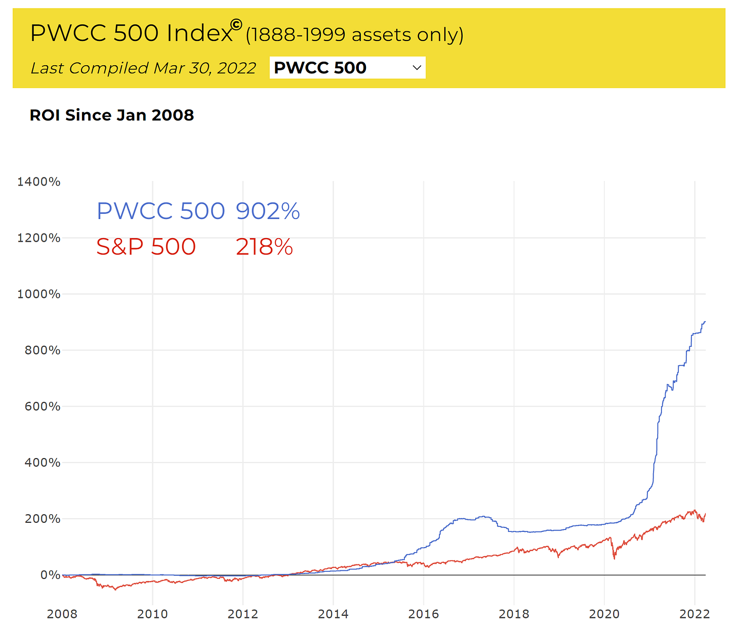
10. Vintage Trading Cards vs The Stockmarket
One of those situations where the rising monetary tides floats all boats.
(n.b. the data is only updated to March 2022)
Source: @PWCCmarketplace via @SoberLook
Thanks for following, I appreciate your interest!
BONUS CHART >> got to include a goody for the goodies who subscribed.
Stockmarket Seasonality Statistics: historically, on average, September has been the worst month of the year for the S&P500 (returns were -0.5% on average, and positive only 47% of the time).
So there are a few things to comment on around this. First of all, 47% is pretty close to 50/50 — albeit it does stand in contrast to some of the other months which were in the 60-70%+ range.
Second, September *did not* have the worst drawdown, OR the smallest upside, and it did not have the greatest dispersion of results either.
But one thing I will note, when I look at seasonality across different asset classes and markets (also looking at the seasonality of asset class relative performance), it is this Aug-Oct period of the year which is generally the worst for risk assets.
Typically we see defensive assets outperform this time of the year (e.g. gold, bonds, defensive equities), while risk assets lose ground (VIX, credit spreads go up, and equities go down).
Seasonality is interesting because it definitely is a thing - statistically, and it is often influenced by physical seasons, actual fundamentals and real life patterns of activity.
But it shouldn’t be the first thing you look at. I always say, put together your core thesis first, and then look at secondary/third-tier factors like this to round out the case or build conviction.
Of course in this instance, I would say that negative seasonality does gel with the generally weak backdrop, so I wouldn’t be inclined to go against it in the current backdrop, and would at the margin travel a little more cautiously.
—
Best regards,
Callum Thomas
My research firm, Topdown Charts, has a new entry-level Substack service, which is designed to distill some of the ideas/themes/charts from the institutional research service to provide the same high quality insights at a more accessible price.
Give it a try and let me know what you think! :-)
Referral Rewards? Refer a Friend to the Weekly Chartstorm… get reward!


Super! Great info in your charts! Thanks.
Great charts!