Weekly S&P500 ChartStorm - 4 July 2021
Your weekly selection of charts...
Welcome to the Weekly S&P500 #ChartStorm (by email!)
The Chart Storm is a weekly selection of 10 charts which I hand pick from around the web (+some of my own charts), and then post on Twitter.
The charts focus on the S&P500 (US equities); and the various forces and factors that influence the outlook - with the aim of bringing insight and perspective.
Hope you enjoy!
1. S&P500 Monthly Chart: A quick update to an old favorite, with the end of June comes a new month, a new all time high, and the second half of the year. Still kind of crazy to look at charts like this and compare/contrast to the doom and gloom at the depths of the pandemic panic. Wild times.
p.s. click here for log version, real (CPI adjusted), + real log version of this chart.
Source: @topdowncharts
2. Average 14-day RSI: So this chart is looking at the 14-day RSI (a simple technical analysis oscillator which indicates overbought conditions around 70 and above, and oversold conditions around 30 and below) averaged across all of the constituents of the S&P500. So it is kind of a breadth indicator and kind of an oscillator. Anyway, the key point is that noticeable downtrend in the indicator over the last few months (and bearish divergence).
In the chart storm I asked somewhat rhetorically: Dangerous bearish divergence? Or healthy stealth correction?
Source: @callum_thomas
3. US Tech Fund Flows and Allocations: On the topic of "stealth corrections" -- notice how tech fund allocations dropped by 5% (n.b. ‘allocations‘ in this sense is the market share of tech ETFs of all sector ETF AUM - so more of an implied allocation proxy). But still, that figure… a FIVE PERCENTAGE POINT drop in allocations is material. Tech bulls will say this is a healthy reset - a stealth correction.
Source: @topdowncharts
4. AAII Surveyed Portfolio Allocations to Equities: Looking at AAII portfolio allocations to equities - investors seem to be increasingly all-in... (but then again, it's still not quite at dot-com bubble levels).
Source: @topdowncharts
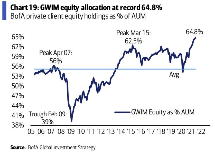
5. BofA Client Equity Allocations: Similarly, BofA clients equity allocations at record highs. Kind of speaks for itself.
Source: @PMack1224
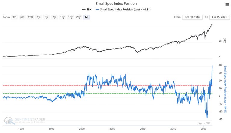
6. Small Speculators Positioning: Another chart that kind of speaks for itself; small speculators are the heaviest net-long they’ve ever been. Who’s left to buy when everyone seems to be all-in already?
Source: @sentimentrader
7. US Corporate Equity Issuance: Records broken. Raise cash while the sun shines...
Source: @DavidSchawel
8. Long-Term View of US IPO Activity: This longer-term perspective on the state of the US IPO market really puts things into perspective; with record levels of retail investor participation and the system awash with liquidity (and of course the SPAC phenomenon) no wonder folk are scrambling to raise capital.
n.b. it’s hard to see on the chart, but after a relative lull in April/May (after a crackdown on SPACs by the SEC), volumes (filings, pricings) picked up again in June.
Source: Blog: IPO Trends - The New Boom
9. Average Holding Period: According to Reuters, as of June last year the average holding period for US shares was a little under 6 months. That’s down from more than 6 *YEARS* …backintheday. Algo trading/HFT obviously accounts for a large part of this, but so too does the rise of retail: greater ease of access and cheaper and cheaper cost of entry. The YOLO meme-stock speculative fervor that has propagated through society has probably pushed this indicator lower still since June last year..
Source: Reuters
10. S&P500 Index Fund Assets: Total AUM in S&P500 linked index funds topped 5 TRILLION in 2020 (and is probably higher now from what I've seen in fund flows and market movement). There is a *lot* I could say about the rise and rise of passive investing, but I might save that for a blog post sometime. For now, it is simply a very interesting statistic, and a continuation of a firmly entrenched trend.
Source: @sherifa_issifu
Thanks for following, I appreciate your interest!
oh… that’s right, almost forgot!
BONUS CHART >> got to include a goody for the goodies who subscribed.
Cash Allocatometer: Another weird and wacky indicator for you, this one looks at the annual rate of change in AAII surveyed investor cash allocations. In simplistic terms if it is rising then conceptually investors are raising cash, and if it is falling then investors could be said to be deploying cash.
As you might guess the indicator is firmly into the “reducing cash allocations“ side. I would note that aside from base effects, we also have market movements simply drifting allocations to and fro (i.e. investors might not physically undertake any transactions, but market movements can drift their allocations materially).
Putting aside all the if’s and but’s and footnotes, even after accounting for base effects and market movements, we have to acknowledge that investors did not need to passively/unconsciously arrive at the current allocations. In other words, for them to let cash allocations drift down (close to record lows, by the way), that in effect is basically an active decision to just go with it.
So whether or not investors are strictly speaking actually moving money around to “deploy cash“, arguably this is just another confirming signal that investors are moving more and more all-in on equities
—
Best regards,
Callum Thomas
SPONSOR: ( …he’s me!) My research firm, Topdown Charts, has a new entry-level Substack service, which is designed to distill some of the key ideas and themes from the institutional service to provide the same high quality insights at a more accessible price.
Give it a try and let me know what you think :-)


