Weekly S&P500 ChartStorm - 4 February 2024
This week: monthly chart, flows, sentiment, positioning, TMT, valuations, small caps, European equities, Lindy stocks, and a reliable risk management indicator...
Welcome to the latest Weekly S&P500 #ChartStorm!
Learnings and conclusions from this week’s charts:
The S&P 500 closed January up +1.6% to a new monthly high.
Further new highs have triggered an influx of FOMO flows, and seen sentiment surge to ranges where the market usually takes a breather.
Tech stock valuations are getting more and more extreme (expensive).
Small caps are smaller than usual (% of total US market cap).
Lindy Stocks outperformed the S&P 500 over the past 20 years.
Overall, the advent of more and more new all-time highs is both a sign of strength and momentum, but also has seen sentiment, flows, and speculation rise to warning levels. Indeed, this week’s bonus chart section is particularly interesting and informative in that respect…
1. Happy New Month: US equities notched-up a positive start to the year, outshining their global peers, and chalking up a new all-time high on the monthly chart. It all looks fairly bullish (new high after a long and relatively deep foray to the downside, price above its (upward sloping) 200-day moving average).
Source: Topdown Charts Topdown Charts Professional
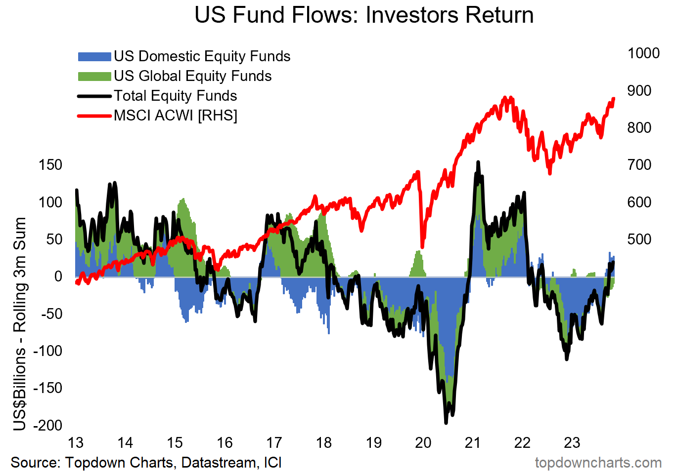
2. Fun Flows: With each new high comes further FOMO, and it’s starting to show with the flows — US + global equity fund flows are turning positive on a rolling 3-monthly basis, this is generally a bullish sign and represents a sort of bullish band-wagoning effect.
Source: Topdown ChartsTopdown Charts Professional
3. Sentiment Supreme: As such, the Consensus Inc stockmarket sentiment indicator has moved further higher — to a place where it has been followed by a period of more ranging and volatile price action in the past. Too much bullishness can be a bad thing if it means everyone is already on board …if expectations are for perfection then it doesn’t take much to undershoot expectations.
Source: @HiMountResearch Hi Mount Research
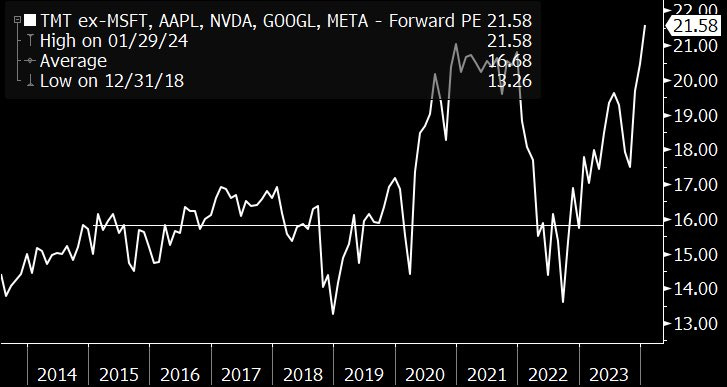
4. Tech Top: It’s no secret that tech has been in the driver’s seat. But interestingly tech (in this case TMT i.e. Technology, Media, Telecommunications) *excluding mag 7* is the most expensive it has been this cycle.
Source: @GinaMartinAdams
5. Tech Mania 2.0: Indeed, looking at TMT as a whole, not only are absolute valuations back toward the 2021 highs (and this chart takes a broader definition/set of valuation indicators), but valuations for tech stocks relative to ex-Tech are the highest they’ve been since 2001. Investors have fallen in love with tech, and are pricing-in very good times ahead.
Source: 12 Charts to Watch in 2024
6. Tech Flows: Echoing the previous chart, this one shows the implied allocations to tech by ETF investors (i.e. the AUM market share of tech ETFs) at record highs, and with inflows into tech funds heating up once again. The new paradigm is here.
Source: Topdown Charts Research Services
7. There’s Always a Reason: The funny thing when you talk valuations, either cheap or expensive, is people always explain why — e.g. “cheap for a reason”. And for tech stocks the reason for being expensive is spectacular growth in earnings, but also lackluster earnings growth elsewhere; making tech in some ways the only game in town. The problem is:


