Weekly S&P500 ChartStorm - 4 August 2024
This week: important market update, technicals, catalysts, key levels, sentiment snapshot, flows and unwinds, risks from here, the Fed, valuations, stocks vs bonds...
Welcome to the latest Weekly S&P500 #ChartStorm!
Learnings and conclusions from this week’s charts:
SPX + NDX have broken key short-term supports.
Markets now face a key technical test (major support levels).
Growth concerns, monetary policy moves, (geo)politics driving it.
Also key is the unwind of previous crowded consensus trades.
Stretched valuations and sentiment mean the stakes are high.
Overall, there was a clear sense of fear in the air on Friday, which is interesting because this is coming from a starting point of market euphoria …and despite some erratic moves last week, many measures of sentiment are so far little-changed. Belief in buy-the-dip and the Fed-put seems unshakable — those beliefs will be put to the test in the coming weeks. Let’s be careful out there.
n.b. I will post the month-end charts I usually post here in the chat room, as they are simply taking up space this time given all that’s going on!
1. Nasdown: So we got the short-term bounce off support as guessed last week, but after a brief intraday retest of the 50-day moving average from the underside the NDX broke down through that short-term support and now eyes the more significant lower support level (and then ultimately probably a test of the 200-day moving average before this is over). I would guess 50-day moving average breadth will probably also need to go a bit lower to get sufficiently oversold before the next bounce.
Source: MarketCharts.com charting tools website
2. Breaking SPX: I quipped elsewhere that the market price action has gone from rotation to rotten… and a key example of that is the S&P500 breaking down below its 50-day moving average and breaking what looks like the neckline of a head and shoulders topping pattern.
As for the lower panels, I’ve included DBC (Commodities) — the weakness there arguably reflects concerns about the growth outlook; DXJ (Japan) — the weakness there is part AI/tech unwind and part BOJ rate hike ructions (they hiked 10bps last week) threatening an unwind of the JPY carry trade; and EIS (Israel) — as geopolitics heat up (major Iran response to assassinations is imminent), albeit also the MSCI Israel index is fairly heavy on tech stocks. These are arguably among the key drivers of the weakness, and will be key to monitor in coming days/weeks.
As to the next steps — 5300 is the floor for now, but it may be tough to defend given the various background risks.
Source: Callum Thomas using StockCharts.com
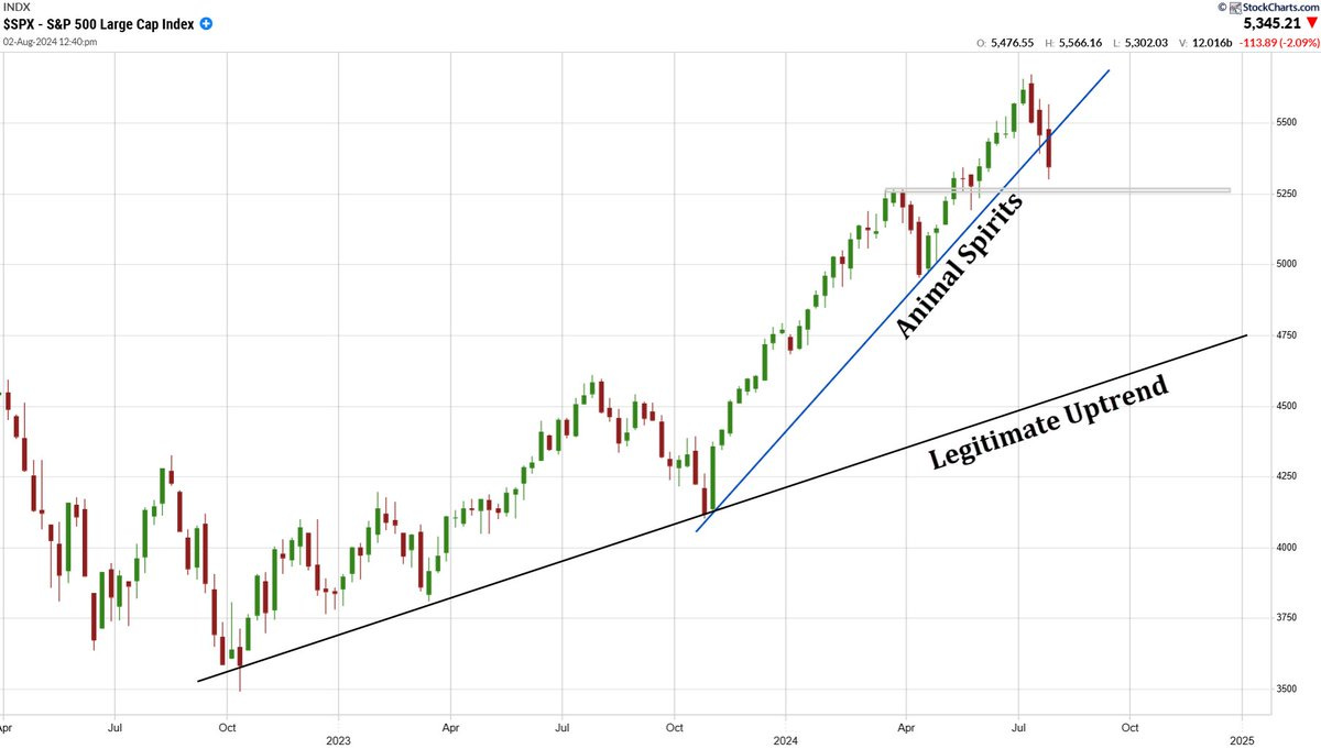
3. The Problem: I think this is the right way to look at it (good chart!) — and this is the problem with the previous two charts… selloffs and corrections are fairly routine and often healthy things in markets, even bull markets, but they can get unhealthy when they start from a place of excess optimism.
Source: @RealStockCats
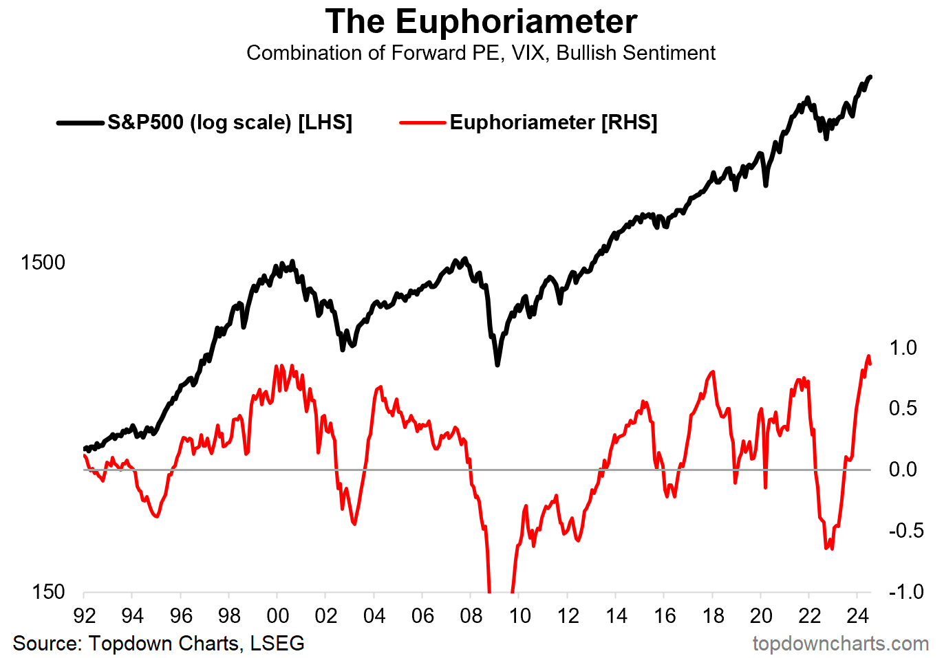
4. Euphoria Heights: Indeed, just about every way you look at it, just about every metric — the starting point is a place of extreme optimism, expensive valuations, complacent risk pricing, and consensus bullishness… AI/tech euphoria.
Source: The Euphoriameter by Topdown Charts
5. On Euphoria: And as the late great Sir John Templeton noted; “Bull markets are born on pessimism, grow on skepticism, mature on optimism and die on euphoria.” — we can see this dynamic playing out in global equity fund flows below.
Source: Topdown Charts
6. The Momentum Moment: Another key aspect to all this is the extreme reached in momentum stocks. It’s entirely typical for the market to charge from one extreme to another, so this one may take a bit to run its course.
Source: @jessefelder
7. Winding: Tied-up in that is the hedge-fund unwind and what drove the initial rotation trade in small caps (unwinding of the popular long big-tech vs short small caps trade). "The hedge fund de-grossing we've seen over the last several weeks has been the most significant in about a year." — is it done yet?
Source: Daily Chartbook
8. Fed Hope: It’s not just investors that are hoping and praying for a Fed rate cut — seems like companies are talking more about the Fed. Does make you wonder if the Fed is behind the curve once again (they were way behind the curve on hiking rates, now maybe behind the curve on cuts).
Source: Bloomberg via ZeroHedge
9. Fed Cuts and the Stockmarket: As to whether Fed rate cuts will actually save (or sink) the market — it depends on whether you get a recession or not.
Source: @Mayhem4Markets
10. Stocks vs Bonds: Lastly, on a similar note — the time for bonds to outperform vs stocks is when you get a recession and market downturn… especially if you get that from a starting point where stocks are expensive vs bonds (e.g. now). Also on that note, the unemployment rate is turning (shown inverted). Maybe this will be the next big rotation trade! (out of stocks and into bonds)
Source: Topdown Charts Professional
Thanks for reading, I appreciate your support! Please feel welcome to share this with friends and colleagues — referrals are most welcome :-)
BONUS CHART >> got to include a goody for the goodies who subscribed.
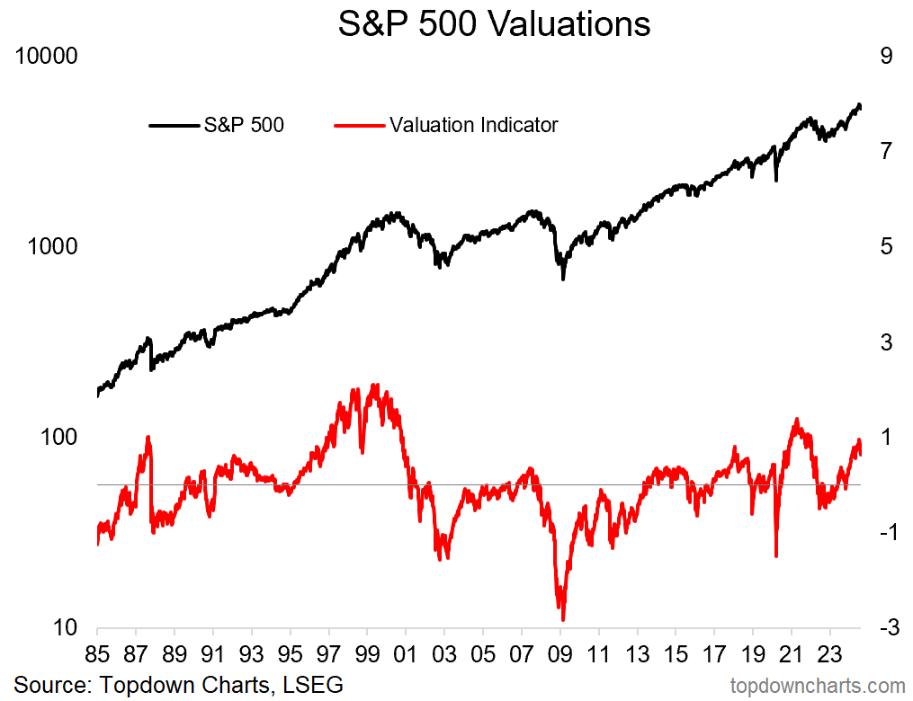
US Equities Valuation Signal: Here’s my composite valuation indicator for the S&P500 (based on PE ratios, equity risk premium, price).
It reached expensive (risk warning) levels in July. But that’s not why I think this chart is interesting and worthy of the bonus chart slot…
Rather — what is most interesting is that it reached an extreme and now appears to have rolled over (and no, it’s not cheap yet, not by a long shot, price would need to adjust significantly further for that to happen).
That is the classic market cycle pattern (as detailed in this article) — the indicator goes to an extreme, and then turns the corner. I don’t want to be alarmist or get painted as a permabear, but you know the risk management saying “if you see something, say something”. And what I see looks like risk of a deeper downturn.
—
Best regards,
Callum Thomas
Looking for further insights? Check out my work at Topdown Charts


Live Q&A chat thread here: https://open.substack.com/chat/posts/0d55a748-746f-4645-b67d-f002260dd2be
Chart #3. A+ take. Ppl are so delusional about where the market has gone since Oct 2023.