Weekly S&P500 ChartStorm - 31 October 2021
This week a look at monthly performance stats, seasonality, flows, sentiment, positioning, and valuations (and bonus chart on REITs)
Welcome to the Weekly S&P500 #ChartStorm (by email!)
The Chart Storm is a weekly selection of 10 charts which I hand pick from around the web (+some of my own charts), and then post on Twitter.
The charts focus on the S&P500 (US equities); and the various forces and factors that influence the outlook - with the aim of bringing insight and perspective.
Hope you enjoy!
p.s. if you haven’t already, subscribe (free) to receive the ChartStorm direct to your inbox, so you don’t miss out on any charts (you never know which one could change the whole perspective!)
1. Happy New Month! The S&P 500 notched up a very respectable 6.9% for the month of October. The chart below shows the monthly progression - n.b. click here for the log chart version (for the log chart enjoyers). Pretty much the reverse of September as seasonality and sentiment shifted.
Source: @topdowncharts
2. Asset Class Returns in October: Among the assets I keep track of (these are the ones I run Capital Market Assumptions for), the S&P500 [US Large Caps] was a close second from the top in October. Overall it was a very risk-on month: equities and commodities did well, and just about all flavors of fixed income took a step back as government bond yields surged globally. EM local currency bonds took a double whammy from rising yields and softer EMFX.
Source: Monthly Asset Class Returns update
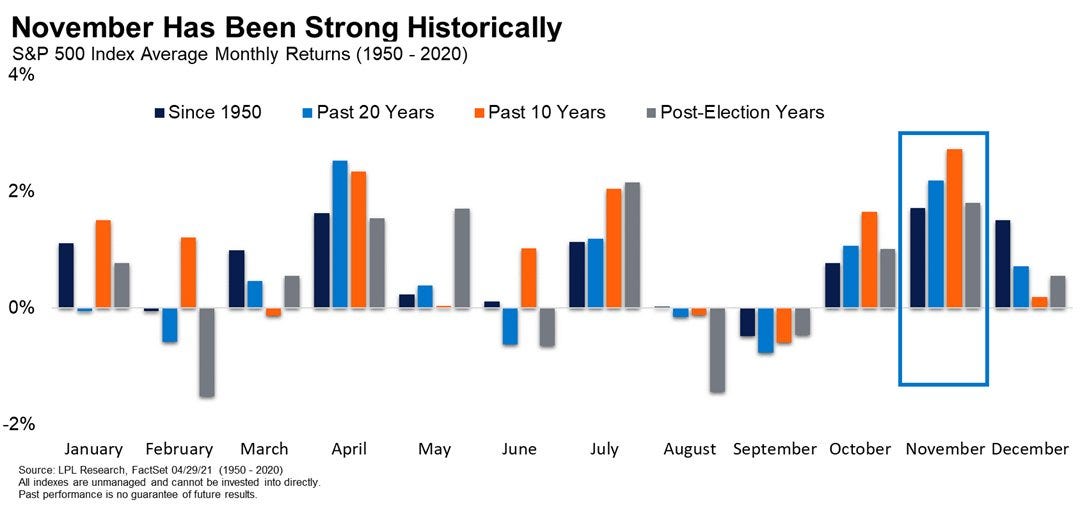
3. November is Here: Regular readers will note that seasonality has been a running topic lately (especially given that it helped flag the September stumble and subsequent rebound). Since we’re just about into November, I thought this chart would be worth highlighting - it shows that historically November has been one of the best months of the year. But then again, one could ask the question: how many of those Novembers featured the Fed announcing taper?! (n.b. the FOMC meets this coming week!).
Source: @RyanDetrick
4. Seasonal Fund Flows: A logical flow-on - as you might expect: November has historically been one of the strongest months in terms of inflows into equity funds.
Source: @ISABELNET_SA
5. Sensational Fund Flows: From seasonal fund flows to sensational fund flows - again, I guess another question worth asking is how many of those Novembers from the chart above featured THIS:
Source: @MichaelGoodwell
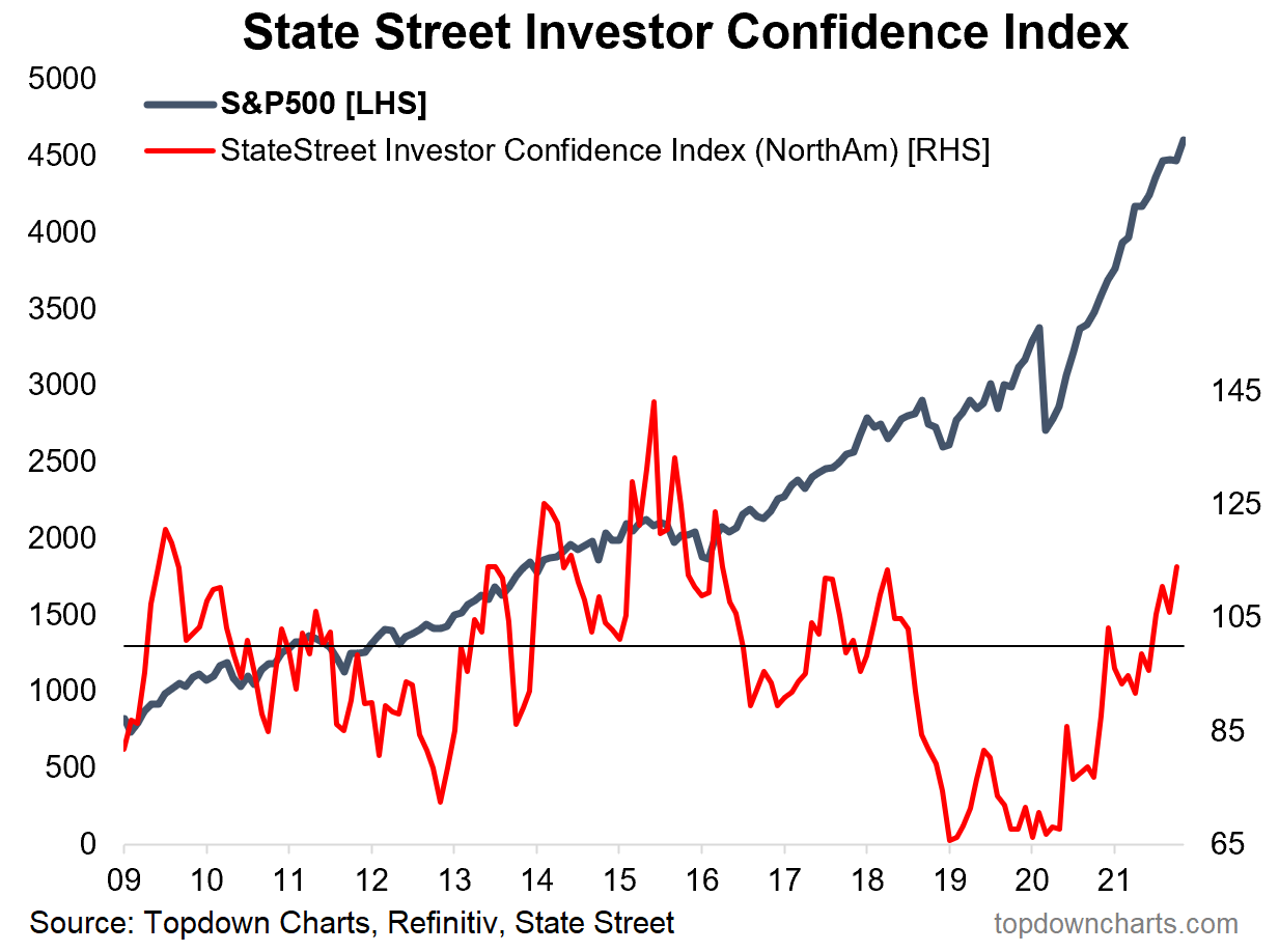
6. Institutional Investor Confidence: This next one shows a measure of investor confidence based on actual data from the massive State Street global custodian business. Key point is that institutional investors seem to be getting more confident: perhaps in part due to declining covid cases, or simply just better price performance - possibly an element of bullish capitulation.
Source: @topdowncharts
7. Investor Sentiment Disagreement Levels: This one requires a bit of explanation - what it basically shows is the level of disagreement between 2 separate investor sentiment surveys… the signal seems to be that the less disagreement (i.e. the lower the spread between the surveys), the more bullish the tactical outlook is for equities. So a fairly interesting chart in terms of the signal, and a novel approach.
Source: @WillieDelwiche
8. Bullish Bears: Another survey, the NAAIM - this one shows the stockmarket exposure of the most bearish active managers who responded to the survey. As we can see: even the most bearish are becoming more bullish (well, strictly speaking: less bearish, given their net exposure is still only just above 50%).
Source: @LizYoungStrat
9. Equity Allocations (exhibit 1): A new all-time high for the S&P 500 last week, and a new all-time high for BofA’s private client allocations to equities. Part of this will just be the market drifting allocations higher (i.e. performance driven, rather than active allocation decisions)… but I always point out with this sort of thing that even just standing by and letting the market decide your allocations for you is effectively an active decision (because you could rebalance/reduce exposure in response).
Source: @MikeZaccardi
10. Equity Allocations (exhibit 2): Similar to the previous chart, but a much wider sample-size, this one shows total average US investor allocations to equities (as a proportion of financial assets). Again it is in some sense both a sign of complacency and a sign rising risk appetite (rising (over?)confidence) — all of these sentiments also mirrored in the ever higher valuations signaled by the shiller PE ratio.
Source: @SnippetFinance via @MichaelAArouet
Thanks for following, I appreciate your interest!
oh… that’s right, almost forgot!
BONUS CHART >> got to include a goody for the goodies who subscribed.
REIT Sentiment: a clear shakeout in real estate sentiment in October.
I thought this would be a good one to share given that US REITs topped the return table in October (up +7% m/m) — albeit I would note, they were at the *bottom* of the table in September (-6.4% m/m)! As it happens, along with the drop in prices in September, sentiment also got a good flushing out - turning net-negative in October.
It’s quite interesting to see REITs doing so well when bonds did so poorly: typically REITs tend to be sensitive to swings in bond yields e.g. in 2013 they lost a fair bit of ground during the taper tantrum.
Rising bond yields mean a higher hurdle for dividend yields to compete with (REITs being basically an income asset: albeit with growth features). Rising yields also tend to mean incrementally less demand for the underlying real estate assets from wholesale investors, and rising cap rates (higher discount rate - i.e. lower valuations, all else equal), and can lead to higher financing costs for what is typically a heavily leveraged business.
So in that respect, while price no doubt has influenced sentiment, it is understandable that sentiment has soured somewhat as taper looms and bond yields balloon.
But then again, as I noted elsewhere (when talking in a report about EMFX/EM fixed income), perhaps taper will actually be a turning point in the other direction …i.e. ”sell the rumor, buy the fact” and all that.
Going to be an interesting week ahead that’s for sure!
—
Best regards,
Callum Thomas
SPONSOR: ( …he’s me!)
My research firm, Topdown Charts, has a new entry-level Substack service, which is designed to distill some of the key ideas and themes from our institutional service to provide the same high quality insights at a more accessible price.
Give it a try and let me know what you think


