Weekly S&P500 ChartStorm - 31 Mar 2024
This week: monthly chart, volatility, hedging, defensive stocks, cyclicals vs defensives, correction risk, equal-weighted, small caps, biggest stocks, stock splits, foreign IPOs
Welcome to the latest Weekly S&P500 #ChartStorm!
Learnings and conclusions from this week’s charts:
Demand for hedging is at very low levels.
Yet, most people think a correction is on the horizon.
Equal vs Cap-Weighted relative performance is at an extreme.
Small caps are extreme cheap vs large caps (for a reason?).
A rising proportion of US IPOs are foreign companies.
Overall, it seems the strong persistent upward run in markets has lulled investors into a sense of calm and complacency. Implied volatility is at the lows, likewise demand for defensive assets. Reminds me of the adage that hedging costs the least when you don’t need it, and the most when you need it…
1. Happy New Month! The S&P500 closed up +3.1% in March, placing it up 10.2% YTD (10.6% including dividends). Interestingly the equal-weighted index made a come-back in March, closing up +4.2% (but still lagging YTD at just 7.4% or 7.9% including dividends). Again, not much else to say — a picture of strength.
Source: Topdown Charts Topdown Charts Professional
2. All is Well, All is Calm: With markets calmly drifting higher, implied volatility (i.e. the price of options) has been drifting lower as volatility and risk sentiment slumbers. We see this across the risk curve with high yield credit spreads plumbing the lows, and emerging markets risk sentiment likewise near record lows. Reminds me the old saying: low volatility is a good predictor of future higher volatility, and vice versa. It also brings to mind the truism that the cost of hedging is the lowest when you don’t need it, and the highest when you need it!
Source: @MikeZaccardi
3. Don’t be so Defensive: Similarly, investor allocations to defensive stocks are at record lows — this is partly just due to defensive stocks lagging behind vs strong performing tech stocks. But also, investors would rather hold higher beta stocks in a bull market to capture more of the upside. Taken alongside the previous chart this is contrarian information, and I would also point out the relative value indicator for defensive stocks is at its 3rd cheapest reading ever. The cost of hedging/diversifying is much cheaper than usual (because no one wants to).
Source: @topdowncharts 12 Charts to Watch in 2024
4. Correction Risk? Yet, interestingly enough, apparently most people expect a correction. Perhaps they expect it to be a small bump in the upward sloping road — a dip/pullback to buy, rather than something to hedge.
Source: @ISABELNET_SA
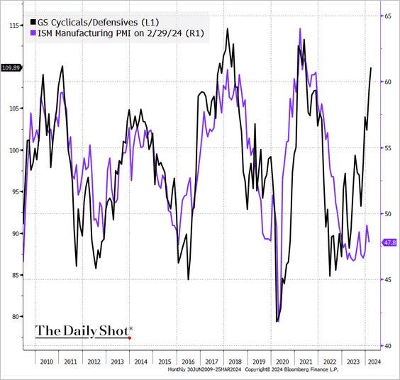
5. Cycling Along: Back on defensives, the outperformance of cyclicals vs defensives is consistent with a significant upturn in the PMI. The bearish take would be that things have gotten out of hand and disconnected from fundamentals. But interestingly, there are a few leading indicators pointing to a PMI reacceleration.
Source: @albertedwards99 (from The Daily Shot)
6. Sucks to be Average: The average stock has seen record underperformance — as proxied by the performance of the equal-weighted vs cap-weighted S&P500 (this is another way of saying that the top stocks have been really strong). What’s really interesting though is how when that performance differential indicator gets to extremes like this it has often market a turning point in equal vs cap-weighted relative performance (which comes down to sector/style/size relative performance).


