Weekly S&P500 ChartStorm - 31 July 2022
This week: monthly stats, seasonality, technical outlook, sentiment and positioning, market signals, onshoring, IPO market trends
Welcome to the Weekly S&P500 #ChartStorm — a selection of 10 charts which I hand pick from around the web and post on Twitter.
These charts focus on the S&P500 (US equities); and the various forces and factors that influence the outlook - with the aim of bringing insight and perspective.
Hope you enjoy!
NEW: Sign up to the (free) Chart Of The Week over at the new Topdown Charts Substack entry-level service: Subscribe to the Chart of the Week
Each week we send you one of the most interesting charts on our radar, along with commentary/context and a key takeaway — so you’re never left guessing on why the chart matters ...and the charts matter! > > > Subscribe Now
1. Happy New Month! S&P 500 up +9.11% in July.
Source: @topdowncharts
2. Monthly Seasonality Statistics Table: August is a mixed bag, can be very good or very bad (September is where it gets a bit messy though).
Source: @topdowncharts
3. Big (Bear Market) Rally: Over 70% of stocks tracking above their 50-day moving average, and the index itself has cleared some pretty key levels...
That said, some would argue that 50-day moving average breadth now looks oversold, and there is heavy overhead resistance around that 4200 level.
Source: @MarketCharts
4. Exposure: As price breaks through initial resistance, NAAIM Exposure Index shows active managers tentatively upping exposure (albeit, clearly from the low end of the range and understandably light exposures in the scheme of things).
Source: @hmeisler
5. Fed Relief Euphoria: Consensus seems to think the Fed last week was dovish, maybe it is, and maybe we are close to a pause/pivot (me = do not think so — I covered this in a report to clients last week: the Fed needs to see inflation expectations re-anchor or at least pull back towards average at a minimum, and will ignore market volatility and economic wobbles until they are confident about containing inflation)
...but anyway one thing is clear --> investors are SO ready to jump on it the moment the Fed "comes to the rescue", as the chart below indicates IMO. Like Pavlov’s dogs, investors, especially newer ones, have had it ingrained in their heads that the bull market of 2020/21 is some how normal.
Source: @topdowncharts
6. Insider Buying: Insiders busily scooping up bargains*
(*at least relative to the crazy valuations in 2021)
Source: @jaykaeppel
7. Consumers hate stocks
Looking at the chart, they got it right in 2009, but patchy otherwise, mostly a contrarian bullish signal. Does go to show though the steady transition in mood as the macro backdrop got worse and worse this year.
Source: @sentimentrader via @LanceRoberts
8. Boom to Gloom: The “Euphoriameter” shows a clear transition from Euphoria in 2021 and now Dysphoria in 2022...
Source: The Euphoriameter
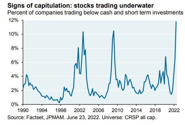
9. Cash Trading: In June there were a record 12% of companies trading below cash and short-term investments… (take note of where the previous climaxes in this indicator were)
Makes me wonder if some of that was switching to cash and short-duration investments given the bond chaos (vs rising cash rates).
Source: @RyanDetrick
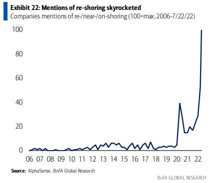
10. On-Shore For Sure
Bullish capex?
Source: @MikeZaccardi
Thanks for following, I appreciate your interest!
BONUS CHART >> got to include a goody for the goodies who subscribed.
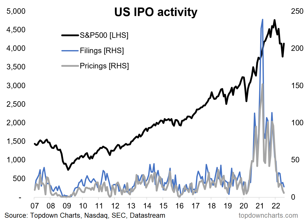
IPO Bubble Bust: As perhaps the most poignant sign and symptom of the tidal waves of liquidity washing across global markets in the wake of the pandemic stimulus, US IPO activity has gone from boom (bubble?) to bust.
July saw the lowest number of IPOs priced since March 2020.
Clearly this is a reflection of the state of the macro-market backdrop, the liquidity tides are going out, the mood is bleak, and there is a famine of speculation. Along with the dearth of IPOs, there is also an ongoing stream of IPOs being withdrawn.
While this does reflect a challenging macro-market backdrop, the upside of this is that when you see a crash in IPO activity it often means a bottom is near (albeit note the almost 2-year long IPO winter in 08/09!).
It does reflect market sentiment, but at the margin it also reflects supply: at the end of the day it’s all supply & demand. If the supply of new IPOs goes down then at the margin that helps the overall stockmarket supply vs demand balance.
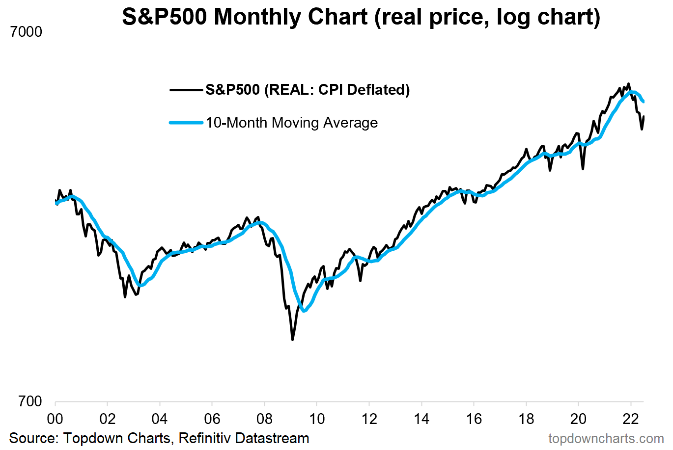
And by the way, all of this is not a new phenomenon — the chart below provides some longer-term perspective. The cycle of market booms and busts can be clearly traced by the ebb and flow of IPO activity.
Just another way of looking at the boom bust cycle.
The boom has been and gone, now we are in the bust phase.
—
Best regards,
Callum Thomas
My research firm, Topdown Charts, has a new entry-level Substack service, which is designed to distill some of the ideas/themes/charts from the institutional research service to provide the same high quality insights at a more accessible price.
Give it a try and let me know what you think! :-)
Relevant Tickers Discussed: SPY 0.00%↑ IVV 0.00%↑ VOO 0.00%↑ IPO 0.00%↑


Callum, as always, thank you for sharing these charts and thoughts.
Was it only a few weeks ago we were guessing “how much lower” could it go?
Hmmm
I did get to enjoy July, but with only a couple of new commitments.
Thinking of some “pink tickets” next week (what we used for sells - the buys were on blue tickets).
Great charts and super timely! Thanks so much!