
Weekly S&P500 ChartStorm - 30 May 2021
Your weekly selection of charts...

Welcome to the Weekly S&P500 #ChartStorm (by email!)
The Chart Storm is a weekly selection of 10 charts which I hand pick from around the web (+some of my own charts), and then post on Twitter.
The charts focus on the S&P500 (US equities); and the various forces and factors that influence the outlook - with the aim of bringing insight and perspective.
Hope you enjoy!
1. S&P500 Monthly Chart: as an FYI, US markets are closed on Monday for Memorial Day. Thus, Friday was the monthly close for the S&P500, and hence we have an update to the monthly chart. For reference click here for the same chart in log/real/real-log terms.

Source: @topdowncharts
2. Market Breadth Trendline: that arbitrarily drawn trendline returns, and is looking less arbitrary and more intriguing. Seems like short-term breadth (50-day moving average) has bounced off that trendline again — looks like a bullish setup to me.

Source: @Callum_Thomas
3. Tech Stocks - Breadth Signal: lots of comments on this one, but don’t overthink it too much, this has been a fairly reliably *short-term* bullish signal. Probably the main cautionary though would be that we could be headed towards a 2018 style bond-stock correction (where bond yields push higher and scuttle stocks). So either way, don’t get sloppy on risk management.

Source: @MacroCharts
4. IPO Activity Comes Off the Boil: following a frenzy of filings, US IPO activity has substantially slowed down - big part of this is the regulatory dampeners put on SPACs (where things had gotten way out of hand). One curious question: did the regulatory dampener end up extending this thing? (i.e. if the regulators let it just keep going and going, would there simply end up being too many SPACs, and basically ultimately “too much“ supply?)
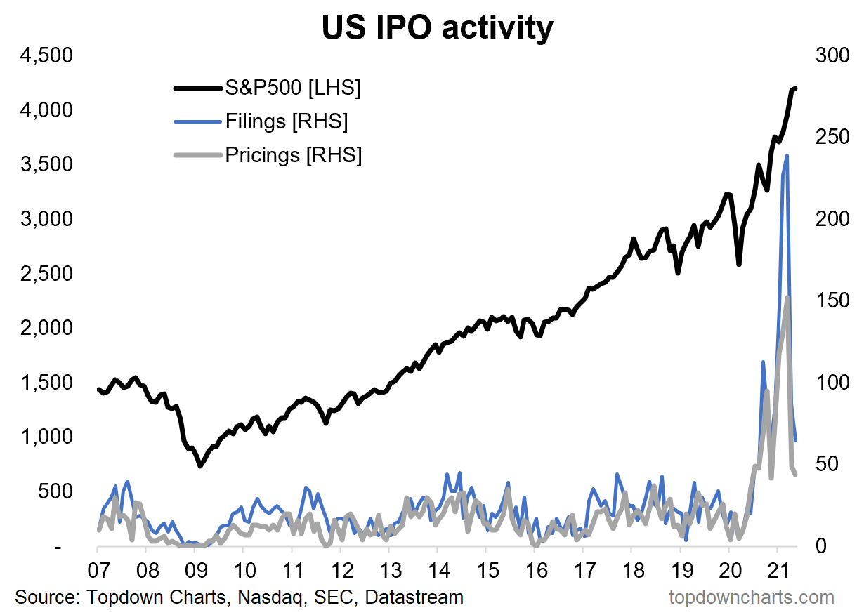
Source: IPO Trends - The New Boom
5. S&P500 Priced in Bitcoin: or in other words, basically what a long S&P500 vs short Bitcoin portfolio would look like: n.b. the chart is displayed in log terms.
Also, I guess this is how a “Bitcoin Maximalist“ would see the world.
What’s the takeaway? Not sure there is one. Maybe you could says stocks look cheap when priced in Bitcoin?
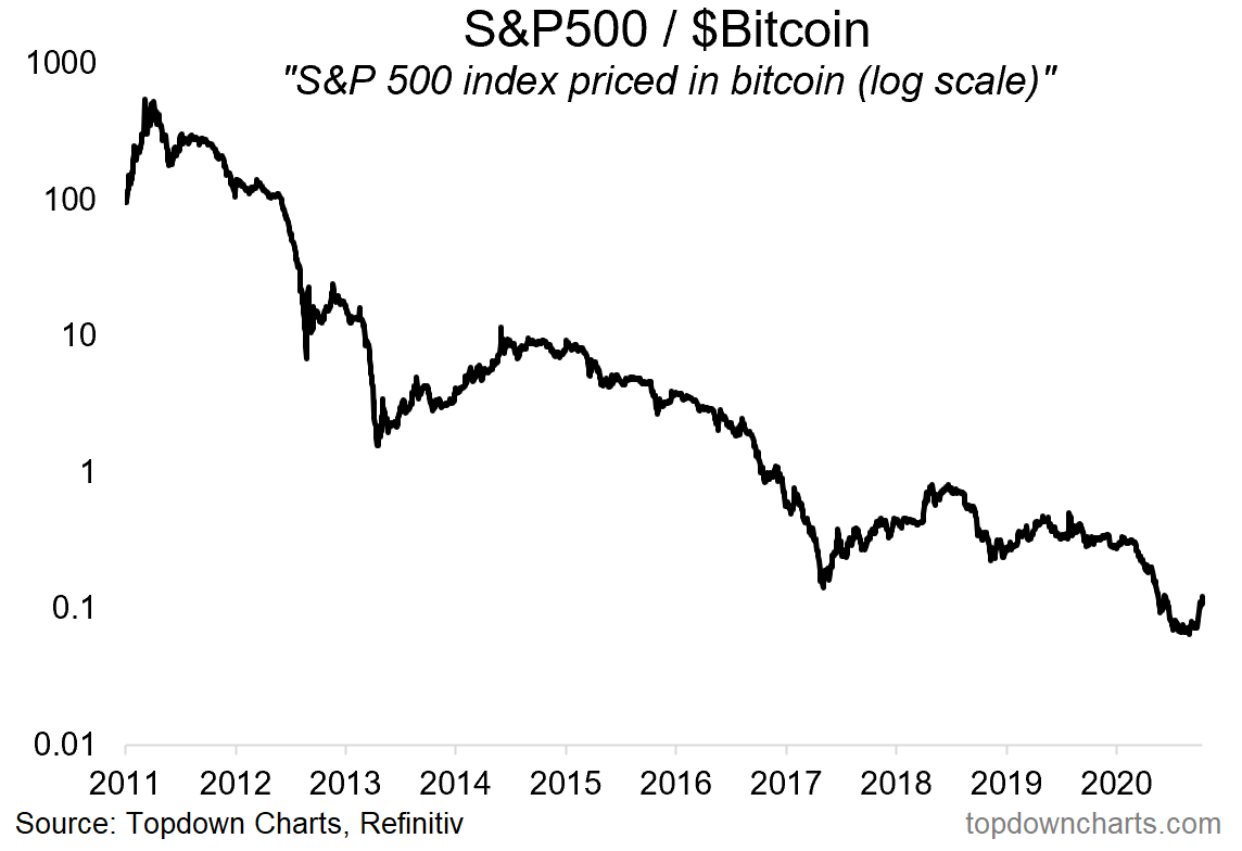
Source: @topdowncharts
6. CBOE SKEW Index (tail risk hedging demand): Second highest reading ever.
Smart money? [as a side note, it does seem to serve as a smart-money indicator at times, and “dumb money“ at other times — not a reliable trading signal, but some interesting background information in terms of what investors who are sophisticated enough to deploy hedging strategies are doing]

Source: @topdowncharts
7. Financials vs S&P500: Financials gearing up for a second wave of relative performance? Here are the lines in the sand...
I would note there are a couple of scenarios: Option A. price breaks out vs that trendline; or Option B. price hits that trendline, fails, and rolls over for a leg down. Ultimately we’ll need price to tell us one way or the other. But as I noted in the comments on Twitter: sometimes it ends up as option C. range-trading as bulls/bears fight it out and are equally dealt generous helpings of frustration.

Source: @MikeZaccardi
8. Financials vs S&P500 - a Macro Clue: A major macro clue in the path of financials vs S&P500 relative performance is the 10-year treasury yield. Bonds are currently in consolidation mode, and on my analysis I would say there is a window for a technicals/sentiment driven rally short-term, but further out all the macro indicators point to much higher yields. So definitely one to watch.

Source: @topdowncharts
9. Cash Allocations of US Equity Mutual Funds: very interesting to see both the level and allocation here - basically US equity mutual funds are running record low allocations to cash. You can’t blame them: we’ve seen a roaring bull market …so mathematically it’s easy for this to happen, but also peer-risk is a big thing: if you’re heavy in cash you get performance drag in a bull market.
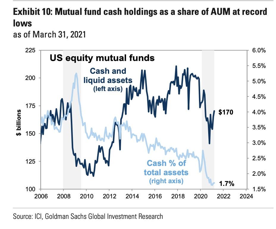
Source: @ercorbeil
10. Aliens? I joked on Twitter: “Stocks tread water ahead of upcoming Pentagon report to congress on UFOs“. Just a fun chart and an excuse to bring up one of my favorite topics (big space nerd over here!).

Source: @EffMktHype
Thanks for following, I appreciate your interest!
oh… that’s right, almost forgot!
BONUS CHART >> got to include a goody for the goodies who subscribed.
Fed Funds Sweet Spot Indicator: this is an unusual indicator I’ve kept track of for some time now. Basically it adjusts the Fed Funds rate by wage growth.
The logic is simple: if wage growth is materially outpacing the level of the fed funds rate it’s good for markets, and the reverse is true. On the Fed funds rate, obviously the easier monetary policy is, the better it tends to be for markets (all else equal). On wage growth, higher wages indicate a strong economy and more cash in consumers’ hands (some of which makes its way to the market).

The key point is that we’re still well and truly in the “sweet spot“ — that will change if wage growth unexpectedly plunges (which would obviously be a bad sign), or if the Fed was caught behind the curve on inflation and had to rapidly hike rates.
We will definitely get to one of those scenarios sooner or later, and at that time it will make sense to position portfolios structurally defensive. Until then, as they say, the music is still playing…
—
Best regards,
Callum Thomas
SPONSOR: ( …he’s me) My research firm, Topdown Charts, has a new entry-level Substack service, which is designed to distill some of the key ideas and themes from the institutional service to provide the same high quality insights at a more accessible price.
Give it a try and let me know what you think