Weekly S&P500 ChartStorm - 30 January 2022
This week: tactical thoughts, violent rotation, hidden bear markets, snoring credit, high valuations, low relative value, and euphoria shift...
Welcome to the Weekly S&P500 #ChartStorm (by email!)
The Chart Storm is a weekly selection of 10 charts which I hand pick from around the web, and then post on Twitter.
The charts focus on the S&P500 (US equities); and the various forces and factors that influence the outlook — with the aim of bringing insight and perspective.
Hope you enjoy!
p.s. if you haven’t already, subscribe (free) to receive the ChartStorm direct to your inbox, so you don’t miss out on any charts (you never know which one could change your whole perspective!)
Sponsor Space: in case you missed it, check out my (Topdown Charts) 2021 End of Year Special Report (includes 50 of my best, worst, and favorite macro/market charts of 2021 + the must-see macro/market charts to have on your radar in 2022…)
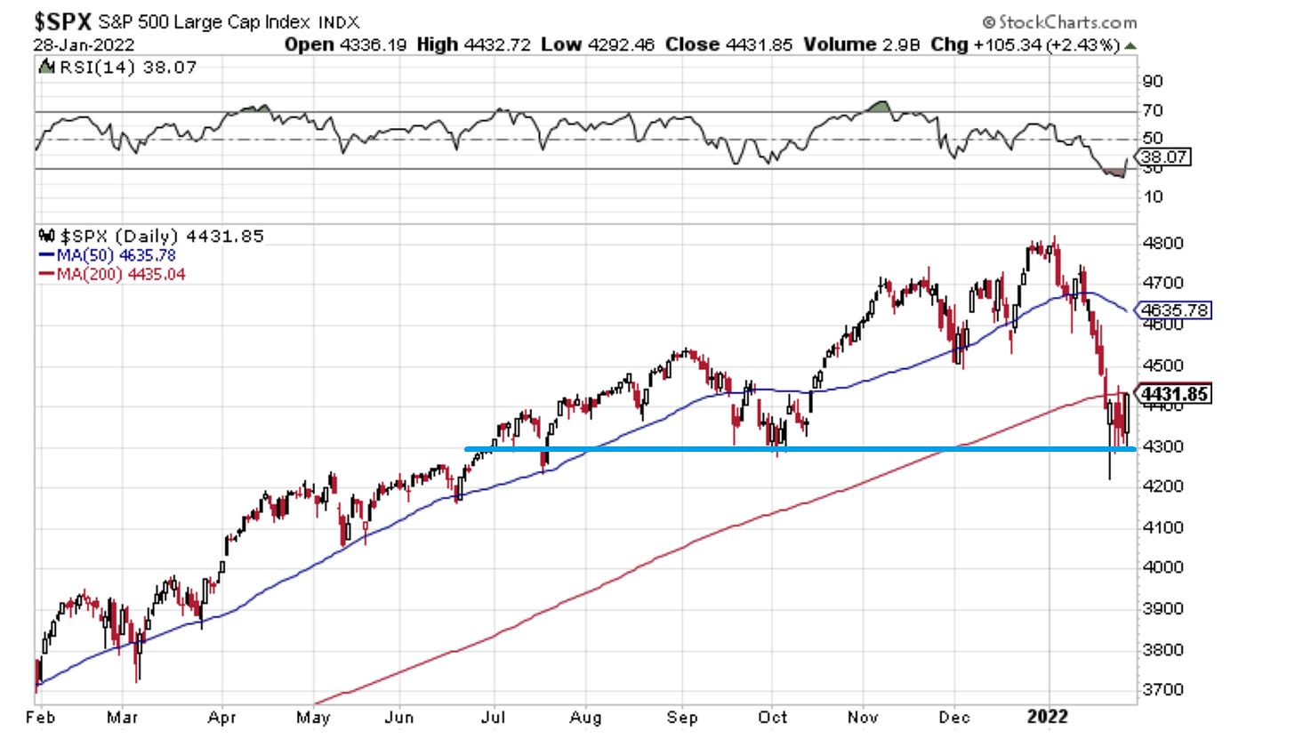
1. Springboard or Diving board? That 4300 level is going to go down as either a big springboard or a big diving board.
For now it looks like a springboard...
As I noted on Twitter: these 2 things can both be true
-the bottom is in
-the top is in
Source: @Callum_Thomas StockCharts
2. Market Breadth: Basically still at about 50/50 on the 200-day moving average breadth indicator: this is not a "sell everything" market, this is a violent rotation.
Source: @Callum_Thomas IndexIndicators
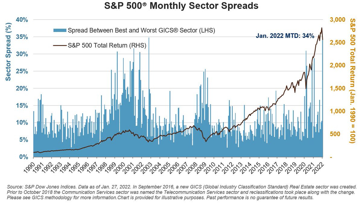
3. Rotation Stations: It was the best of times (Energy +18% in Jan), It was the worst of times (C.Disc -13% in Jan). That’s the widest best-worst spread since October 2002.
Source: @SPDJIndices via @LizAnnSonders
4. The Clear Bear Market: The S&P500 is down -7.6% YTD, and all said so far the correction has been just over -12% from the intraday high to the low...
But elsewhere a raging bear market is well underway: over 1600 stocks in the Nasdaq have *halved* ! (i.e. down at least 50% vs their 52-week high).
Source: @sentimentrader
5. VIX Soared, Credit Snored…
Source: @topdowncharts
6. Energy Sector: The long-standing and substantial relative bear market in energy stocks appears to be ending. Would it be too simple to expect them to rebound all the way back? (probably, but effectively I would say this chart represents an element of excess that needs to be at least partially unwound)
Source: @ISABELNET_SA
7. Stocks are Cheaper! Good news bargain hunters, the S&P500 price/sales ratio is now *only* 20% above dot com bubble levels!
(apologies for the sarcasm)
Source: @OJRenick
8. "stocks are cheaper now"
Yes:
-vs the heights of the dot-com bubble
-vs a couple of weeks ago
No:
-vs every other time in all of history (and vs RoW)
Source: @CliffordAsness
9. Valuations — Global vs USA: On the topic of valuations, I’ve noted before the wide valuation gap between US (extreme expensive) and the rest of the world (reasonable). Of course valuation is only one part of the puzzle, but if you ask me: more and more puzzle pieces are starting to show up too (after being lost under the couch for years).
Source: @trendwhizo
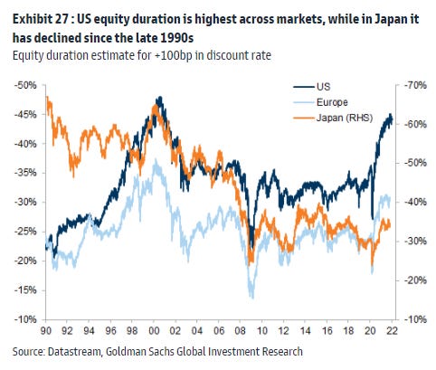
10. Equity Duration: This chart tracks "Equity Duration" aka sensitivity to interest rates. Not only is the US the most expensive market (as noted above), but it is the most @ risk should interest rates rise.
*cue the sound of a ticking clock*
Source: @PhilipJagd
Thanks for following, I appreciate your interest!
oh… that’s right, almost forgot!
BONUS CHART >> got to include a goody for the goodies who subscribed.
Euphoriameter: the mood of the market is changing…
This weird indicator, The Euphoriameter (link has details), shows that after a period of peak euphoria, the stockmarket mood is moderating. The indicator combines the signals from valuations, risk pricing, and surveyed bullish sentiment.
So a couple of things are probably worth highlighting on this: firstly the indicator has dropped materially (some would argue that = contrarian bullish), but secondly, the indicator remains elevated vs history (some might argue that it has a lot further to fall as the market blows off some speculative steam).
As I noted before, I think it’s worth dwelling on the point: it can be equally true to say that the bottom is in and the top is in.
In other words, it sure looks like a technical short-term bottom is in the market (tactical indicators show a washout in sentiment and oversold signals).
But the top might be in for now given the Fed has clearly signaled a path to the exit …and specifically that it is now focused on inflation.
That means no more “stimmy“, no more “fed got my back“
For newer investors, “the training wheels are off“.
—
Best regards,
Callum Thomas
SPONSOR: ( …he’s me!)
My research firm, Topdown Charts, has a new entry-level Substack service, which is designed to distill some of the key ideas and themes from the institutional service to provide the same high quality insights at a more accessible price.
Give it a try and let me know what you think
Appreciate your support and interest!


If you found this interesting, I would appreciate if you can help spread the word :-)