Weekly S&P500 ChartStorm - 3 September 2023
This week: market technical check, correction drivers, flows and positioning, seasonality, macro, hype cycles, IPO market boom-bust cycles...
Welcome to the latest Weekly S&P500 #ChartStorm!
Learnings and conclusions from this week’s charts:
The August price action looks like a bull market correction.
However the correction drivers look to be turning down again and the market rebound has stalled at short-term overhead resistance.
Seasonal downdrafts are most intense typically in late-Sep/early-Oct.
Retail flows, hedge fund positioning, corporate buybacks, analyst earnings estimates are all displaying clear bullish/extreme optimism.
Meanwhile the macro remains murky (e.g. from charts this week show JOLTS jobs jitters, student loan payments unpausing).
Overall, there’s definitely a case to be made that the August sell-off was a sort of healthy correction, but at the same time, it might be a little healthier if it cleared out some of the clear froth and consensus bullish ebullience. Of course it should also be noted that there is nothing stopping the correction from becoming “healthier” (and this week I’ve outlined a couple of key risk metrics to monitor on that front).
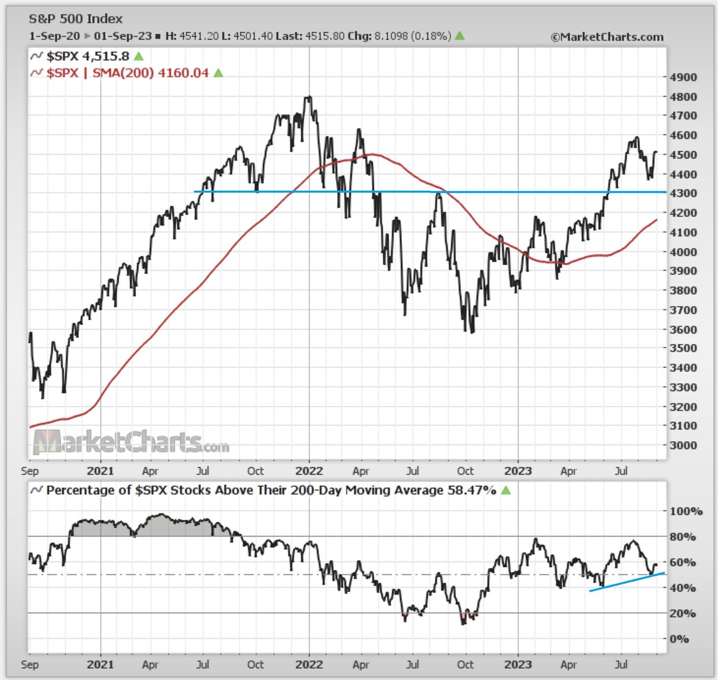
1. Healthy Correction? Many are looking at the August selloff (which all said was about -5.4% top-to-bottom), and reflecting on the chart below, you have the market bouncing off a short-term support level (4400) — rather than going all the way to that intermediate support level around 4300 — you also have the market comfortably above its upward sloping 200-day moving average, and 200dma breadth rebounding off a higher low after a minor shakeout. In other words, it has all the look and feel of a selloff within an uptrend, and it came just after many of the big-name-bears threw in the towel. So yeah, that looks like a ““healthy correction””
Source: @Callum_Thomas using MarketCharts
2. Correction Drivers: Against that, you have the rebound stalling at short-term overhead resistance, and those correction drivers at least as of Friday’s close look to be at risk of turning down again (the key driver of August’s correction could be explained as a tightening of financial conditions [US$ up, bond yields up, WTI crude up) meeting frothy tech hype). So yes, we do have the Fed later in the month, but in the immediate term market-driven financial conditions tightening is probably the bigger risk, and the chart below lays out the risk metrics to monitor.
Source: @Callum_Thomas using StockCharts
3. Seasonal Swirl: And of course, as many have reminded us, we are not done with the shifty seasonality of September (and early-October).
Source: Topdown Charts Topdown Charts Professional
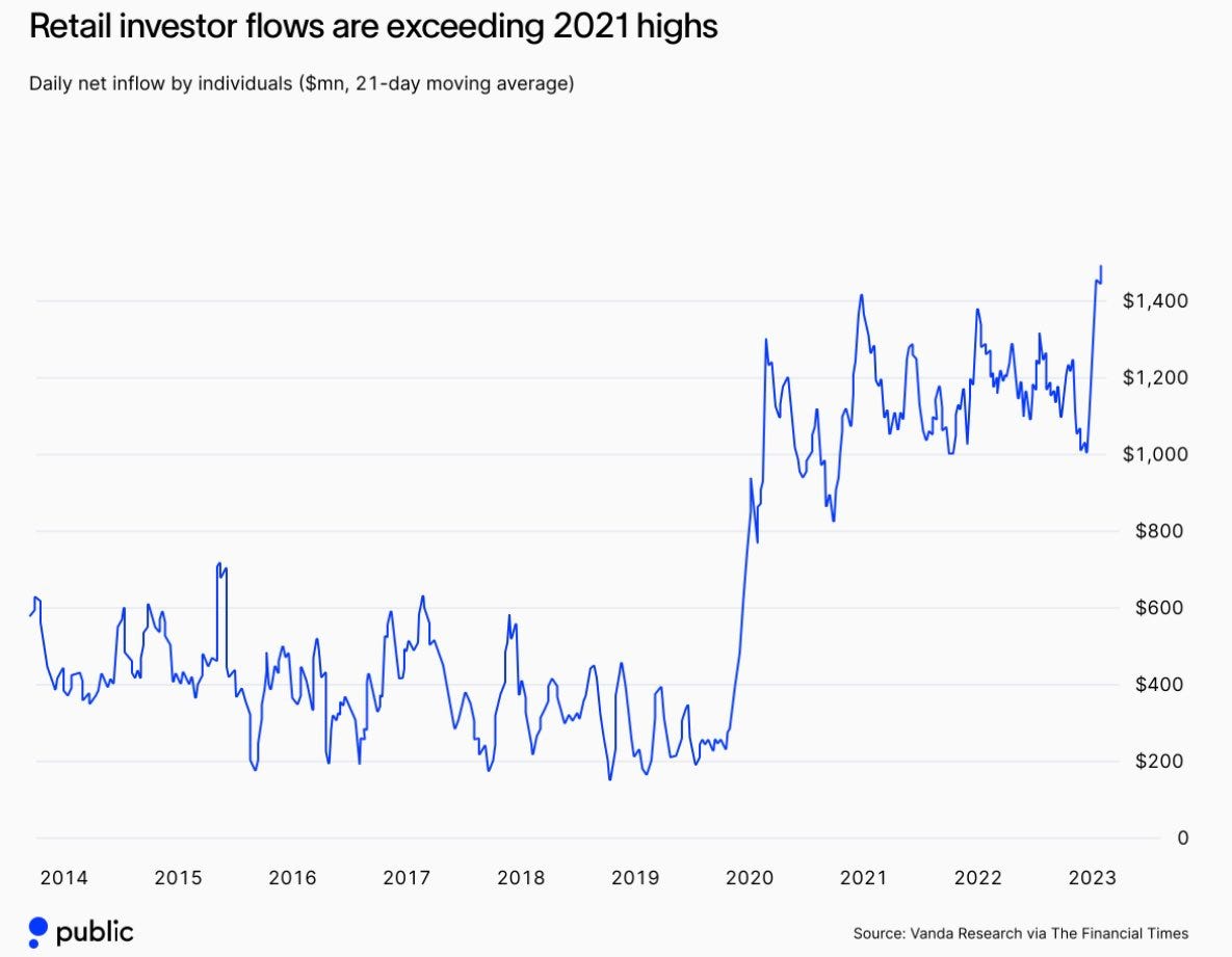
4. Ravenous Retail: Also, retail have not been shaken in the slightest, and in figuring out whether the correction is healthy or not, one sign of health would be a shaking out vs apparent surge in retail flows.
Source: @Marlin_Capital via Daily Chartbook
5. Hedge Fund Tech Bandwagon: And hedgies are also bulled up… got to get that bonus and there’s been one sure thing to ride this year. Often find that the hedge fund crowd pile into the main momentum play of the market, and it works fine, and gets their P&L targets filled… until it (usually suddenly and violently) stops working and they all rush to reduce risk.
Source: @Barchart
6. Buybacks Back: Also of intrigue, even companies are bullishly buying back their own stocks (so we have retail, hedge funds, and corporates out on a buying spree).
Source: @MikeZaccardi
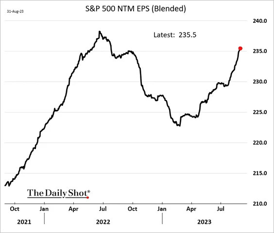
7. Analysts Bullish on Earnings: Even analysts are bullish, scrambling to revise up their earnings estimates after an apparent brief earnings revession.
Source: The Daily Shot
8. Stocks to be robbed by jobs? Wouldn’t be ironic if just as everyone wrote off all the macro-murkiness, the wrong recession calls, and permabears… that macro ended up being the thing to scuttle stocks. I’ve certainly been in the recession-data-highlighter camp, noting the dozens of leading indicators pointing to recession. It is different this time in many respects, but equally I find it very hard to capitulate and call the all-clear on what are some substantial and evidence-based long and variable lags of monetary tightening. Maybe it is just the leads and lags.
Source: @spomboy
9. Student Loan Payment Pause-Play: So this one I thought was stark and interesting, and to be fair as a proportion of total PCE expenditure it’s less than half a percentage point… but as I noted on the fixed vs floating interest rates aspect, there are winners and losers, a bifurcated economy, and a return to full student loan repayments could create another economic loser segment… another pocket of pain.
Source: @JosephPolitano Apricitas Economics
10. The Hype Ride: This clever visual shows the path from boom to bust and back again via Google search trends.
Source: @FusionptCapital
Thanks for reading, I appreciate your support! Please feel welcome to share this with friends and colleagues — referrals are most welcome :-)
BONUS CHART >> got to include a goody for the goodies who subscribed.
IPO Market Signals: in tune with some of the recent bonus chart features, here’s another one that could be described as a medium-term bullish/bottoming signal.


