Weekly S&P500 ChartStorm - 3 July 2022
This week: monthly chart updated, H1 returns, stocks vs bonds, earnings outlook, who owns the market, stocks for the long-term, equity allocations data
Welcome to the Weekly S&P500 #ChartStorm — a selection of 10 charts which I hand pick from around the web and post on Twitter.
These charts focus on the S&P500 (US equities); and the various forces and factors that influence the outlook - with the aim of bringing insight and perspective.
Hope you enjoy!
NEW: Sign up to the (free) Chart Of The Week over at the new Topdown Charts Substack entry-level service: Subscribe to the Chart of the Week
Each week we send you one of the most interesting charts on our radar, along with commentary/context and a key takeaway — so you’re never left guessing on why the chart matters ...and the charts matter! > > > Subscribe Now
1. Happy New Month! Pretty much a round trip for the S&P 500 index in inflation adjusted terms at this point. Up the escalator, down the elevator.
Source: @topdowncharts
2. YTD Returns in Context: H1 2022 was one of the worst first halves of the year in history for the S&P500, but it was not a lonely journey...
Basically nothing worked outside of cash and commodities.
Source: Asset Class Returns
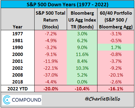
3. Stocks vs Bonds: Interesting table to reflect on — over the period covered in this table, 60/40 always bet 100% stocks when stocks were down for the year, albeit “YMMV” with regards to *absolute returns*.....
Source: @charliebilello
4. Bond Yields as Seen by Stocks: Seems like "equities for rising rates" had their doubts on how far 10-year yields could go. Looks like the ceiling may be in for bond yields?
Source: @AlfCharts
5. Financial Conditions: The key point to note on this one, as the always excellent SoberLook remarked: "tighter financial conditions require higher compensation for investors to take on risk"
i.e. valuations have to not just mean-revert, but go to a level where it compensates for the risks of excess policy tightening and global recession.
Source: @SoberLook
6. Stock Losses in Context: This one is actually low-key shocking — US equity market drawdown is equivalent of -46% of US GDP, that's massive.
(i.e. speaking of financial conditions!)
Source: @strategasasset
7. Easy-Peasy Margin-Squeezy: Looks like a margin squeeze is incoming...
(recession will hit demand, inflation: input costs)
Source: @TaviCosta
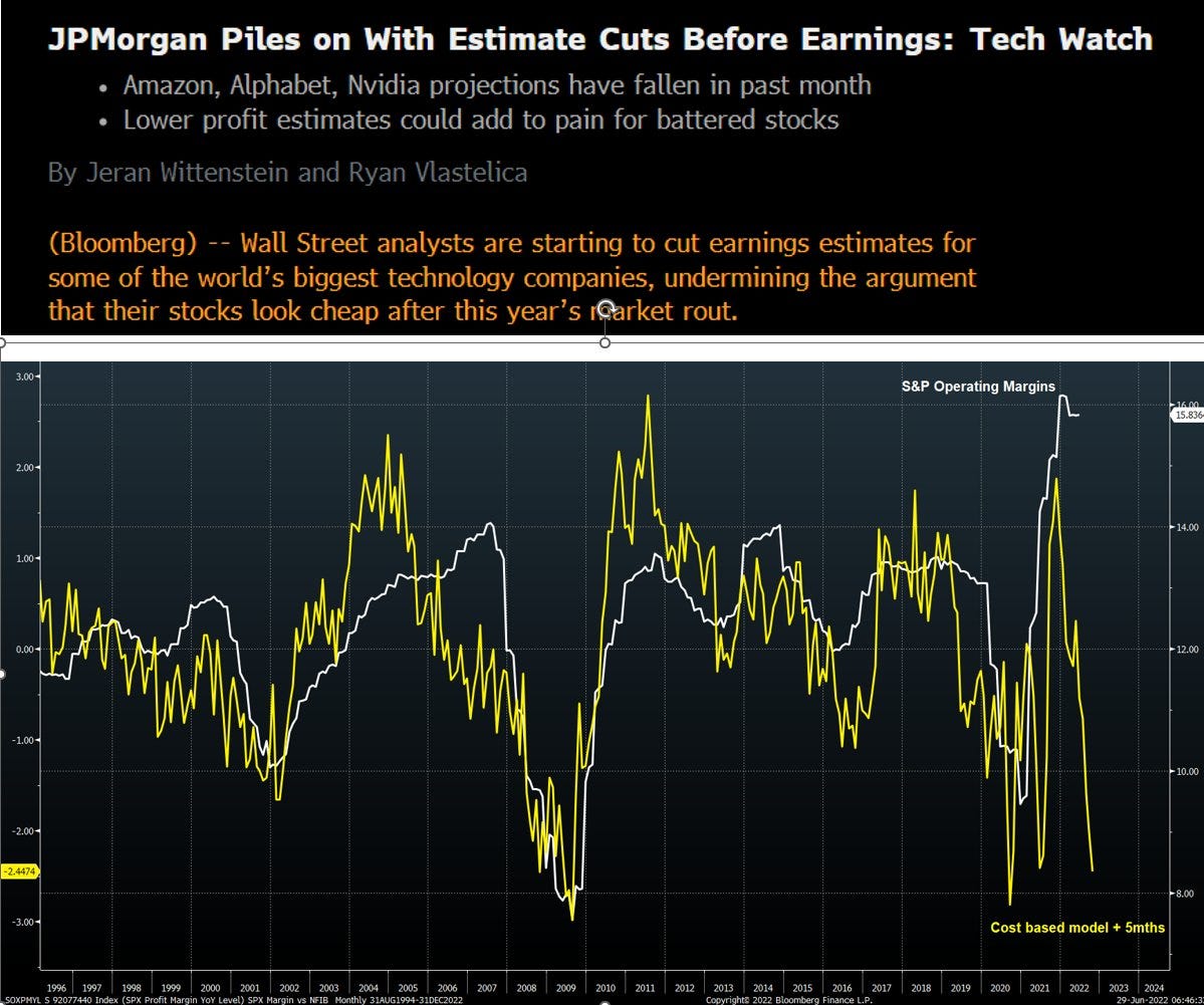
8. Earnings Outlook: Another perspective on the outlook for corporate margins, this time looking at operating margins and cost pressures -- either way you cut it, the outlook for earnings is not good...
Earnings FUD is real. Expect more downgrades.
Source: @JulianMI2
9. Who Owns the Market: Probably a few surprises in there for those who haven't seen this type of breakdown before...
Source: @Ksidiii
10. Long-Term Perspective: "Stocks for the Long-Term"*
*(n.b. beware of occasional lost-decade(s))
Source: @MikeZaccardi via @MichaelAArouet
Thanks for following, I appreciate your interest!
BONUS CHART >> got to include a goody for the goodies who subscribed.
Equity Allocations: much to my delight, the AAII just released its June Asset Allocation Survey (just in time for me to write this email!). But it’s not just a convenient space-filler, there were actually some pretty interesting moves in the latest set of data.
For instance, equity allocations dropped -2.5% to 64.7% — that’s down from the peak of 71.4% in November, and compares to the long-term average of 61.6% (since 1987).
The other two buckets in the allocation survey were also interesting, bond allocations blipped ever so slightly up to 14.1% (from the low point of 12.6% in April this year). But as we know by now, both bonds and stocks sucked in H1…
So cash is where it got a bit more interesting: up 2.1% in June to 21.2% (up 7.5% from the low point of 13.7% in August). Cash was one of the few things that worked (in that it didn’t go down in nominal terms) in H1.
Interestingly, if you had raised cash at the nadir of cash allocations in August last year, you would have made double-digit returns in relative terms vs both stocks and bonds. Often turns out that going against the crowd pays off, especially as back then valuations were lofty and policy was beginning to pivot.
But that’s hindsight.
Looking forward, the reset in equity allocations is encouraging from a timing standpoint — in terms of when to get bullish on equities again. Ideally you want to see the market go full circle from expensive valuations and crowded/stretched allocations to cheap valuations and light allocations (and big cash allocations).
Progress: yep. There yet: nope.
—
Best regards,
Callum Thomas
My research firm, Topdown Charts, has a new entry-level Substack service, which is designed to distill some of the ideas/themes/charts from the institutional research service to provide the same high quality insights at a more accessible price.
Give it a try and let me know what you think! :-)
Relevant Tickers Discussed: SPY 0.00%↑ AGG 0.00%↑ TLT 0.00%↑ IEF 0.00%↑ EQRR 0.00%↑ IVV 0.00%↑ VOO 0.00%↑ SPLG 0.00%↑


Curious, would there be much interest in an audio/YouTube version of this?
Fantastic Information. Thanks