
Weekly S&P500 ChartStorm - 3 December 2023 [free version]
This week: monthly stats check, seasonality, election years, recession priced-in? growth vs value, top stock value, moving volatility, biggest of the big, and the rise of cash...

Welcome to the latest Weekly S&P500 #ChartStorm! [free preview version] — the Weekly ChartStorm is an easily digestible selection of charts which I hand pick from around the web (and from my own personal library of charts at my research firm Topdown Charts). These charts focus on the S&P500 (US equities) with a particular focus on the forces and factors that influence the outlook, to bring you insight and perspective…
For more background, see: ChartStorm Origin Story
Learnings and conclusions from this week’s charts:
November was a solid month, the S&P500 up 8.9% — riding the wave of easing financial conditions and Fed peak prognosis.
Historically December tends to be a good month in markets (albeit watch out for the “29%”).
Presidential election years (2024) also have historically been good.
The stock market historically never predicts/prices-in recession.
Investors are piling into cash, scooping up bonds, and dumping equities.
Overall, the rise off the October low (October 2023) has been a storming one, with wide participation, and a quick readiness by investors to jump on the bandwagon. With sentiment, seasonality and Santa seemingly set to glide us gently onwards and upwards into year-end, it’s timely to study the stats and take-stock before we all check-out for the year…
Content Spotlight: Emerging Markets — Different this time… (click)
As 2024 outlook season approaches, here’s an update on what was a very consensus view at the start of this year, and why things are different now…
1. Happy New Month! Certainly a bit happier this month for most, with the S&P 500 up +8.9% in November (placing it up +19% YTD as of the close on 30 November 2023 — or 20.8% including dividends).

Source: Topdown Charts Topdown Charts Research Services
2. In Context: Here’s how the S&P500 (US Large Caps) stacked up vs some of the other major asset classes during November and 2023 Year-To-Date. Interestingly, November saw just about every asset rally as the market made up its mind that the Fed is done with rate hikes (along with the ensuing easing of financial conditions).

Source: Topdown Charts — Asset Class Returns
3. Welcome to December: Looking at the monthly seasonality stats table, historically December has been just about as good as November (if not better in some respects). But again, there are always exceptions to the seasonal rule, and although 71% of past returns were positive in December, 29% were negative.

Source: Topdown Charts Professional
4. Next Year: As we’re soon headed into election year it’s worth highlighting an interesting stat — returns historically were positive 83% of the time during presidential election years (and 4 out of the past 24 election years were negative, i.e. 17%). Again, the odds are with you, but remember it’s a statistical observation of the past… and there is nothing to preclude 2024 becoming the 5th. But still, interesting.
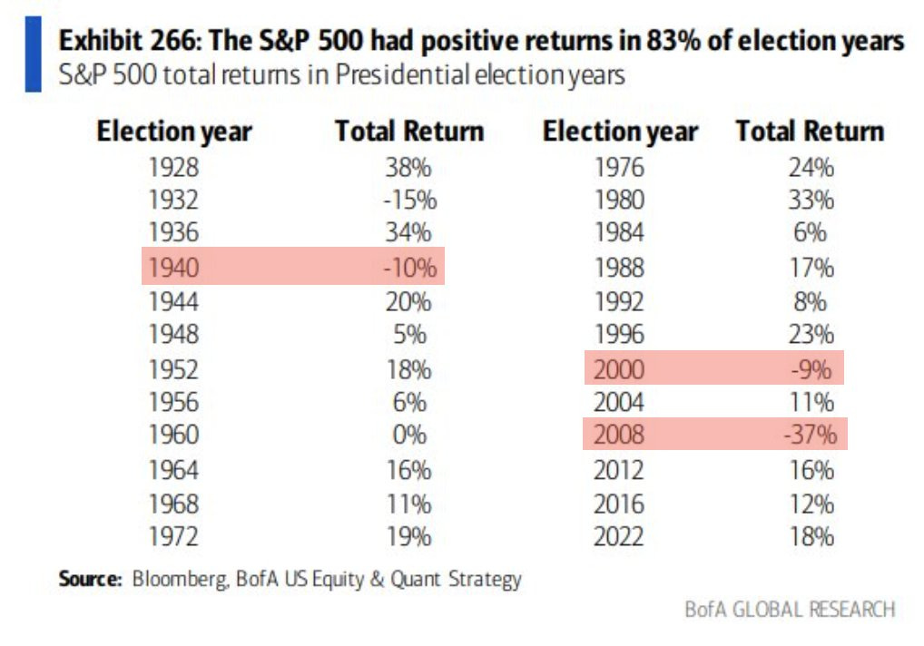
(my footnote added: presumably this table means 2020 instead of 2022, and also 1932 should probably(?) be highlighted red)
Source: @SethCL
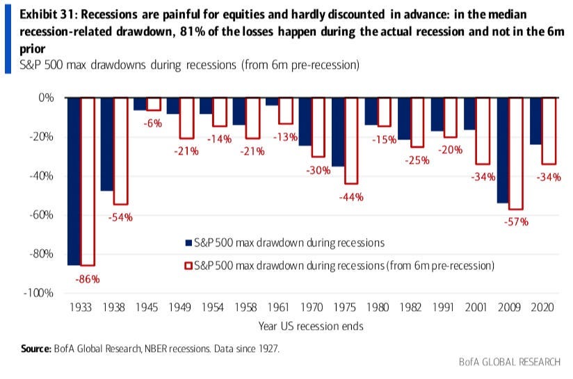
5. Never Priced for Recession: This chart shows the drawdown in equities during recession (the dark blue bars) vs the drawdown *including the time period 6-months prior to recession*. For the most part the bars are fairly close together… or in other words, most of the pain comes *during* recession. And I think one takeaway from this is that recession risk is basically ignored by markets until its unignorable.
Source: Daily Chartbook
6. Investor Sentiment vs Economic Sentiment: On a similar note, as of the latest data investor sentiment has surged back towards the heights of extreme bullishness… while economic sentiment (combined signal from consumer, small business, manufacturing, services, housing surveys) remains deeply depressed, recessionary. So who’s right?
(Wall Street says: Bull Market, Main Street says: Recession)

Source: Topdown Charts — see also “Chart Of The Week”
7. Growth Gain Gridlock: Last year value stocks gained the upper hand (and growth stocks took a step back) — this year that was all completely reversed. And now?
We’re back to that growth vs value relative performance line hitting its head on the ceiling…
[Subscribe for the full set of charts and access to comment section Q&A]
Like what you see so far?
Then sign up as a paid user so you can receive the full weekly chart packs (all 10 charts + bonus chart/thematic section) straight to your inbox + participate in the comments section banter + Q&A.
It’s a good and easy way to stay on top of the markets, with a balanced and broad perspective on the drivers of risk and return. At just US$95/year (or $10/month if paying monthly) it’s easily affordable and a sound investment in market intel.
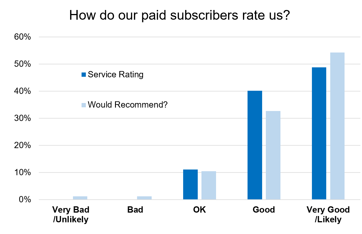
What do Paid Subscribers Think about it?
I recently surveyed our paying subscribers (see full results of that survey + testimonials), and here’s a couple of charts from the results…
90% of paying subscribers think that the service is either good or very good — and would happily recommend the ChartStorm to friends and colleagues.
Most people subscribed for the charts, naturally, but subscribers also appreciate the commentary, and how it helps make them think, identify ideas, and expand their knowledge base.

And when I asked what changes they’d like to see, most of them basically said that it’s great and don’t go changing! :-)
So some interesting results, and certainly confidence inspiring if you are considering upgrading to a paid subscription at some point.
I would also say these results are definitely validating to me in terms of what I hope to achieve with the service, and the direction I’m taking it.
Best regards,
Callum Thomas
Founder & Editor of The Weekly ChartStorm