Weekly S&P500 ChartStorm - 29 October 2023
This week: technicals check, sentiment, seasonality, buyback blackout, cash rate headwinds, quality bubble, Japan, stocks vs bonds, risk assets vs defensive assets...
Welcome to the latest Weekly S&P500 #ChartStorm!
Learnings and conclusions from this week’s charts:
The S&P 500 has broken down through multiple key levels, with breadth also breaking down (indicating broad-based weakness).
Most of the market has left the earnings reporting buyback blackout window now: offering some hope as a potential source of buying for a seasonal year-end rebound.
Yet, monetary policy remains a headwind: (safe) cash rates present a high hurdle and higher borrowing costs hurt fundamentals.
Based on valuations there appears to be a bubble in “Quality Stocks”.
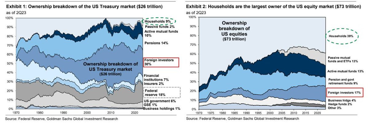
US households are much more important holders of stocks vs treasuries.
Overall, I think it’s fair to say the market is at a dangerous point with the technicals now looking decidedly negative, monetary headwinds ongoing, and the specter of major real and pressing geopolitical tail risk looming in the background. Yet we can’t forget that the economy remains more resilient than most including myself have expected, sentiment although mixed is much less bullish now, and seasonality (albeit can be hit and miss) turns strongly positive from here into year-end. And while you might not like seasonality, it can become a self-reinforcing dynamic... So I would say keep focused on risk management, and open minded on next steps.
1. Another Breakdown: As of Friday’s close, the market has now broken down through its short-term downtrend channel, down through 4200, and down through its 200-day moving average — and the 200-day breadth indicator also continues to deteriorate (which goes to show that the weakness is increasingly broad-based).
They say “nothing good happens below the 200-day moving average” and I’d have to say the picture below does not look good.
Source: Callum Thomas using Market Charts
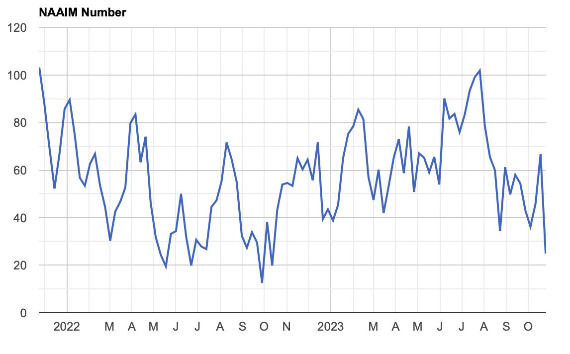
2. Sentiment Check: The latest NAAIM exposure index reading shows active investment managers reporting the lowest exposure to stocks since the depths of the 2022 downturn. Increasingly investors are expressing doubt on the market outlook as the rally off the 2022 low looks more and more like just one big bear market rally (and if you noticed on the previous chart, it looks like we’ve locked in a lower longer-term high — raising the question as to whether a lower low may come next).
Source: @Barchart
3. Bear Bottom or Bare Bottom? The alternate view to those bearish takes would be that the market simply follows the seasonal script of strength into year-end (and rallies out of the increasing pessimism)… but also the script of how the S&P500 trades through Nov-Dec when it was up at least 10% YTD in the first half of the year (as the chart below maps out).
I would say some of the logic or psychology behind this pattern is market participants remain encouraged and greedy from the H1 gains, and the resultant bullish bias sees the crowd ready to jump back on the bandwagon at a moment’s notice.
Source: @RyanDetrick via @TheChartReport
4. Back Out of Blackout: The majority of companies are now out of earnings reporting buy-back black-out. And you’d certainly wonder if companies are thinking that buybacks may be interesting given the cheaper prices… more bang for the buy back buck.
Source: @DayHagan_Invest
5. Bye Bye Buybacks: Q4 is typically a stronger quarter in terms of buybacks, but it is notable that the recent trend has been down in terms of buyback announcements. Some of this will have to do with the cost pressures dampening margins last year, but especially also with borrowing costs now a lot higher — making it more difficult a calculus for firms to fund buybacks with debt.
Source: @WallStHorizon via Daily Chartbook and @MikeZaccardi
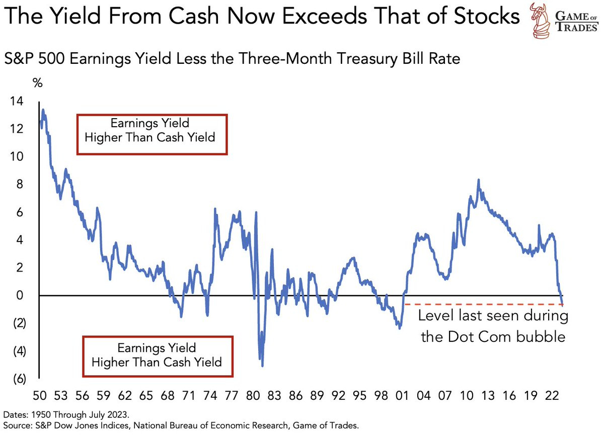
6. Cash vs Stocks: Last week (chart 5), I highlighted how cash rates are now higher than the earnings yield — but this chart shows the spread and provides further historical context. Arguably the past couple decades were unusual in terms of the large and persistent spread of earnings yields vs cash rates, but equally it’s unusual for the spread to fall this quickly and also relatively rare for it go negative.
And I think it’s important to dwell on this fact: despite sentiment and seasonality, we just don’t have any monetary buffers — monetary policy is still a headwind.
Source: @GameofTrades_
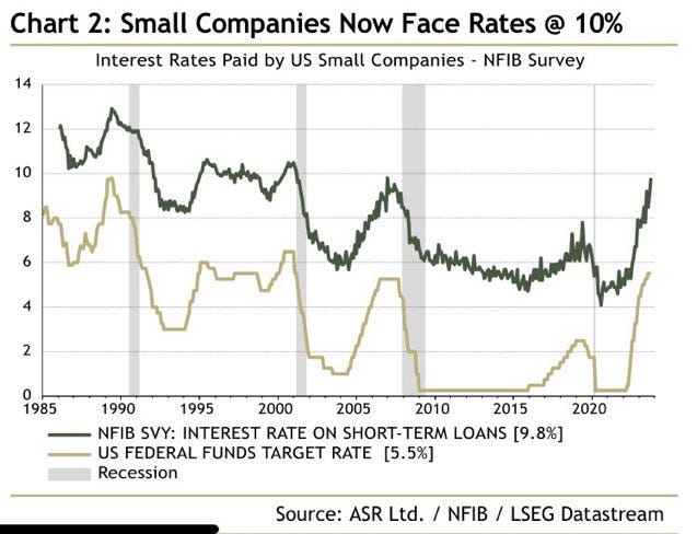
7. Big Rates for Small Business: Small businesses are reporting sharply higher borrowing costs — up more than 2x off the average of the past decade. This makes it harder for firms to justify debt-driven expansion (less capex, less hiring), and makes it harder on those already leveraged up and who need to roll-over existing debt. Again, monetary policy is still a headwind.
Source: @IanRHarnett
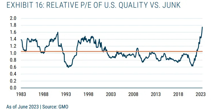
8. A Quality Bubble: In a recent presentation, GMO highlighted that historically the performance spread of “quality vs junk” stocks served as a good tail risk hedge or downside diversifier. The only issue is quality stocks are now at record expensive valuations vs junk stocks. For reference, “quality” here means (and there are varying definitions) stable and strong earnings growth, low financial leverage, strong profitability. And in practice, it’s heavily skewed into big tech (e.g. the largest quality factor ETF in the US [QUAL] biggest holding is… NVDA).
Source: 4 Forms of Tail Risk Protection Stephen Clapham
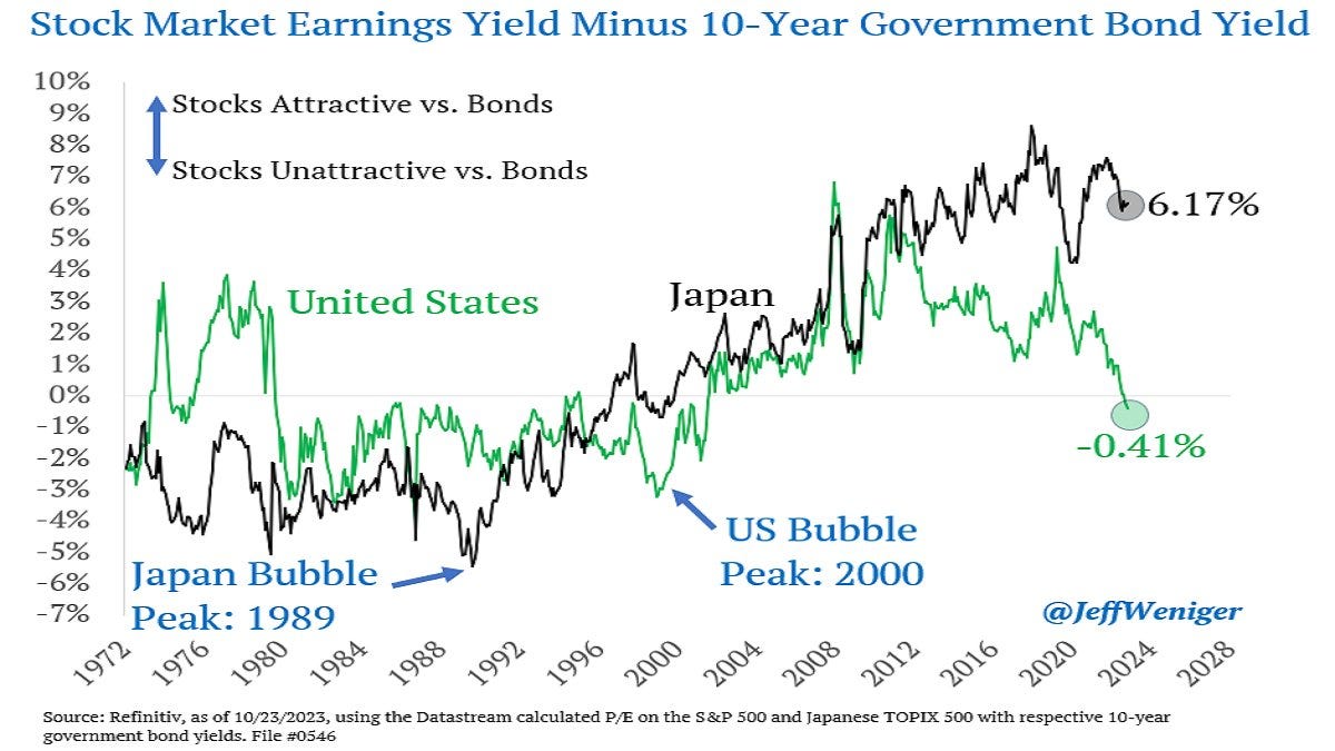
9. Japan: Most investors want nothing to do with Japanese stocks, it’s not on their radar, not even in the sphere of consideration — everyone knows Japan has bad demographics, bad corporate habits, decades of deflation, etc etc. But this is more than reflected in the price, Japanese stocks are cheap, and things have been changing. Corporate governance has significantly improved, Japan is set to benefit from a variety of key global themes, and has seen its stock index + GDP breakout from a long-term range.
Source: @JeffWeniger
10. Who Owns Stocks & Bonds? Here’s some intriguing context on stocks vs bond ownership breakdown, especially as bond yields go up and earnings yields drift lower — households own 39% of the stock market (more if you include indirect holdings), while just 9% of treasuries.
Source: @MikeZaccardi
Thanks for reading, I appreciate your support! Please feel welcome to share this with friends and colleagues — referrals are most welcome :-)
BONUS CHART >> got to include a goody for the goodies who subscribed!


