
Weekly S&P500 ChartStorm - 29 August 2021
This week: risk indicators, value vs growth, leverage/debt, and profit margins

Welcome to the Weekly S&P500 #ChartStorm (by email!)
The Chart Storm is a weekly selection of 10 charts which I hand pick from around the web (+some of my own charts), and then post on Twitter.
The charts focus on the S&P500 (US equities); and the various forces and factors that influence the outlook - with the aim of bringing insight and perspective.
Hope you enjoy!
p.s. if you haven’t already, subscribe (free) to receive the ChartStorm direct to your inbox, so you don’t miss out on any charts (you never know which one could change the whole perspective!)
1. Leveraged ETF Trading - Risk Indicator: This unusual indicator looks at the degree of trading in bullish vs bearish leveraged ETF bets. The higher it goes the more bullish bets are being placed, the lower it goes the more bearish bets are dominating. As we can see it has been *launched*. Thus, all else equal, the risk of a sell-off or correction is higher than usual.

Source: “Yet Another Risk Indicator“
2. S&P500 vs Credit Spreads: “High Yield“ (aka Junk Bonds) credit spreads have been quietly but steadily rising recently [n.b. they are shown inverted in the chart below]. Like all indicators, it ain’t perfect, and we do need to take some liberties in this “intermarket analysis“ but credit can be a bit of a canary in the coal mine so to say for equities. The logic is that if credit markets are pricing in or demanding a higher risk premium, perhaps equities should take note.
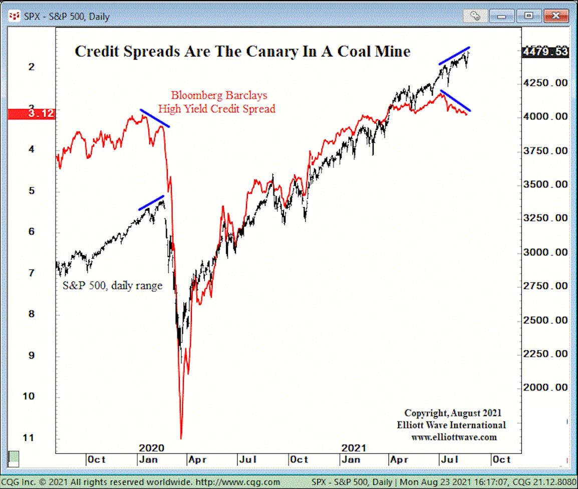
Source: @B2Investor
3. Short-Term Cycles in Volatility: An interesting one - this shows the price action in the S&P500 vs a 21-trading day simple cycle. Clearly we are also taking some liberties with this analysis, but it does seem to fit quite well to how things have gone the past few months. So, September?

Source: @NautilusCap
4. The Curse of the Magazine Cover? Magazines like Barron’s and The Economist seem to have an impeccable record of picking tops and bottoms with their covers - so the one below certainly raised some eyebrows this week; particularly for the “unstoppable“ tech sector.

Source: @chigrl
5. Value vs Growth Correlations: Anyone who has been paying attention will have noticed the wild rotations in and out of value vs growth during and since the covid crash of 2020. This chart provides a good visual of how drastic the resultant correlation breakdown has been. It also provides yet another chart that reminds us of the dot com bubble.
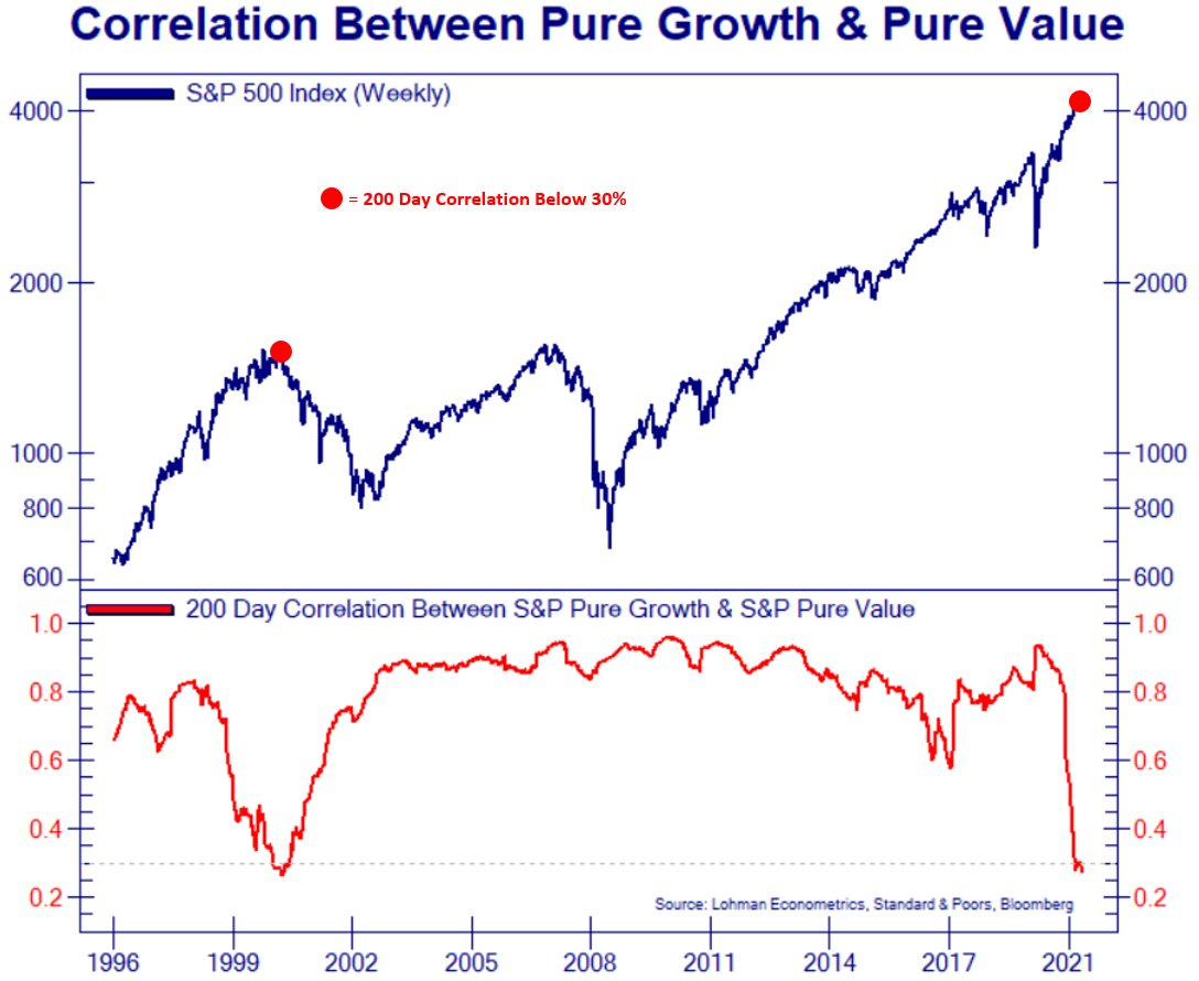
Source: @Not_Jim_Cramer
6. Value vs Growth Volatility Tracker: On a similar note, this indicator tracks the rolling annual sum of daily price moves in value vs growth which exceed plus or minus 1%. It’s quite a remarkable chart for a few reasons, but perhaps what stands out the most is the 2000 vs 2009 episodes where the indicator last spiked near similar levels. Begs the question for value vs growth whether this is 2000 (good for value) or 2009 (bad for value).

Source: @topdowncharts
7. US Margin Debt: Margin debt dropped in July (yeah I know, that’s a while ago, and that’s one downside of this data series - it’s released monthly with about a 1-month lag… one of those little quirks that is worth factoring in if you’re building trading algorithms!). Anyway, the key point is that this has sometimes, but not always, been a harbinger of troubling times for markets.

Source: @TheOneDave
8. US Profit Margins: Despite a major global pandemic, amidst labor market shortages, supply chain disruption, and inflation pressures, US profit margins are… at new all time highs! Of course it should be noted that the economy has bounced back hard thanks to stimulus and reopening, and *sales* is a much more important driver of profit margins at an aggregate level. Also, most companies end up banking inflation due to operational leverage and ability to pass on costs.
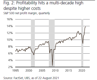
Source: @SarahPonczek
9. Tech Sector Profit Margins: Following on from the previous chart, perhaps the more interesting story is not that profit margins reached an all time high but how profit margins seem to be locked into a clear and persistent uptrend. This next chart provides some color (even though it is greyscale!) - Tech sector profit margins are pretty much the key driver here as internet and software supremacy completely changed the game. The growing weight of tech over time has meant that the tech sector is basically in the driving seat of the previous chart. Raises a few questions though - how long can this uptrend persist? Will it peak and then mean-revert? Will it stay steady at this new “permanently higher plateau“?

Source:
10. Low Leverage: There are a few ways to measure leverage, but this interesting one shows debt vs market value of equity - firstly, *market value* of equity is clearly doing some heavy lifting here. Another point is changing sector composition also matters e.g. most tech companies are relatively capital-light (e.g. vs a utility or energy company which requires massive capex and funding thereof). But still, I find this to be a stark chart - considering how low borrowing costs are.

Source: @MikeZaccardi
Thanks for following, I appreciate your interest!
oh… that’s right, almost forgot!
BONUS CHART >> got to include a goody for the goodies who subscribed.
Leveraged Equity ETF Assets Under Management: I thought it would be a good follow up to the first chart of this week’s session - instead of volume traded, here we’re looking at the total assets.
Specifically, I’ve aggregated assets under management of all leveraged-long ETFs for US equities (including 2x and 3x leveraged), and the same for inverse/short ETFs. It presents a fairly spectacular picture.

Leveraged-long ETFs have seen about a 5x rise in assets since the depths of March 2020. While at just over $50 Billion in AUM it’s certainly not systemic or even particularly material when you consider the US stockmarket is close to 50 trillion in total market cap.
But it does show a clear shift in behavior: investors voting with their feet. It also gels with that first chart which shows a surge in speculation.
I would also say that leveraged ETFs are only one way to make a leveraged bet in the markets (e.g. think about options, futures, margin debt, simply borrowing/credit card, etc etc)… and from what I’ve seen it is consistent with what we see there too.
And well, this is what you tend to see later in the cycle.
Can it go higher? Yes! Is it “too high“? Perhaps…
Is it a sign of risks building up in the system? I think so.
Point to note about leverage is that when things do get moving, when fear takes over from greed, things can unwind fairly quickly. Just like leverage can accelerate gains during raging bull markets: it can accelerate losses and ruin lives on the way down. So take this as a cautionary on both a personal basis - keep your risk management in check, but also a market-wide asset allocation timing perspective.
—
Best regards,
Callum Thomas
SPONSOR: ( …he’s me!)
My research firm, Topdown Charts, has a new entry-level Substack service, which is designed to distill some of the key ideas and themes from the institutional fund manager service to provide the same high quality insights at a more accessible price.
Give it a try and let me know what you think