Weekly S&P500 ChartStorm - 28 November 2021
This week: taking stock of the selloff and some interesting stockmarket studies
Welcome to the Weekly S&P500 #ChartStorm (by email!)
The Chart Storm is a weekly selection of 10 charts which I hand pick from around the web (+some of my own charts), and then post on Twitter.
The charts focus on the S&P500 (US equities); and the various forces and factors that influence the outlook - with the aim of bringing insight and perspective.
Hope you enjoy!
p.s. if you haven’t already, subscribe (free) to receive the ChartStorm direct to your inbox, so you don’t miss out on any charts (you never know which one could change the whole perspective!)
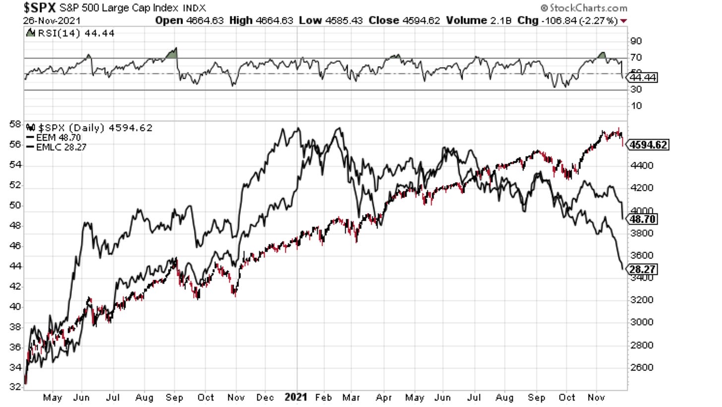
1. Selloff! I can’t help but wonder if “Omicron” is just the trigger the market was already looking for… Emerging Market assets have been quietly but steadily bleeding away in the background (chart shows local currency debt and EM equities - both also reflect the FX aspect, which has been a disaster recently as the US dollar heats up), and the S&P500 itself had just seen an overbought RSI signal. So given that background context (not to mention taper is now underway), maybe this goes a little further?
Source: @Callum_Thomas
2. Emerging Markets vs S&P500: After a number of false dawns, EM equities have made fresh relative low vs US equities. It would be perhaps ironic if what it took to turn the corner on this chart was a re-visitation of the all time low back around the peak of the dot-com bubble (prior to the major multi-year bull market in EM).
Source: @topdowncharts
3. Oil Breakdown: Last time crude oil broke down this sharply it didn’t end too well for stocks. Could be explained away as a knee-jerk reaction to Omicron, but certainly something to keep an eye on.
Source: @Callum_Thomas
4. S&P 500 vs Bitcoin: “Just two risk-assets selling off...“ Worth also keeping an eye on markets like Bitcoin (and others) where a lot of speculative money has been crowding into. Volatility across assets can damage overall speculative sentiment.
Source: @topdowncharts
5. Healthcare Stocks: Healthy discount in healthcare stocks... perhaps all the more interesting given I would consider the healthcare sector to be one of a few key defensive sectors that tend to hold ground at least on a relative basis during corrections and bear markets.
Source: @dissectmarkets
6. The Rise of Retail (part 1): This chart shows a fascinating account of the rise of the day trader… no not during the pandemic, but during the original retail bubble - the dot-com bubble. Really interesting to see how rapid the adoption of online trading was back then.
Source: @hindsightcapllp
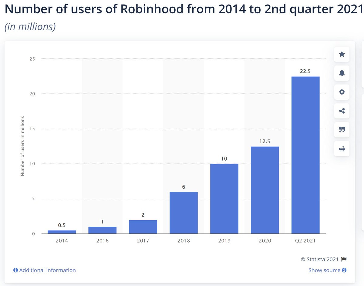
7. Rise of Retail (part 2): Obviously things are very different this time, but one similarity between now and the dot com bubble is the fast and furious rise and rise of retail trading. As a curious side note, here in New Zealand a company called “Sharesies“ (basically the NZ equivalent of Robinhood went from less than 100k users pre-covid to now more than 440k (NZ total population = 5m). The past 2 years have been the perfect cocktail of conditions to trigger a global speculative fervor.
Source: Statista
8. Annual Share Turnover: Interesting to note that the “turnover of shares on the US stock market was higher in early 1900s than in 2000". Always like to see these longer term charts. Link to the study.
Source: @DuncanLamont2
9. Equity ETF Concentration: Average holdings by Equity ETFs has been trending down to a new record low. Basically equity ETFs are becoming more concentrated in their holdings (greater active share, greater conviction)… and I guess by definition less diversified too.
Source: @tpsarofagis
10. Where do Listed Companies Go? Over the past decade 62% were still listed. Of the 38% that de-listed.. 23% (or 60%) were taken out by a listed company (so basically still listed, but just indirectly!).
Source: @DuncanLamont2 (Link to the Study)
Thanks for following, I appreciate your interest!
oh… that’s right, almost forgot!
BONUS CHART >> got to include a goody for the goodies who subscribed.
Crude Oil Seasonality: this chart returns from a few weeks ago!
As I noted last time ”this chart maps the seasonal tendency of the WTI Crude Oil price — in contrast to equities, the oil price has a tendency of weakness into year-end.”
Now obviously we did have a pretty important catalyst in terms of the Omicron Covid variant making headlines, and you might argue that the strategic petroleum reserve releases may have also had an impact at the margin.
But again, from a technical standpoint, crude oil was looking overbought, had pulled back from the all-time high, sentiment/positioning was stretched bullish, and as noted in this chart - seasonality was turning negative.
So maybe it was just another case of a market looking for an excuse…
—
Best regards,
Callum Thomas
SPONSOR: ( …he’s me!)
My research firm, Topdown Charts, has a new entry-level Substack service, which is designed to distill some of the key ideas and themes from the institutional fund manager service to provide the same high quality insights at a more accessible price.
Give it a try and let me know what you think


