Weekly S&P500 ChartStorm - 28 August 2022
Weekly selection of charts: bitcoin vs S&P500, systematic flows, investor positioning, short interest, macro backdrop, earnings, profit margins, Canadian stocks, USA vs global ex-US equities
Welcome to the Weekly S&P500 #ChartStorm — a selection of 10 charts which I hand pick from around the web and post on Twitter.
These charts focus on the S&P500 (US equities); and the various forces and factors that influence the outlook - with the aim of bringing insight and perspective.
Hope you enjoy!
NEW: Sign up to the (free) Chart Of The Week over at the new Topdown Charts Substack entry-level service: Subscribe to the Chart of the Week
Each week we send you one of the most interesting charts on our radar, along with commentary/context and a key takeaway — so you’re never left guessing on why the chart matters ...and the charts matter! > > > Subscribe Now
1. Falling to Bits…
Bitcoin back towards the lows. It’s hard for either of the things in this chart to sustainably rally when the monetary tides are going out. Bitcoin is basically a more direct play on that theme, and that's why this chart make sense.
Source: @topdowncharts
2. System of a Top: Seems like systematic funds bought the rally... will be interesting to see how quant/systematic/trend following strategies perform in this environment — which is very different to that of the previous decade. I think a bear market or simply range-trading market would confound both human algorithms and computer algorithms!
Source: @MacroCharts
3. Diamond Hands: I’ve mentioned this a few times (e.g. last week chart no.5) and with reference to a few different datasets, but here is another interesting dataset — and this one shows it in a more accentuated form...
Investors have not sold.
Source: @LanceRoberts
4. Short Interest Short of Interest: Did short selling die in 2020?
(or is it just resting, like in 2000?)
Source: @MikeZaccardi
5. Stagflation Sucks for Stocks.
Interesting analysis in the context of Powell’s speech at Jackson Hole, which basically said expect more tightening, but also emphasized the likelihood/necessity of a "sustained period of below-trend growth" in order to combat inflation and prevent the risks of high inflation begetting high inflation. Again, the current macro backdrop is unfriendly for markets.
Source: @robanderson_stl
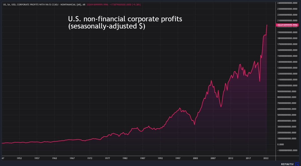
6. Prophets vs Profits: In other news, US corporate profits reached a new all-time high in Q2: surpassing the $2 Trillion mark for the first time in history. (maybe you can call that an upside of high inflation: everyone feels richer, or at least they have more nominal dollars)
Source: @ReutersJamie
7. Profit-Able: On a related note, profit margins remain near record highs as companies happily pass on rising costs to consumers. Expect this to change as the Fed increasingly steps on the neck of the economy: lower profits = "transmission mechanism".
Source: @DiMartinoBooth
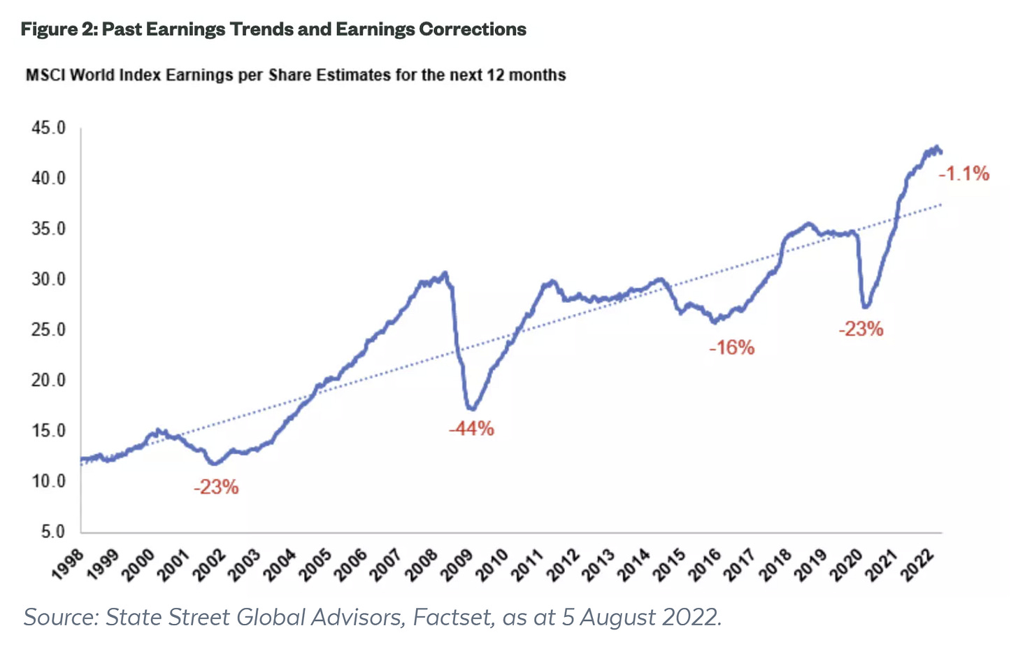
8. Peak Performance: This is what peak performance looks like.
(i.e. a peak in earnings performance)
Source: Why the earnings correction is yet to manifest in global markets
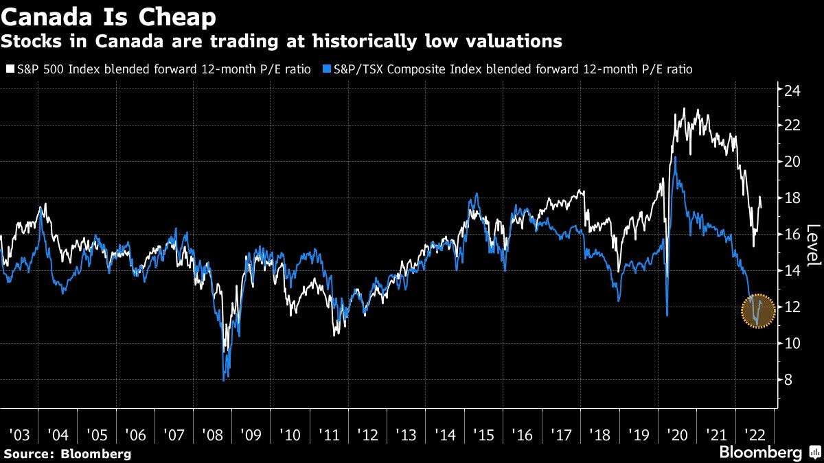
9. Canada is Cheap, eh: Interesting to see the divergence there; Canadian equities have priced in a much different reality vs that of the USA. Naturally though, there is also something to be said about the level of PE ratios if the E drops.
Source: @jeancharlesgand
10. USA vs The World: Some (a lot? most?) investment professionals have never seen US underperform vs global ex-US equities during their career.
(would be shocking for them if this flipped)
Source: @NateGeraci
Thanks for following, I appreciate your interest!
BONUS CHART >> got to include a goody for the goodies who subscribed.
USA vs The World — Valuations: Following 15 years of outperformance, US equity valuations are nearly twice that of the rest of the world. Or in other words, the market is very confident in the USA vs the rest of the world!
This chart shows the price vs trailing 10 year average earnings (in order to smooth out the distortive effects of cycles and shocks) for the USA, and for the median of the 46 countries I keep track of.
Aside from the big gap between US vs global, another thing sticks out…
Relative to the past decade, both the USA and the rest of the world are still not cheap. There is a long way to go if we were to revisit the pandemic panic or global financial crisis lows, or even the 2015/16 mini-bear low(s).
The only thing we’ve really done is go back to pre-pandemic levels. But the macro backdrop is vastly different from then. And I would say mostly in a bad way (high inflation, monetary tightening, geopolitics, negative wealth effects, etc).
Bad macro can easily be overcome or ignored: *if* the valuation cushion is big enough. And that’s the key takeaway in this chart I reckon. Valuations aren’t cheap enough to compensate for the likelihood of much-tighter-for-longer monetary policy nor the possibility of a global recession.
Until then, at best, it’s a waiting game for better entry or better macro (IMHAPWO*).
—
Best regards,
Callum Thomas
My research firm, Topdown Charts, has a new entry-level Substack service, which is designed to distill some of the ideas/themes/charts from the institutional research service to provide the same high quality insights at a more accessible price.
Give it a try and let me know what you think! :-)


I hope I am writing for the many who don't, in that: you are the man to what you present.
I've always found you charts astounding, but it is also supporting my (expensive)
outside research I follow. Thank You
I don't doubt that profits and profit margins are spiking. Most non-financial companies are selling (or trying to sell) inventories that they purchased before the inflation spike.